
 September 8th
 February 22nd
What Is a Combo Chart and When Should You Use One
Should you overcomplicate your report when you can answer all the questions with a single chart?
A combo chart is a visual that draws two or more series with different mark types on one shared category axis. For example, the columns carry the amount, the line carries the rate, and your readers get both without moving between two charts.
In this guide, we'll explain how a combo chart works, when to use one in your reports, the types of combo charts, and how to create one that answers the board’s questions.
What is a combo chart?
A combo chart is a visualization tool that draws two or more series with different mark types on one shared category axis. The usual pairing is columns for an amount and a line for a rate, so revenue and margin sit in the same picture.
The mark types are the easy part, because drawing one series as columns and another as a line tells your readers the two things differ in kind, so nobody tries to compare a percentage against a currency.
The axis is where it gets harder. Different units mean the line would sit flat against the bottom on a shared scale, so most tools add a second axis on the right. Once there are two axes, the vertical position of the line against the columns means nothing, because two range choices put it there rather than the data.
PRO Trial AVAILABLE FOR FREE!
Revenue as columns and margin as a line, without a range anybody had to pick. Zebra BI Charts draws the second measure over the same plot instead of on a second axis.
Combo chart cheat sheet
One axis, or a second axis you can defend in a sentence. Combine mark types freely. Never let a reader measure the distance between 2 series that sit on different scales. The panel has the specifics, and the rest of the page is the argument behind them.
Combo chart details
Doing its job
Time to switch
Broken most often
4 cases when you should use a combo chart
The combination earns its place when the 2 series belong on the same category axis and nobody has to measure the gap between them. All 4 cases below clear that bar. The first clears it without a second axis at all.
1. You want a target or a benchmark drawn across the columns
The reader sees which periods cleared the bar, with no arithmetic. Monthly sales as columns, with the industry average as a line running across them. Both series are the same measure in the same unit, so they share one axis and the distance between them is a real number. This is the safest combo chart there is. Nobody picked a second range, because there isn't one to pick.
2. You need a rate read beside the amount it came from
Revenue in millions with gross margin in percent gives you the size and the quality of the same business in one picture. Microsoft's own example is homes sold as columns and average sale price as a line. The pairing is right and the reason for it is real. The axis is the part to get right, and the next 2 sections are about that.
3. Both series are the same quantity in different units
Temperature in Celsius and Fahrenheit, or a total in dollars and in euros at a fixed rate. Here 2 axes are fine, because arithmetic locks the ranges to each other. Nobody can move one axis without moving the other, so nobody is choosing the story.
4. Only the shape of the second series matters, and the chart says so
Sometimes you want a reader to see that conversion dipped in the month revenue dipped, and you don't want them measuring how far. That's a real job, and a combo chart does it well. Put it in the subtitle so nobody reads a level off the right-hand axis. It's the weakest case here, and it stops working the moment somebody quotes a number from the chart.
3 cases when you shouldn't use a combo chart
Each of these has a better chart behind it, and the reason is always the same. The reader is being asked to judge a distance the chart can't show.
1. You want the reader to judge how the 2 series relate
Index both series to 100 at a common starting point and draw them as 2 lines on one axis. That puts them on a shared scale legitimately, and the gap between them becomes a real number of index points. It's the one exception IBCS, the open standard for business reporting, makes to its zero-baseline rule. Indexing removes the range choice instead of hiding it.
2. What you actually want is the gap between 2 series
Use a variance chart, which draws the difference itself instead of making the reader measure it. Actual against plan is the case this happens to most. A combo chart makes somebody subtract 2 column heights by eye. A variance chart prints the answer.
3. Somebody is going to read the crossover as an event
People read a crossing point as the moment something happened. With 2 axes, the crossover lands wherever the ranges put it, so you can drop it into any period you like. If the crossing is the story, split the measures into small multiples. One panel per measure, same category axis, and nothing implies a moment that never happened.
Combo chart vs dual axis chart
Most people use the 2 names for the same picture. They aren't the same thing. A combo chart is about mark types. A dual axis chart is about scales. You can have either one without the other.
| Single axis combo | Dual axis combo | |
|---|---|---|
| What the 2 series share | One value scale and one category axis | The category axis only |
| Vertical distance between them | A real difference, in the shared unit | An artifact of 2 separate range choices |
| Where the 2 series cross | A real crossing point | Wherever the ranges put it |
| What decides the picture | The data | Whoever set the 2 ranges |
| Reader can measure the second series | Yes, off the same axis | Only against its own axis, if it is labeled |
| Safe when | Both series share a unit, or one is a target for the other | Arithmetic locks the 2 ranges to each other |
Here's the verdict. Combining mark types costs a reader nothing and often helps. Splitting the scales costs them the ability to read the picture, and hands the author a dial nobody can see.
Two measures in different units, and no agreement on whether they share an axis? The Chart Selector is a free Power BI Desktop file. It starts from the question you are answering and lands on the chart that answers it, on real numbers rather than a sketch. It renders through Zebra BI, so install the visuals before you open it. Download the Chart Selector
A second axis lets you choose the story
The clearest way to show this is to change nothing except the right-hand axis.

| Right-hand axis range | What the line does | What the reader concludes |
|---|---|---|
| 0% to 100% | Sits near the floor and looks flat | Margin barely moves, not worth discussing |
| 0% to 40% | Rides above the columns | Margin is healthy and stable |
| 28% to 34% | Swings hard between quarters | Margin is the most volatile thing in the business |
That third range was chosen to fit the data tightly, which is what a tool does when you let it pick the range for you.
Three charts, one dataset, 3 conclusions. Nothing was falsified: every point is plotted correctly against a labeled axis, and a reader has no way to tell that a choice was made. That is the same mechanism behind Truncating the Y-Axis: Threat or Menace?, the CHI 2020 study by Michael Correll, Enrico Bertini and Steven Franconeri.
They went further than the obvious finding. They tested whether warning the reader fixes it. It doesn't:
"the subjective impact of axis truncation is persistent across visualizations designs, even for designs with explicit visual cues that indicate truncation has taken place"
That paper studies single truncated axes, not dual ones, so treat it as the same mechanism rather than a study of combo charts. The lesson still lands. Labeling the range does not undo what the range did.
The same dial sets where the 2 series cross. Slide the right axis and the crossover moves to whichever quarter you want. That matters, because people read crossovers as events.
Types of combo chart
Tools name the variants after the 2 mark types they put together. Microsoft's list of chart types in Office names 3, and a 4th turns up everywhere else.
- Clustered column and line, with or without a secondary axis. The default combo chart nearly everywhere.
- Stacked area and clustered column, where the columns carry the amount and the area carries a composition behind them.
- Custom combination, which Microsoft describes as letting you mix chart types and assign them to separate axes as needed. The most flexible option, and the easiest one to make unreadable.
- Combo bar chart, which is not on Microsoft's list but is on most others. The same idea rotated so the categories run down the page, which suits long labels better than time.
Power BI narrows that to 2 ready-made visuals, Line and stacked column and Line and clustered column, and puts everything else behind the field wells.
One split cuts across all 4 of them, and it's the only part of this list worth arguing about: 1 value axis or 2. That's a property of the chart you built, not of the type you picked off the menu.
Combo chart layouts in Zebra BI
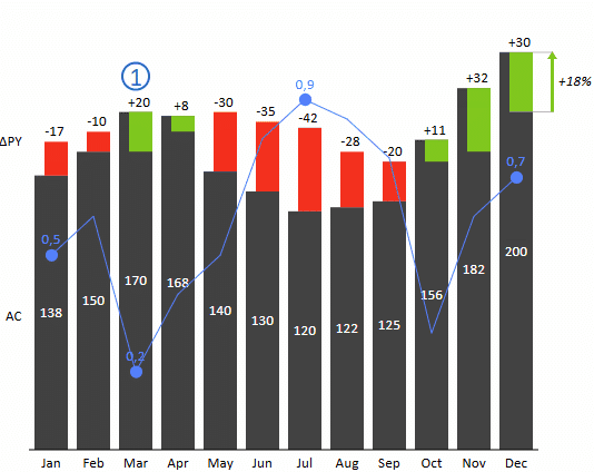


Zebra BI has a combo chart. It has one axis.
The product names it in 2 places, and both are the product's own words rather than ours. In the Values field well, the description tells you to add a second measure to create a combo chart. Add one and the format pane grows a settings group called Combo chart. What it draws is the second measure as a dot series over the same plot. A setting called Max height percent (%) sizes it, instead of an axis of its own.

Be precise about what that buys you, because it isn't magic. The dot series is scaled, so it isn't sharing the columns' numeric scale either. It's mapped from its own smallest and largest value into a band, and that band takes up a percentage of the plot height. Max height percent (%) is the percentage.
So the second measure gets its own range, and no axis of its own. Those are 2 different things, and the difference is what a reader can do with the chart. There's nothing on the right to read a level off, so nothing invites anyone to compare heights across the 2 series. You get the shape of the second measure over the first. You don't get an implied relationship between their positions.
The rest of the settings group is presentation. Line width and Line style decide whether the markers are joined and how. Marker shape picks between a circle, a square, a diamond and a triangle. Drop line width adds a stem from each marker down to the axis. The overlay works over any chart type in the visual, so a variance chart or a waterfall can carry it, and the knowledge base names both.
3 LAYOUTS, 1 COMBO MEASURE
Move the slider. The combo measure follows the chart layout rather than asking for an axis of its own.
Every layout in the grid above is a real Zebra BI render of 1 dataset, not a mockup. Put your own 2 measures through the same visual.
Combo chart in Power BI
Power BI ships the combo chart as a first-class visual, in 2 forms: Line and stacked column, and Line and clustered column. Drop a measure into the Line y-axis bucket. In Microsoft's own words, from its guide to combo charts in Power BI, "Power BI creates two axes". The same article then carries the fix. It's a section called "Sync the axes to share a single scale". Its limitations note adds one thing worth knowing. The secondary axis shows or hides itself automatically, based on how far the 2 data ranges overlap.
Zebra BI Charts is a licensed set of custom visuals you add to Power BI. Its combo chart takes at most 2 measures in the Values placeholder. The first is the chart, the second becomes the dot series over it. The chart type overview walks through it and admits the real catch. Labels on the 2 series can collide, and Max height percent (%) is the setting that pulls them apart. It works over any chart type the visual draws. What you give up is the right-hand axis itself. There's no way to produce one when somebody asks for it.
Combo charts for Office
Zebra BI for Office is 1 suite covering Excel and PowerPoint, and Zebra BI Charts for Office is the add-in inside it that draws the charts. Both applications build combo charts on their own, so each section starts there.
Combo chart in Excel
Excel has drawn these for decades and the path is short. Select the chart, then Design, then Change Chart Type, then Combo. Microsoft's instructions for a secondary axis in Excel name a preset for it. It pairs clustered columns with a line on a secondary axis. Then you tick the Secondary Axis checkbox for whichever series you want moved. So the second axis is 1 click away, with nothing between you and it. If you tick it, set both ranges yourself instead of letting Excel pick.
Zebra BI Charts for Office draws the same set of charts as the Power BI visual, so the combo chart here is the same dot series on one axis. The Excel overview covers it, with the same example: sales revenue alongside gross margin in percent. You get the Combo chart settings group here too, so the markers, the line and the labels are yours to set. Small multiples of a combo chart come from a pivot table over your data. So 1 chart per region is a layout change, not a rebuild.
Combo chart in PowerPoint
PowerPoint draws charts from the same Office engine as Excel, so the Combo dialog and the Secondary Axis checkbox are both there. The slide then holds its own copy of the numbers, and that copy is the problem. It doesn't move when the model does, so somebody rebuilds the deck by hand every close, ranges and all.
Zebra BI Charts for Office runs in PowerPoint too. The PowerPoint overview covers the combo chart along with the rest of the chart chooser. Same behavior as Excel: a second measure becomes a dot series over the plot, with the Combo chart group for its markers and labels. Link the slide to an Excel file on OneDrive or SharePoint and the chart refreshes from the model, so the numbers stop being a copy.
Combo chart design best practices
IBCS has a name for this chart. It calls it an overlay chart, and its rule on overlay charts opens by saying what one must have:
"In an overlay chart, two or more basic charts overlap. These overlapping charts always use the same category axis."
The rule accepts the sales-and-margin pairing by name. Then it adds the limit most pages leave out, that "this approach can only be used for a few chart combinations".
It also lists 2 costs. Labeling both series is hard. And the primary chart's own development over time gets harder to see once something is drawn on top of it. Where there's room, the rule suggests multi-tier charts instead. The second measure gets its own strip above the first, on the same category axis, so both stay readable and neither borrows the other's scale.
The other rule that lands here is the rule on truncated axes. Cut axes, "value axes not starting at zero", are not wrong in themselves. The standard's objection is narrower, and it's ours too. The message the chart conveys no longer matches the numbers underneath. Its one exception is indexed data. So when you index both series to 100, you're following the standard rather than working around it.
5 rules follow from that, in the order you'd apply them.
- Put both series on one scale if any unit lets you, including a target line, an industry average or an index.
- If you keep 2 axes, set both ranges by hand and write those ranges into the subtitle.
- Never let a crossover carry meaning across 2 scales, because you chose where it fell.
- Give the second series a mark type that doesn't invite measurement, such as markers rather than a filled area.
- When the reader needs the gap between 2 series, draw the gap instead of the 2 series.

Join over 1.5 million Zebra BI users
Does the next monthly pack need revenue and margin in one picture? Zebra BI Charts draws it the same way in Power BI, in Excel and in PowerPoint. Settle the axis question once.

Answer both questions with one combo chart
Use a combo chart when your two measures belong on the same category axis and no one needs to measure the gap between them. Representing revenue with a target line is the safest version because both are in the same unit on the same scale.
If you do add a second axis, set both ranges yourself rather than letting the tool pick. The same margin line can read as flat or volatile depending on that range, and nothing on the chart tells your readers a choice was made.
With Zebra BI Charts, the second measure runs over the same plot as a dot series, so so there's no second axis and no level for anyone to read off the right-hand side. You can try Zebra BI’s charts with your own business numbers during the 14-day free trial.
Frequently asked questions
The questions people ask most often about combo charts.
What is a combo chart used for?
Showing 2 related measures of different kinds together, usually an amount as columns and a rate as a line, so a reader sees both without moving between charts. Revenue with margin, or volume with conversion rate, are the standard examples. Microsoft also lists saving canvas space as a reason, which is fair as long as nobody is measuring the distance between the 2 series.
What is a combo bar chart?
The same idea with bars rather than columns, or a chart that mixes bar and line marks. Bars run horizontally, so the categories go down the page. That suits long labels and structural breakdowns better than it suits time. The mark types vary by tool, and the structural question, whether there's a second value axis, is the same one.
How do I make a combo chart in Excel?
Select your chart, then Design, then Change Chart Type, then Combo. Pick a mark type per series from the dropdowns. Excel puts a Secondary Axis checkbox beside each series in that dialog, and one of the presets is built around it. If you tick it, set both ranges deliberately rather than letting Excel choose them.
Are dual axis charts misleading?
They can be, and the mechanism is the range rather than the data. Each axis has a range somebody picked. So the distance between the 2 series, and the point where they cross, are both consequences of that pick. The chart gives a reader no way to see it happened. Two axes are defensible when the ranges are locked to each other, such as the same quantity in 2 units.
Can you give an example of a combo chart?
Monthly revenue as columns with gross margin percentage as a line across the same months. That's the most common one in finance reporting, and it's also the pairing most often drawn with 2 axes. The safer version of the same example is revenue as columns with a target line, since both are in the same unit and share one scale.
Does Zebra BI have a combo chart?
Yes, and it has one axis. Add a second measure to the Values placeholder and Zebra BI Charts draws it as a dot series over the same plot, with its own settings group called Combo chart. That second measure does get its own range, scaled by Max height percent (%), which is how a percentage and a currency fit in one picture. What it doesn't get is an axis of its own. There are no tick labels on the right, so there's no level to read off, and nothing implying a relationship between the 2 series.
Before you add a second axis to anything, answer one question out loud. What does the vertical distance between these 2 series mean? If the answer is nothing, the chart is asking a reader to read something you didn't put there. The Chart Selector file is free if you want to see the single-axis version on your own numbers.
Related links
- Column chart, for the mark type most combo charts start from
- Variance analysis in Power BI, for drawing the gap instead of implying it
- Small multiples in Power BI, for 1 panel per measure on a shared axis
- Zebra BI Charts, for the chart types the visual renders, including the dot series
- Chart Selector, the free Power BI file that picks a chart
