
 September 8th
 February 22nd
Stacked Area Chart: When the Total Is Worth the Trade
Your report shows 5 revenue streams as 5 lines, and leadership keeps asking the same question: what's the total doing? So you add a 6th line for the sum, and now it crosses every other line on the chart.
A stacked area chart solves that by piling each series on top of the one below it. The top edge of the stack becomes the total, so your readers see how the whole moved and roughly how it splits, in one frame and without an extra line.
In this guide, we'll explain how a stacked area chart works, when to use one and when to switch to something else, which band belongs at the bottom, and how to build one in Power BI, Excel, PowerPoint and Zebra BI.

What is a stacked area chart?
A stacked area chart is a visualization tool that plots several series over time as filled bands, with each band stacked on top of the one below it.
With a stacked area chart, time runs along the horizontal axis and values run up the vertical one. The height of each band is that series' value at that point, and the top edge of the stack traces the total of all series.
There are 2 steps to read a stacked area chart. Follow the top edge to see how the total moved, then look at the bands to get a rough sense of how the mix shifted underneath it.
So, a chart answers 2 questions at once:
- how did the total change?
- where did the change come from?
PRO Trial AVAILABLE FOR FREE!
Need the total and the mix out of 1 chart? Zebra BI Charts draws the stacked area chart as a view of small multiples, so a report viewer can switch between the 2 after you publish.
Stacked area chart cheat sheet
Few bands, stable sizes, and a total somebody actually wants. Put the series that matters most on the floor. Keep that order across every chart in the report. The panel has the specifics, and the rest of the page is the argument behind them.
Stacked area chart details
Doing its job
Time to switch
Broken most often
Only the bottom band has a flat baseline
This is the whole thing, and it's worth being precise about rather than waving at.
The bottom band rests on zero, so its shape is its actual shape. The 2nd band rests on the 1st one. If the bottom series wobbles, the 2nd band inherits that wobble on top of its own movement. You can't tell which is which by looking. By the 4th band you're reading a shape made by 4 series interacting. Only 1 of them is the one you're trying to read.
The failure is specific. A flat series looks like it's growing if the bands below it are growing. Nothing in the chart signals this. The band's thickness is correct at every point. But thickness is much harder to judge than height off a common baseline.
That difference has been measured. Cleveland and McGill ranked perceptual tasks by accuracy. Position along a common scale beat length. Their 1984 paper in the Journal of the American Statistical Association is Graphical Perception: Theory, Experimentation, and Application to the Development of Graphical Methods. Readers judge the top edge, because that's what the eye follows.
So a stacked area chart is reliable for exactly 2 readings: the total, and the bottom band. Treat everything in between as an impression, not a measurement you can quote.

4 cases when you should use a stacked area chart
Here's the case nobody on this topic commits to, so here it is plainly. The chart earns its place when the total is the thing being discussed and the split is background. All 4 cases below are versions of that, and the 1st is the clearest.
1. You care about the total, and the split is background
Group revenue over 3 years, where the point of the chart is the trajectory of the whole. The segment mix is context. You get the sum as a continuous shape, with no separate total series cluttering the plot and no arithmetic to do. Headcount across divisions works the same way. Leadership cares about the number and only wants a rough sense of where it sits.
2. You want the largest component read properly and the rest as context
Traffic by channel, where organic is 60 percent of the business. The other 4 channels are supporting detail. Put organic on the floor and it gets a real baseline, so its trend is readable rather than implied. The rest stack above it and answer a rougher question, which is the question you had about them anyway.
3. Your bands are few and their sizes hold steady
Keep it to 3 to 5 bands that don't cross over each other. IBCS, the open standard for business reporting, caps stacked columns at the same number. More than 5 series "will only work well in the case of little variations". Revenue split across 4 product lines works, if the sizes have held steady for 2 years. 12 SKUs that trade places every quarter will not.
4. You need the total drawn without adding a total series
A line chart of 5 series plus a 6th line for the total is 6 lines, and the total line crosses the rest. Stack the 5 instead and the total is the top edge, drawn for free. Nothing is added to the plot. Does your report already carry a total chart beside a parts chart? This is the version that fits in one frame.
4 cases when you shouldn't use a stacked area chart
Each of these routes somewhere better, and the reason is the same every time. The reader is being asked to measure something the chart can't show them.
1. You want the reader to compare the series against each other
Draw plain unstacked lines instead. Every series then sits on the same baseline, so the gaps between them are real numbers. The cost is the total, and lines stop working once they cross a lot. IBCS caps that at 3 or 4 intersecting lines. Past that it recommends small multiples, 1 panel per series on a shared scale.
2. Your time axis is a handful of discrete periods
Use stacked bars or columns instead. They make the same part-to-whole trade without implying anything about the gaps. Areas imply continuity between points and bars don't. So 4 quarters drawn as areas is claiming something about January to March that isn't in the data. 4 quarters is bars. 36 months is areas.
3. You have more series than a stack can carry
Switch to small multiples, or collapse the tail into an Others band with a Top N setting and keep the stack. Small multiples costs you the total and buys back every series read properly. Top N keeps the total and gives up the detail in the tail. That's usually the trade you wanted. The tail was unreadable at that thickness anyway.
4. Some of your values are negative
Nothing good happens here, and the standard says so. From the IBCS rule on stacked column charts:
"It must be pointed out that stacked columns should only be used if all chart values are either positive or negative."
The reason carries straight over to areas. A stack is a running total. A negative value reverses direction partway up, and the top edge stops being the sum of the parts. Split the positives and the negatives into their own charts, or draw the net as a waterfall.
Stacked area chart vs area chart
3 charts sit under the same name in every chart menu, and they answer 3 different questions. The difference is entirely about what the baseline does.
| Area chart | Stacked area chart | 100% stacked area chart | |
|---|---|---|---|
| Where each series starts | At zero, all of them | On top of the one below | On top of the one below |
| What the top edge means | The value of the front series | The total | Always 100 percent |
| What you can read accurately | Every series, off one baseline | The total, and the bottom band | Share, at any point in time |
| How it copes with more series | They hide each other | The middle bands blur | The middle bands blur |
| The question it answers | How did each one move | How did the total move, and roughly the mix | Who is winning, and by how much |
Here's the verdict. The plain area chart is the one Microsoft warns about. Its advice is to "consider using a line chart instead of a non-stacked area chart". One series can hide behind another. Stacking fixes the hiding and charges you the baselines. Normalizing to 100 percent throws away the total and buys back a clean read on share. Pick by the question, not by which one looks fuller.
Still choosing between the area chart, the stack and the 100% version? The Chart Selector is a free Power BI Desktop file. You pick the question, it lands on the chart that answers it, on real numbers rather than a sketch. It renders through Zebra BI, so install the visuals before you open it. Download the Chart Selector
100% stacked area charts, and when to switch to one
Don't need the total? Drop it. A 100% stacked area chart scales every point so the bands always fill the full height. The chart becomes purely about mix. Microsoft says the same. These charts show "the percentage that each value contributes over time".
It's the right call when the total is either uninteresting or actively distracting. Market share over time is the classic case. Nobody wants the size of the market on that chart. They want who is winning.
The same baseline caveat applies, with one addition. Because everything is normalized, a band can shrink while its own number grows. That happens when the others grow faster. Say so in the subtitle if the audience might read share as volume, and say it before the report goes to the board.

Which band goes at the bottom
Band order is not neutral. Most tools default to something arbitrary, like alphabetical or model order, and most people leave it alone.
The bottom band is the only one anybody can read accurately, so put the series that matters most there. If 1 series is the reason the chart exists, it goes on the floor.
IBCS says the same thing in its own words, in the rule on stacked columns. "Position the data series of central importance or interest directly on the axis." The standard has no area chart rules yet. That's covered further down. This one transfers as it stands.
Failing a series of central importance, the most stable series goes at the bottom. A volatile bottom band makes everything above it worse. The top band takes the worst of the accumulated wobble, so put the least important series there. And keep the order fixed across every chart in a report. A reader who learns the order once shouldn't have to relearn it on the next page.
Types of stacked area chart
Office and Power BI between them name 4 variants. There's a 5th that turns up in data journalism and nowhere near a finance report.
- Stacked area chart. Absolute values, top edge is the total. The subject of this page.
- 100% stacked area chart. Bands fill the full height, top edge is always 100 percent.
- 3-D stacked area and 3-D 100% stacked area. Office ships both. They add a depth effect without a depth axis, which buys nothing and costs readability, so skip them.
- Streamgraph. A stacked area chart with a centered wiggly baseline instead of a flat one, used for shape rather than numbers. Zebra BI doesn't draw one.
One split cuts across the first 2, and it's the only part of this list worth arguing about. Do you need the total, or the share? Everything else here is a rendering choice.
Stacked area chart layouts in Zebra BI
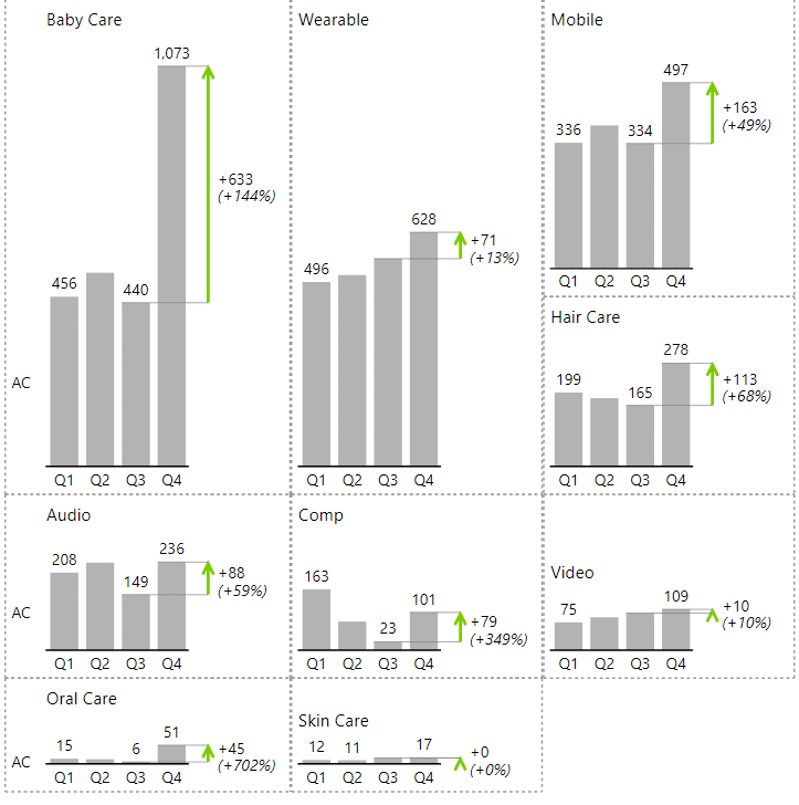


Zebra BI Charts gets to a stacked area chart from the other direction. The route is worth knowing, because it explains the settings.
Put a dimension in the Group placeholder and the visual makes small multiples, 1 panel per group on a shared scale. The on-canvas icon labeled Show stacked chart collapses them into one stack. Then the chart slider switches the stack from columns to areas. The instruction card in the shipped chart selector file is blunt about it. Use the slider to "switch to stacked area chart". Stacking and small multiples are 2 views of the same thing. So the switch between them is 1 click, and a report viewer can make it after publication.
| Setting | What it does |
|---|---|
| Sort | Puts the bands in Descending, Ascending or Original order |
| Area opacity (%) | Sets band fill from 0 to 100. It appears only on an area chart, and ships at 67 |
| Labels as % of total | Prints each band's share of the column instead of its value |
| Top N | Keeps the leading bands by count or by percentage and sums the rest |
| Number of items | How many bands survive before the tail collapses |
| Others label | Renames the collapsed band, which ships as "Others" |
| Colors | From Style, or Power BI neutral |
Labels as % of total is the setting worth a second look, because it does something a 100% stacked chart can't. It changes the labels and nothing else. The bands keep their true heights, so you read the mix off the numbers and the total off the top edge at once. A 100% stacked chart throws the total away to get the mix. This keeps both, which is the trade this whole page is about.
There's no 100% stacked mode in the visual. If share is the only thing you need and the heights are in the way, that chart has to come from somewhere else.
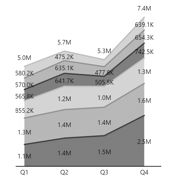
3 LAYOUTS, 1 DATASET
Turn Top N on. The tail stops being a row of unreadable slivers and becomes 1 band with a name you choose.
Every layout in the grid above is a real Zebra BI render of 1 dataset, not a mockup. Put your own series through the same visual.
Stacked area chart in Power BI
Power BI draws this natively and files it under line charts. Microsoft's line chart article names 4 variants. They are line chart, area chart, stacked area chart and 100% stacked area chart. Both stacked forms are in the standard visual gallery, with no add-in involved. One caveat from the same article is worth knowing first. Anomaly detection and forecasting need a single series on a continuous X axis. So the analytics pane thins out on the stacked variants.
Zebra BI Charts is a licensed set of custom visuals you add to Power BI. Its stacked area chart is a mode of small multiples, not a separate visual. What it adds over the native one is the tail and the labels. Top N collapses everything past the leading bands into a named Others band. The knowledge base on advanced stacked charts describes an adaptive legend too. It keeps series names beside their bands instead of in a legend box. The same article names the limitation this page cares about. Labels can be normalized, and the chart itself cannot.
Stacked area charts for Office
Zebra BI for Office is 1 suite covering Excel and PowerPoint. Zebra BI Charts for Office is the add-in inside it that draws the charts. Excel and PowerPoint both build stacked area charts on their own. Each section below starts there.
Stacked area chart in Excel
Excel has drawn these for decades. Insert, then Area, then the stacked or 100% stacked variant. Microsoft's caution about this family lands on the plain version, not the stacked one. Set the band order yourself rather than accepting whatever order the sheet produced.
Zebra BI Charts for Office builds its charts from a pivot table. Put the grouping column into Columns, the time column into Rows and your measures into Values. The add-in then renders 1 chart per group, with the vertical axis synchronized across all of them. That's the part people get wrong by hand. Change a setting on 1 chart and it applies to all of them. One gap is worth naming. The Excel article covers small multiples and Top N + Others. It never mentions the stacked view, so check the chart chooser in your own build.
Stacked area chart in PowerPoint
PowerPoint draws charts from the same Office engine as Excel. Both stacked area types sit under Insert, then Chart. The slide then holds its own copy of the numbers, and that copy is the problem. It doesn't move when the model does, so somebody rebuilds the deck by hand every close.
Zebra BI Charts for Office runs in PowerPoint too, and here the stacked chart is documented by name. The PowerPoint overview lists stacked charts and small multiples. They are the last category in the chart chooser. The stacked chart appears first, and 1 click switches it to the small multiples view. Link the slide to an Excel file on OneDrive or SharePoint and the chart refreshes from the model. The numbers stop being a copy.
Stacked area chart design best practices
IBCS, the open standard for business reporting, is unusually direct here. It has no rules for this chart, and it says so. Its rule on other horizontal charts lists area charts and leaves it there. The notation concept "can be easily derived from the notation concept of column and line charts". That sentence is the instruction. The area chart rules are the column and line chart rules.
The standard also recommends the format. That surprises people who expect it to be against stacking. From the rule on line charts:
"Line charts cannot be 'stacked' in order to show structure like in stacked column charts. In the place of line charts for 'stacked data', area charts offer a good solution (there is no layout concept for area charts in this version of IBCS yet)."
So when you have stacked data over time, this is the chart the standard points you at. What it wants in return is the discipline from the column rules. 4 things carry over, in the order you'd apply them.
- Keep every value on the same side of zero. A stack with mixed signs has no meaningful top edge.
- Stay at 5 series or fewer unless the sizes barely move, which is the number the stacked column rule gives.
- Put the series of central importance on the axis, and keep that order across the report.
- Start the value axis at zero. CH 1.1 allows a cut axis only for indexed data. Its objection is precise. The message then "does not correspond to the numerical values upon which the chart is based".
One more, and it's the exit rather than a rule. EX 2.4 says a chart with more than 3 or 4 intersecting lines is usually worse than several smaller charts with 1 line each. Stacking is one way to stop lines crossing. Small multiples is the other, and it's the better one whenever the reader needs to read each series properly.


Join over 1.5 million Zebra BI users
Does the next monthly pack need the total and the mix in one picture? Zebra BI Charts draws the stack in Power BI. Band sort, area opacity and the percent labels are settings on the same visual.

Show the total and the mix in one chart
Use a stacked area chart when the total is the message and the split is background. Keep it to 3 to 5 bands that hold steady, put the series that matters most on the floor, and keep that order across every chart in the report. If your readers need to compare the series against each other, or any value is negative, switch to plain lines, small multiples or stacked columns instead.
With Zebra BI Charts, you don't have to pick one view for good. The stacked area chart and small multiples are two views of the same visual, so you can start with the total and switch to one panel per series with a single click when a band needs a closer look. You can try with our own data through Zebra BI's 14-day free trial.
Frequently asked questions
The questions people ask most often about stacked area charts.
What is a stacked area chart used for?
It shows how a total changes over time. It also shows roughly how that total splits between series. The top edge gives the combined figure and the bands give the mix. It suits a small number of series where the total is the main point and the split is context.
What is the difference between an area chart and a stacked area chart?
A plain area chart draws each series from zero. The series overlap, but each one is readable against a common baseline. A stacked area chart places each series on top of the previous one. The top edge then becomes the total, and only the bottom band still starts at zero. Microsoft's advice on the plain version is to use a line chart instead. One series can hide behind another.
When should you avoid a stacked area chart?
Avoid it when the reader needs to compare individual series, or when the series cross a lot. Past 5 bands the middle ones become unreadable, and plain lines or small multiples serve better. Any negative value rules it out too, because the top edge stops being the total.
What is a 100% stacked area chart?
A version where every point is scaled so the bands always fill the full height. It shows mix rather than absolute values. Microsoft calls it the trend of the percentage each value contributes over time. Use it when the total is irrelevant or distracting, such as market share. Be aware that a band can shrink while its underlying number grows.
How many series should a stacked area chart have?
Between 3 and 5 in most reports. IBCS puts the ceiling at 5 for stacked columns, and adds that more than that works only when the values barely vary. The same reasoning applies to areas, because the failure is the same. Past 5 the middle bands get too thin to carry a label, which is where the chart stops paying for itself.
Does Zebra BI have a stacked area chart?
Yes. Put a dimension in the Group placeholder to get small multiples. Then click the Show stacked chart icon to collapse them into a stack. The chart slider switches the stack to areas. Band sort order, area opacity, Top N with a named Others band and a Labels as % of total toggle are all settings on the same visual. There's no 100% stacked mode, so a chart that has to show share alone comes from somewhere else.
Before you stack anything, name the 1 band a reader will actually try to measure and put it on the floor. If there are 3 of those, you wanted small multiples. The Chart Selector file is free if you want to try both on your own numbers.
Related links
- Column chart, for the same part-to-whole trade drawn in discrete periods
- How to choose the right business chart, for the unstacked area chart and the rest of the family
- Small multiples in Power BI, for more series than a stack can carry
- Stacked bar chart in Excel, for the bar version of this chart
- Zebra BI Charts, for the chart types the visual renders
- Chart Selector, the free Power BI file that picks a chart
