Custom Power BI Visuals Can Turn Your Reports Around
PRO Trial
Power BI is one of the most exciting things to come out of Microsoft in recent years. It provides practically anyone with a powerful tool to explore data and find insight. It doesn't matter whether you are a regular finance user, a developer or a marketer - if you work with data, you can probably find a use for Power BI.
Custom Power BI visuals are a service, not a single product
It's best to think of Power BI as a service with several parts. It consists of a Windows desktop application (Power BI Desktop), an online service (Power BI service) and Power BI mobile apps for Windows, iOS, and Android devices.
There are also various data connectors that allow you to connect to different data sources (Excel, SQL, MailChimp, Google Analytics and many others). The final part of the puzzle is a marketplace, hosting an ecosystem of custom visuals and specialized solutions for your needs.
Connect to multiple data sources
While Power BI was initially based on Excel add-ins, it has grown into a tool that can handle numerous additional data sources. Microsoft is very good at supporting external sources, such as GitHub, Twilio, MailChimp, Google Analytics and so on. This ensures that you can analyze your data hidden in other apps and services.
Online component facilitates data sharing
The solution is also available online as a service. While the desktop version is more powerful with some additional bells and whistles, the online component is great for sharing. You can easily publish your dashboards or reports online and have others explore data and look for insights.
This is a feature we regularly use ourselves to share our visuals with the world. It's a great feature you should definitely try out.
Going for a custom look
Microsoft has always been good at making its solutions available to developers to expand them and Power BI is no exception. This ability makes the tool much more flexible as you can either use custom visuals developed by others or even roll your own.
Some visualizations can be found on the Marketplace while others, like Zebra BI for Power BI, can be downloaded separately.
Adding custom visuals in Power BI
It's easy to add new custom visuals in Power BI on the desktop. Simply click on the three dots in the Visualizations pane and then select the option you need.
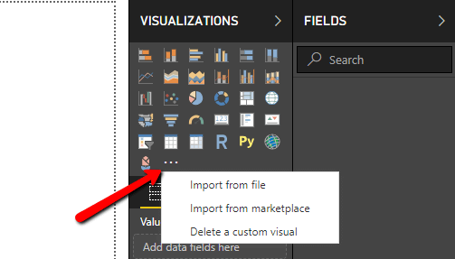
You can choose Import from marketplace option to open the marketplace and look for a suitable solution. There are hundreds. If you need inspiration, here's a list of the visuals we like the most.
However, if you decide to use Zebra BI, you need to first download the visual from our site and then click Import from file.
We've created a more detailed walkthrough for installing Zebra BI custom visuals for Power BI. Check here >
Powerful small multiples
Put simply, small multiples are one of the best ways to compare different parts of a dataset. Let's say you want to compare sales of different product categories over the past year. You should use small multiples. When using Zebra BI visuals you simply add another dimension to your existing chart. This will generate a series of charts using the same scale and axes so you can easily compare them.
Take a look at the clean and easy-to-understand design of small multiples in Zebra BI visuals. A single glance tells you that stationery is by far the largest product category. Another look also makes it clear that Pet care products are seriously underperforming.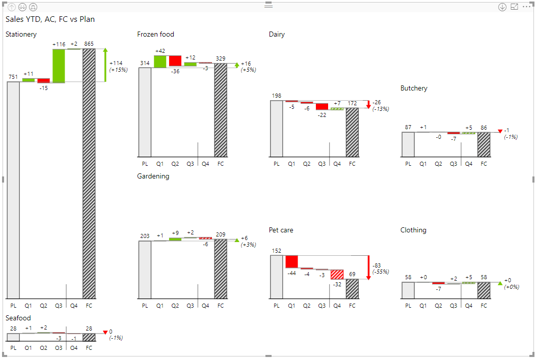
Small multiples in Zebra BI provide an intuitive display of multiple scaled charts for easy comparison.
It would be very difficult to replicate the same functionality in vanilla Power BI, while this is one of the core features of Zebra BI custom visuals. What's more, you can display a more detailed breakdown by individual months with a single click ...

... or drill down into individual quarters.

Why should you use small multiples?
Easy. Small multiples essentially put all your charts displaying different categories on a single page and scale them, which means that the Y-axis is synchronized. This allows anyone looking at your dashboard to immediately see which categories are the most important and the trends on them.
Doing small multiples well is hard but Zebra BI makes it easier. It automatically generates your small multiples and scales them for optimal viewing. This is what you need to really make your reports tell a story.
Automated variance calculations
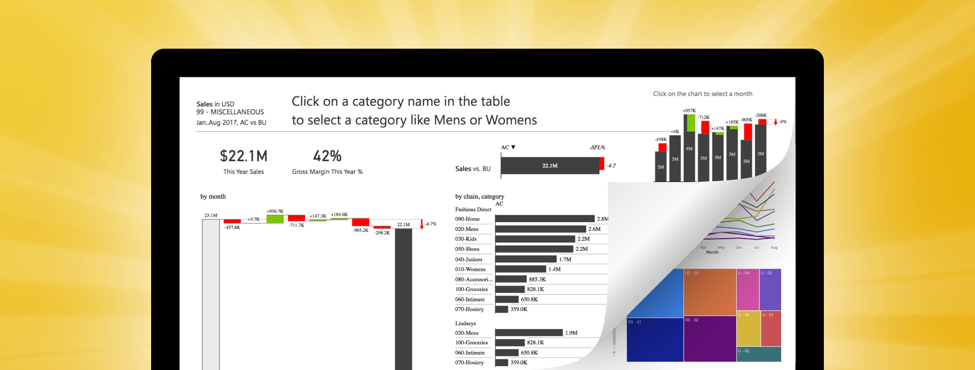
You only need two columns for your basic variance chart, for example: Actual vs. Budget, Actual vs. Forecast or Actual vs. Previous Year. Insert a new Zebra BI PowerCharts custom visual and simply drag the two measures into the corresponding fields in your visualization properties. Look at the variance chart you can create in just three clicks:
All the variances are calculated automatically and you can click on variance values to switch between relative or absolute variance or both at the same time.
The same data set in default Power BI just doesn't look as good or informative.
Why should you use variance calculations?
One of the most important features in any business dashboard is the ability to present variances in a clear and easy-to-understand way that makes an impact. Put simply, variance reports show the difference between the planned or past financial outcomes and the actual financial outcomes. Ant put even more simply - no organization can expect to make informed decisions without insight into actual growth or decline in its KPIs.
Advanced chart types
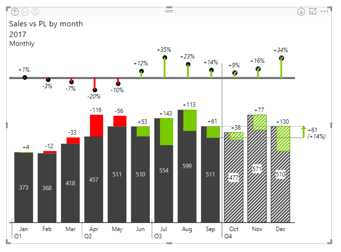
Once you have your variance chart, there is a lot you can do with it. Start by switching between different chart types by clicking on the < and > arrows to the left and right sides of the visual. You can switch between waterfall charts, integrated variance charts, area charts, and line charts.
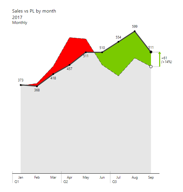
Integrated variance charts are a powerful way to display actual values as well as absolute and relative deviations. Since both values (actual and deviation) are shown, you can see both the importance of a deviation (its magnitude) as well as its relative share of the actual value at the same time.

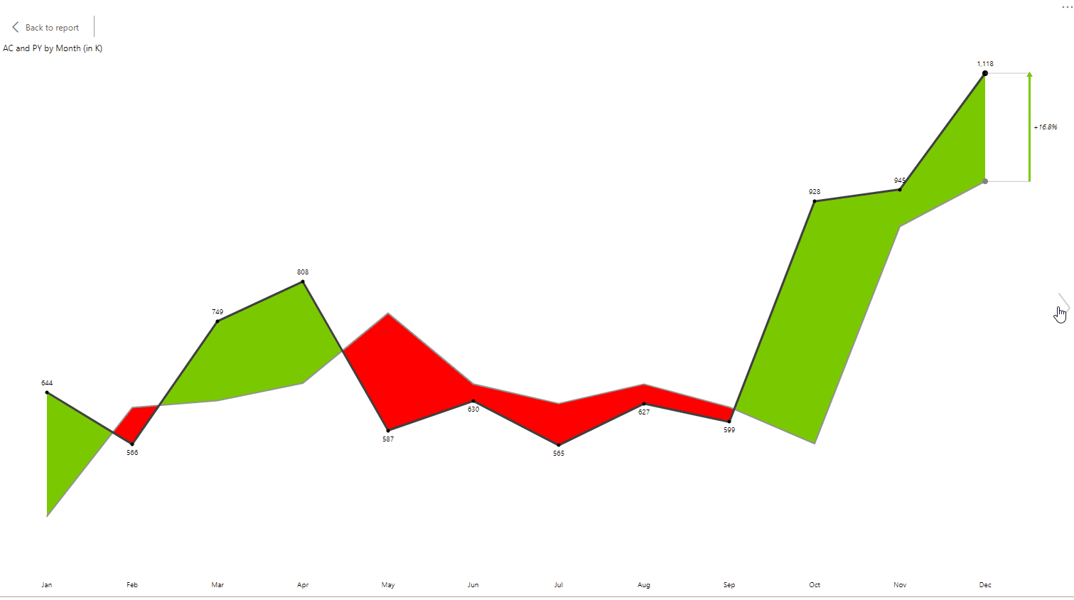
When you work with a larger number of data points, use an area chart that also shows actual values as well as deviations in the form of an area between the two values.
When you want to focus on absolute and relative variance, you can use bar and lollipop charts. If you are not working with a time series, use vertical variance charts to display variance by products, countries, profit centers or other "structure" dimensions. Here is a sample of a variance chart detailing product category sales on a given month in a single store.
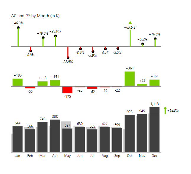
With just a glance, you can view absolute values and their change on bar charts, while the lollipop charts represent relative growth or decrease in percentages.
Why does selecting the right chart type matter?
Your data needs to tell a story. And to tell a story you need to select the right tools. For example, a waterfall chart is a better tool for a small number of categories. Are you working with a large number of data points? Go for the area chart. By using the correct chart type you will be able to convince, inform and direct your audience.
We prepared a handy infographic to help you select the right chart type.
Custom Visuals will overhaul your Power BI experience
As you analyze and view your data, you need to look at it through a standardized lens that delivers comprehensive and quick insights. This is why Zebra BI is fully IBCS compliant. This means that data is visualized in accordance with best practices to ensure data is delivered clearly, concisely and consistently. And since you're working with Power BI, it means it is available across the cloud, mobile, and desktop versions.
Zebra BI custom visuals for Power BI bring meaningful one-click visuals to users where they need them the most and allow you to communicate and collaborate effectively between organizational units across your entire organization. These custom visuals deliver actionable information that will streamline your decision-making process and support better choices.