Difference highlight: the fastest way to improve your reports and dashboards
PRO Trial
The goal of visualizing data with charts instead of plain tables is to bring clarity to the readers and decrease the time it takes them to get the key piece of information from the data.
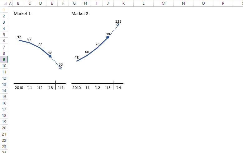
This is usually achieved by removing all unnecessary items from your visualizations and emphasizing the important values. One of the best tools for this is a difference highlight. Here's how it looks like:
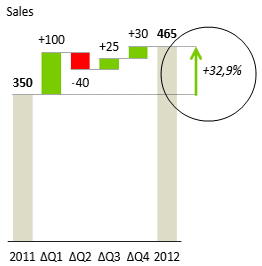
Imagine having to create a difference highlight like the one on the picture by hand in Excel.
Sure, it can be done, but it would take you a couple of minutes to insert the lines and arrows, get them properly aligned and insert the label with the value of the difference.
Now, what if the charts change because the source data changes? You're stuck with having to manually repair all elements of the difference highlight. Not good.
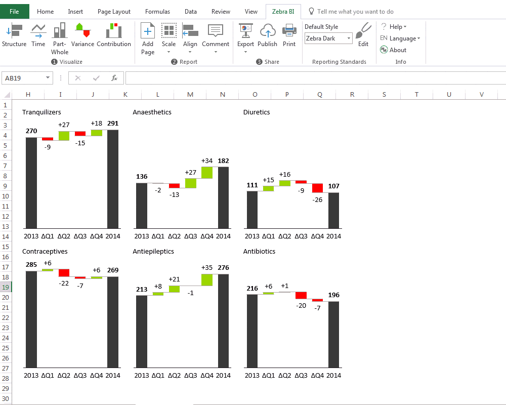
Since we know that small multiples are one of the best methods of data visualization, would you create difference highlights by hand for 12 charts in your report? And then repair them when the data changes? Forget about it!
Difference highlight in one click? You bet!
Luckily, with Zebra BI, all the above problems become a thing of the past. All it takes to insert difference highlights with Zebra BI is one click. Here is inserting a difference highlight to 6 charts at once:
Real-world examples with difference highlights
Alright, let's see the difference highlights in action! In this section, we'll present a few practical ideas on how you can use the new difference highlighting feature of Zebra BI in business reporting.
There are plenty of situations where displaying the differences will significantly improve the understanding of the data. Displaying year-over-year growth, presentations of plans for the next business year or displaying cumulative growth in waterfall charts are among the most obvious ones.
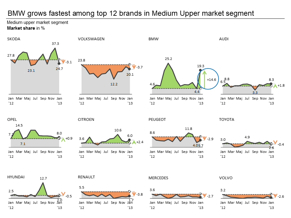
Trend analysis: year-over-year (YoY) growth
In the following example, we're visualizing the development of market shares on an auto market. Market shares (in %) of top 12 car brands are displayed (of course the numbers are fictional). We're using a time series of 13 data points (from January 2012 to January 2013). The reason for choosing 13 categories instead of "traditional" 12 rolling months is that in this way we're able to compare year over year (YoY) values - January this year to January last year.
One-click to add the highlights to all 12 charts at once and another click to select the Jan '12 as the comparison value and here's the rather awesome result:
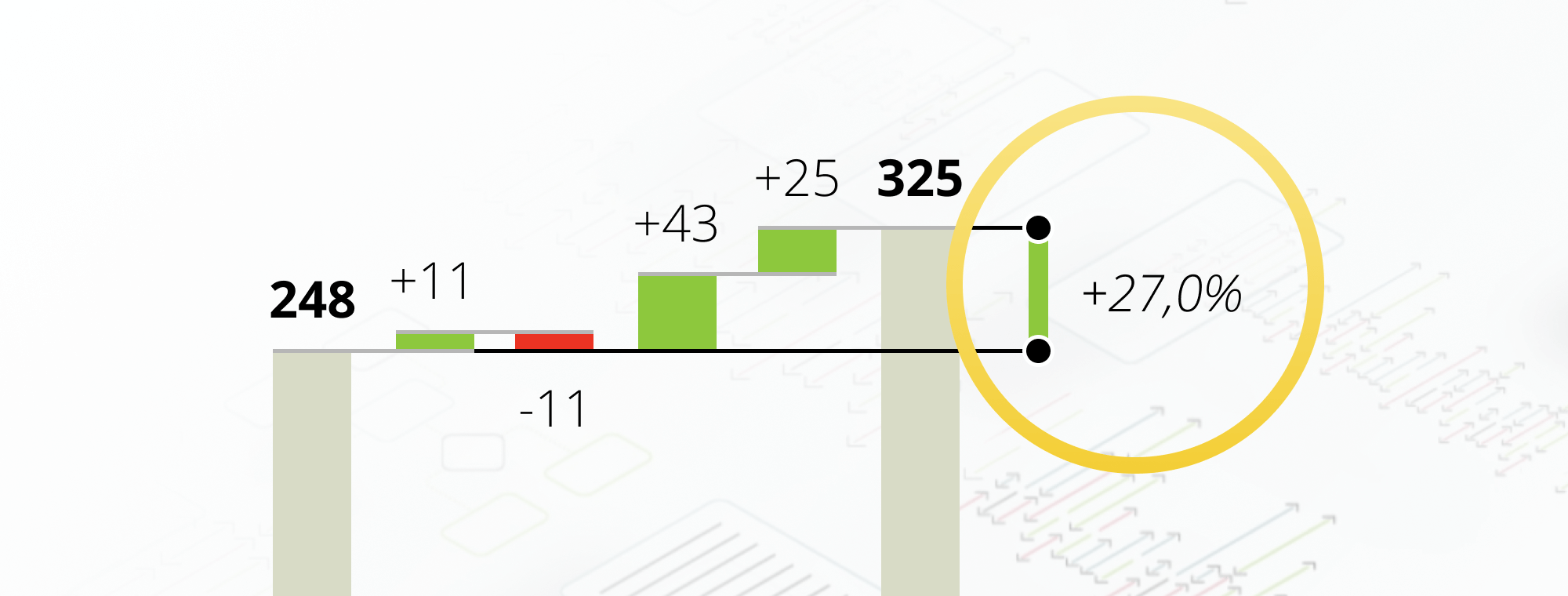
Displaying cumulative growth in waterfall charts
The next one is simply a classic. Presenting cumulative growth as a difference highlight makes perfect sense in a waterfall chart:
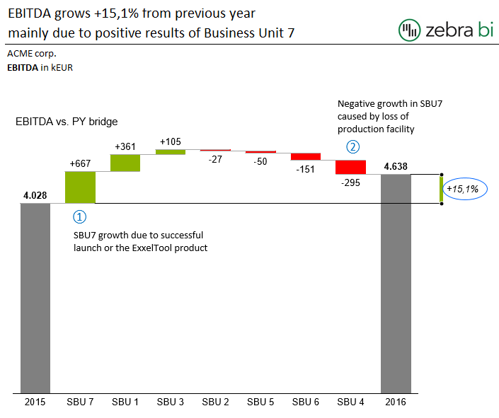
By the way, in the above example, we have used the IBCS (International Business Communication Standards) style of the difference marker (this one is not really an arrow...).
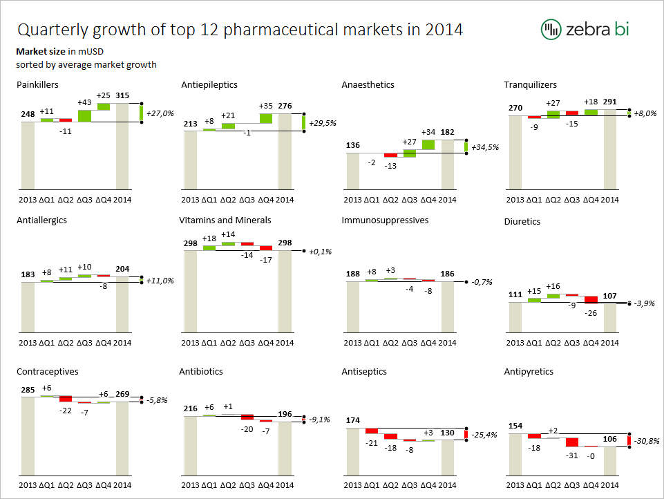
OK, one chart is nice, but more charts can tell a much more elaborate story. Whenever you need to explain a business situation in more detail, you need to increase the information density. Specifically, in this case, you need to increase the number of charts. Like in the following analysis of top 12 pharmaceutical markets:
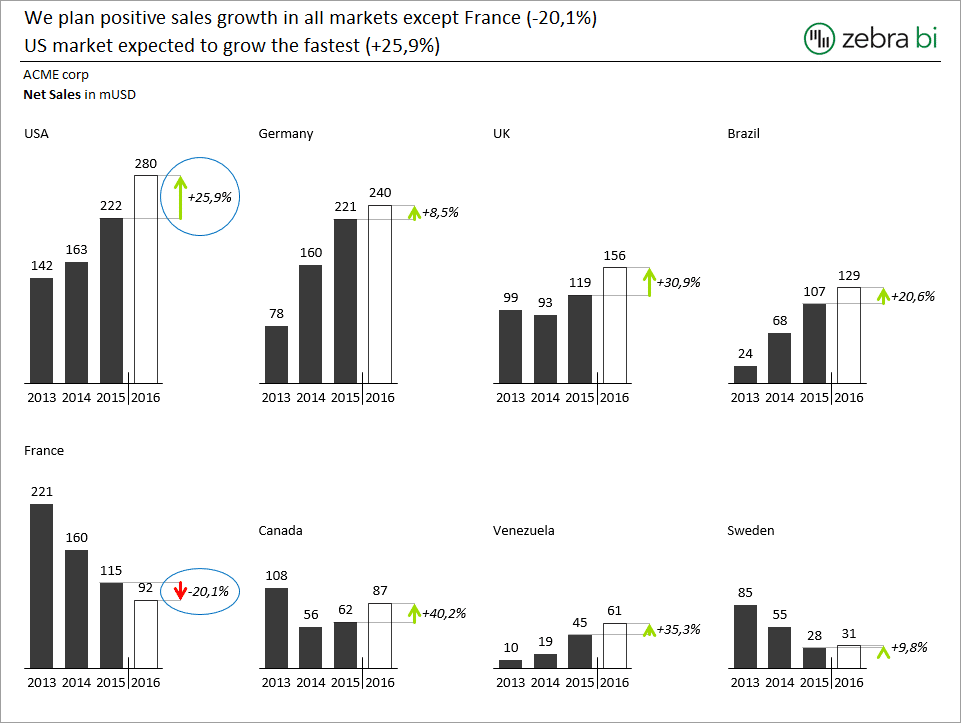
Presenting the plan for the next business year
How about this presentation of the business plan for the next year? Eight markets on a single slide:
You think the above examples are difficult to create in Excel? Not really, all it takes is the latest version of Zebra BI Add-in and a few clicks:
PS. How do you like our examples? Which visual style of the difference highlight do you prefer: the arrow or the "IBCS" style without the arrow? Let us know in the comments!
zebrabi When to support Chinese?
Hi MK,
If you mean Chinese regional settings (number formats, currency, etc.), they are already supported.
As for the Chinese translation of Zebra BI interface, we have it planned for the future. First we have to find someone who would translate it. 🙂
Hi MK,
Since the version 2.0, Zebra BI is available in Chinese! It's 100% translated, not just the user interface, but also the Getting Started tutorials, etc. Try it out and let us know how you like it!