Try Zebra BI for FREE - includes Income Statement P&L template
Stop spending hours on P&L formatting. Get instant access to a ready-made Income Statement template and build professional, decision-ready financial reports in minutes.
Profit and loss statements, also known as income statements, play a crucial role in assessing a company's financial health. They provide a detailed summary of a company's revenue, expenses, and net profit or loss over a specific period of time. Creating and analyzing profit and loss statements can be a complex task, but with the help of Power BI, a powerful business intelligence tool developed by Microsoft, this process can become more efficient and effective.
Want your P&L statement done in 30 seconds instead of 6 hours?
Zebra BI builds professional income statements in Power BI automatically - no complex DAX, no manual formatting. Start free and get the P&L template included.
Now that we have an understanding of the importance of profit and loss statements and the benefits of using Power BI let's dive into the step-by-step process of creating a profit and loss statement. The first step is to gather the necessary financial data from various sources, such as accounting software, spreadsheets, and databases. Once the data is collected, it must be imported into Power BI and cleaned to ensure accuracy and consistency. Power BI provides various data transformation tools to perform tasks like filtering, sorting, and aggregating data.
After the data is cleaned, the next step is to design an effective visualization representing the profit and loss statement. Power BI offers a wide range of visualization options, including charts, tables, and slicers, allowing users to choose the most suitable format to present their data. Selecting visuals that convey the desired information clearly and concisely is important. Users can customize the visuals by applying formatting options, adding labels, and defining colors to enhance the visual appeal and readability of the profit and loss statement.
The first step is to gather the necessary financial data from various sources, such as accounting software, spreadsheets, and databases.
Once the data is collected, it must be imported into Power BI and cleaned to ensure accuracy and consistency. Power BI provides various data transformation tools to perform tasks like filtering, sorting, and aggregating data.
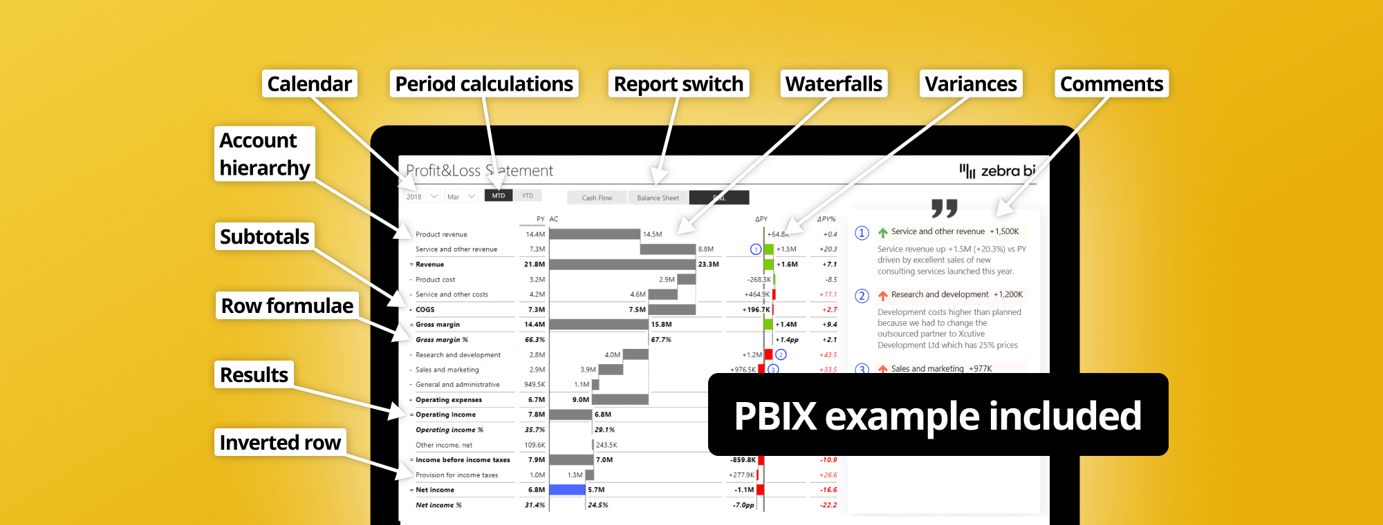
Before we begin designing, a quick note: we will not cover the switch between the year-to-date and monthly views or commenting. We have covered this in our past webinars - Top 5 DAX tricks for super effective Power BI dashboards and Dynamic Commentary in Power BI.
Let's add a Zebra BI Table. We're using the latest version that offers some exciting features.
Start by adding the actuals (Value AC) and the comparison to the previous year (Value PY) from the Financials table. Then add the Account field to the Category placeholder to get a simple income statement.
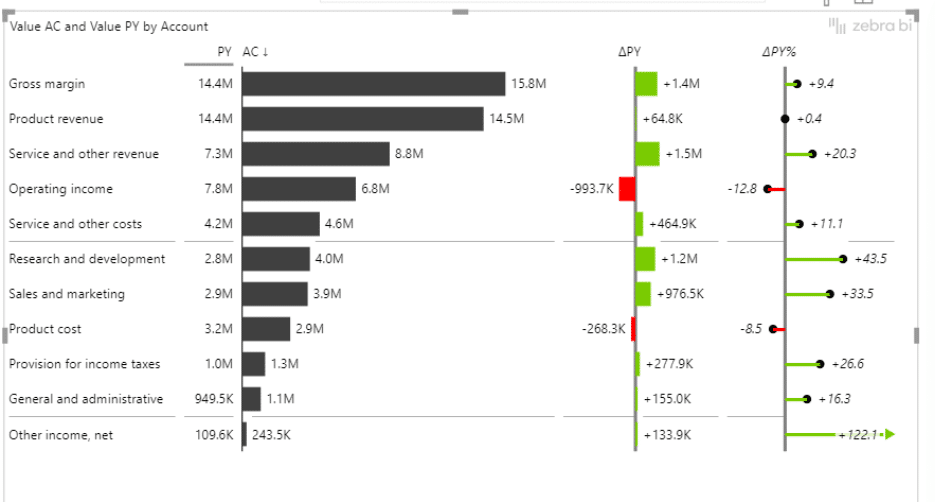
A simple income statement in Power BI
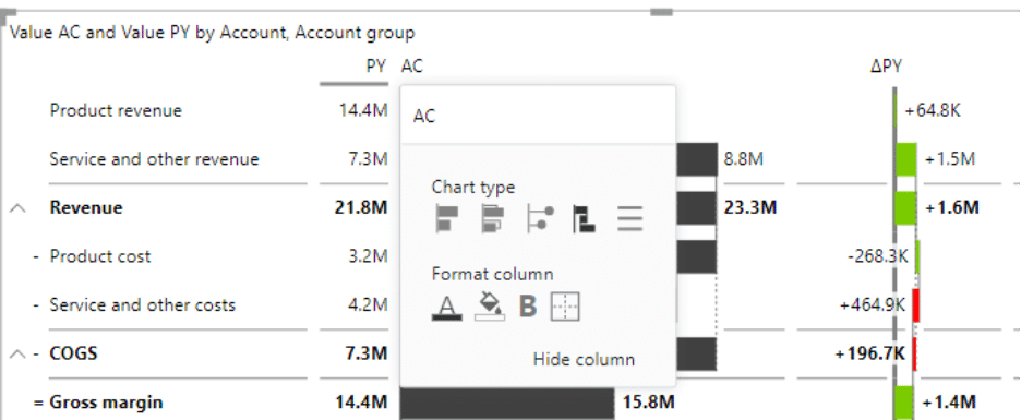
The next step is to add the Account Groups field and drop it on top of the Accounts field, within the Category placeholder in the Visualizations pane.
Switch the previous year (PY) and actual revenues (AC) columns to the waterfall chart view.
Switching the chart to the waterfall chart view
Then switch sorting to Sort by Account Group and Sort ascending.
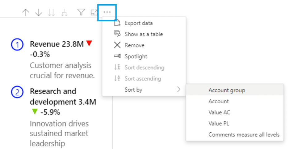
This is something you need to get right in your data. To get the sort order of your accounts right, you have to make sure that the IDs of your accounts are sorted in the right order in your table of accounts.
You need to give the correct IDs to all your accounts - for example, your product revenue will be your number one, your service and other revenue will be number two, and so on.
The same goes for your account group IDs. Your revenue here is the first account group. Your cost of goods sold is the second account group, and so on.
Once this is done, get the sort order for your data field to the new sorting column.
To set the sort order, select your data field in Power BI, then click on Column tools > Sort by column and select the appropriate sorting data field from the menu
If you didn't do this, your accounts would have been sorted alphabetically by default, and you don't want that.
If you'd like to learn more about sorting, you can read the article in the Knowledge Base about options for Sorting rows in the Zebra BI Tables visual or how to sort a hierarchy by custom sort logic.
Once we have that in place, we must ensure that the rows with expenses, costs, and so on are inverted.
If you're using regular native Power BI visuals, dealing with this would be quite complicated. You must return to your data and ensure your costs are negative numbers. Many people do that, but we believe keeping positive numbers across the board is better (especially since this is compliant with the IBCS standards).
It is worth mentioning that doing income statements with just native Power BI visuals can be quite time-consuming, as it can take up to six-to-eight hours to get one report done.
Of course, the time needed to complete one report can vary a lot, depending on the complexity of your report, the state of your dataset, and how much DAX coding you need. The timings we included here are approximations.
Plus, you need to be at least an intermediate to advanced Power BI and DAX user.
We wanted to make it all much easier for you, with a fast, structured, visual-based process that's done in minutes (not hours or days).
In May 2025, we set out to change this cumbersome process and make it easier, even for those who may not be advanced Power BI users or DAX formulas coding. Our one-click P&L statement update adds embedded row calculations to your P&L statements automatically, instantly, and with minimum hassle.
Spending hours on data prep and formatting?
Zebra BI handles subtotals, variances, and row calculations automatically - get the free P&L template and see for yourself.
Basically, we cut the hard work you had to do on your data model and make it a one-click process. Once your data model is ready, you can have your P&L done in less than 30 seconds.
Here's how the new, updated process for creating Profit and Loss statements in Power BI could look like if you used Zebra BI:
The first step remains unchanged and is critical for building a strong foundation for your reports. Begin by constructing your General Ledger and account hierarchy as you normally would, ensuring it aligns with your organizational needs.
Next, create the necessary relationships between your fact tables and dimensions to enable seamless data analysis. This phase is essential because Zebra BI operates on top of a robust data model, ensuring accuracy and consistency throughout your reporting process. Do make sure you add a separate column in your data model and assign the right symbol for the calculation (to make sure your tables and reports will calculate everything correctly). Here's a more detailed guide on how to do this.
With your data model ready, it's time to leverage the intuitive drag-and-drop functionality of Zebra BI. Start by adding the Zebra BI Tables visual to your report page. Then, incorporate your account hierarchy and basic DAX measures like Actual, Budget, and PY into the visual.
Once you apply custom sort in your Zebra BI table and sort by column (by Account ID), Zebra BI will instantly bring your data to life, rendering rows in the correct order without the need for manual sorting.
Zebra BI also calculates subtotals and totals based on your data model, adds automatic variance columns (both absolute and percentage), and ensures the correct signs for income and expenses, automatically. This saves you a lot of time (as until not very long ago, you had too manually set your invert/ skip/ results for each item).
Additionally, the Zebra BI visual comes with IBCS-compliant elements like bar charts, small multiples, and variance highlights for enhanced visual clarity. For example, here are some specific use cases where IBCS visuals will prove very useful in painting the right picture in your P&L statements:
Zebra BI eliminates the need for manual subtotal logic, extensive DAX formulas, placeholder rows, or complicated SVG bar/arrow tricks. You won’t have to create custom sorting measures or wrestle with formatting gymnastics. Instead, you’ll achieve a clean, polished report that's ready to share.
Just turn on the preview features in the visual settings and enjoy a coffee while the calculations take care of themselves--and not just for Profit and Loss statements, but anywhere you need calculate and summarize data effectively, like:
All in minutes, rather than hours, excluding the data modelling, and with far less Power BI and DAX skillset required. And all, even if you are new to Zebra BI.
Ready to build your P&L in 30 seconds?
Start your free Zebra BI trial and get the ready-made Income Statement Power BI template - just connect your data and you're done.
Don’t miss the new features we added for income statements—watch the May 2025 Product Update video to learn more.
Next, we are adding a formula for the gross margin percentage.
We'll add the Gross margin percentage by using a formula. Right-click on the account name and click Add Formula. Please keep in mind that it is very important to place your cursor correctly when you do this (for example, if you position the cursor on the gross margin and right-click the formula, it will add a new row below it).
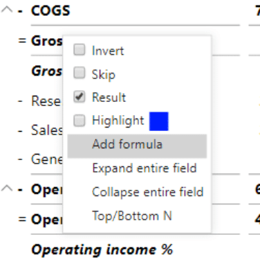
Adding a formula to your report
The formula for this is:
Gross margin % = [Gross margin] / [Revenue]
It's all very intuitive. Start typing Gross margin, and Zebra BI will suggest the right account here. Confirm the suggestion by clicking or pressing Tab.
If you are working with a percentage number, click the percent button to format this formula as a percent.
You also have some formatting options, such as decimal places, bold, and italics. Once you're done, click Add. This adds an entire row and calculates values for all columns.

Interface for adding and editing formulas
You can do the same for other calculations, such as operating income as a percentage of revenue. Add another formula:
Operating income % = [Operating income] / [Revenue]
Now let's look at the slicer.
A slicer in Power BI is a visual filter that lets users interactively select and refine the data displayed in other visuals, making dashboards more dynamic and focused.
When working with financial reports in Power BI, it’s common to present different types of statements: an Income Statement, a Balance Sheet, and a Cash Flow Statement. Instead of building three separate visuals or pages, you can create a Report Type slicer that allows users to switch seamlessly between these views within a single Zebra BI Table.
1. Organize your data
The foundation is to have all accounts and data in one table. This means that your financial fact table should include transactions or balances from all three types of reports. To make this work, you also need a Chart of Accounts (CoA) or account hierarchy table.
In this account hierarchy, each account is tagged with a Report Type — Income Statement, Balance Sheet, or Cash Flow. This classification is critical because it tells Power BI (and Zebra BI) which statement each account belongs to.
2. Create the slicer
With the Report Type defined in your Chart of Accounts, you can add a slicer visual in Power BI. The slicer will display the three options: Income Statement, Balance Sheet, and Cash Flow.
When a user selects one of these, Power BI will filter the accounts and only pass those belonging to the chosen report type into your Zebra BI Table.
One visual, multiple perspectives: Instead of maintaining separate visuals or pages for each financial statement, one Zebra BI Table adapts based on user choice. This provides you with:
The Report Type slicer acts as a “switch” between financial statements. Behind the scenes, it simply filters accounts, but in the Zebra BI Table it feels like you’re navigating between three different reports — all in one place.
While we previously explained how to build a comments table, I would like to share how to add comments in your visuals.
To incorporate dynamic comments, you have to first add a data field called Comment to your visual by placing it into the Comments placeholder. Now, you will be able to see a comment marker for the presence of comments on specific data points. Users of your income statement can hover with their mouse over the comment marker, and they will see the text with the comment in the tooltip.
You can even design the tooltips. Do this in the standard tooltip settings of Power BI, where you can choose the color, text size, transparency, and other properties.
Keep in mind that, to make the comments visible, navigate under the Settings to the Comment Box and simply turn it on. What you have now is a new element on the visual that displays the comments.

Additionally, Zebra BI enables you to even add comments directly on the visual with a simple click (in case you want to make an annotation and ensure you share the whole story in your statement or report).
To learn more about creating dynamic comments in Power BI, look at our ultimate guide (+ PBIX example) here: Dynamic Commentary in Power BI.
You have now laid the groundwork for different reports. For example, you might not want to switch between months using the dropdown menu and would like to have them in one table.
To do that, take your Month field from your Calendar group and put it in the Group placeholder. Then remove the dropdown month selector. This creates a wide table that needs to be worked on a bit. You can condense it and focus on actual and variances, hide some columns, and reduce the font size.
There is one more thing you can do on a table like this. You can add quarters where the months making up individual quarters can be collapsed or expanded.
Quarters grouping results in the income statement
It's easy to do. Just add your Quarters field on the top of the Month field in your Group placeholder.
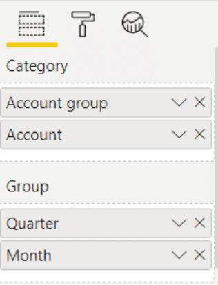
Quarters added to the Group placeholder in the Visualizations pane
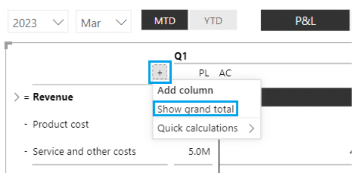
You could also add a grand total which is essentially your year-to-date value. Hover over the Q1 label on your chart so a small plus sign is displayed. Click on it and select the Show grand total item. This will add the grand total as the last column in the table.
Using Period calculation
You can build on this view and create a month versus year-to-date view. Remove the Month and Quarter fields from your Group. Then, instead of using the MTD and YTD slicer, you can take your period calculation and put it in the group placeholder.

Visualization showing month-to-date and year-to-date tables on the same page
This gives you a tremendous single-page overview of your month-to-date and year-to-date data. You can select individual months on the horizontal month slicer to switch between them.
Instead of the period calculation, you can now bring in your business units to do a breakdown by business unit. Replace the Period calculation field in your Group placeholder with the Business unit field to get the income statement for all the business units.
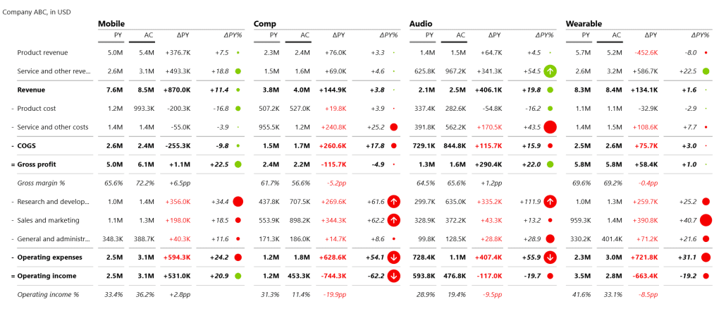
P&L statement by business groups
The powerful thing here is that you have all the data ready, and you could easily switch to a cash flow view if you had the data. And that is the beauty of merging all your accounts into one big accounts table. You can do all your financial reporting directly using just one data model.
One thing that is kind of chronically missing in financial reporting is trend charts. Financial reports are typically just tables, although it doesn't have to be like this. You should ensure that you also include charts showing the trends in the movement of values. Let's look at the example we'll be building.

Trend charts showing movements in values
Start by adding the Zebra BI charts visual. We'll compare actual values versus the previous year's values broken down by month. Add Value AC to your Values placeholder, Value PY field to your Previous Year placeholder, and Month field (Calendar table) to your Category placeholder.
Creating trend charts
To make sure you can switch between different KPIs, pull your Account groups field onto your workspace. This lists KPIs you can switch between gross margin, operating expenses, operating income, net income, etc.
An even better approach is to take the Account groups field and pull it onto your Group placeholder. This creates multiple charts within the same visual or small multiples. This is one of the best features of Zebra BI charts.
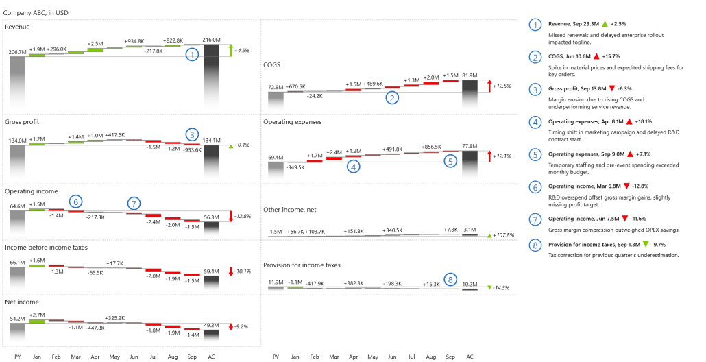
Small multiples with the most important KPIs
Because we merged all the accounts, you could also switch from this P&L statement to your cash flow report balance sheet.
Let's look at one more trick here. If you look at the chart, you see your revenue grew by 4.5%, but your gross margin stayed almost the same. Something happened here, and you can find the culprit in the cost of goods sold, which grew by 12.5%. You need to invert this element to show this is a negative development. Simply right-click on the label and select Invert.
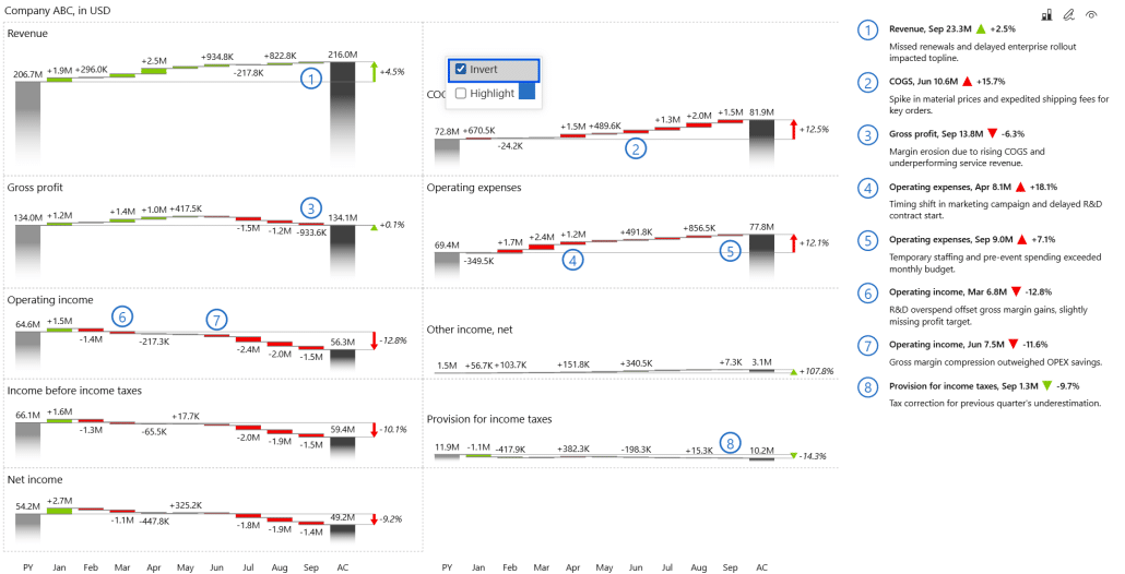
Inverting a chart to show negative trends
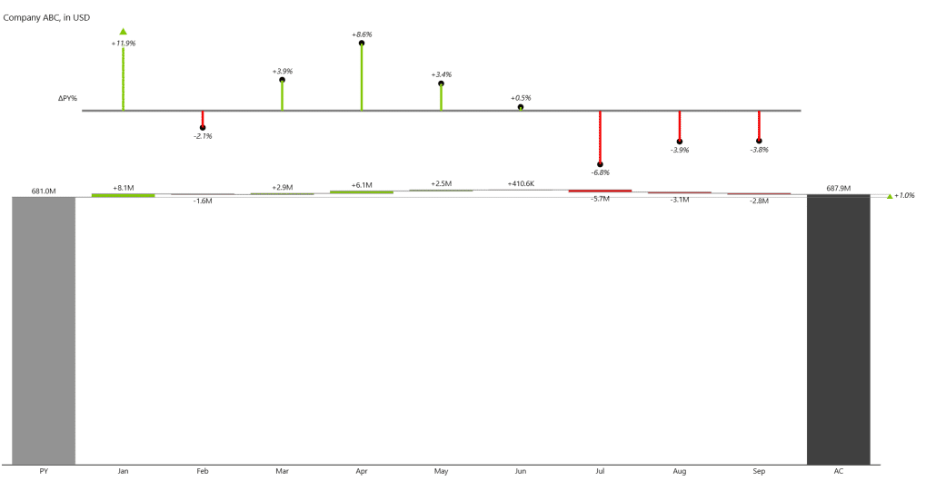
The bridge chart is interesting, especially for the cash flow or net income. Essentially, you have the opening and closing balance of your cash. You take all the changes and present them in a waterfall chart.
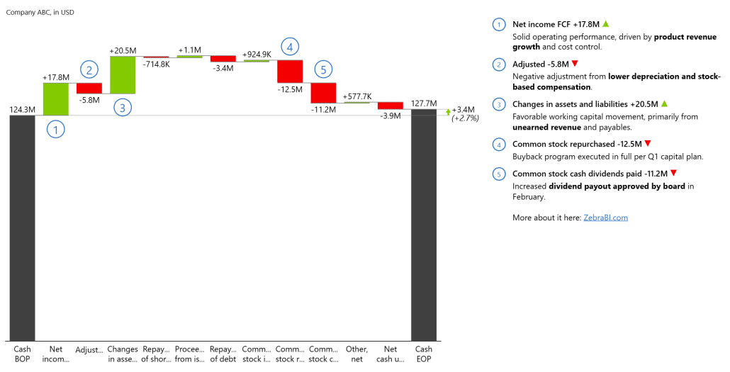
A waterfall chart showing the impact of different factors on cash flow
In this case, we could invert the chart, something made possible by the Zebra BI charts visual. In the Visualizations pane, click the Format button and expand the Chart settings. Then toggle the Show vertical charts option.

Vertical axis chart showing a breakdown of the cash balance
The bridge charts work quite nicely in financial reporting, and the financial management and the top executives love these types of charts. You can do the same thing with the net income plan or the previous year and compare it to net income actuals. If you are unsure which chart to use, our tutorial on choosing the right visual will help.
Ready to give Zebra BI a try and save yourself time, energy, and money to create better, more actionable income statements?
Tired of rebuilding financial reports from scratch every month?
Get the free Income Statement template and stop starting from zero.
We have already explained how to create P&L statements in Power BI, without any additional tools, in a previous guide (you can check our tutorial on how to build income statements here).
If, however, you want to go beyond that (and save yourself time and energy), there are a few other things you should know. Here are most important ones:
When creating a profit and loss statement in Power BI, choosing the right data sources that provide accurate and relevant information is essential. For instance, financial data can be sourced from accounting software, such as QuickBooks or Xero, which often have built-in integration options with Power BI.
Spreadsheets, such as Microsoft Excel or Google Sheets, can also serve as reliable data sources. Additionally, external databases or APIs can be used to import financial data into Power BI. It is important to ensure that the chosen data sources are reliable, up-to-date, and cover all the necessary revenue and expense categories required for the profit and loss statement.
Once the data sources are identified, the next step is to import the financial data into Power BI. Power BI provides intuitive data import features that enable users to connect to various sources and import the data with just a few clicks. Users can establish connections to data sources, specify settings such as filters or transformations, and import the data into Power BI's data model.
Once the data is imported, it must be cleaned and transformed to ensure accuracy and consistency. Power BI's data transformation tools allow users to perform operations like removing duplicates, filtering out irrelevant data, and handling missing values. Cleaning the data ensures that the profit and loss statement is based on reliable and accurate information.
The design of the profit and loss statement in Power BI is a crucial aspect that determines its usability and effectiveness. Power BI offers a wide range of visualization options that enable users to present financial data in a meaningful and engaging manner.
Users can choose from various chart types, like bar charts and line charts, to represent revenue, expenses, and other financial metrics. Additionally, tables and matrix visuals can be used to display detailed information about individual revenue and expense categories. Users can also use slicers to enable interactivity and allow users to drill down into specific metrics or time periods. By selecting the appropriate visuals and arranging them logically, users can create a profit and loss statement that is easy to understand and interpret.
Power BI provides a powerful formula language called DAX (Data Analysis Expressions) that allows users to define custom calculations and measures. These calculations enable users to perform advanced financial analysis and extract deeper insights from the profit and loss statement.
For example, users can use DAX formulas to calculate growth rates, analyze revenue trends, or calculate key performance indicators (KPIs). By utilizing DAX formulas effectively, users can gain a comprehensive understanding of the revenue dynamics and identify any underlying patterns or anomalies.
Read and learn more: Financial Analysis in Power BI: How To Do Financial Benchmarking Right [Fortune 500 Companies Real Data Examples]
Tracking and analyzing expenses is crucial for understanding a company's financial performance. Power BI enables users to create customized expense and cost categories that align with the specific needs of their organization. By categorizing expenses effectively, users can track individual expenditure items, understand cost trends, and identify areas for cost optimization.
Power BI provides flexible options for creating expense categories, ranging from simple text fields to hierarchical structures that allow detailed expense classification. By incorporating these expense categories into the profit and loss statement, users can gain valuable insights into the cost structure of their organization.
Calculated measures in Power BI are custom calculations that users can create to enhance the analysis of profit and loss statements. These measures allow users to perform calculations based on specific requirements or unique metrics. For example, users can create measures to calculate gross profit margins, net profit ratios, or return on investment (ROI). By including these calculated measures in the profit and loss statement, users can gain a more comprehensive understanding of the financial performance of their organization.
One of the powerful features of Power BI is the ability to drill down into specific financial metrics using filters and slicers. Filters allow users to select specific criteria or conditions to focus on specific aspects of the profit and loss statement. For example, users can filter data based on time periods, product lines, or geographical regions to analyze financial performance in more detail.
Slicers provide an interactive way to filter the data by presenting a visual interface that users can interact with. By utilizing filters and slicers effectively, users can gain deeper insights into their profit and loss statement by focusing on specific metrics or categories that are of interest.
Budgets and forecasts are important tools for financial planning and analysis. Power BI allows users to incorporate budgets and forecasts into their profit and loss statement analysis by integrating these data sources into the reporting framework. Users can assess how well the organization performs against its financial targets by comparing actual financial performance with budgeted or forecasted figures.
Power BI provides various visualization options, such as variance charts and KPI indicators, to highlight the deviations between actual and projected figures. By incorporating budgets and forecasts into the profit and loss statement analysis, users can gain a comprehensive view of their organization's financial performance.
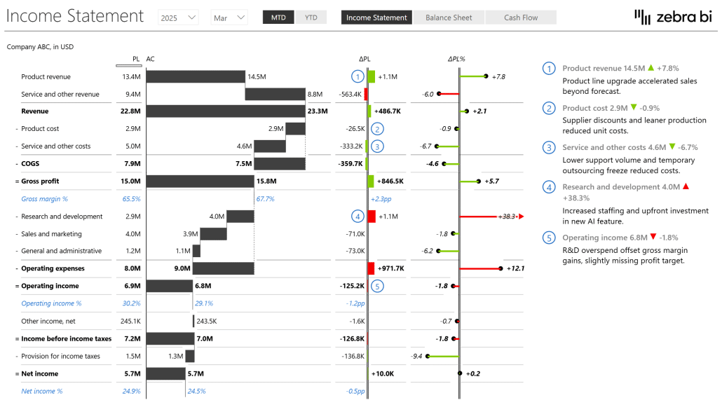
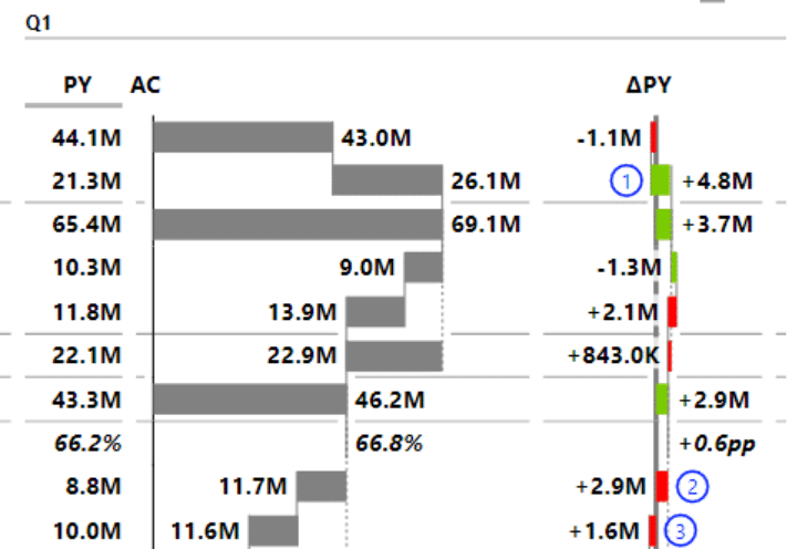
In the interactive example, you can see how variances in Profit and Loss should be presented:
The dashboard's homepage shows the AC and PL values (and the variances) of:
It also features dynamic comments related to the above KPIs.
Zebra BI advantage: The Zebra BI Tables visual is the perfect tool for this task, and it offers a load of features, such as completely responsive design, integrated variances, and hierarchies. One of the things we're most proud of, however, is calculations. Whenever you want to add a new element to your table, and it's not in your data set, you can simply calculate it with a formula within a visual without doing any work on your data set.
Do you want to put everything you’ve learned into practice?
Watch this step-by-step walkthrough on how to build a fully interactive Profit & Loss statement in Power BI using Zebra BI visuals.
You can follow along by downloading our free Income Statement Power BI Template. With it, you’ll leverage all the advanced capabilities—like automatic variances, hierarchies, subtotals, and dynamic comments.
👉 To unlock the full power of this template, start your free Zebra BI trial for Power BI and experience how quickly you can create professional, decision-ready financial reports.
YOUR CHOICE:
Build P&L statements in native Power BI → 6-8 hours per report, complex DAX required, manual formatting, intermediate to advanced Power BI skills needed.
Use Zebra BI → 30 seconds, automatic subtotals and variances, no DAX coding, P&L template included, works even if you're new to Zebra BI.
Native Power BI requires complex DAX formulas and custom formatting to build P&L reports. Zebra BI Tables simplify this process with automatic subtotals, integrated variances, row-level calculations, responsive design, and dynamic comments—all without manual coding.
Yes. With Zebra BI Tables, you can calculate KPIs like Gross Margin or Operating Income directly within the visual, without writing DAX or restructuring your data model.
You can download our free Income Statement Template for Power BI and connect it to your own data. For full functionality, start a free Zebra BI trial.
A solid model includes fact tables (e.g., financials, comments) and dimensions (accounts, business units, calendar, and period calculations). This structure ensures flexibility and accurate reporting.
Yes. Zebra BI allows you to create new rows and KPIs directly in the visual by using formulas, so you can adapt your P&L report without modifying the underlying dataset.
Absolutely. Zebra BI’s visuals scale from basic P&L reports for small teams to enterprise-level financial reporting with multiple business units and hundreds of users.
Variances show the difference between actuals, budgets, or previous periods. With Zebra BI, both absolute and relative variances are built-in and automatically calculated, helping you explain performance trends instantly.
Yes. Reports built with Zebra BI can be published and shared in Power BI Service, enabling collaboration, comments, and decision-making across finance and business teams.
Explore our Zebra BI Resources and watch tutorials like the Profit & Loss video guide to master financial statements in Power BI.