This is an exciting post for anyone interested in using benchmarking data in their reports. All too often, we are pretty myopic regarding financial reports. We tend to focus on our internal financials, sales data, and other data points and neglect the useful external data. This data is often publicly available online and can provide priceless insights into our performance, providing clues about what we could do better.
This post is about how to get that data, use it for deep financial analysis, and do it all in Power BI using Zebra BI visuals.
What we're going to build
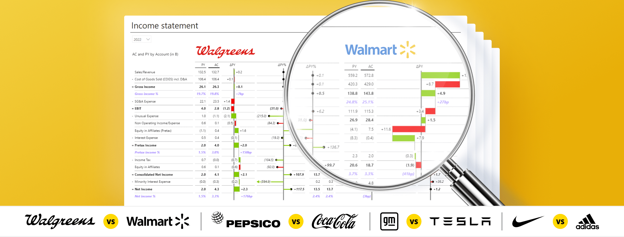
Let's start by looking at our Power BI dashboard. We collected publicly available financial statements from some of the most famous Fortune 500 companies. These are income statements, balance sheets, and cash flow reports from Walgreens, Walmart, Coca-Cola, PepsiCo, General Motors, Tesla, Nike, and Adidas. This gave a nice mix of retail, beverages, sports equipment, and automotive companies.
Download free PBIx file to follow along: CLICK HERE
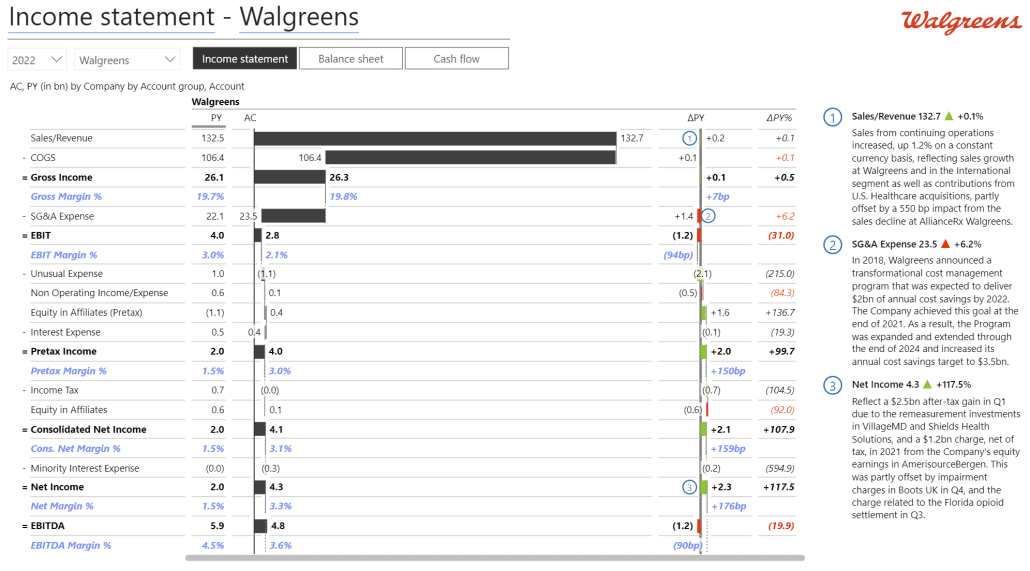
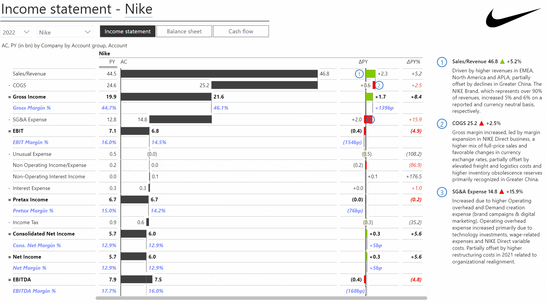
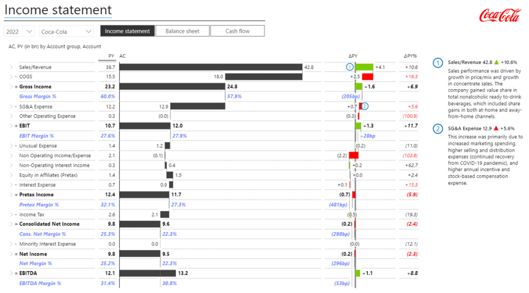
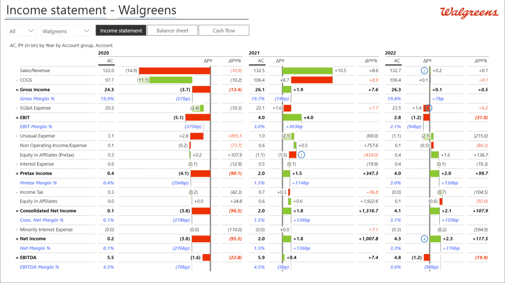
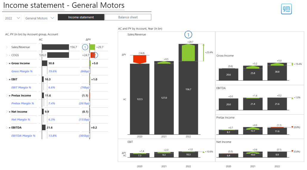
For example, here is the income statement for Walgreens:
This is a pretty basic report. It includes the core financial statements, but we've also added some basic KPIs, such as gross margin (gross income as a percent of sales), EBIT margin, and EBITDA margins. The latter was added using the Add Formula feature of Zebra BI Tables that allow you to add calculations in the visuals by simply referencing your data and adding mathematical operations - simple as that, no DAX formulas (more explained below).
To make it easier to compare, you can easily switch between companies using the dropdown menu or between different reports using the three buttons above the report. On the right are comments explaining the key variances and certain data outliers to deliver actionable insights.
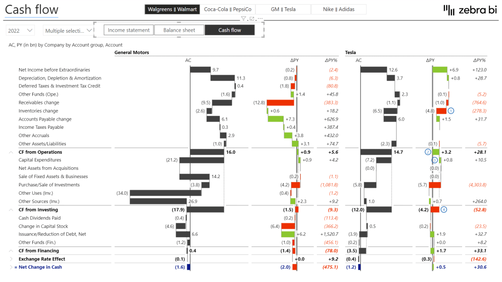
However, just gathering data is not enough. To get true insight, you want to compare the cash flow data between GM and Tesla. Like this:
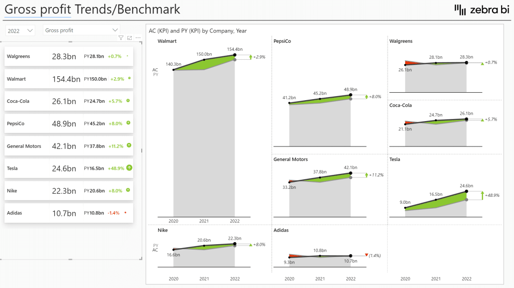
Or we can do a comparison in KPI trends over a specific period. For example, here's a chart comparing gross profit KPI between the companies over three years.
In this report, you can switch between various KPIs, such as sales/revenue growth, EBITDA and EBIT, inventory turnover, financial leverage, ROIC, etc.
Reports like this can help you in your own business. You could use this approach to benchmark your company against your competitors or the industry average.
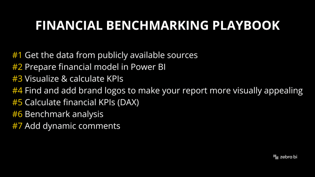
Financial benchmarking playbook
Financial benchmarking can be a complex topic, and it's best to follow a process that will help you stay organized and focused. Here's the playbook we've used at Zebra BI when coming up with our benchmarking dashboard.
1. Get the data from publicly available sources
You need to get financial data from somewhere, and there are a couple of online sources where you can get it. We decided to take publicly available financial data from the Wall Street Journal for our project. We used the PowerQuery data transformation and preparation tool in Power BI to extract, clean, and load the data into Power BI.
2. Prepare the financial model in Power BI
We'll show the financial model in more detail later on. The preparation includes creating fact tables, dimensions, comment tables, and DAX measures.
3. Visualize and calculate KPIs
We used Zebra BI Tables visuals to visualize the financial reports and calculate the first KPIs, such as margins, EBITDA, gross profit, and net income margins.
4. Find and add brand logos to make your report more visually appealing
To ensure our reports looked great and that the statements for each company included a logo of the company, we used the website Brandfetch which offers logos of various businesses.
5. Calculate financial KPIs (with DAX)
We tied everything together by calculating financial KPIs, such as net debt, working capital, etc. This was done with DAX, and we'll share the formulas and tips on how to craft your own.
6. Benchmark analysis
After having everything in place, a more in-depth benchmarking analysis can start. Again, we've used Zebra BI visuals focusing on Zebra BI Charts. With this report, we've pushed Power BI and our own visuals to the limit because this type of analysis requires advanced visualizations to ensure comparisons are clear and understandable and that scaling is correct. With Zebra BI, those advanced visualizations are right at your disposal, easy. This allows users to compare data visually and immediately understand what is happening.
7. Add dynamic comments
The final step was to add comments that explain the movements in individual categories to support the data-driven storytelling further.
Getting the data
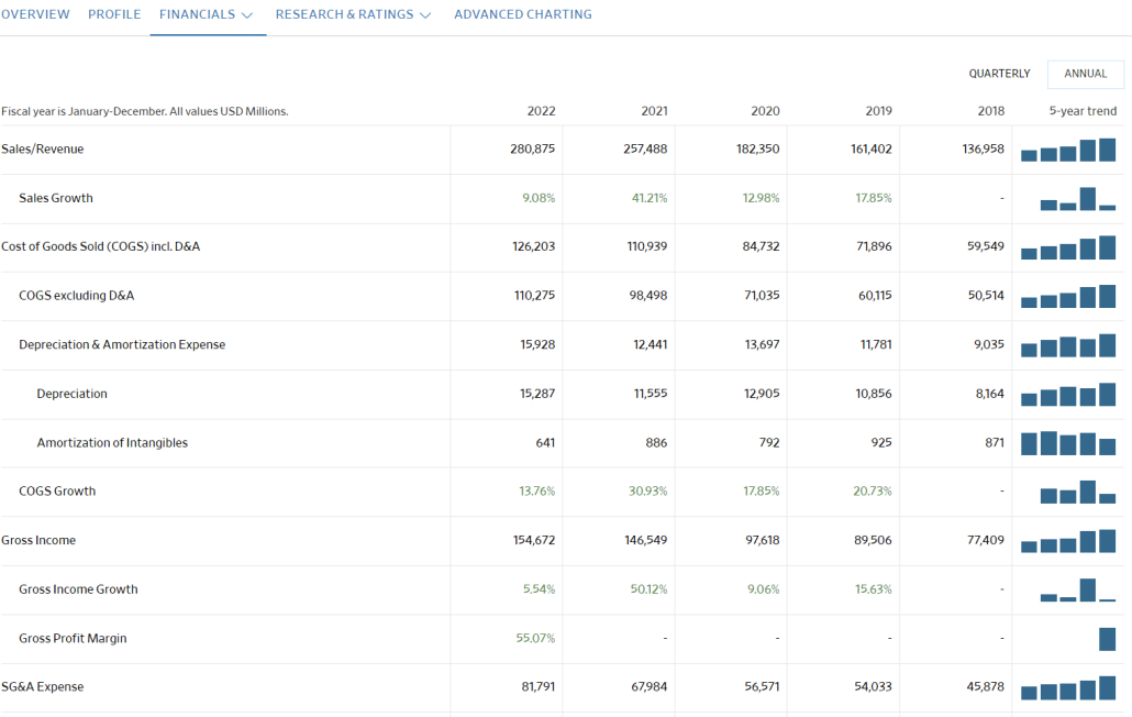
The Wall Street Journal website has an excellent section dedicated to financial data, where you can easily find data for public companies. For example, here are the financials for Alphabet, the company behind Google.
These reports include basic data and calculated KPIs, such as sales growth.
When pulling the data from sources like this, you need to be careful only to import so-called additive measures into your Power BI report. What are additive measures? At its most basic, these are the measures that you can add to calculate sums. Revenue is an example of an additive measure - adding revenue for 2021 and 2022 will give you a valid sum.
Non-additive measures are data points like sales growth. For example, if you want to look at cumulative sales growth over two years, you cannot simply add revenue growth percentages for both years.
The correct approach is to import only additive measures and then calculate non-additive measures again in your Power BI data model using DAX.
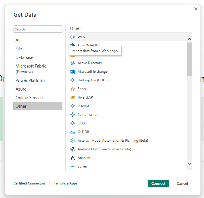
To get the data, copy the URL and open Power BI. Go to Home and click Get Data. In the pop-up window, select the Web entry.
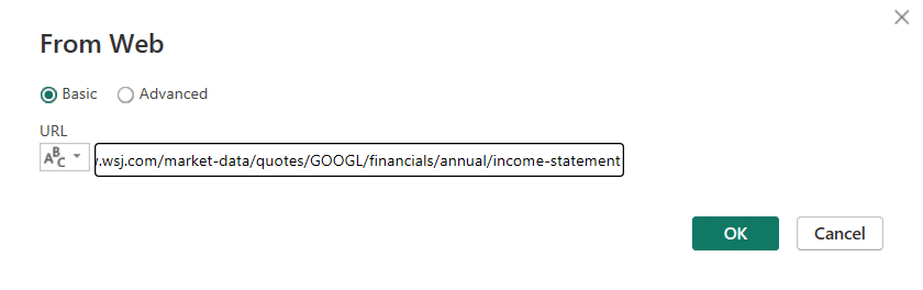
In the following windows, paste the URL into the field and click OK.
Power BI will parse the data on this link and show you the data table. You will need to process it using PowerQuery, and we have knowledge base articles that can be helpful:
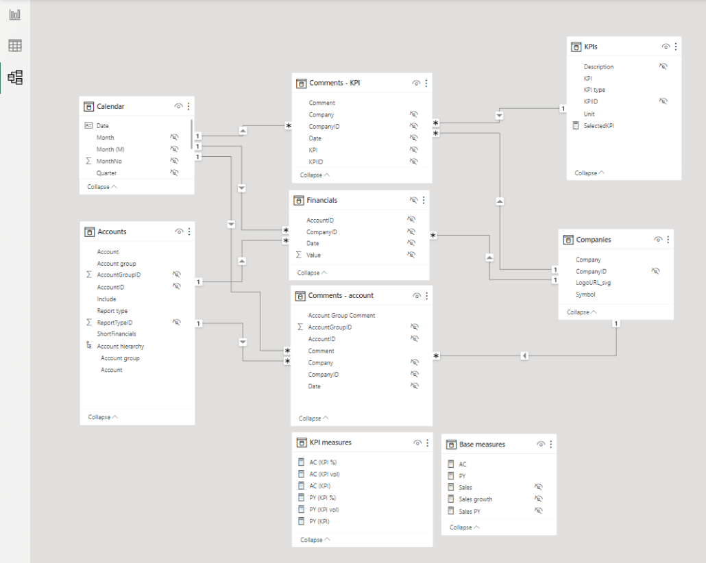
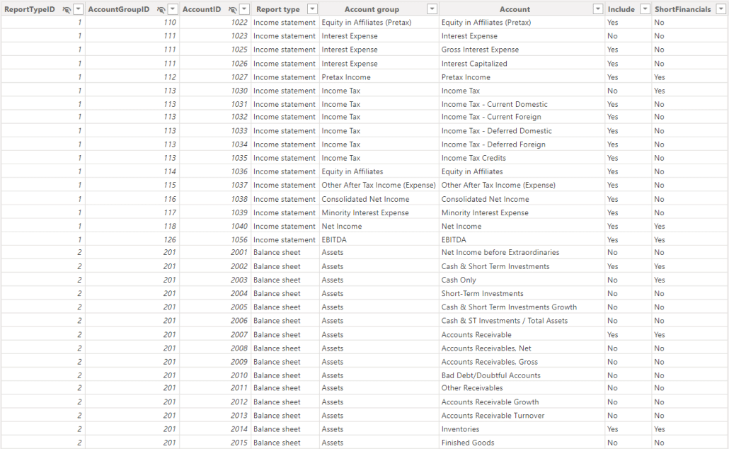
What are we looking at here? There is the financial data (Financials) and the table with accounts (Accounts) for all three financial reports.
We've done something interesting here. We've combined measures from all three reports into a single account table. This account dimension now contains the accounts from income statements, balance sheets, and cash flow statements.
Take a look:
This is a very important trick because it allows you to switch between different report types for a single company easily. You only need to click a button to filter the data and look at different reports.
The data model also includes comments (Comments - account & Comments - KPI)that contain information from companies' annual reports and a table with KPIs (KPIs) that contains a list of all the KPIs we want to include in our report.
Visualizing the data using Zebra BI
Let's start by trying to recreate the basic view - the report that shows different report types for a single company and includes some calculated rows and comments.
The Zebra BI Tables visual makes it pretty easy. Start by adding the Zebra BI Tables visual from the Visualizations pane in Power BI.
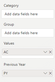
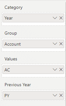
The next step is adding measures - actual and previous year values to their corresponding placeholders.
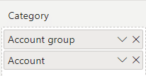
Zebra BI automatically calculates the absolute and relative variance, an out-of-the-box feature, so you don't have to use DAX for the calculation. The next step is to add Account and Account Group measures to the Category placeholder.
The result already looks like an income statement. However, it is sorted by actual values at first, so you can click on the AC columns several times to enable the custom sort.
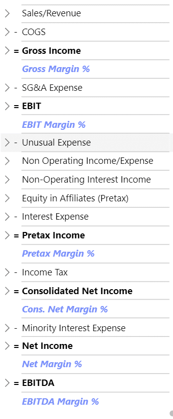
Setting correct meaning to items
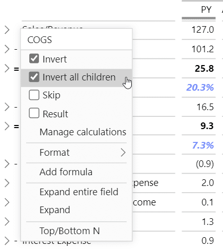
Regarding actual values, you want to communicate more information than just numbers. The best approach is to use a calculation waterfall visual, a more advanced version of the basic waterfall chart. Click on the arrow by the AC column heading and select the Calculation Waterfall option.
After selecting the Calculation Waterfall, you need to tell the visual which categories are costs and results so that the waterfall chart will get you the most out of your data. This is something that can be easily done in Zebra BI. Right-click on COGS value and select Invert or Invert all children since this is a hierarchical account - a parent account with several items at lower levels.
The visualization will make sense as soon as you invert this on the visual. Now cost of goods sold is subtracted from the revenue.
Our next stop is gross income. This is a result and should be marked as such. You can right-click on it and select the entry Result from the dropdown menu.
To make sure the visual makes sense, you need to mark all intermediate results and expenses as such. Accounts like SG&A Expense, Interest Expense, and Income Tax should all be marked as inverted values (marked with a - sign), while EBIT, Pretax Income, Net Income, and EBITDA are results (denoted by the = sign).
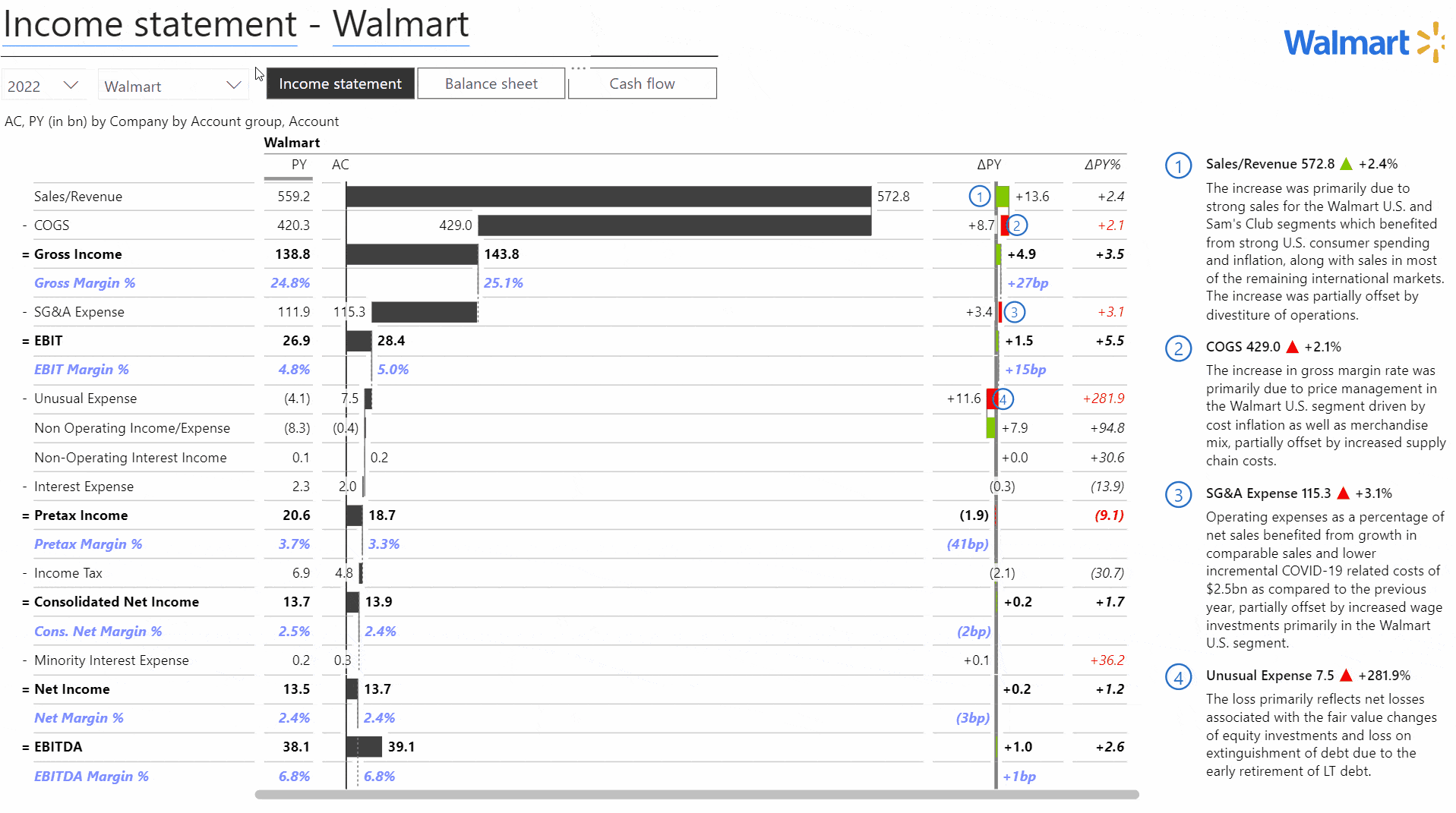
This approach gives a much clearer understanding of the erosion of the margins and the costs that have been subtracted. It simply visualizes the basic financial calculation here, and it's much easier to understand.
And since you have companies from different industries, you can switch between companies to quickly understand how their businesses differ. For example, retailers like Walmart have a much smaller gross margin than sports apparel manufacturers like Nike.
Adding calculations
You often want to know even more information, such as your gross margin in percent. With Zebra BI Tables, you can right-click on the table and select Add formula directly to the visual. This is the easiest way to start adding financial KPIs to your reports.
Let's add a Gross Margin calculation to our visual. Once you add the formula, you can edit and format it. We calculate the Gross Margin percentage by dividing gross income by Sales/Revenue.
You can set the display of the value in percentages and perform basic formatting tasks, such as changing fonts and their color.
You can add multiple calculations, such as EBIT as a percent of revenue or net income as a percent of revenue.
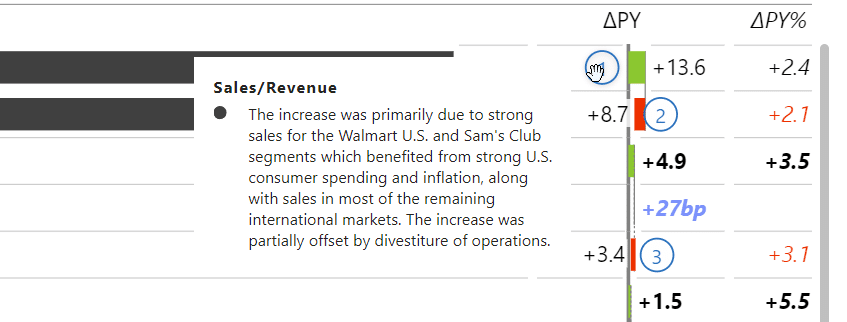
Working with comments
To pull your comments into your visuals, you must collect them in a table, where individual comments are linked to specific accounts (for example, inventory), companies, and dates. Once you have this table in place, you can use the comments on your visuals directly.
Here's a look at the comments table.
This allows you to add the Comment measure to the Comments placeholder. By default, comments appear as tooltips.
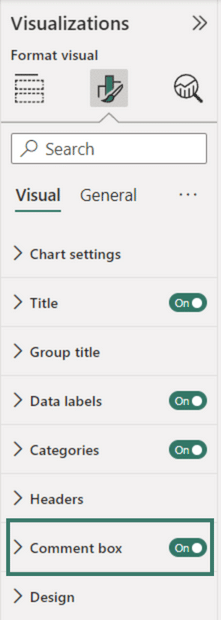
However, under Format your visual pane, you can turn on the Comment box to display related comments to the right.
Adding the logos
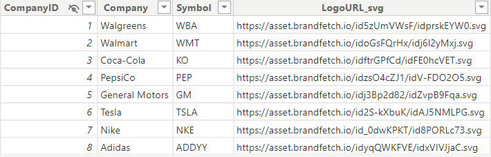
One of the exciting things about this dashboard is that the logo changes when you change the company for which you are viewing the report.
We used the native matrix visual that loads a link to the right logo. We achieved this by including a Companies dimension into our data model, including company names, their ticker symbol, and a URL to their logo.
URLs point to the Brandfetch website that hosts most of the world's brands, including the ones we were looking for. Make sure that the format is SVG, the vector graphics format.
All you need to do then is create a spreadsheet in Excel with the above information and load it into Power BI.
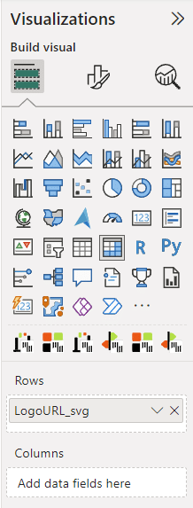
You then add the default matrix visual to your report and add the column with the URL to the SVG logo to the Rows placeholder.
You can then set the size and format of the entire visual. There are limitations, such as the inability to hide headers and borders, so you'll have to resort to some tricks. The easiest way is to make them smaller and white so they don't show up even though they are still there.
Start benchmarking
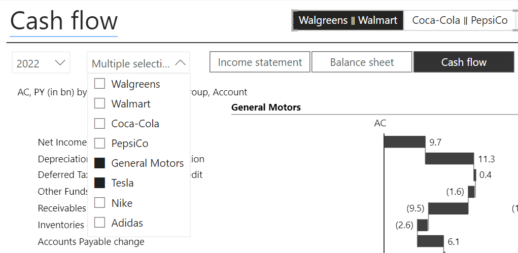
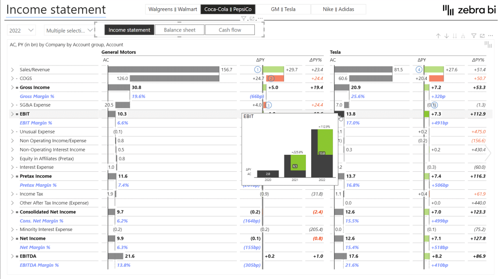
We now have a report that only shows a single company at the time, which is not particularly useful for benchmarking. We want to have companies side by side so we can compare them.
We created a similar Tables visual that includes a dropdown that allows multiple selections, so you can select multiple companies and compare them side by side.
We achieved this by adding the Company dimension to the Group placeholder. Much like the native matrix visual, all Zebra BI visuals support grouping, and this will create a cross tab with several groups.
You can see how easy it is to compare the two companies now. A quick glance reveals that while GM is a much larger company, the gap between them is shrinking, especially in gross income, as Tesla's EBIT margins are much higher.
You can see that we also added a tooltip that shows up when you hover over a value. It shows a historical trend to add context to your data visually. Here, you can see that Tesla is exhibiting crazy growth in EBIT.
In this example, you can see how useful comparisons are. If you look at your own data for this year and maybe the past year, you're missing out on how the industry or your competitors are doing. This external data adds context to your own data, and then you can extract more value from your BI solution and data.
Let's take a look at another example. Here is a presentation of income statements that normally require tables with data from multiple years. We tried to take a better approach to a traditional table that makes it easier to understand.
This table quickly shows that the COVID-19 epidemic made 2020 a bad year for Walgreens with lockdowns and social distancing. Later in 2021 and 2022, the company bounced back.
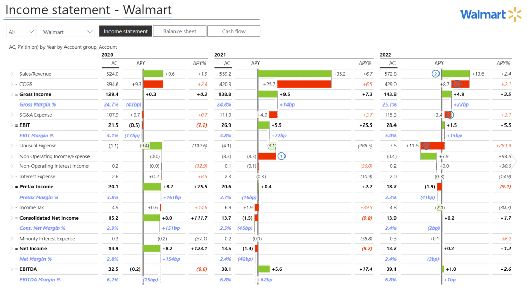
You can then look at Walmart to see a similar trend but less pronounced.
However, making a comparison like this is hard because you have to switch between two reports. The better approach would be to combine the tables with charts on the same report page.
An alternative way of benchmarking comparison
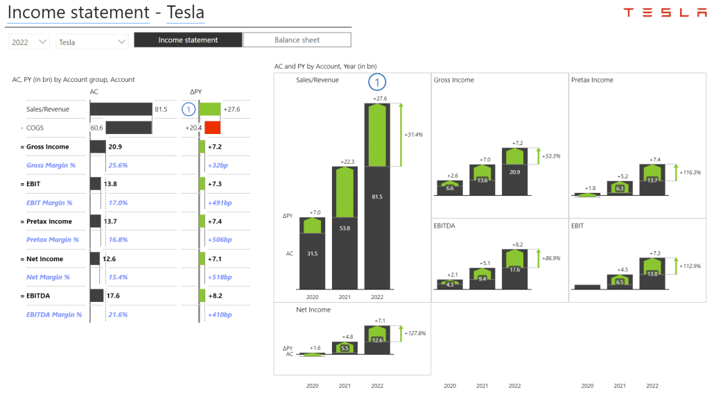
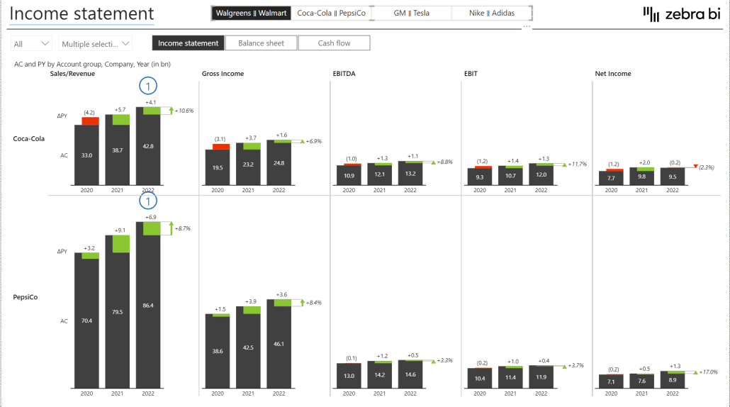
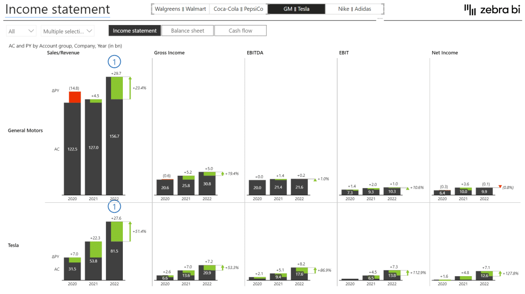
For our next attempt, we combined a short profit and loss statement showing revenue, cost of goods sold, gross income, and other metrics with trends in the charts.
At a single glance, we can see that Tesla is growing across all KPIs and not just growing but growing fast. Once we switch the report to data for General Motors, the picture is completely different, and we see that the incumbent's growth is much slower.
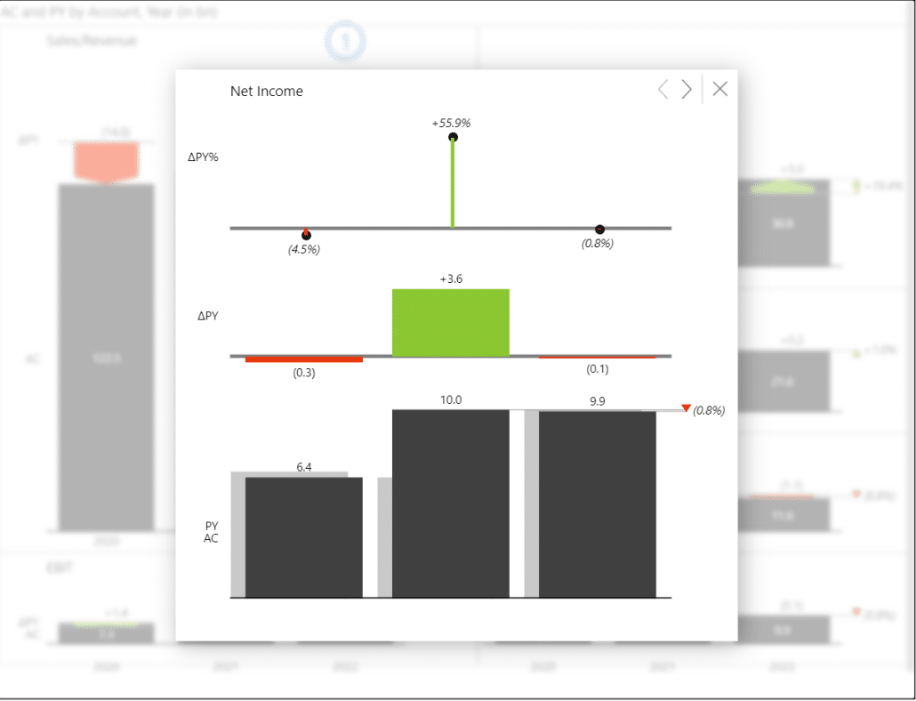
The great thing about this visual is that it is scaled. This means that the size of the charts reflects the actual data. In our example, you can see that revenues are much larger than net income, which means that the margins for GM are quite low.
You can click on individual KPIs in Zebra BI to see more detail. Here is an example of the window opening if you click the Net Income KPI.
Again, Zebra BI achieves this by employing grouping to create groups of data categories. In our example, we added a group of KPIs under the Grouping placeholder.
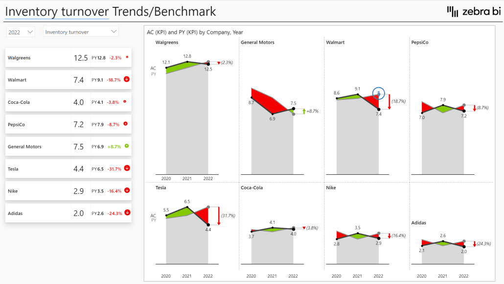
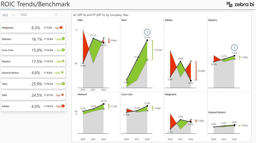
Small multiples to the rescue
The small multiples visual technique shows several charts on the same page while maintaining scaling. We could use this to compare the same KPIs between two companies.
We tried it out on PepsiCo and Coca-Cola.
This advanced version of small multiples allows us to compare two companies head to head. We see that while PepsiCo has much larger revenues (resulting in larger charts), the company lags behind when it comes to net income.
As an analyst, here is where you can start asking interesting questions: is this a result of marketing costs or logistics? What is the reason behind this margin erosion for PepsiCo?
We can see a similar story but even more pronounced if we look at GM and Tesla.
While GM dwarfs Tesla in revenue, its net income lags Tesla's, which shows that Tesla has uncovered some efficiencies that drive its performance.
Adding more KPIs
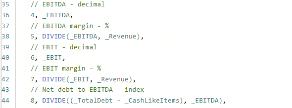
To make the benchmarking analysis even more effective, we added KPIs, such as net debt, inventory and asset turnover, and financial leverage. This is all based on and calculated using the Wall Street Journal data.
We created a new dislocated table with these measures. The first step was to create an Excel spreadsheet with all KPIs and their descriptions and load it into Power BI.
The second step was calculating values for the KPIs listed in the previous step. It is done in a single DAX statement that is too long to reproduce here but essentially calculates all the values you will need in your report.
Here is a sample:
Here's a tip for you. When writing in DAX, always use the DIVIDE function instead of the symbol for division. It works better and handles errors better.
You do all of this in a SWITCH statement, meaning you switch the selected KPI with numbers 1, 2, 3, and so on. These are the KPI IDs from the table you created in the previous step.
This lets you view advanced calculated KPIs for all companies simultaneously on a single page.
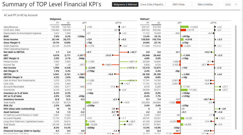
We added the third Zebra BI visual on the left - Zebra BI Cards. In this case, it is used to display values for all companies quickly and to allow users to select individual companies for comparisons.
For example, you can review all companies or select Coca-Cola and PepsiCo to compare the two.
With this, you are moving beyond traditional financial analysis and just looking at income statements or balance sheets. These calculated KPIs combine data from different financial statements to deliver more value and help you better understand what is going on with your business.
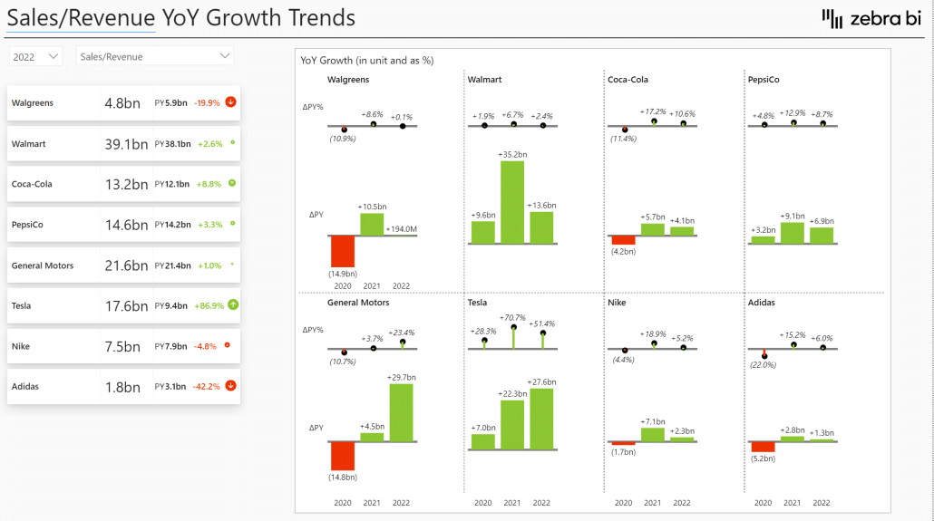
We've also created a dashboard for growth trend comparisons. Instead of just looking at absolute KPIs, you can focus on the growth of those KPIs. You can see just how fast Tesla grows compared to other large corporations.
The final report in our demonstration sheet compares all the KPIs, which is an excellent tool for financial users and CFOs.
Hopefully, this gave you some ideas on how to use benchmarking data based on publicly available data. And if you want to learn more about building effective Power BI financial dashboards, we have an A-to-Z guide for that too (just click the link here and read more).
Takeaways
This post showed you how to use benchmarking to understand better your industry, your competition, and - last but not least - your business. Here are the key visualization takeaways you should follow to create better benchmarking reports.
Use benchmarking to add context to your data and improve your insights.
Add comments to your reports to explain the reasons behind data points and changes.
Use on-visual calculations or DAX to create KPIs.
Use appropriate charts to visualize financial data. Use waterfall charts in tables to show contributions, growth rates, and year-over-year variances.
Use small multiples to allow comparisons by visualizing multiple charts and KPIs on a single page.
These approaches will help you create actionable reports that drive action and empower users to make decisions.
Watch video tutorial
If you'd like to learn more about financial analysis and benchmarking, enter your data for immediate access to the full 1-hour video recording with Zebra BI's CEO and Founder Andrej Lapajne, together with the PBIx file and the presentation from it.