 September 8th
 February 22nd
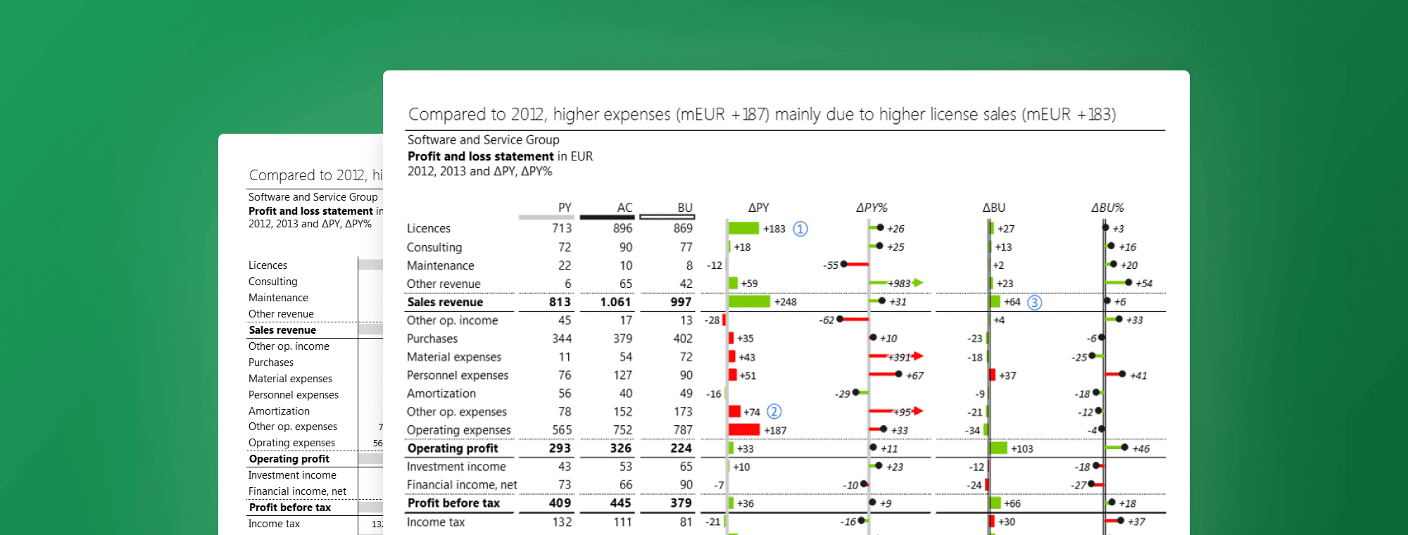
How to Design Income Statements in Excel
If there is one report that's a business constant, it's the income statement (also known as a profit and loss statement). Its core purpose is to show managers and investors the bottom line of a company for a specific period. It is normally delivered as a structured spreadsheet that shows how the top line (revenues) is transformed into the bottom line after taking out expenses.
There is a much better way, however. An income statement tells a very important story about your company and you can tell it in a much more effective way. Instead of relying on just numbers, you can use visual language that makes your story not just much more attractive but also much easier to understand.
A Basic Income Statement
First, let's take a look at a relatively simple income statement showing business results for two years.
Tip: There are many things you can do to improve the readability of your report. Some are more subtle than others - for example, in the structure waterfall chart, the numbers that have positive contribution are displayed to the right of the bar, while negative contribution values are marked on the left. This is a good practice that clarifies your story without any added visual noise.
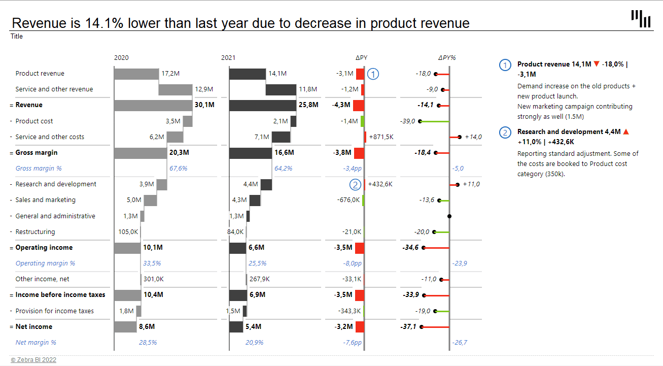
The first and second columns of the waterfall charts show the different types of revenue and costs that make up total profit across two different years. The first section of the chart shows revenue sources and growth that contribute to the overall profit, followed by costs, such as product, service, and other operating expenses that reduce the overall profit. Note the "Operating income" which is a subtotal of all other expenses above it. This intermediate calculation improves readability and helps visualize the end result. These subtotals are actually very easy to do in Zebra BI for Office. You only need to right-click on the selected row and select the option 'Result' and Zebra BI will do the rest.
When you create a report like this, you use the "structure" waterfall chart. This type of waterfall chart shows the structure of the final profit and contributions of individual items. You could also use the "Variance" chart that puts the focus on actual differences.
The two waterfall charts are complemented by a variance bar chart and a lollipop chart on the right:
The bar chart displays absolute values and their change. The lollipop chart represents relative growth or decrease in percentages. The important thing about the variance chart is that it is scaled. The length of the chart now corresponds to the actual difference between 2020 and 2021 values.
Tip: Use a waterfall chart instead of a bar chart to display absolute variance. You will be able to visualize not only the values but also how they contribute to the total difference. Like this:
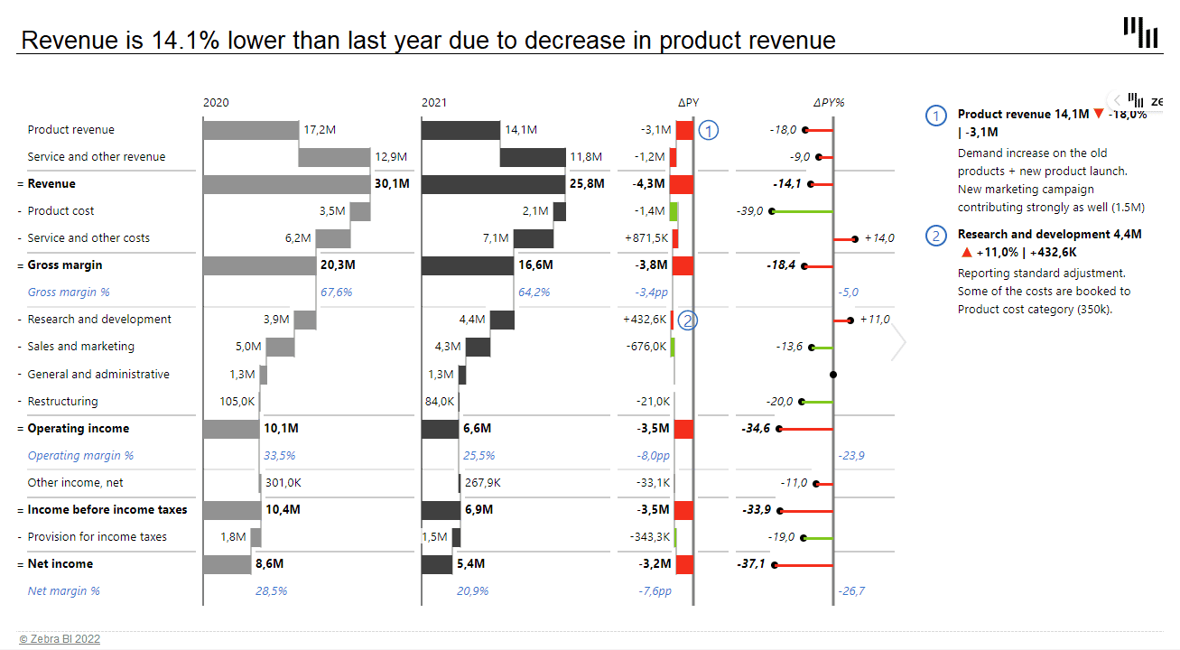
When working with comparisons, you will soon meet the Zebra BI custom calculations. Instead of using negative or positive numbers, you can use the custom calculation Invert to define whether an item is a positive or negative addition to the total. Using this feature you can easily invert KPIs that have a negative contribution despite being a positive value. Simply right-click on the selected KPI and choose Invert. For example, an increase in the cost of research and development is a positive value with a negative impact on your overall profit. Zebra BI will show it in red, despite it being a positive value.
Taking It Up a Notch
In real life, you might want to show data for more than just two years. A typical scenario is a report with the current and past year's data and plans for the coming year.
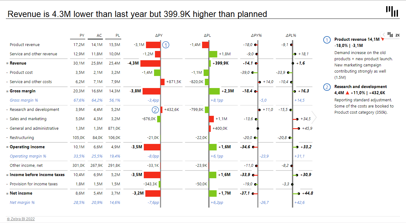
Notice a different approach to designing the report. With three data sets, we are coming up short on space. Since the variance data is much more relevant, we used a table and chart combination. The PY, AC and BU values are displayed in a table, while the more important variance data is visualized with charts.
The bar and a lollipop charts are telling the same story as with the previous template. However, we now have two pairs of them - one pair for showing variance from the past year and the second pair displaying the difference compared to the plan.
The great thing about Zebra BI is that you have complete design freedom. For example, you could change the order of charts or even place data columns between charts.
Tip: When designing a more complex template like this, decide on an order of charts and stick to it. I prefer showing the variance compared to the previous year and then the comparison to the plan. You might want to use a different approach, just make sure to stay consistent. This way, you'll ensure your income statement always tells a clear story at first glance.
When designing a report like this, make sure that all the charts that visualize the same type of data are scaled. You can see here that bar lengths clearly display the difference between the previous year and the plan. Keep in mind that this type of report is fairly useless if it's not scaled. Luckily, scaling is one of the strong points of Zebra BI as it happens automatically.
The more the merrier
These two sample income statements were for a single company. But what about if we are create an income statement for a group of companies, subsidiaries, or profit centers? In this case, you might want to show multiple countries or companies on a single page. Take a look at an example:
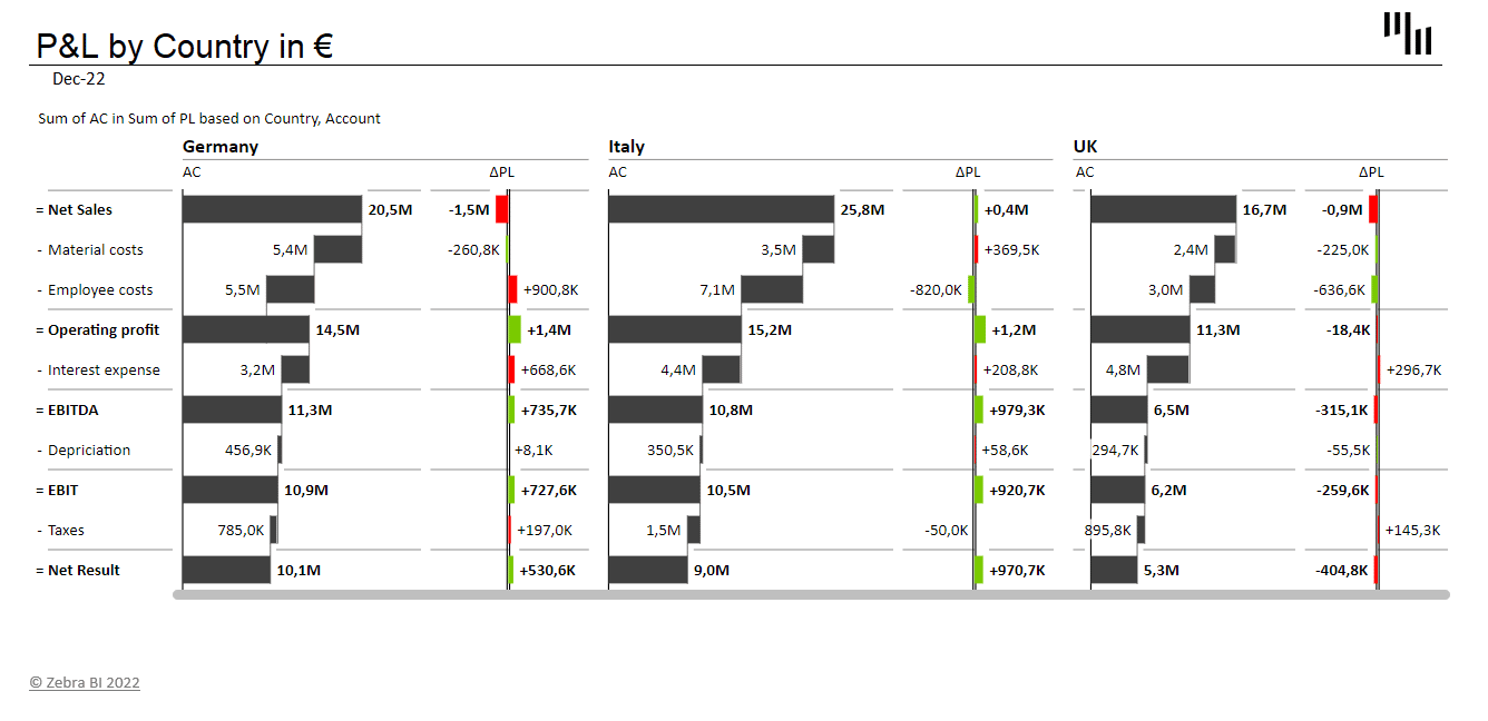
This table contains multiple levels of data - you can see the performance of key metrics for three different countries within one visual. The actual value is represented with a waterfall chart and it shows clearly the net sales, costs, operating profit, EBITDA, and net result. On the right are variance charts showing differences compared to the plan. This is a great way to show the picture of your business on a single page.
Tip: When designing visual reports like this, pay attention to labeling and headings. Clear and understandable headings help you tell the story while comments help you draw attention to significant data points.
All these visualizations comply with the IBCS standards, which ensures that you can easily read this page without losing sight of the overall picture.
Want to create income statements like these?
If you'd like to create the income statements that you see in this article, you can download our free templates:
This is a well explained and well written blog. It is worth a read. Thanks for sharing it with us.