
 September 8th
 February 22nd
Clustered Bar Chart: When to Group Your Series, and When to Stop
Two series on one chart is easy, and your report is still readable. The trouble starts at five, when your readers stop comparing bars and start matching colors to a legend.
Getting that balance right is what makes a clustered bar chart work.
A clustered bar chart is a visual that displays more than one series per category, side by side within each group. Sales by region, split into Hardware, Services and Licenses, is the standard case. Every bar sits on the same baseline, so any bar can be compared against any other one.
In this guide, we'll explain how a clustered bar chart works, when to use one in your reports, the types of clustered charts, and the best practices when creating one.
What is a clustered bar chart?
A clustered bar chart is a visualization tool that shows more than one series per category, with bars drawn side by side within each category group.
You build one by adding a second categorical field to a bar or column chart. Each category then splits into as many bars as that field has values, and a legend tells your readers which bar is which.
When working on a clustered bar chart, keep in mind that every bar still sits on the same baseline. That shared baseline means any bar can be compared to any other, within a group or across the chart.
Clustered bar charts are also known as grouped bar charts, side-by-side bar charts, or paired bar charts. The names are used interchangeably in most tools, though the reporting standards mean something narrower by "grouped".
PRO Trial AVAILABLE FOR FREE!
Past 4 series a cluster stops comparing and starts matching colors. Zebra BI splits the same data into 1 panel per group, on 1 shared scale.
Clustered bar chart cheat sheet
Cluster 2 or 3 series. Overlap a scenario pair. Stack when the total is the question. Split into a grid of small charts past 4 series. The panel has the numbers and the rest of the page is the argument behind them.
Clustered bar chart details
Doing its job
Time to switch
Broken most often
3 cases when you should use a clustered bar chart
Clustering earns its place under 2 conditions. The reader has to compare inside a group and across groups at once. And there have to be few enough bars that color still means something.
1. You have 2 or 3 series and both readings matter
Product lines across 5 regions. Headcount by department across 2 years. The reader compares the bars inside a cluster. Then they scan the same color across clusters to see whether the pattern holds. At 2 or 3 series both readings work, because the bars stay wide enough to measure by eye.
Beyond that the bars get thin, and the section below puts a number on it.
2. Every series is a peer
Hardware, Services and Licenses are 3 equals. None is the reference the other 2 get judged against. Actual against plan is the opposite: 1 number is the answer and the other is the yardstick. Peers cluster well and a yardstick doesn't.
3. Nobody is asking for the total
Clustering throws the total away. That's fine when the sum means nothing. Mixed units do that, so do rates, and so does a channel split where every market has its own base.
4 cases when you shouldn't use a clustered bar chart
Each of these has a better chart behind it, and the reason is always the same. Clustering spends width on series count. Width is what makes a bar readable.
1. You have more than 3 or 4 series
Past 4 series, stop clustering and draw a grid of small charts instead. Every extra series makes every bar thinner. Past a handful, nobody is comparing bars any more. They're matching colors to a legend first, then comparing.

There's a second cost that's easy to miss. In a cluster of 8, the bars you most want to compare sit furthest apart on the page. Those are the same series across different categories.
The ceiling is our reading. Nobody published that rule for bars, and the nearest published one is about lines. IBCS, the association behind the open standard for business reporting, writes that line charts "with more than three intersecting lines tend to be confusing", and sends the rest to small multiples. The mechanism carries over.

2. You are comparing a scenario against a reference
Actual against plan, actual against last year, actual against forecast. Cluster those 2 values and the reader compares 2 bar lengths and does the subtraction in their head. Draw the reference behind the primary and the gap between them is the variance, read straight off the page. IBCS says the same for grouped bar charts: the 2 bars "overlap, the reference scenario placed behind the primary scenario". Overlapping also halves the width each category needs. That starts to matter at 12 months on the axis.

3. The question is the total
Then you want a stacked chart, which puts the segments end to end so the bar length is the sum. You give up reliable comparison above the first segment to get it. IBCS adds one limit. Stacked columns "should only be used if all chart values are either positive or negative". A negative segment breaks the length the total depends on.
4. You only have 1 series
Then you have a bar chart, and it needs no legend at all. IBCS puts it plainly: legends "for single column charts and single bar charts are best integrated into the title". Plenty of charts grow a second series because the data was there and nobody asked the question. That's the most common way a readable chart stops being one.
Clustered bar chart vs stacked bar chart
They answer different questions. Clustered is for comparison, stacked is for composition.
| Clustered | Stacked | |
|---|---|---|
| The question it answers | How big is each part? | What is the total, and how does it split? |
| Shares a baseline | Every bar | The bottom segment only |
| Reads well | Any bar against any other | The total, at a glance |
| Gives up | The total | Comparison above the first segment |
| Handles negatives | Yes | No, the total stops working |
Pick on the sentence you'd say out loud. "Services is bigger than Hardware in every region" is a clustered chart. "Each region turned over about 4 million, split like this" is a stacked one.
Not sure whether your data wants a cluster, a stack or a grid of small charts? The Chart Selector is a Power BI Desktop file that walks you from the question you are answering to the chart that answers it, on real numbers. It draws through Zebra BI, so you need the visuals installed to open it. Download the Chart Selector
Clustered bar chart vs grouped bar chart
Most pages treat clustered and grouped as 2 words for the same picture. They are not the same chart, and the gap catches people out.
Power BI, Excel and most chart libraries mean one thing by clustered. N series per category, side by side, one color each. IBCS means something narrower by grouped. The standard's grouped bar chart sets "a primary scenario (e.g. AC or FC)" against "a reference scenario (e.g. PY or PL)". Two bars per category, no more. And they overlap rather than sitting beside each other. A third scenario arrives as a small triangle, not a third bar.
Search for a clustered bar chart, land on the standard, and you find a chart that doesn't look like the one you drew. Both names are right in their own world. Know which one you're in before you quote a rule at someone.
The split by axis carries home too. IBCS puts time series on grouped columns and structure breakdowns on grouped bars.
Types of clustered bar chart
There are 2 real variants and 1 to avoid.
- Clustered column chart, categories on the horizontal axis and the bars standing up. This is the form for time, and most tools give it to you by default.
- Clustered bar chart, categories running down the page. Use it when the labels are long or the categories are structural.
- Clustered 3-D, which Microsoft lists for both orientations. It adds a depth illusion and makes every bar harder to measure, so skip it.
You'll also see the 2-series form called a side by side bar chart or a paired bar chart. Same chart, informal names, same advice.
Our alternatives for clustered bar chart layouts in Zebra BI

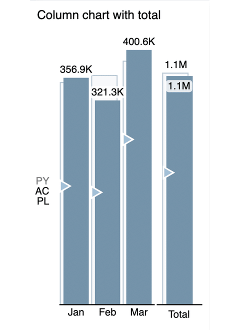
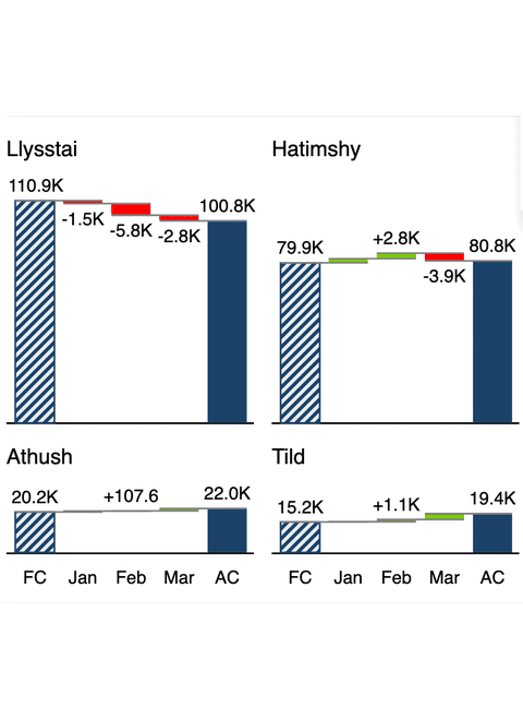


Zebra BI Charts does not draw clustered charts, and that is a deliberate position rather than a gap. Its chart type list is Waterfall, Area, Bar, Variance, Line and Pin. There's no clustered member and no side by side mode.
What it does with grouped data is split it or stack it. Put a dimension in the Group placeholder and the visual creates small multiples. One small chart per group value, with the Y axis synchronized so the panels stay comparable. A second dimension there gives you a 2 way matrix of panels. The Show Stacked chart icon in the top right corner flips the same data into a stacked chart and back. A report reader can do it after publication.
Scenarios take a different route. Actual goes into Values, and the comparison measure goes into Previous Year, Plan or Forecast. Show comparisons as then draws that reference as Overlapped columns, behind the actual and on the same baseline.

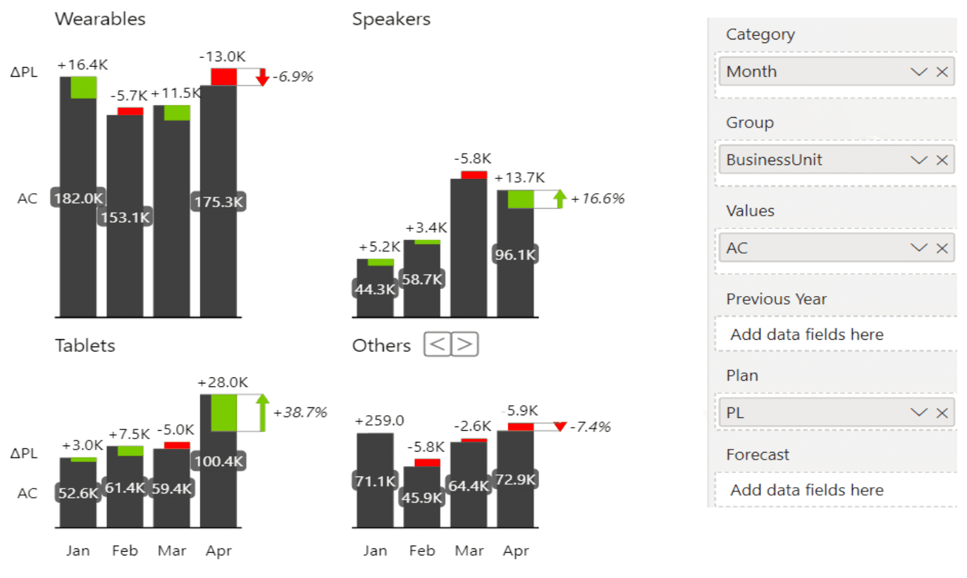
6 LAYOUTS, 0 CLUSTERS
Move the field to Group. The chart splits into panels instead of thinner bars.
Every layout in the grid above is a real Zebra BI render, not a mockup. Put your own numbers through the same visual.
Clustered bar chart in Power BI
Power BI ships the cluster as a first-class visual. Microsoft's guide to column charts in Power BI names 3 types: stacked column, clustered column and 100% stacked column. The bar chart carries the same 3. Drop a field into the legend well and every category splits into 1 column per value. Nothing caps the count, so 12 series give you 12 columns and a 12 item legend.
Zebra BI Charts is a licensed set of custom visuals you add to Power BI. It takes the opposite position on purpose. Grouped data becomes small multiples or a stacked chart. A scenario pair becomes overlapped columns. Either way the chart never grows a legend it didn't need. The trade is real. If a stakeholder asked for 8 series side by side, this visual won't draw it. The chart type overview lists everything it does draw.
Clustered bar charts for Office
Zebra BI for Office is 1 suite covering Excel and PowerPoint. Zebra BI Charts for Office is the add-in inside it that draws the charts. Both applications cluster on their own, so each section starts there.
Clustered bar chart in Excel
Excel has drawn clusters for decades. Insert, then Column or Bar chart, then the clustered variant. Microsoft's list of chart types in Office names Clustered bar and 3-D clustered bar, plus Clustered column and 3-D clustered column. Series order follows your column order, so arrange the sheet the way you want the chart read.
Zebra BI Charts for Office draws the same set as the Power BI visual. So there's no clustered option here either. Small multiples come from a pivot table instead. The knowledge base walks it: grouping column into Columns, trend column into Rows, AC, PY or PL into Values. Each column then becomes its own chart, on a Y axis synchronized across the grid.
Clustered bar chart in PowerPoint
PowerPoint draws charts from the same Office engine as Excel. Both clustered subtypes are there and the insert path is the same. The slide then holds its own copy of the numbers, and that copy is the problem. It doesn't move when the model does, so the deck gets rebuilt by hand every close.
Zebra BI Charts for Office runs in PowerPoint too. Pick a visual from the chart chooser. The last category is stacked charts and small multiples, and one click switches between the 2 views. Still no cluster. Link the slide to an Excel file on OneDrive or SharePoint, turn Auto-refresh on, and the chart updates when the file opens. The knowledge base states one catch. In the PowerPoint desktop app a visual only updates while its slide is on screen. So you click through the deck to refresh them all.
Clustered bar chart design best practices
5 things decide whether a clustered chart is readable.
- Keep the series count to 3, and treat 4 as the outer limit. Past that, draw one small chart per series on a shared scale.
- Sort the categories by value, descending, unless the axis is time. Alphabetical order throws away the ranking a reader came for.
- Set the gap between clusters wider than the gap inside them. If the 2 gaps match, the grouping stops reading as grouping.
- Put a scenario comparison behind the primary bar rather than beside it. Label the scenarios AC, PY, PL, BU and FC instead of coloring them.
- Match the axis to the comparison. Time goes on a horizontal category axis and draws as columns. Structure goes on a vertical one and draws as bars.


Join over 1.5 million Zebra BI users
Do you rebuild the same comparison chart before every monthly review? Zebra BI Charts draws the same set of charts in Power BI, Excel and PowerPoint. Settle the notation once and it travels with the report.

Keep your clustered bar charts readable
Use a clustered bar chart when you have 2 or 3 peer series and nobody needs the total.
However, there’s one case when you should use a different chart. If one series is the reference the others get measured against, like plan or last year, put it behind the primary bar instead.
Zebra BI Charts draws that comparison as overlapped columns, and sends grouped data to small multiples instead of thinner bars. You can use Zebra BI’s 14-day free trial to build your reports in hours, instead of days.
Frequently asked questions
The questions people ask most often about clustered bar charts.
What is a clustered bar chart?
A bar chart that shows more than 1 series per category. The bars for each series are drawn side by side inside every category group. Every bar sits on the same baseline, so any bar can be compared with any other. A legend says which bar belongs to which series.
When should clustered bar charts be used?
Use one when you have 2 or 3 series and the reader needs to compare them within and across categories. Past 4 series the bars get too thin and color matching replaces comparison. A grid of small charts on a shared scale serves the same data better. Skip clustering when the 2 series are a scenario pair, such as actual against plan.
How do you interpret a clustered bar chart?
Read inside a cluster first, comparing the series for one category. Then scan the same color across clusters to see whether the pattern holds. Every bar sits on 1 baseline, so any bar can be compared with any other. What the chart can't tell you is the total.
How many series can a clustered bar chart handle?
Three comfortably, 4 at a push. The number is our reading, not a published rule for bars. It comes from the mechanism the reporting standard describes for lines. Past a few series in one plot, the reader is matching colors instead of comparing values.
Can you make a clustered bar chart in Zebra BI?
No, and the omission is deliberate. Zebra BI Charts renders Waterfall, Area, Bar, Variance, Line and Pin, with no clustered mode in the list. Grouped data goes to small multiples or a stacked chart. A scenario comparison is drawn as overlapped columns, with the reference behind the actual.
Before you cluster anything, check 2 things. How many series are you about to draw, and is one of them the yardstick for the others? Those 2 answers pick the chart for you. The Chart Selector file is free if you want to see the overlapped and small multiples versions on your own numbers.
Related links
- Column chart, for a single series over time
- Small multiples, past the series ceiling
- Stacked bar charts in Excel, when the total is the question
- The bar chart guide, for the underlying chart
- Chart Selector, the free Power BI file that picks a chart
