Try Zebra BI with your own data
Start your free trial and get professionally designed dashboard templates - just connect your data and see results immediately.
 September 8th
 February 22nd
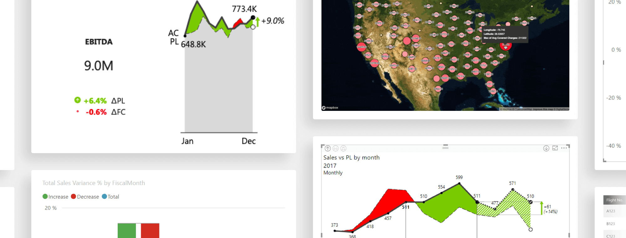
It has never been this easy to visualize and tell stories with your data.
There are few tools as powerful as Power BI when it comes to creating actionable reports and dashboards that explain, clarify and amplify your message.
While Power BI provides you with a great suite of tools that you can use to create great-looking visuals and dashboards, there is still plenty of room for improvement. And that’s where custom visuals come in.
In this article we will look at a handful of built-in visuals that we like and that we built upon to improve. Then, we will review a couple of really nice custom visuals that you can use to improve your reports & dashboards and make them actionable.
Want to see the best visuals in action?
Get the free trial with 12+ dashboard templates and try them with your own data.
You can do some pretty cool things with default visuals in Power BI. While advanced users might want a bit more power, default options are not bad at all. Here are some of the default visuals that you can use if you don't already.
Power BI slicers are visuals acting as filters. They are very useful to switch between years, months or other similar data. Be careful not to overuse slicers and limit to just showing up to five values and switching to a dropdown menu, when you have more than that.
Add a slicer by selecting the Slicer icon ![]() in the Visualizations pane. Then simply select values for filtering from your Fields pane.
in the Visualizations pane. Then simply select values for filtering from your Fields pane.
This creates a simple slicer that filters displayed data by year. For more advanced use, look at our article on how to change measures and switch MTD/YTD using slicers.
Waterfall charts were long an elusive feature in Power BI. They provide a great way to visualize a starting value, any positive and negative contributions to that value, and the end result. In a waterfall chart, the first column is the starting value and the last column is the end value. The floating columns between them are the contributing positive or negative values.
Here are some examples of when you should use waterfall charts:
Below is a simple waterfall chart created using Microsoft's sample dataset.
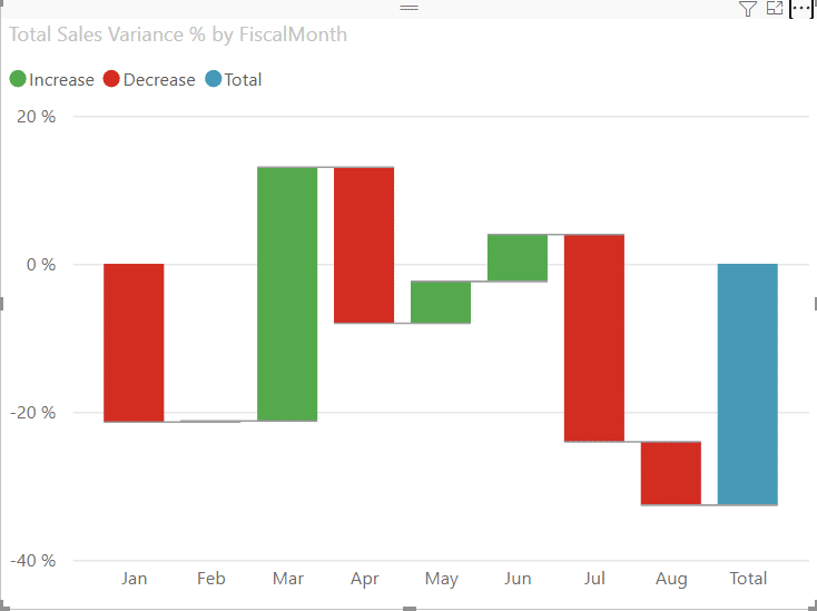
Microsoft has a simple tutorial on how to use waterfall charts. Intermediate and advanced users will quickly want more features, such as subtotals, difference highlights, axis break and Top/Bottom N.
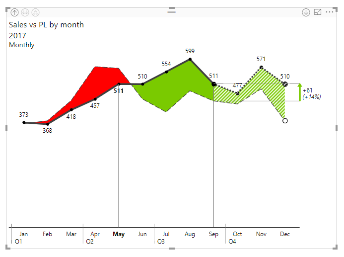
Area charts are a variant of the line chart where the area between axis and the line has fill to show volume.
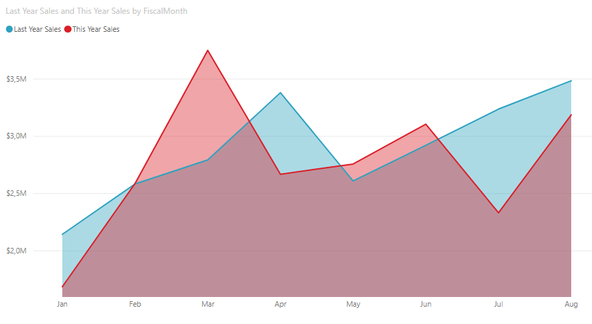
When displaying two measures like here, the real focus is on the area between the two charts.
When you work with a large number of data points, use an area chart that also shows actual values as well as deviations in the form of an area between the two values. This is something where Zebra BI shines with its focus on variances.
Even though visualizations are great, sometimes you cannot achieve your goals without a table. Power BI includes a table visualization which is what you would expect: rows and columns that can contain headers.
Tables are great for quantitative data with multiple values for a single category. We believe tables are so powerful, we created a separate visual - Zebra BI Tables. They include variances, rows that can be expanded or collapsed, subtotals and hierarchies.
Here is an example of an income statement done in Zebra BI Tables:
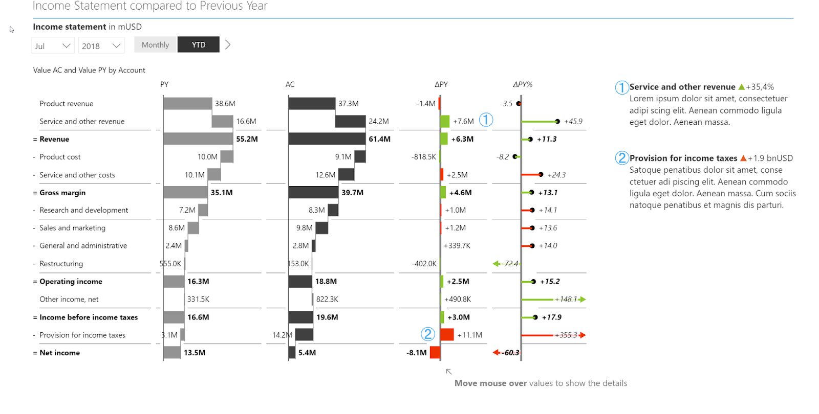
Find out more about Zebra BI tables.
However, if you work in Power BI you might need some help to do that. That's where Power BI custom visuals come in. These add-ins expand your options with additional visualization features that you can use to create compelling visual stories.
Bar charts are the reliable workhorse of visualizations. Column charts should be mainly used for visualizing a single category over time, while bar charts are great for looking at a specific value across different categories.
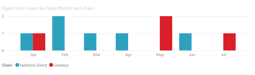
At Zebra BI, we like using bar charts for things like variances in a table.
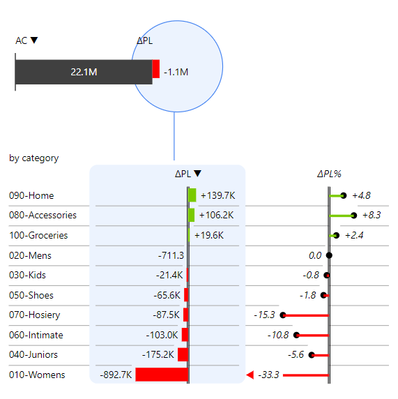
In this instance, we used bar charts to show the absolute variance and lollipop chart to highlight the relative variance.
Go beyond built-in visuals
Add professional waterfall charts, small multiples, and variance analysis to your Power BI reports - no code required.
While defaults are great, you will probably need to find a custom visual element or theme at some point. Microsoft made it very easy to add new visuals. Just click on the three dots in the Visualizations pane and select Get more visuals.
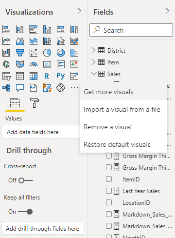
You will be taken to AppSource, where you can look for the visual you want.
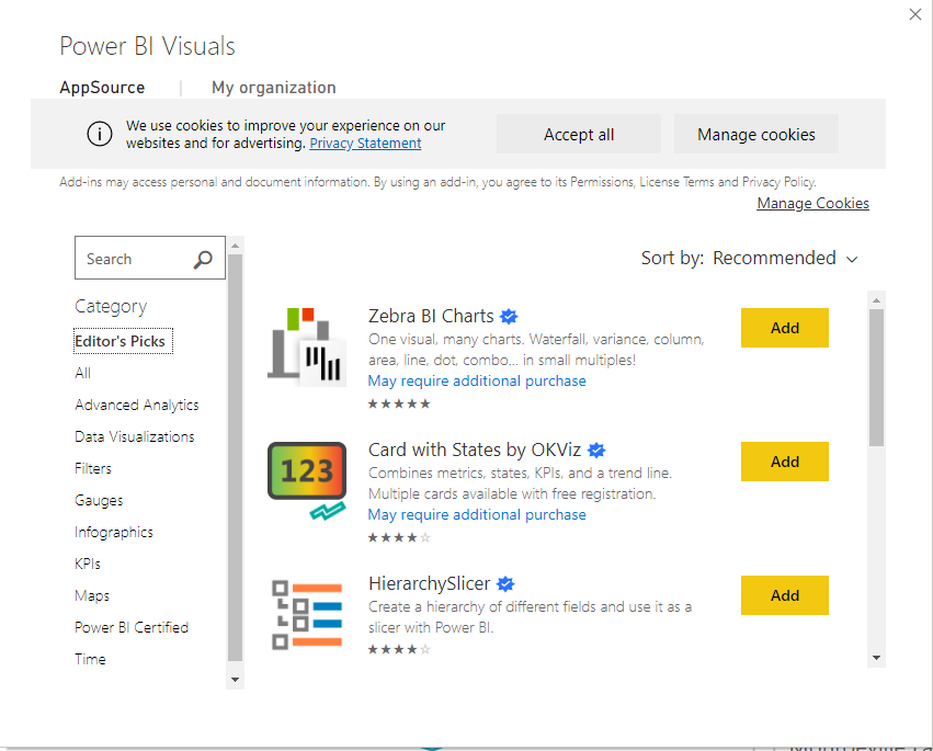
After you find the visual you want, just click on the Add button and it will be added to your Power BI project. You should probably click on Zebra BI, seen here among Editor's Picks.
Get started with the #1 rated Power BI visual
Zebra BI is an Editor's Pick on AppSource - used by over 1,500,000 users including Microsoft, Bayer, and Coca-Cola.
To help you start, we're highlighting some of the custom visuals that will make your reports stand out.
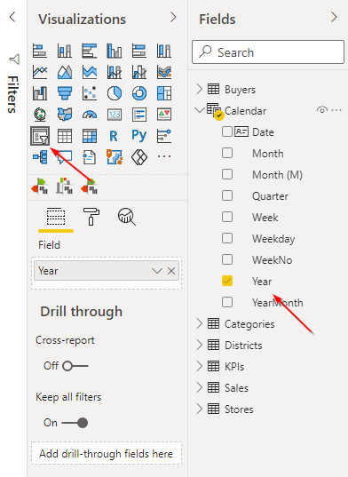
Power BI already has a built-in card element but Zebra BI Cards visual supercharges it. Instead of overloading your reports with separate visuals for each KPI, Zebra BI Cards enables you to add as many KPIs as you wish into one visual. You can then compare KPIs with Scaled groups, add up to three measures for comparisons, explore details with Drill-through and much more.
See Zebra BI Cards in action with your own data
Compare KPIs, add drill-through, and build executive dashboards - all from a single visual.
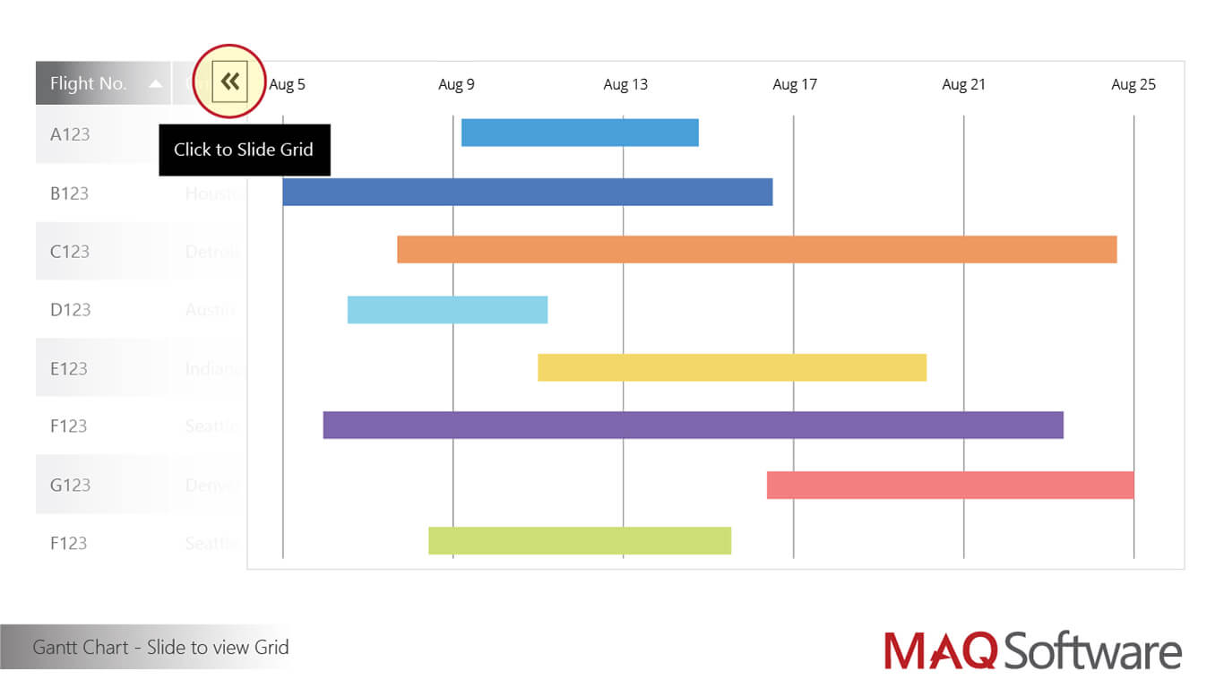
MAQ Software developed an upgrade to regular Gantt charts. It offers features such as the ability to view data related to the task and the hierarchy of data categories and to sort the data based on any data point contained in the task. The visual can be used by project managers to monitor projects as well as by users to view individual tasks and progress. These attractive charts will definitely help you improve your project management efforts.
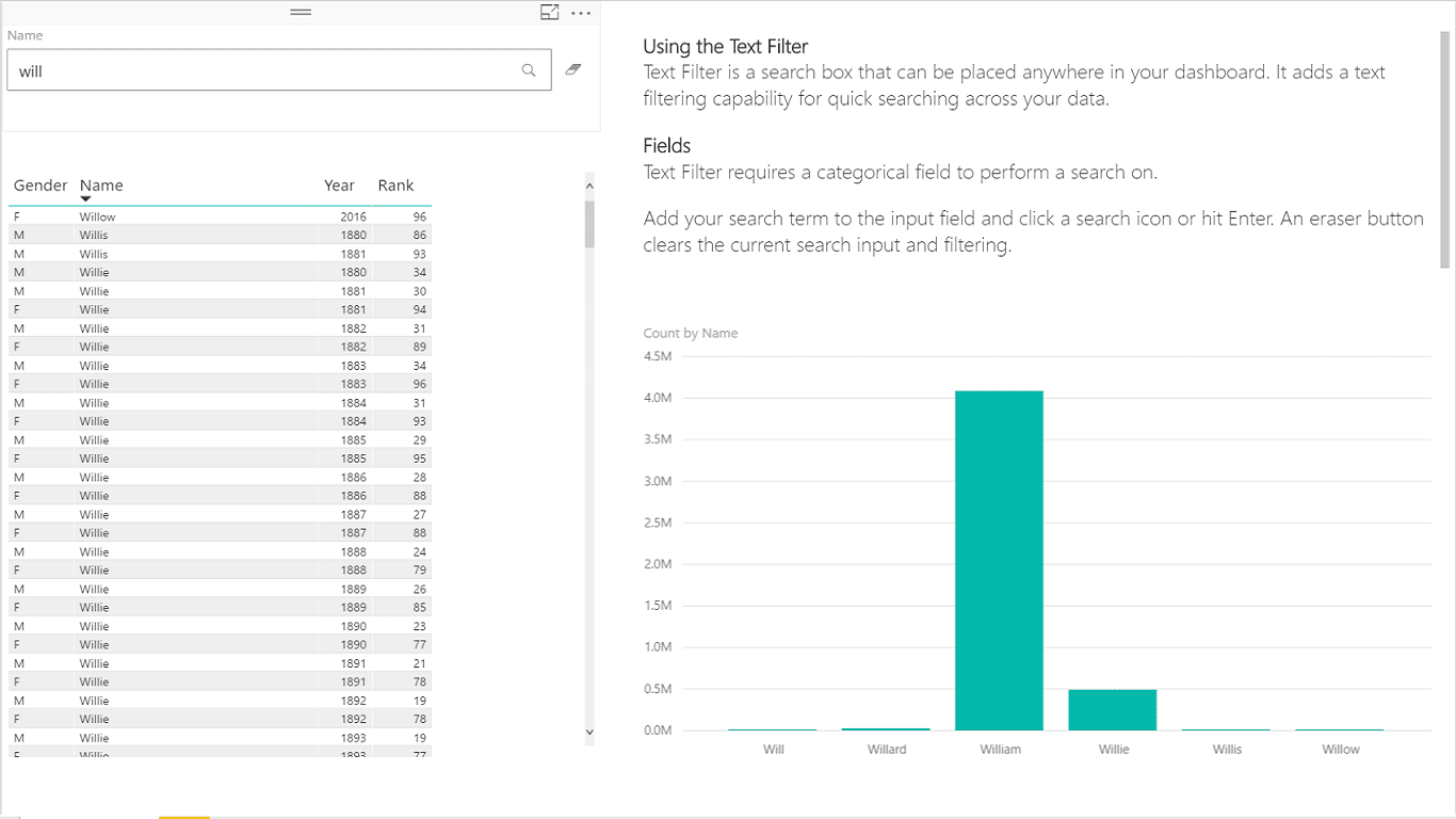
Sometimes the most powerful things are the simplest and this custom element fits this description perfectly. All Text Filter does is add a search box to your dashboard that you can use to filter your data. For example, we have a demonstration dashboard that displays information from hundreds of stores and to easily display just a subset of them, you need to simply enter some text, such as "new york" into the search box. The data is filtered in real time and helps you find specific content on your dashboard.
Like the previous item on this list, this is another custom visual developed by Microsoft. Since Power BI is a part of its Power platform, it's no wonder Microsoft added support for PowerApps. This custom visual makes it easy to bring forms and data editing to Power BI. You can even connect to external data, stored in services such as SharePoint, Dropbox, and MailChimp. It can be used to easily enter parameters for what-if analyses or to create an inventory dashboard through which you can place orders as needed.
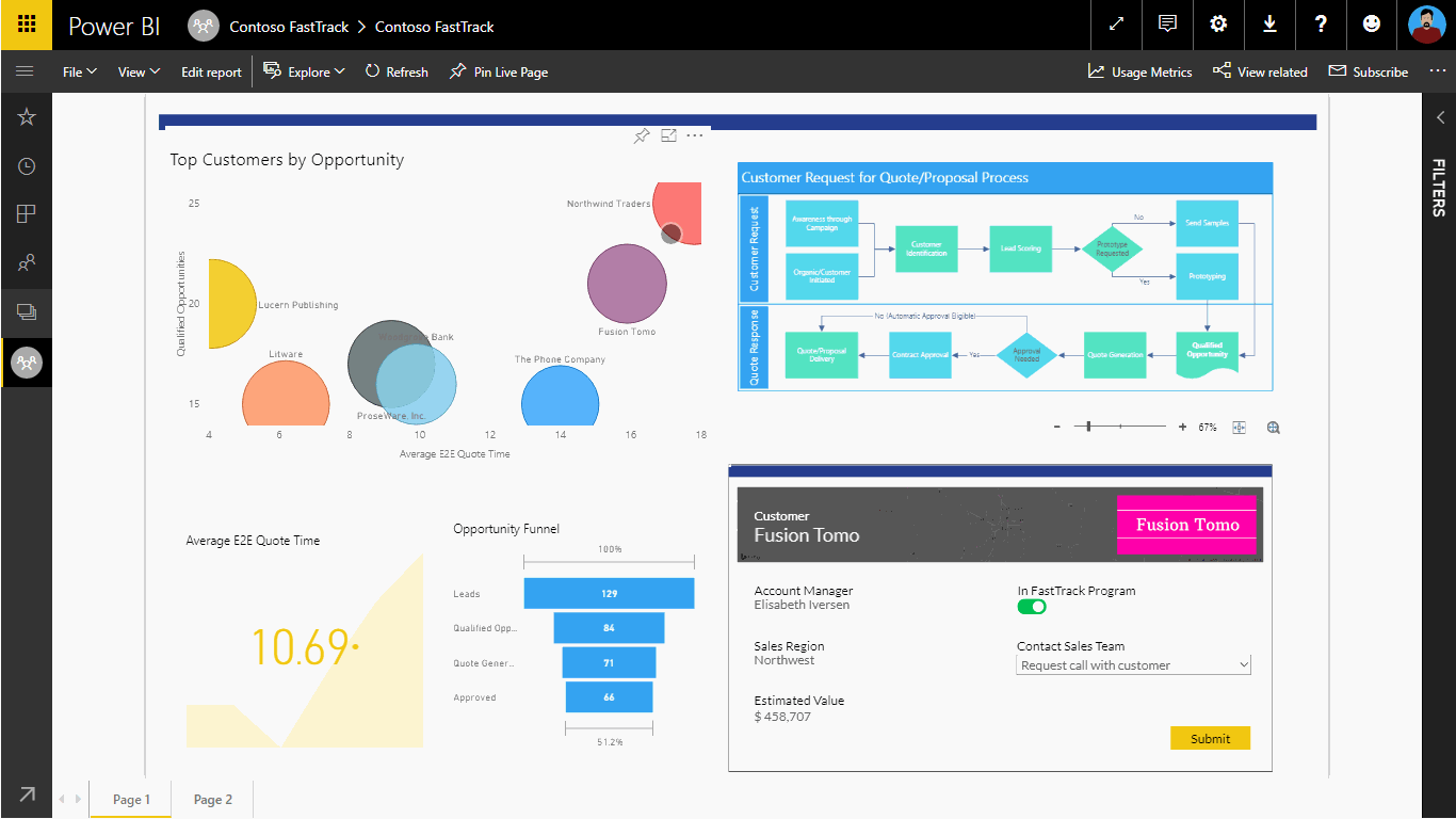
At Zebra BI, we recommend our customers add commenting functionality to Power BI using PowerApps. All you need is to create a simple app that is used to add comments, which are displayed as a tooltip or in a separate table. Currently, this is the only native option to implement live commenting in Power BI.
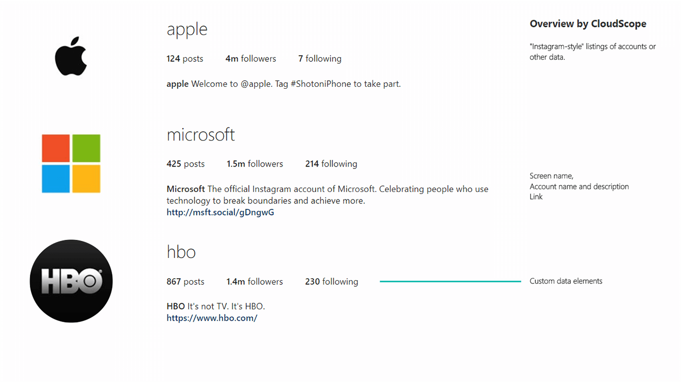
You could also go Instagram on your data. We don't mean filters but showing your list-oriented data in Instagram-like formatting. You can take data about companies and show their icons, names, hyperlinks and additional data fields and display it as an easy-to-read overview. This is exactly what Overview by CloudScope does. (Edit: Overview by CloudScope is no longer available on Microsoft AppSource.)
Build reports that drive decisions, not just display data
Zebra BI turns your Power BI dashboards into actionable, boardroom-ready reports in minutes.
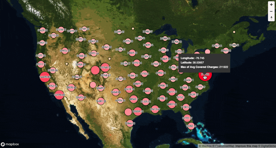
If you're working in multiple geographies, you often need a way to put visualizations on a map. Power BI can be extended with customizable heatmaps, point cluster maps, and graduated circle maps that are available in Mapbox Visual for Power BI. This plug-in allows you to overlay Power BI data on a satellite map. It offers several advanced features, including the ability to visualize data differently at different zoom levels through layers. In practice, this means that you receive more detailed data the closer you zoom in on the map.
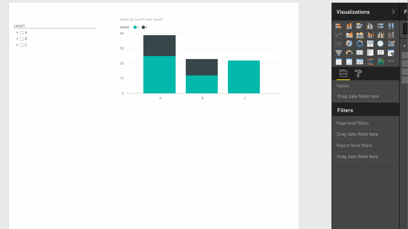
Slicers are a great way to switch between different filters, especially those that you use often. You might want to use more complex slicers and that's where HierarchySlicer comes in. It allows you to use a Power BI hierarchy as a slicer to filter other report items. You can expand individual levels to navigate through the hierarchy and you can use either predefined or ad-hoc hierarchies.
Arria NLG's add-in for Power BI automatically creates narratives for your data. It analyzes your data to create natural language narratives. You can set various configurations to select the level of detail to share or even use the NLG Studio to program your narratives down to the smallest detail. You can add your specific knowledge for your industry to drive compelling stories or just highlight the most important facts. This is truly one of the more interesting custom visuals out there.
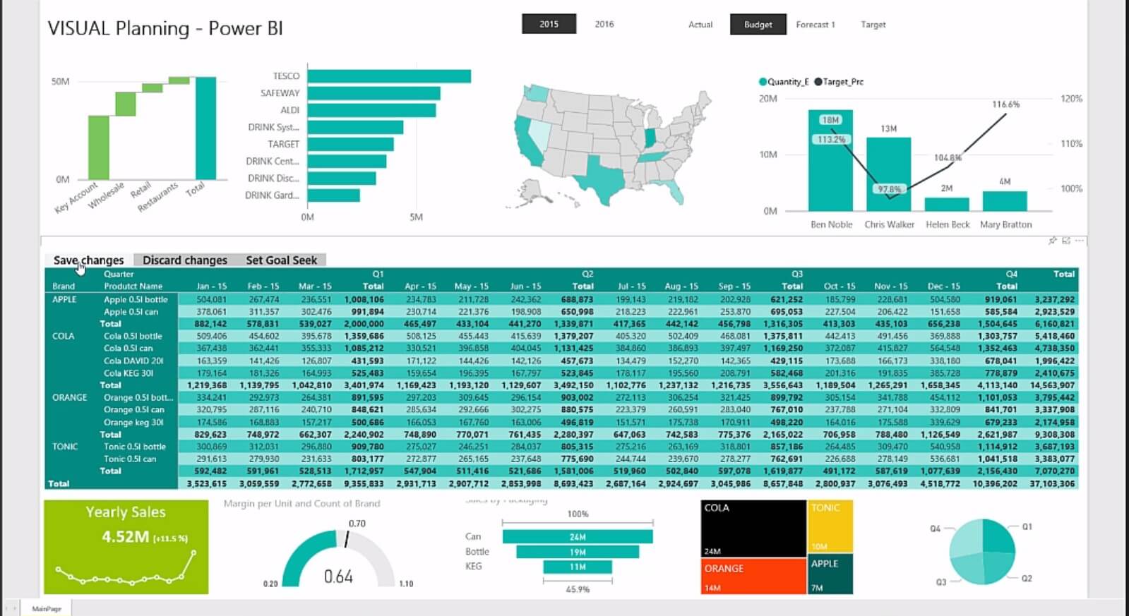
Power Planner Visual Planning is a powerful tool for budgeting, planning and forecasting. It allows corporate users to see a data visualization as they are entering data. When they change or add data in a dashboard or a report, it changes interactively. This makes it easier to adjust projections and forecasts and observe the impact immediately.
A list of custom visuals for Power BI would not be complete without our own Zebra BI Tables and Zebra BI Charts. These extremely advanced visuals enable you to create convincing financial reports that make a point and reveal hidden insights. They are the first and only IBCS®-certified visuals on the market and allow you to create complex visual reports that combine waterfall charts, small multiples and other advanced features. Fully responsive and interactive, they allow you to take meaningful decisions based on actionable insights.
Don't just take our word for it, go ahead and sign up for a free trial. The solution is so powerful even Microsoft uses it internally for their reports.
Hi, can I use Zebra BI visuals in paginated reports as well?
Thank you!
Best regards,
Martin
Hi Martin! No, custom visuals are not possible in the paginated reports.
nice post
Thank you 😀