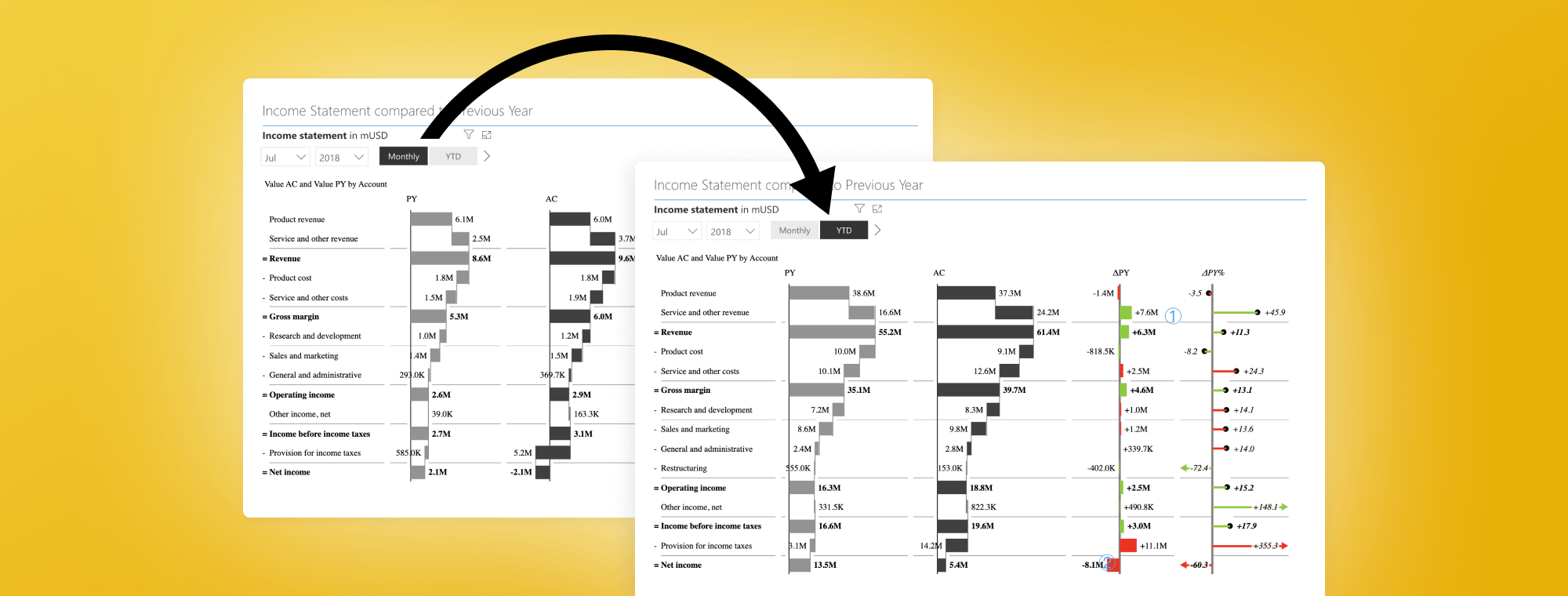
Burning Questions: How to Add a Monthly/YTD Switch to a Power BI Dashboard?
PRO Trial
One of the questions we get most often by our users is how to create a switch in their Power BI dashboard that would let them switch between Monthly and YTD views. You can do this by using Data Analysis Expressions (DAX), which is the formula language used throughout Power BI. This blog post will provide a quick overview of what you need to do to create a simple switch.
Before you start, download the examples from our webinar page for Top 5 DAX tricks for super effective Power BI dashboards. We also recommend that you watch the video as it also contains detailed step-by-step instructions for preparing your data and tables that are not covered in this post.
Start by opening the Sales Dashboard example (SalesDashboard-ZebraBI-webinar.pbix) from the zip file you downloaded. Open a new page by clicking on the + icon on the bottom of the start page.

The example already includes all the tables, relationships between them and code, so you just need to recreate the basic sales dashboard you will add the Monthly/YTD switch to.
Recreating the basic visualization
Start by recreating the main visual in your report. Add a Zebra BI Power Chart and select the following fields: Group under Business Units, Month under Calendar, AC and Revenue PY under Sales. Set them to the corresponding Fields as shown on the image below:
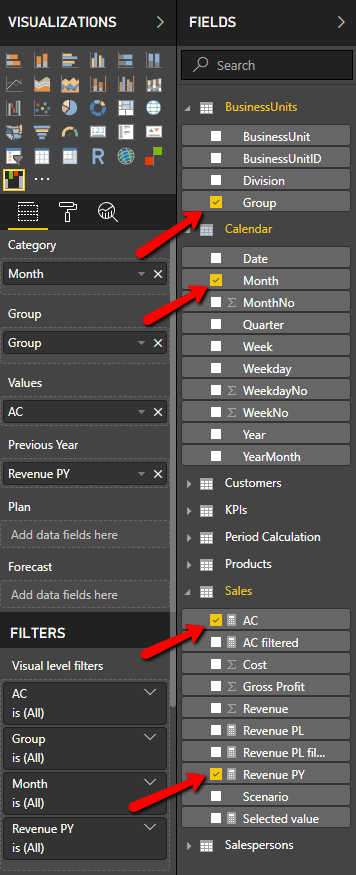
Now combine various visuals. For example, you can add a comparison to previous year using another dimension. Add a Power Table and select the fields as shown:
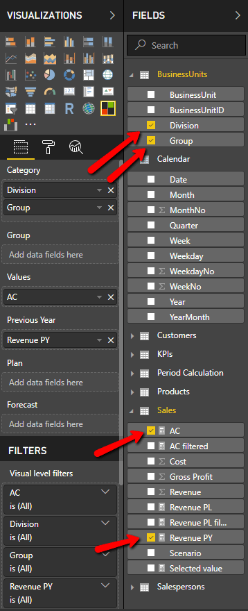
This table adds a comparison of actual results to the revenues from the previous year by individual product groups and divisions.

This visual is fully responsive and also controls the small multiples visual on the right that you've created in the previous step. If you click on a category, the chart on the right will change to display just the selected category or group of categories (division). With this, you've already created a great visual. However, we can make it better.
Adding slicers to your dashboard
The next step is adding two slicers: Year and Month that you can use to switch between views for individual months and years.
Click on Year field in the Calendar group and drag and drop it onto the dashboard. Switch it to the Slicer visualization and select Dropdown option from the menu.
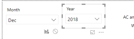
Add another slicer for months. Click on Month field in the Calendar group and drag and drop it onto the dashboard. Switch it to the Slicer visualization and again select the Dropdown menu item.
This will break your visualization. To fix it, you need to decouple the time series view from your slicer. Click on the month slicer and select the Format tab on your ribbon. Select the Edit interactions tool.
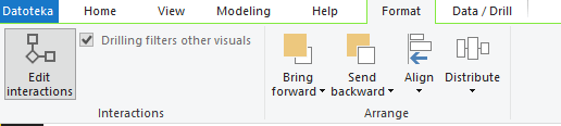
This shows additional controls on the dashboard, where you can control what impact the selected visualization should have on the others. To prevent the currently selected visualization element from impacting your small multiples chart, you should select the no impact icon.
Adding the Monthly/YTD switch to your dashboard
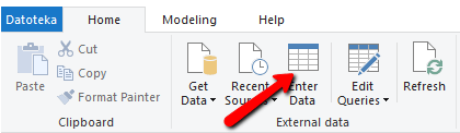
Now, we will add the Monthly/YTD Switch. Switch to Data view and add another table for the switch on the dashboard. Go to the Relationship view, where you will create what is called a "disconnected table" and serves as a switch between two values. Click the Enter Data button in the Home tab and name it Period Calculation in the Name field on the next screen.
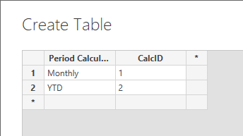
You need to create just two columns - Period calculation and CalcID.
You now have a new table in your project that is available for you to select in Report view in Power BI. Drag and drop the Period Calculation field onto the chart and switch it to a slicer element. You get two options - monthly and YTD. Switch to Horizontal orientation under General option in the Formatting tab.

You now have a slicer with two options (YTD and Month). You click between the two although the options do not do anything yet.
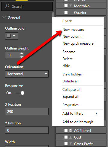
Create a new measure and name it Selected calculation. You will use the MIN function, which simply returns the smallest value in a column. Enter the following formula: SelectedCalc = MIN('Period Calculation'[CalcID])
All you have to do now is to link this back to your model. You need to take your AC measure and use the following DAX formula:
AC = SWITCH([SelectedCalc];
1; [AC filtered];
2; CALCULATE([AC filtered]; DATESYTD('Calendar'[Date])))
Just to explain briefly, what these functions do. SWITCH returns different results depending on the value of an expression, in this case AC filtered element in your project. If the value is 1, the expression returns the AC filtered value. If the value is 2 it calculates revenue to return the YTD value for which the DATESYTD function is used.
Make sure you download the free trial!
In addition to out-of-the-box support for IBCS standards, Zebra BI visuals for Power BI feature 1-click data sorting, powerful outlier handling, advanced small multiples, responsive visuals, improved navigation, and full customization. With support for Power BI, best practice reporting is now available on the desktop and mobile and in the cloud.
Hi ZebraBI,
is there also a solution for Month/YTD View when using ZebraBI-Chart FORECAST Logic? Forecast-Detection only works in MONTH View but when Switching to YTD View the values with forecast are no more detected because the actual YTD is for all month filled (even the months without sales)
Hi Jochen! Yes, it works the same also for YTD but the AC measure needs to be adjusted so that YTD shows only AC data until AC is available - and not until the end of the year (which replaces FC).