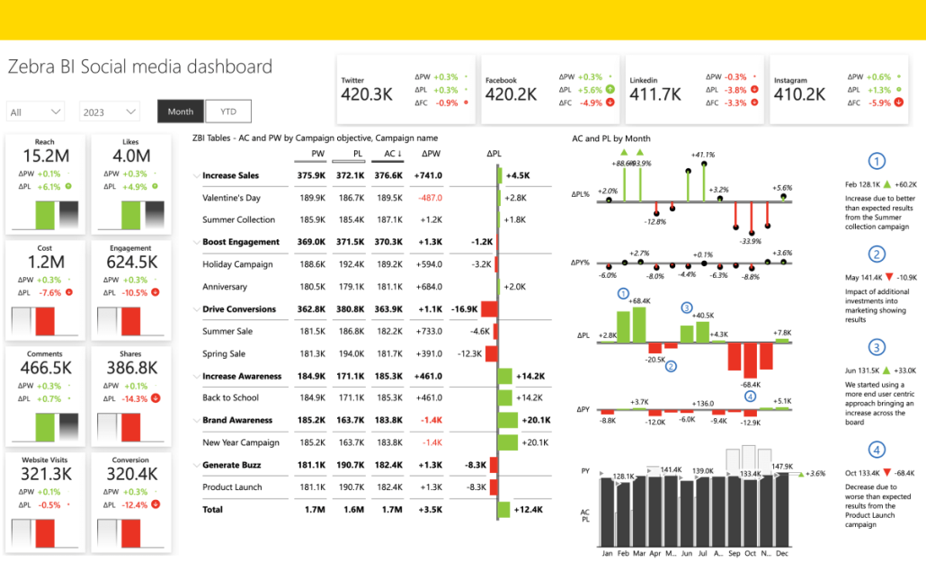
Zebra BI's Social Media Power BI Template provides a clear view of your online activity. Easily navigate key metrics and boost your social media impact.
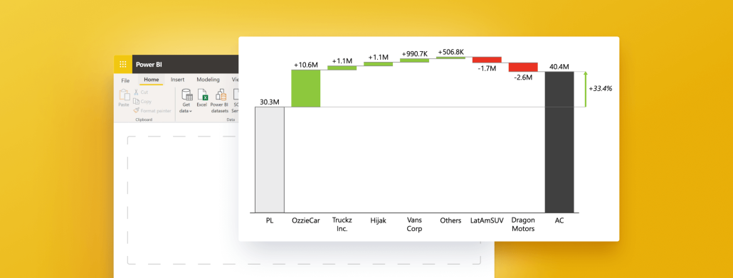
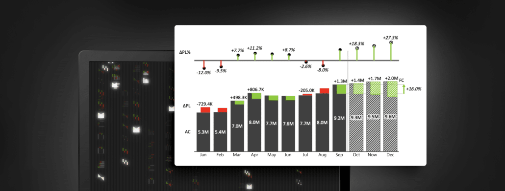
Need to understand waterfall charts (and quickly)? This guide explains everything you need to know about Power BI waterfall charts and their main use cases.
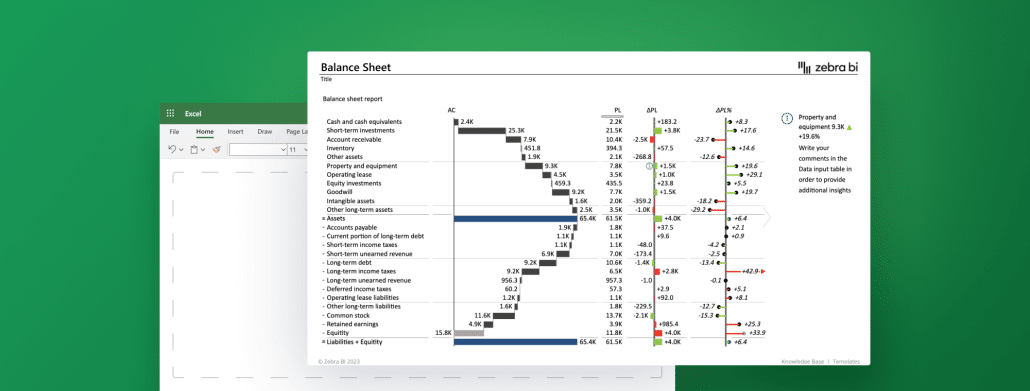
Conquer the creation and analysis of a balance sheet in Excel with our comprehensive guide. Learn to gather data, calculate ratios, draw insights, and present effectively.
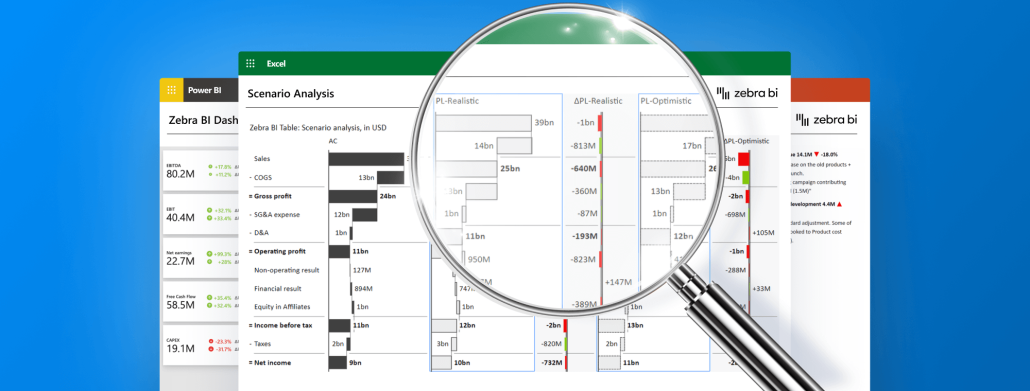
Unveil the future of business intelligence as we delve into data visualization using AI, revealing game-changing tools and a glimpse at what's to come.
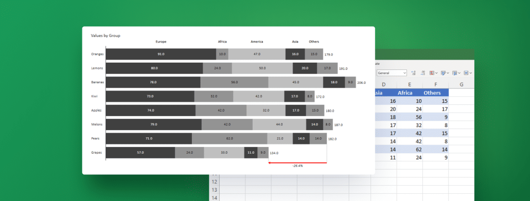
Stacked bar charts allow you to break down your data into segments, which provides your stakeholders with a comprehensive view of the information at hand. Learn how to create your best stacked bar chart in Excel with next-level features using Zebra BI for Office.
 September 8th
 February 22nd