 September 8th
 February 22nd
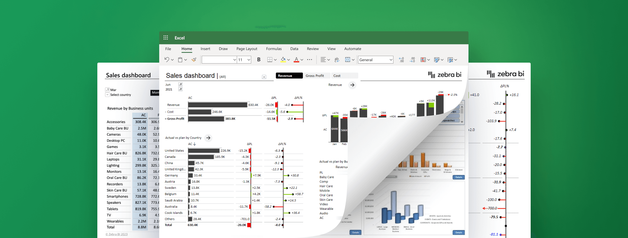
Best practices for using Excel for data visualization
This guide explores the best practices for using Excel for data visualization that has an impact and tells a convincing story.
Excel has been a mainstay of business visualization in companies large and small for decades. While it's certainly a powerful and flexible tool that can help business professionals understand and communicate data, it too often results in visualizations that are not actionable and fail to tell a coherent and convincing story.
Something like this.
In this guide, we will look at why data visualization is important and what are the most common mistakes you should avoid. Next, we'll look at the available tools and what you can do with them, followed by tips for standardizing your visualization for consistent reporting. The guide will also cover International Business Communication Standards (IBCS) that provide firm guidelines on designing your visuals. We'll finish with some of the best practices when using Excel for data visualization.
Why data visualization matters
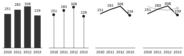
You know how they say a picture's worth a thousand words? It is completely true. A good visualization can communicate complex data in a simple way and can reveal trends and insights that would otherwise remain hidden in regular tables of numbers.
When you look at a table with data, it's hard to glean anything meaningful from it. If you want insight, you need to study it closely and carefully.
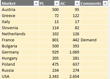
Now look at a visual created using this same data.
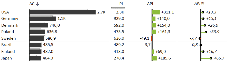
By including comparisons and variances, we're telling a much more interesting story from the get-go even though we're using the exact same data. A quick glance is all it takes to see the biggest gains and losses and the countries that contribute the most to your overall results.
That's why data visualization matters.
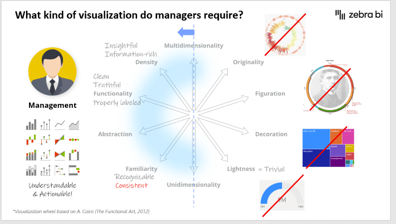
Key principles of good data visualization
A great visualization should follow some key principles to make sure it is understandable and actionable. It should deliver the right information and messages needed by business users to make decisions without obscuring the truth.
Here are the key principles you should follow:
Insightful. Visualizations should provide insight into data that may not be readily visible from raw data and give information about the things readers care about.
Information rich. You are striving for data density and you should put enough information on your dashboard to help readers make a decision. When thinking about data density, consider maps. A relatively simple map potentially has thousands of data points on a single page but it still helps you quickly find your way from one town to another.
Clean and truthful. One of the main risks with data visualization is that tools offer so many customization and design options that too often obscure the truth. Your goal should be to show the truth and let readers make their own decisions, instead of railroading them to what you believe is the truth.
Familiar. Use charts that are familiar instead of "creative" and use the correct chart type to convey a specific type of information. For example, a bar chart is a good choice when emphasizing individual values, while a line chart might be a better choice if you want the reader to focus on trends.
Consistent. This concept dovetails with familiarity. Using the same visuals for the same data consistently ensures your users recognize them and are familiar with them. This makes sure they understand your points more quickly.
Common mistakes to avoid
Choosing the right chart for your data and selecting the most salient things to visualise can be a trial-and-error process until you home in on the charts that help you get your message across. Here are some of the most common mistakes.
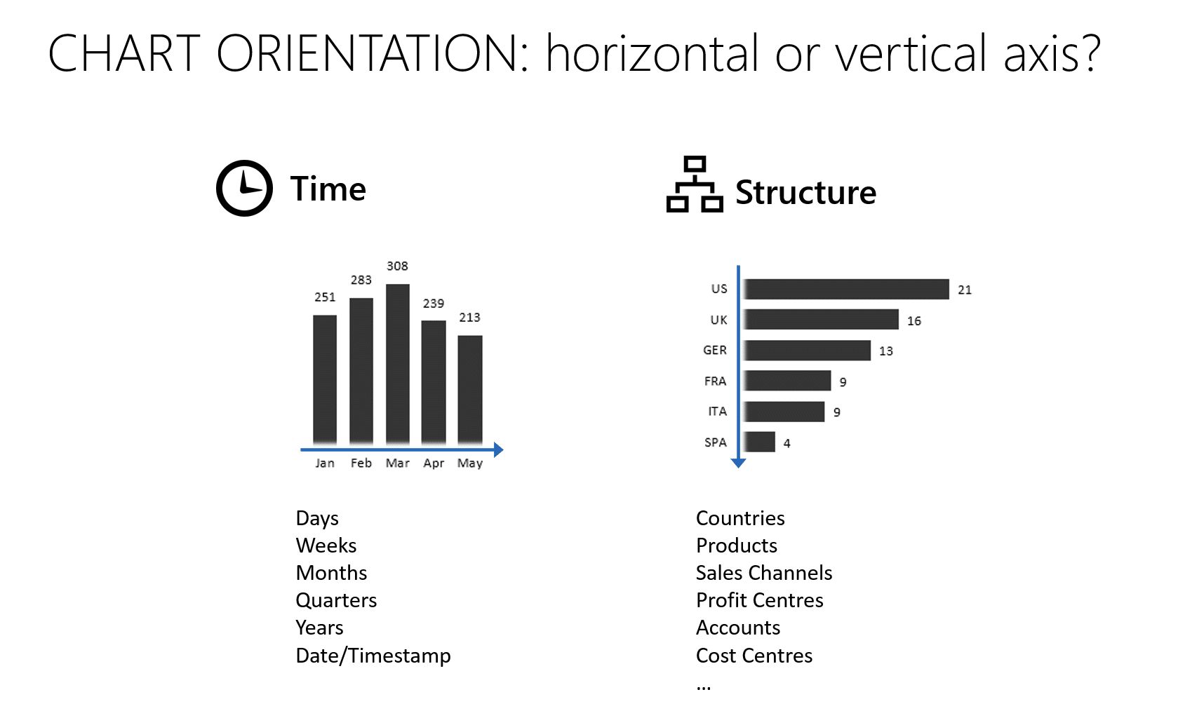
Mistake 1: Choosing the wrong chart
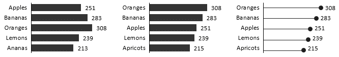
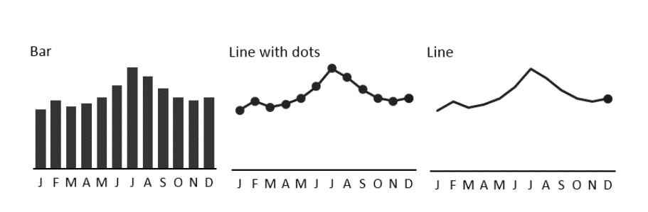
It turns out that for many users, wrong chart orientation is a big one. However, the rule for deciding is very simple. If you're presenting time, like days, weeks, months, years or other time series, use charts with a horizontal axis. For every other type of data, like countries, products, sales channels, and so on, rotate the chart to a vertical axis.
Mistake 2: Poor labelling
Getting the labels right is another challenge - you can have too few or too many. By leaving out labels, you leave your users guessing and confused about what data are your charts are really showing.
On the other hand, you should also avoid having too many labels. A good rule of thumb is that once labels overlap, you have too many.
Another quick point about labels - they shouldn't be diagonal, because that makes them hard to read. If you have to tilt your head to read your charts, you're doing it wrong. When faced with diagonal labels, you should rotate your chart to the vertical axis, so your labels are displayed horizontally.
A related point - shorten your month and other date labels, so they fit nicely on the axis.
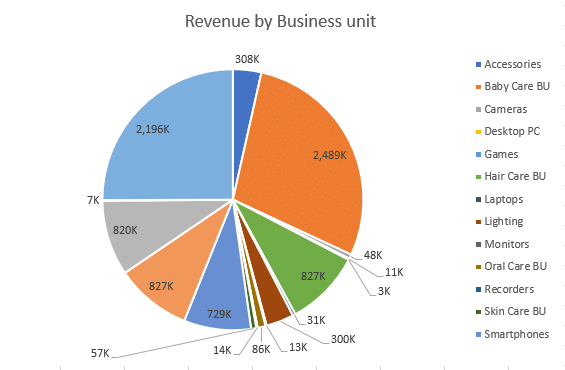
Mistake 3: Using pie charts instead of bar charts
Here's another simple general rule: don't use pie charts. They have many problems and limited utility. They are hard to scale and when showing multiple values, you are suddenly dealing with a flood of colours that make the chart more or less unreadable. They are most useful when showing two values in relation to a whole, giving them the classic "Pac Man look". There are very few instances, where a pie chart is the right choice.
Compare this pie chart:
with this bar chart showing the same data:
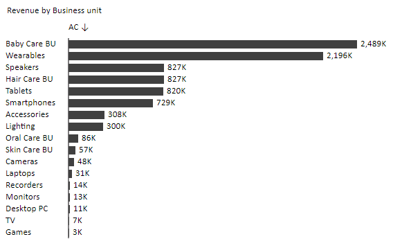
It's not even a competition. Bar chart is far more readable and clear. Plus, in real life scenarios bar charts take up much less space on the page, improving the information density of your visualizations.
Mistake 4: Misuse of colors
While colours make your charts look "pretty", they also make them less readable. When you use multiple colours, it is much harder to stay consistent and the same colour might represent different things on different charts. Colours should serve a purpose other than just decoration and should help tell a story.
Mistake 5: Missing variances
Charts without variances are not telling a story. Variance analysis is the most fundamental task in business reporting and understanding deviations from plans, forecasts and previous years is crucial for seeing the big picture and contextualizing your data.
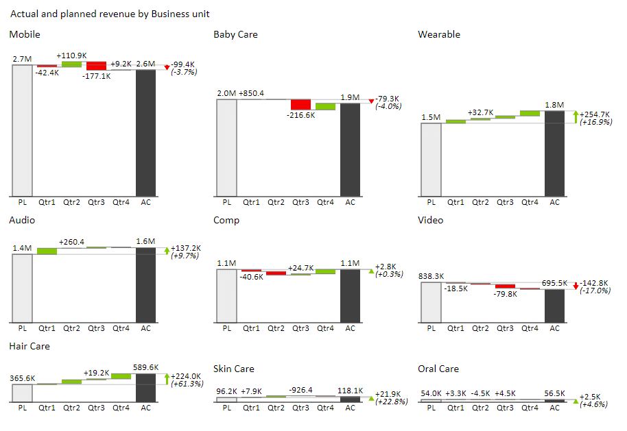
Mistake 6: Not scaling charts
Scaling simply means that the maximum of all the Y axes on the charts placed the same page is the same. This clearly shows the importance of each individual category compared to all others. The largest chart is showing the category with the largest contribution. An example of this in action are small multiples. The dashboard below makes it clear that Mobile is the largest business unit in terms of revenue.
Want to learn more about the most common data visualization mistakes in Power BI too? We have a guide for this--check it out!
Using Excel for data visualization
Without a doubt, Excel is the world's most popular tool for collecting, reviewing and analysing their business data. And despite the rise of dedicated visualization tools over the past couple of years, it also remains a popular choice for visual presentation of data.
However, despite its popularity, using Excel for data visualization can be ... shall we say, challenging? First of all, it can be hard to enforce consistency in Excel. Most users are visualizing data based on their best hunches and what they think looks good. That is how you get 3D pie or bar charts, colours all over the place and charts that are unsuitable for their purpose.
Another issue is that Excel simply isn't the right tool for some advanced data visualization tasks. While you can create waterfall charts, variance charts and small multiples, achieving the right results can be a major headache that requires hacks and workarounds that will come back to haunt you further down the road.
However, with just a bit of preparation, you can be an Excel visualization wizard that gets the right results every time.
Your first step is ...
Choosing the right chart for your data
With the wealth of available chart types and shapes it can be difficult to decide on the right one. However, we came up with a simple process that makes it easier to choose.
Chart orientation
We've talked briefly about this above but let's repeat the simple rule: Use horizontal charts for time series. Use vertical charts in all other cases. It doesn't matter, whether you're working with a bar, line or area chart. Using horizontal charts for anything other than time series will cause issues with labelling, spacing and many other issues.
Just keep it simple.
Vertical
Horizontal
Task for your chart
In this step, you need to decide what you want the reader to know. Let's look at a couple of core tasks you should consider.
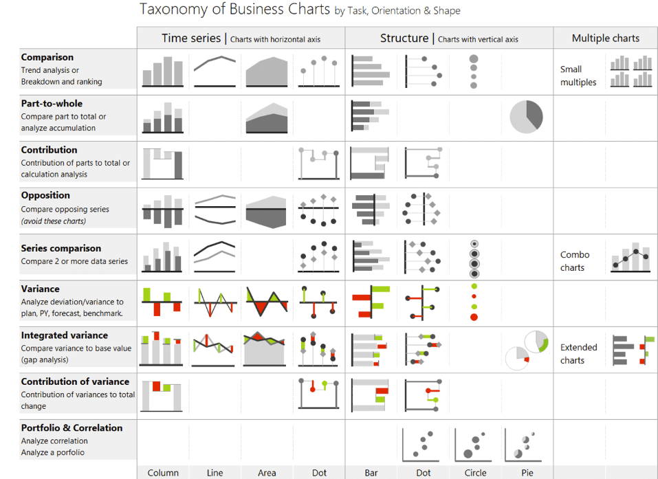
- Comparison. This is the most basic task for your chart and it allows you to compare values, rank them, identify patterns or look up a specific value. These are usually some type of bar chart that is then sorted or filtered in some way.
- Time-series analysis. We already know that when your categories are time periods (days, months, years, etc.), you should use a horizontal chart. This will help you compare individual values and spot trends in your data.
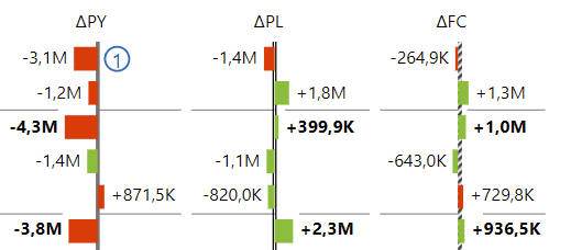
- Variance analysis. When you're working with related sets of data (for example, this year's and previous year revenues), you are usually interested in the difference between them or variance.
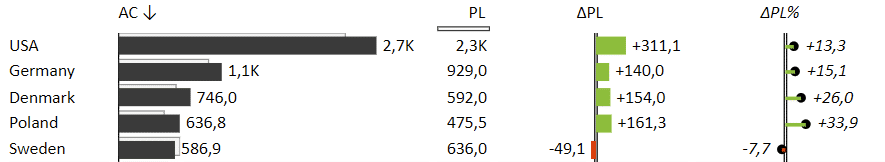
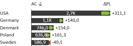
In this instance, absolute and relative variances are shown as separate bars. To save space, you could also choose a bar chart with integrated variance, like this:
- Contribution analysis. Sometimes, you're interested in how individual categories or variances contribute to the whole. For example, you could be looking at how P&L statement items make up the final result. In this case, we recommend a waterfall chart.
Here is a handy taxonomy of business charts that will help you decide:
The right shape for your chart
You should use different chart shapes for different types of values. For example, a percentage value can be shown with a thin line and a bubble at the end of it (a "lollipop" chart). Bars denoting revenue are usually thicker than bars used for showing price and so on.
You also need to decide whether you're emphasizing single values or trends. Bars will put more focus on individual values, while a flow of a line will emphasise a trend more clearly.
Turn to add-ins to get better results when using Excel for data visualization
The best thing about Excel is that you don't have to stick with the built-in charts and graphs. Instead, you can capitalize on Excel's expandability and download add-ins that will expand your visualization options.
Zebra BI offers two add-ins for Excel: Zebra BI Tables for Office and Zebra BI Charts for Office. Both add-ins offer a wealth of additional features that help you design better visuals and dashboards in Excel.
You can read more about them here:
Zebra BI Tables for Office was designed as an intuitive and powerful tool for visualizing tabular data and offers handy functionalities, such as automatic variance calculation and coloring, dynamic comments, custom formulas, top N data category filtering and advanced visual and formatting settings.
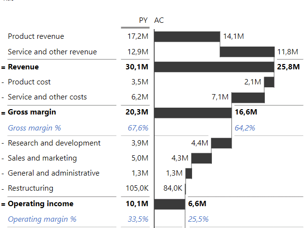
Below is an income statement showing most of these features.
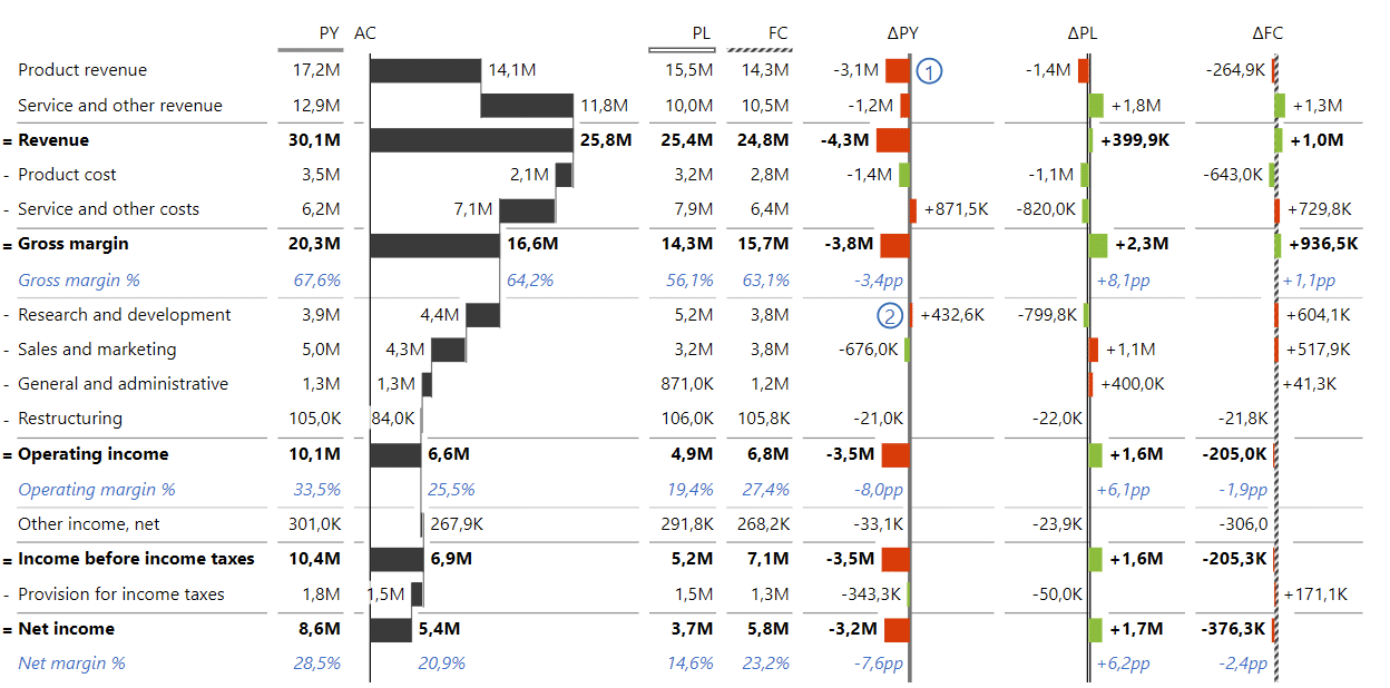
Designed as a waterfall chart, this table shows how individual items contribute to the final result and their variances compared to previous year, plan and forecast. There are also subtotals for groups of categories and formulas that calculate data within the table.
Zebra BI Charts for Office supports a number of different chart types, including column/bar charts, area charts, line, waterfall, variance, “hills & valleys”, dot, and lollipop charts. You can switch between them by clicking on slider buttons and select the chart that best reflects your intention.
In addition to offering a wealth of customization options, Zebra BI Charts also supports rendering small multiples, that is multiple charts on the same page to the same scale.
If you're interested in trying out these tools, you can sign up for a trial version of Zebra BI for Excel.
Implementing IBCS with Zebra BI in Excel
Let's turn our attention to the principle of consistency. The core value of consistency is that it drives efficiency and makes reports much easier to read. Think of it like musical notation - any musician can pick up a sheet of music and start reading it. Why shouldn't the same be true for business reports?
Zebra BI follows the recommendations prescribed by International Business Communication Standards (IBCS), created by Dr. Rolf Hichert in 2004. Essentially, this is a set of rules to help you organize, create and design your business communication.
IBCS builds on the work of some of the largest authorities and pioneers in data visualization. Implementing a recognized standard like this will not only help your company but also open up your colleagues' options for business reporting.
To get a feel what the standard covers, here are some IBCS recommendations.
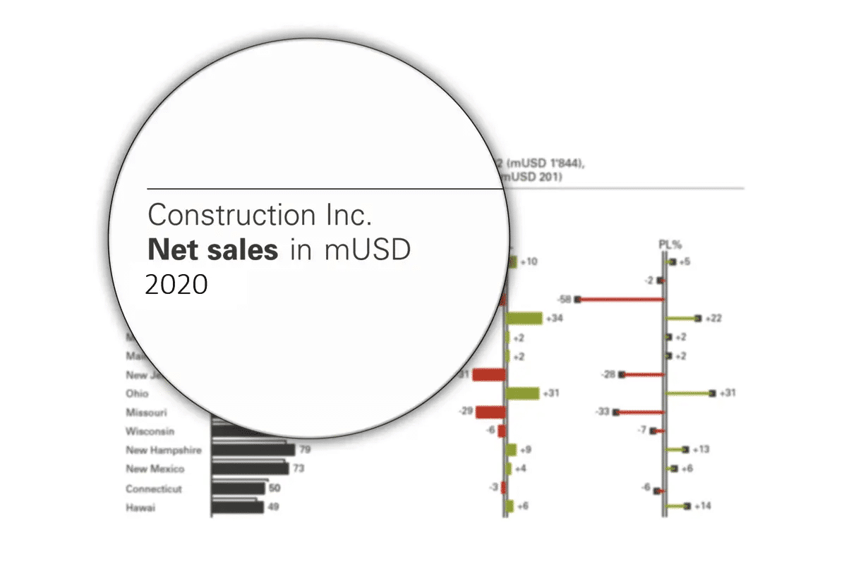
Unify the titles of your visuals. Include the following elements when naming your charts or tables: subject, measure with units and time period. Here is an example:
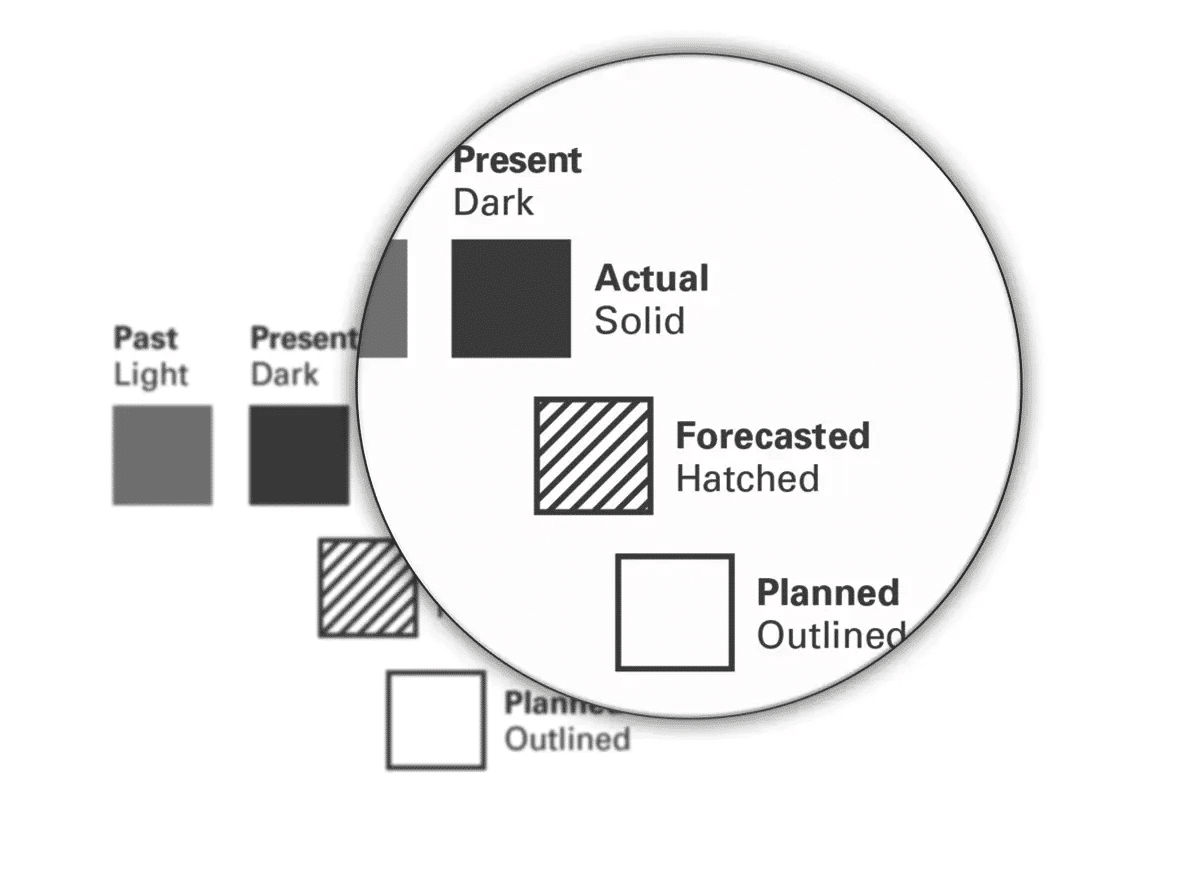
Use fill patterns to identify patterns. Instead of using colours, consider using different patterns for your bars. For example, a solid bar denotes actual values, while a hatched pattern fill is used for forecasts.
Highlight variances with green and red. As a rule, IBCS advises against use of colours that don't convey information. So, when variances are in question, you can use colours to great effect: red denotes negative variances and green denotes a positive variance.
Get your point across with highlighting. When designing dashboards, you can use highlighting to direct the attention of the reader. For instance, when showing a share price trend, you could highlight the difference between the highest point and the current value.
Scale properly. Being honest is important when designing charts and you should use the same scale for all charts on the same page.
To get a taste of the difference that IBCS rules and guidelines make, just take a look at this redesign of a typical business dashboard.
We went from this:
to this:
You can read the full story behind the redesign process in our article IBCS - Achieve Consistent Reporting Across Your Company.
Implementing IBCS when using Excel for data visualization
Let's look at some examples of reports following IBCS that were created in Excel. First up is an income statement with some advanced features, such as vertical waterfall charts, subtotals and calculations.
You should also note the use of variances for comparisons to previous year and plan data with green indicating positive developments and red showing negative movements.
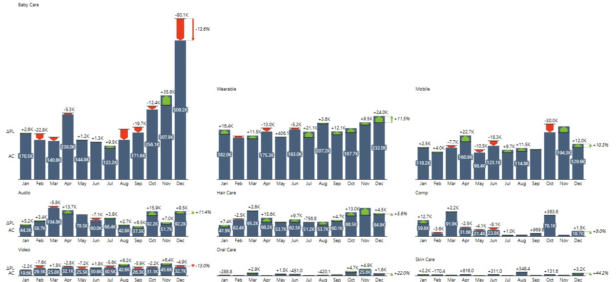
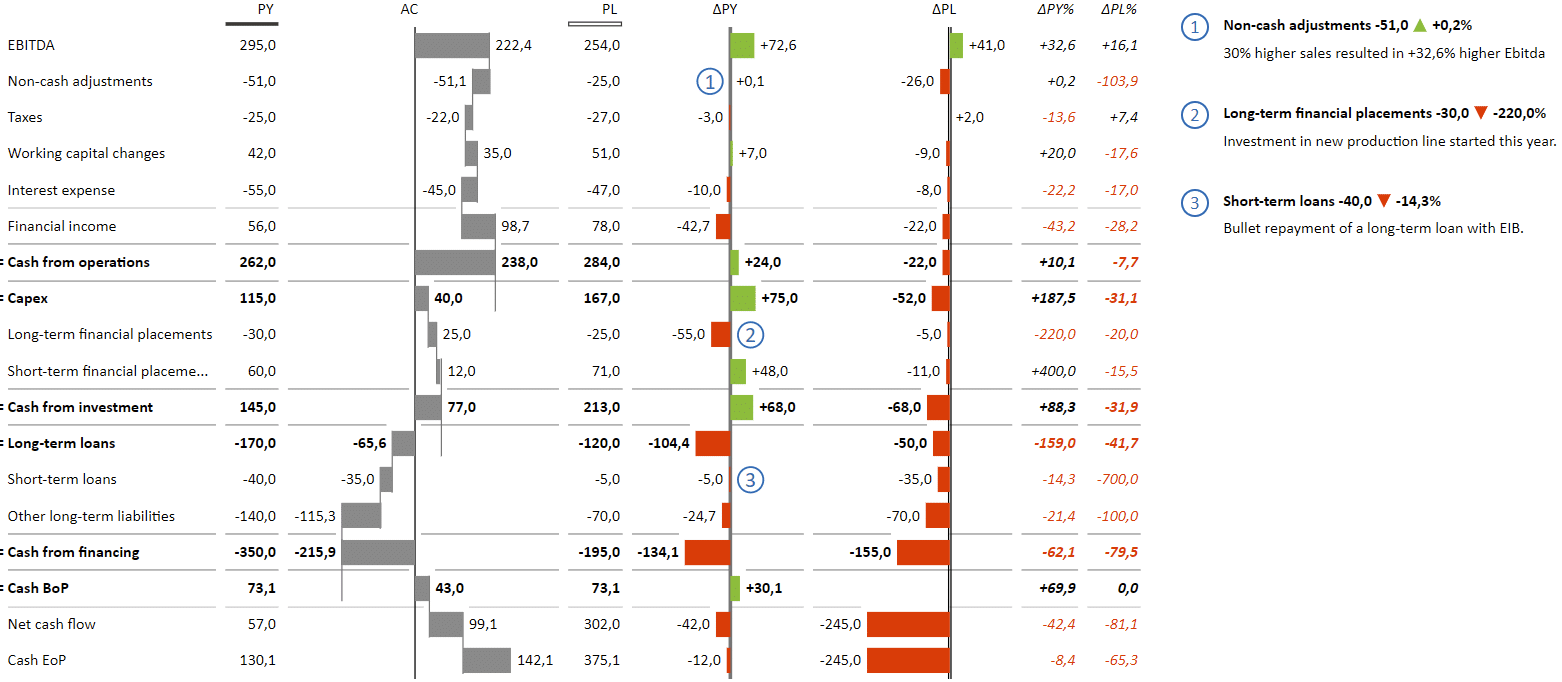
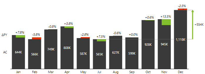
Next, let's look at a monthly sales variance analysis.
This visual highlights the use of several IBCS recommendations. Actual results are shown in a solid coluor and the hatched pattern is used for forecasts. Relative variances are shown with lollipop bars while absolute variances are shown as integrated variances on the bars. All of this makes for an easy-to-read and informative visual that combines several data points into a single image.
Bridge chart is another powerful visualization option. The purpose of a bridge chart is to help viewers understand how a value changed over time, and to highlight the contributions to this change. A good example of this is an EBIT contribution analysis:
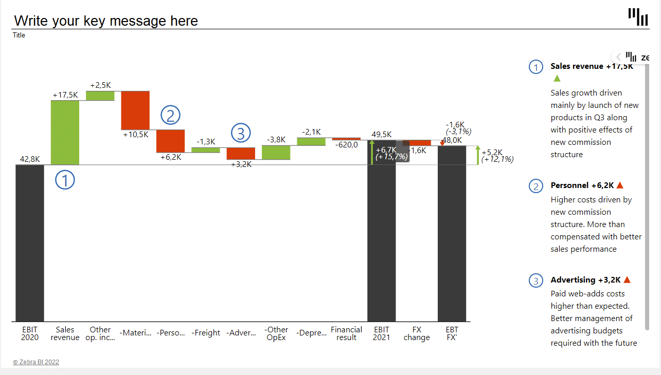
The chart shows starting and ending values and individual contributions. It also includes highlights of the variances to show the difference between the start and end values.
The final IBCS feature we want to highlight is small multiples. The Price-Volume-Mix Analysis shows you how price changes, sales volume, and product mix are affecting your revenue.
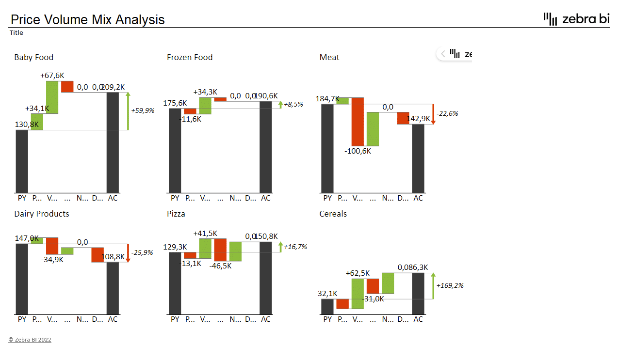
The small multiples view is the star of the show here. Several bridge charts for different product lines can help you understand your margins and product profitability better.
Best Practices for Excel Data Visualization
We know that using Excel for data visualization can be intimidating. Excel is a general purpose piece of software that offers something for everyone, which means that it can be overwhelming when it comes to specialized tasks, such as designing really effective and actionable visuals.
However, when setting out on your data visualization journey, the tool you'll be using should not be your first concern. Instead, consider the following:
- Think about your audience. Consider who will read the report and what information they need. Does the top brass in your company need to deal with the sales results for every single store or do they need a broader picture? Design your visuals accordingly.
- Keep it simple. Avoid clutter of any kind. Don't bury your data under unnecessary information and superfluous design choices. Allow the reader to focus on the important information.
- Minimize colours. While colours may look attractive, they very rarely add value to the visual. Instead of colours, use fill patterns that we covered above. Solid blacks for actuals, outlines for plans and hatched pattern for forecasts.
- Select the right chart orientation and type. We covered the basics of this process above . Think about the task you want your chart to perform and consider what you want to emphasize.
- Use appropriate scales and axes. You want your charts to represent information honestly and don't want your reports to be misleading. Do not truncate axes and make sure all charts with comparable information are using the same scale.
Staying clear and concise
One of the key strategies in data visualization is to keep your charts and tables clear and concise with minimal use of colour. Let's look at some of the best practices you can follow.
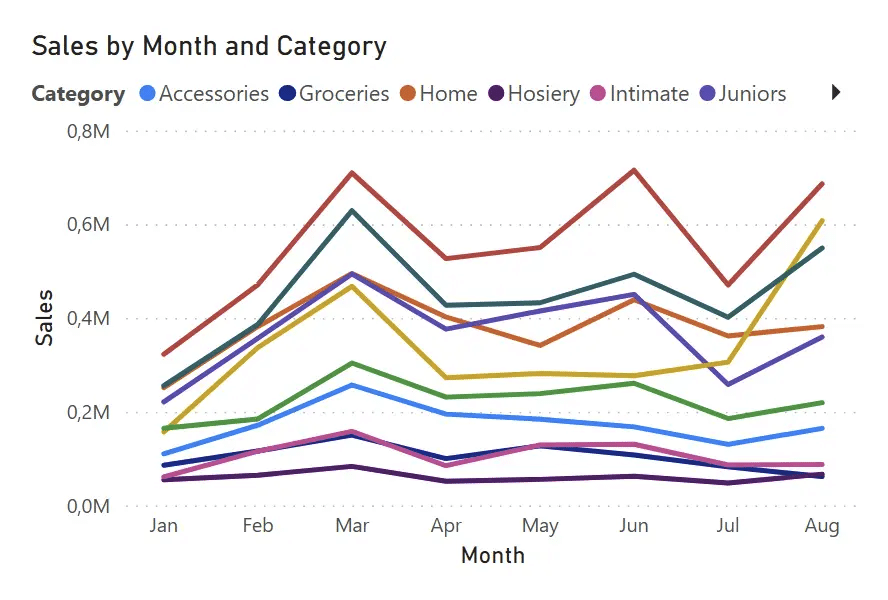
When it comes to visualizing comparable data sets, such as sales by category, users often decide to use a line chart with coloured lines representing individual categories. We call this "the spaghetti chart".
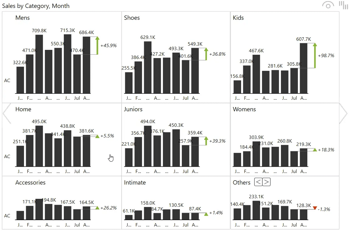
A much better and clearer approach is to use small multiples with nine separate charts, each showing individual values. Since all of them are to the same scale, you can easily see which ones are the most important and which are the smallest.
Maybe, you feel that having nine charts doesn't really meet the criteria for "concise" and you feel it takes too much space. In this case you could just show those values that contribute significantly to the final result. Zebra BI for Office has the Top N feature that allows you to show only the top 5 (or more) products, while the others are grouped together under the Others category.
You also shouldn't neglect labels. Think about what kind of labels you want on your data. Will they be showing values and variances and highlights?
To keep things organized and neat you might want to decide to omit certain labels and only show the first and the last value or maybe the first, last, minimum and maximum values. This makes sure your readers aren't overwhelmed with information.
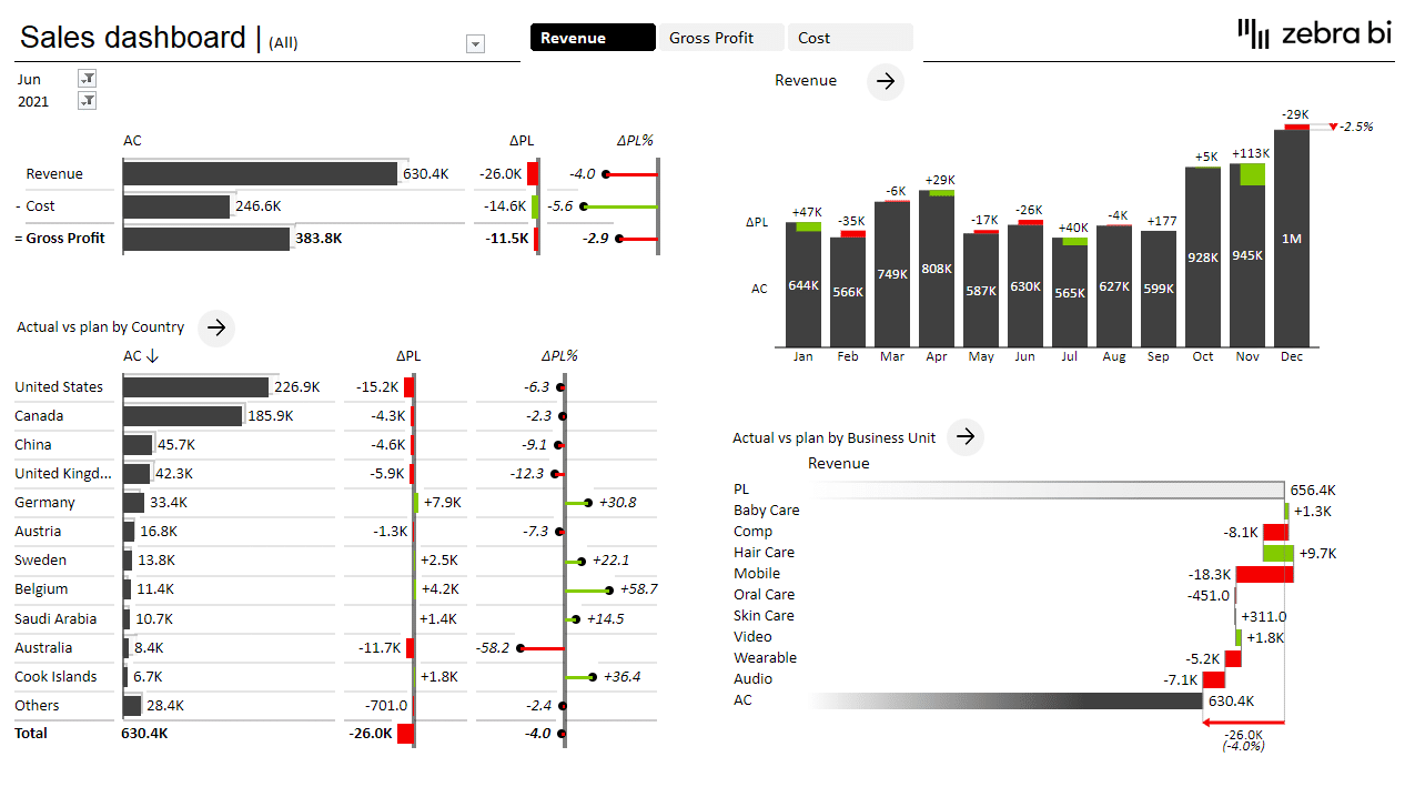
Another way to help the reader understand data is to use totals and calculations in your visual. Let's take another look at the profit and loss statement we've covered above.
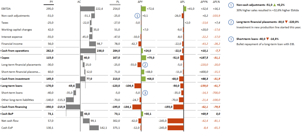
We've included several subtotals, such as Cash from operations, Cash from investments and Long-term loans. These are useful when you want to show an intermediate result within your chart before the final result.
If you're using Zebra BI Tables, you can also include calculations that are done using table from the data.
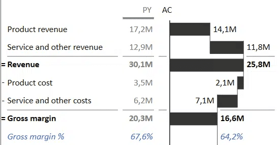
This way you can provide the reader with additional information that is calculated on the fly using a formula. Ratios like the Gross margin percentage are very important in business reporting as they demonstrate a company's ability to turn a profit.
Another thing you can do to ensure your charts are as informative as possible. Include comments. You can use them to explain unexpected spikes or dips in your data or provide additional context.
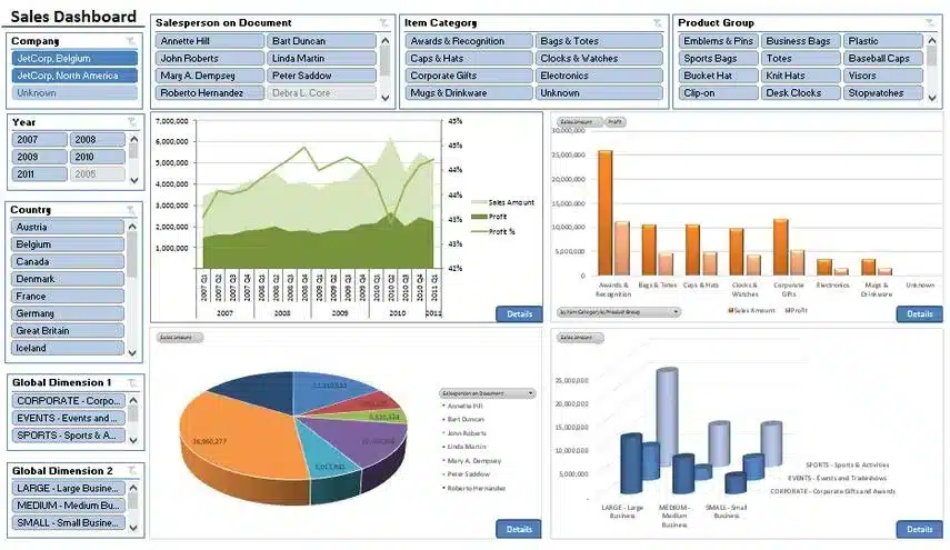
Creating interactive dashboards
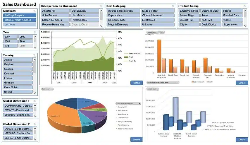
You can use Excel to create interactive data dashboards where you can easily change or adjust the data shown using filters. An example would be a sales dashboard where you can switch between years, months and KPIs and then move on to another page in the dashboard to review additional data with the same filter applied.
Here is an example.
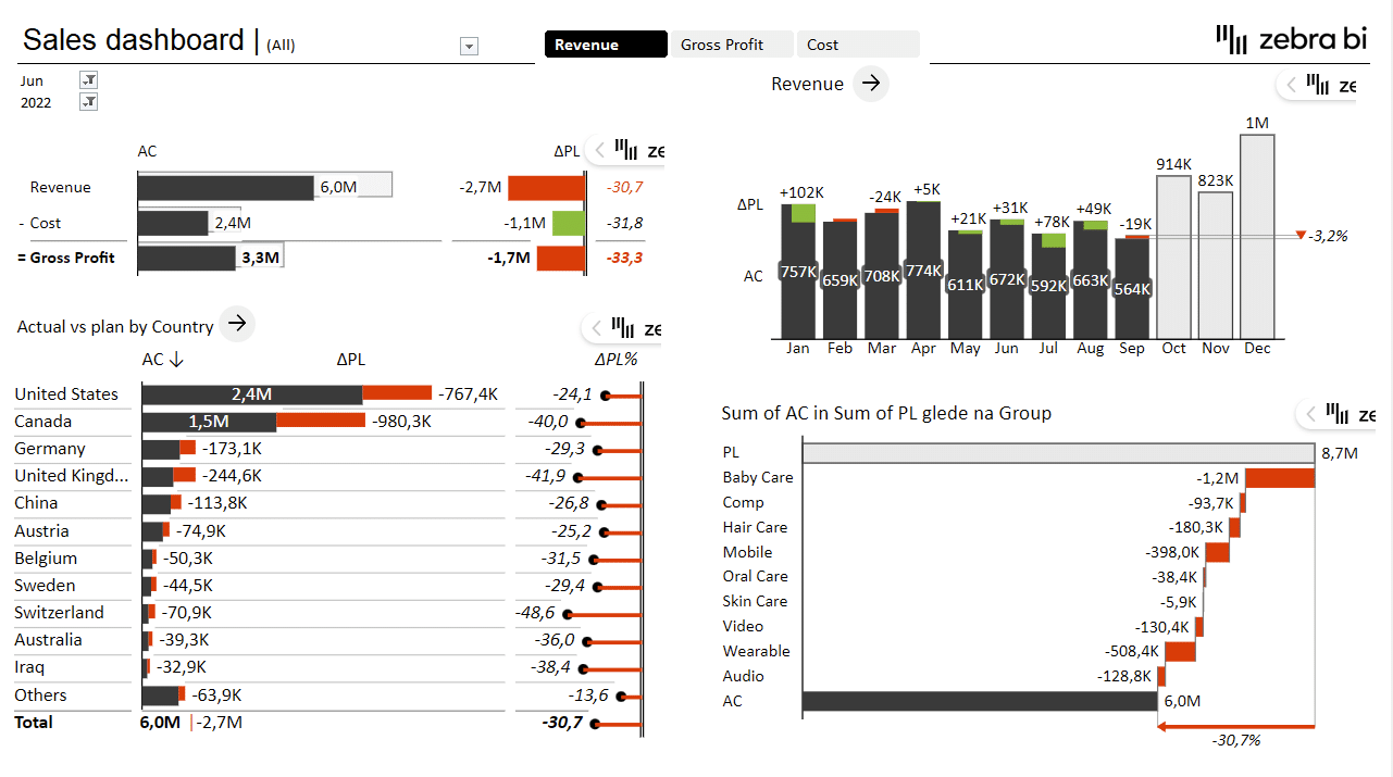
This dashboard displays three key KPIs - revenue, costs, and gross profit - broken down by countries, product groups and time. It utilizes most of the concepts that we've discussed in this post previously. There is a time series to show revenue over time, a bar chart to show results by countries and a waterfall chart to show how product categories contributed to the total.
However, this dashboard also allows you to manipulate the view. You can switch between individual KPIs (revenue, gross profit and cost) and select the month and year for which you want to review data.
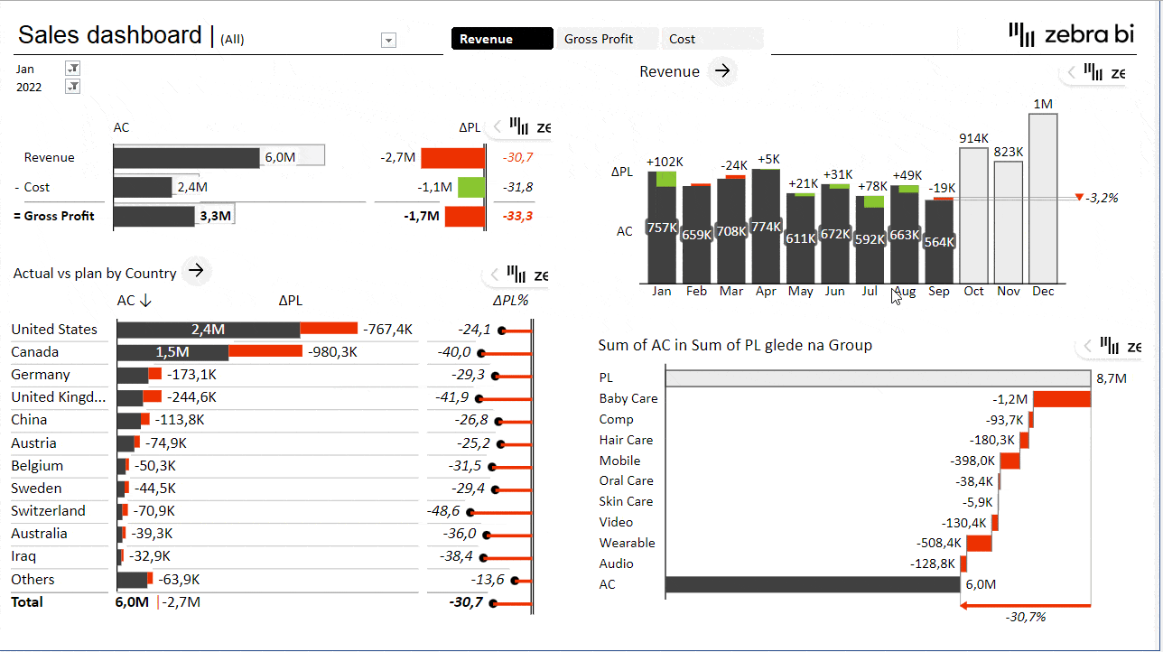
This ability to switch between views requires a couple of advanced techniques using PivotTables and slicers. You can read more about creating it in our article Must-Know Tricks for Interactive Excel Dashboards in 2023.
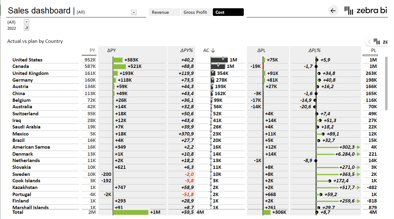
Another important part of having an interactive dashboard is providing a way for users to navigate through the report to drill into more detailed data. You can achieve this by using hyperlinks that link from the main page to the relevant pages in your report.

Once a user clicks the link, they are taken to a page with a detailed breakdown of sales by individual countries.
Conclusion
Excel is a valuable tool for data visualization, but creating effective visualizations requires more than just technical proficiency. Zebra BI for Office add-ins enable you to automatically follow the best practice principles of data visualization and IBCS guidelines. This enables you to effortlessly create impactful and meaningful visualizations that support decision-making and drive results.
Are you ready to get started?
Try Zebra BI for Office for free & automatically receive an instructional file that will help you kick off your data visualization journey in Excel.