September 8th
 February 22nd

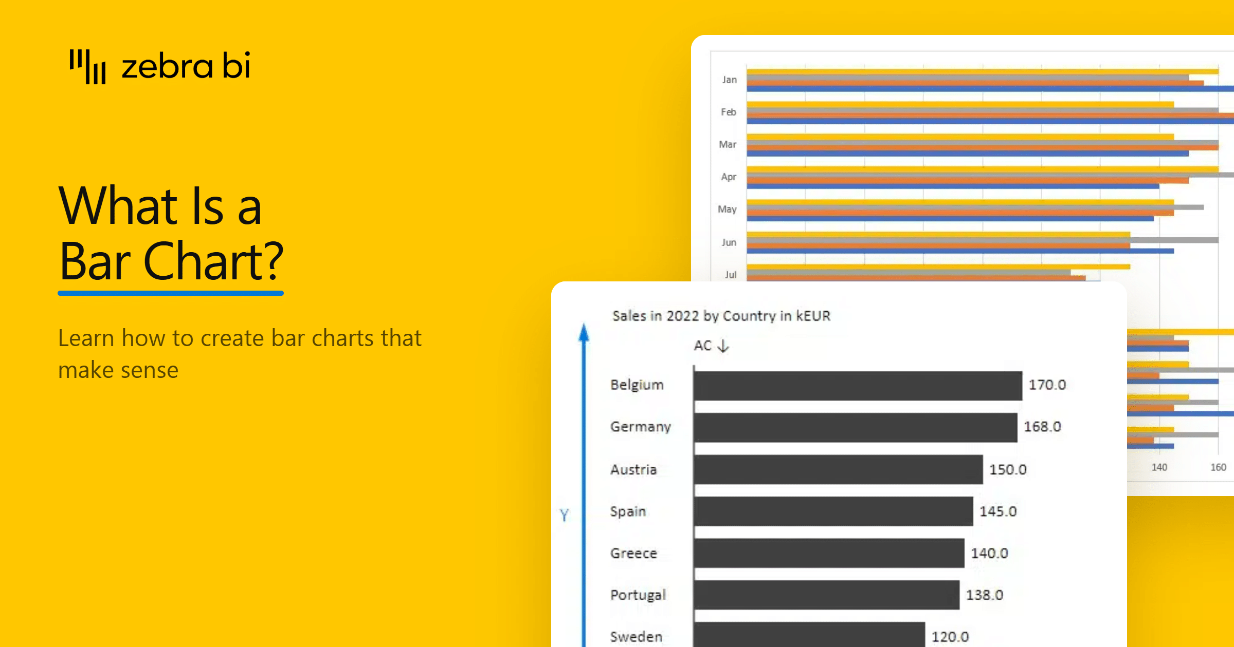
What Is a Bar Chart? When to Use One, and How to Draw It Properly
You want to compare revenue across 3 regions. Should you use a bar chart because it's the right choice or because it's the default choice in your team?
A bar chart (or bar graph) is a visual that compares values across categories using rectangular bars, where the length of each bar represents its value. Category names sit on one axis, values run along the other, and every bar starts from the same baseline. Bar charts are efficient for comparing numbers due to one simple rule: the longer the bar, the bigger the number.
In this guide, we'll explain how a bar chart works, when to include one in your reports, the different types of bar charts, and the mistakes to avoid when creating one.
What is a bar chart?
A bar chart is a visualization tool that compares a single measure across a set of categories. Usually, categories run along one axis, and values are placed on the other.
Keep in mind that a bar chart is a comparison chart, not a trend chart. It shows how things stack up against each other at a specific point in time, which makes it a common choice for ranking multiple categories.
The bars are drawn apart, with small gaps between them, with each bar standing for one category and its length indicating the category's value.
Bar charts are also known as bar graphs or bar plots, but they all describe the same chart.
PRO Trial 14 DAYS, NO CARD
Bind last year, or plan, or a forecast to its own field. Zebra BI Charts draws the variance, labels it, and puts the percentages on pins instead of bars. It's a paid custom visual, and the trial needs no card.
Bar chart cheat sheet
Bar chart details
Doing its job
Time to switch
Broken most often
What is a bar chart used for?
You can use a bar chart to compare a measure across categories and highlight the ones that stand out. Here are 5 cases when a bar graph is the right choice for the job:
1. Compare values across categories
You can easily compare revenue by region, headcount by department, or spend by vendor using a bar chart. Each bar represents a category, and your readers compare the bars' length instead of looking through a column of figures.
2. Rank multiple categories
Sort the bars by value, so readers immediately identify the largest and smallest categories. If there are too many categories on your chart, list the top 5 and group the rest into an "Other" bar. Then, include a full breakdown in a table or a drill-through for anyone who needs more information.
3. Show parts of a whole
Split each category of your bar graph into segments, and you get the composition and the total in one picture. It works with a maximum of 3 segments. Past that, the middle segments float and become difficult to compare. When the split matters more than the totals, use a 100% stacked bar instead.
4. Count how often something happens
A bar chart also works when you keep track of how often something happens: support tickets per product, customers per pricing tier, survey responses per answer option, and so on. Each group gets one bar, and the bar's length is the count you have to analyze.
5. Track progress against a target
Use a bar graph to show how far along something is: quota attainment by sales rep, budget spent by department, completion rate by project.
Every bar shares the same scale, so you can tell who's on track and who isn't. Draw a line at 100%, and the bar chart shows you which projects hit the target and which ones need your team's attention.
When you shouldn't use a bar chart
A bar chart is great for comparing named categories, but it's not the best choice in several cases. So, you need a different chart if:
Your categories are time periods. Months and quarters belong on the horizontal axis so they read left to right. If you want to highlight a trend, use a column chart or a line chart.
You need to explain what changed. A bar chart shows you the values, not the movements between them. To show how a total went from one figure to another, use a waterfall chart.
You only have one number. You don't need a bar graph if you have nothing to compare. Instead, use a KPI card so your report readers get the most important information upfront.
Bar chart best practices
A bar chart is easy to build, and even easier to get wrong. Here are 5 rules you can follow to make sure your graphs are useful:
1. Sort by value
A bar graph with alphabetical order only helps you find a category by name. It doesn't show which categories are the biggest, smallest, or furthest from plan.
To keep your report easy to read, sort the categories by value for a standard comparison. If your bar chart includes a target, sort by variance instead, and the biggest gaps move to the top.
However, there's one important exception to the rule. When working with categories like age bands or rating scales, keep the original order even if it puts a small bar at the top. Reordering the categories by value would change your graph's meaning.
2. Start the value axis at 0
If your axis doesn't start at 0, every gap on your bar chart looks bigger than it is. Keep the same scale across charts that share a unit on the same page, and skip the logarithmic axis.
To make sure your graph is accurate, add the same 2 values to different categories. If one looks twice as long as the other, your axis is starting above 0.
3. Draw absolute and relative variance differently
If your bar chart shows absolute variance, it should use the same unit as the value it came from. For example, if your sales are in EUR, the variance should be in EUR too. Draw both at the same width and on the same scale, so your reader can compare their lengths directly.
Relative variance is a percentage, a different kind of number. Drawn as a full-width bar, it looks like an amount, and your readers will read it as one. Draw it as thin pins instead, so the two are easy to tell apart at a glance.
One more thing: don't clip a long bar just to make it fit. Clipping a bar takes away the visual comparison and makes your bar chart misleading. Instead, increase the chart size or adjust the scale so everything fits. If one category is genuinely much bigger than the rest, use an axis break.
4. Keep the bar chart labels readable
Limit your labels to 3 digits and use prefixes like K or M because "6.5M" reads faster than "6,500,000". Also, use the same color scheme for your bar graph. If green means favorable and red means unfavorable, add a sign, the label position, or a pattern so the meaning is the same for readers who can't tell the two apart.
5. Use the same notation
If your bar chart shows more than one scenario, give each one its own fill. Actual as a solid bar, previous year as a lighter solid, plan as an outline, forecast as hatched. Your readers can then tell which bar is which without checking the legend.
Types of bar charts
Chances are, you heard there are only 3 bar chart types: grouped, stacked, and 100% stacked.
The truth is that these 3 bar graph types only describe what happens when you add a second series to your chart. Depending on how you sort your bars and what you show next to them, there are more bar chart types you'll use in your reports:
| Type | What it draws | When to use it |
|---|---|---|
| Ranked bar chart | 1 measure, sorted by value | A standard category comparison |
| Grouped bar chart | 2 or more series side by side | Comparing series within each category |
| Stacked bar chart | Series placed end to end, with totals visible | Showing a total and its composition |
| 100% stacked bar chart | Every bar set to the same full width | Comparing the mix when totals don't matter |
| Variance bar chart | The difference from plan, previous year or forecast | Showing whether a result is good or bad |
| Overlapped bar chart | A reference bar behind the main bar | Comparing 2 values without doubling the bar count |
| Small multiples | The same bar chart repeated for each category | Showing many categories on a shared scale |
Bar charts in Power BI
Power BI has a native Clustered bar chart in the Visualizations pane. Place the category on the Y-axis and the measure on the X-axis. Microsoft documents the vertical version separately in its guide to column charts in Power BI.
That's enough for a basic comparison, but a comparison against plan or previous year takes more work. There are no dedicated field wells for them, so you need a second measure and then you have to format it yourself. Power BI also draws amounts and percentages the same way, which is the exact mistake that makes a -3.9% variance read like an amount.
Keep in mind that sorting by variance depends on your model too. The native visual sorts on a measure, so your variance to plan has to exist as a measure before you can use it as the sort field.
When working on a report, you have to manually apply most of the rules so your graphs make sense. However, there's a faster way to get all of them right at once.
Bar chart layouts in Zebra BI Charts
Zebra BI Charts is a paid custom visual for Power BI, built around the IBCS reporting standard. It doesn't cover every chart in the native pane, because it includes the charts you need for efficient business reporting, where your readers don't spend time decoding what they're looking at.
Even if your reports go to another department, business unit or client, a standard notation reads the same way everywhere, so nobody has to learn one team's conventions to follow another team's numbers.
Once you install Zebra BI Charts, it sits in the Visualizations pane like any other visual. Drag a dimension into the category field and your measures into the corresponding buckets: actual, plan, previous year, forecast. You get a bar chart that's already sorted by value, labelled directly on the bars, and drawn from a zero baseline.
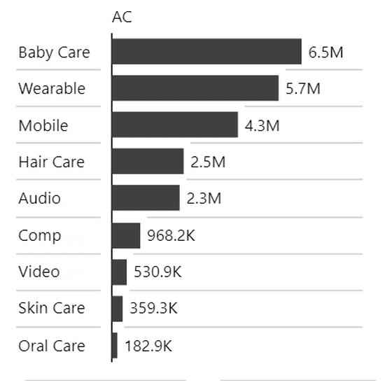
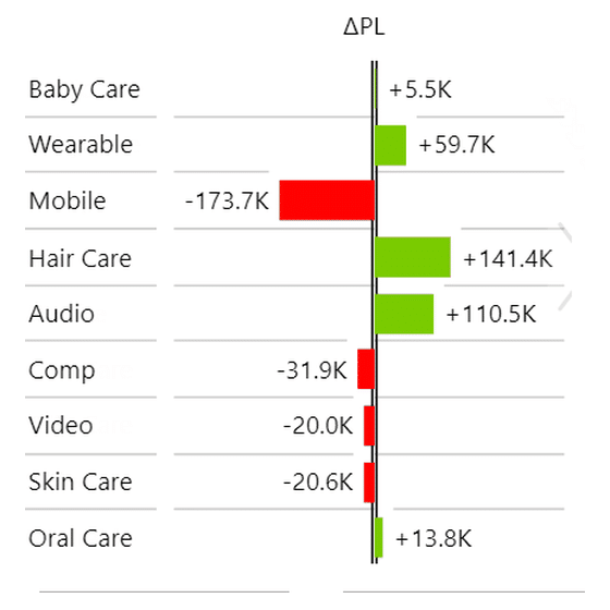

The variances are there from the start. They're calculated automatically, with no extra DAX to write, and each comparison gets its own notation based on IBCS guidelines: actual solid, plan outlined, forecast hatched. Your readers can tell them apart immediately, and absolute variance is drawn at full width on the same scale as your values while relative variance sits on thin pins.
You can also flip the orientation with a single setting, so the same visual works whether you're showing structure like products or countries, or a time series where columns read better.
Then there's the chart slider. You get several chart types inside one visual and you click between them to find the one that works for your audience. That saves you maintenance time later, and it keeps your report faster, since only one visual has to load.
Bar charts for Office
Zebra BI for Office is separate from the Power BI visuals. A single add-in works in Excel and PowerPoint, though the workflow is different in each app.
Bar charts in Excel
Excel has a native bar chart. Select the data, open the Insert tab, and choose a bar chart. Excel creates horizontal bars with the category names down the left.
Keep in mind that the chart follows the order of the selected range, so sort the source data if you want a ranked chart. A comparison against plan or previous year usually needs a helper column, and you have to format the variance yourself.
Zebra BI Charts for Office is one of the 2 visuals in the Zebra BI for Office add-in. The other is Zebra BI Tables. You install the add-in from AppSource, and it works in Excel desktop and Excel online.
You get the same main variance layouts as the Power BI visual, including integrated, absolute, relative and combined views and you switch between them on the chart slider.
One thing to know before you plan around it: the documented chart selection is column-oriented, and there's no horizontal setting like Show vertical axis in Power BI. For a horizontal bar chart in Excel, use the native chart.
Bar charts in PowerPoint
A PowerPoint bar chart is often a picture pasted from Excel. It looks fine until the Excel numbers change and your slide still shows last month's figures.
Zebra BI Charts for Office also runs in PowerPoint desktop and online. Its data linking connects the visual to an Excel file on SharePoint or OneDrive. Auto-refresh updates the slide whenever the presentation opens.
The same orientation limit applies in PowerPoint. There is a free version of the add-in for personal use, but a team presentation needs a paid license.

Build these layouts in Power BI
One visual draws all 3 of the charts above, with the same notation every month, so a ranked chart and a variance chart are the same chart at a different setting.

Build bar charts that make sense
Before you publish your next report, run each bar chart through four checks. Is it sorted by value? Does the axis start at zero? Are your labels short enough? Are percentages drawn as pins rather than full-width bars?
Then, check if the chart shows whether the numbers are good or bad. If there's no plan, your readers will see the numbers with no context around them.
Applying all of that by hand, on every chart, in every report, is the part that doesn't scale. Zebra BI Charts does this by default in Power BI, so your team gets the same notation and rules across every visual.
Try it on your own with Zebra BI's 14-day free trial.
Frequently asked questions
What is a bar chart?
A bar chart is a visualization that compares a single measure across categories, with each category represented as a bar whose length indicates its value.
Should a bar chart start at 0?
Yes. The bar's length represents its value, so a truncated axis exaggerates the differences. If 1 bar is far larger than the rest, resize the chart, change the scale, or use a clearly marked axis break.
How should I sort a bar chart?
Sort by value for a standard comparison or by variance when performance against a target is the main question. Keep the natural sequence for ordered categories such as age bands and rating scales.
Can a bar chart show variance to plan?
Yes. Use full-width bars for absolute variance because they have the same unit as the base value. Use thin pins for relative variance so percentages don't look like amounts.
When should I not use a stacked bar chart?
Avoid a stacked bar chart when the series mix positive and negative values, since the total becomes hard to read. It is also a poor fit for explaining what changed between 2 totals. A waterfall chart is clearer for that question.
Related
- How to choose the right chart type
- Stacked bar chart in Excel
- Waterfall chart in Excel
- Zebra BI Charts for Power BI
- Zebra BI Charts for Office in Excel
- Bar chart guide