
 September 8th
 February 22nd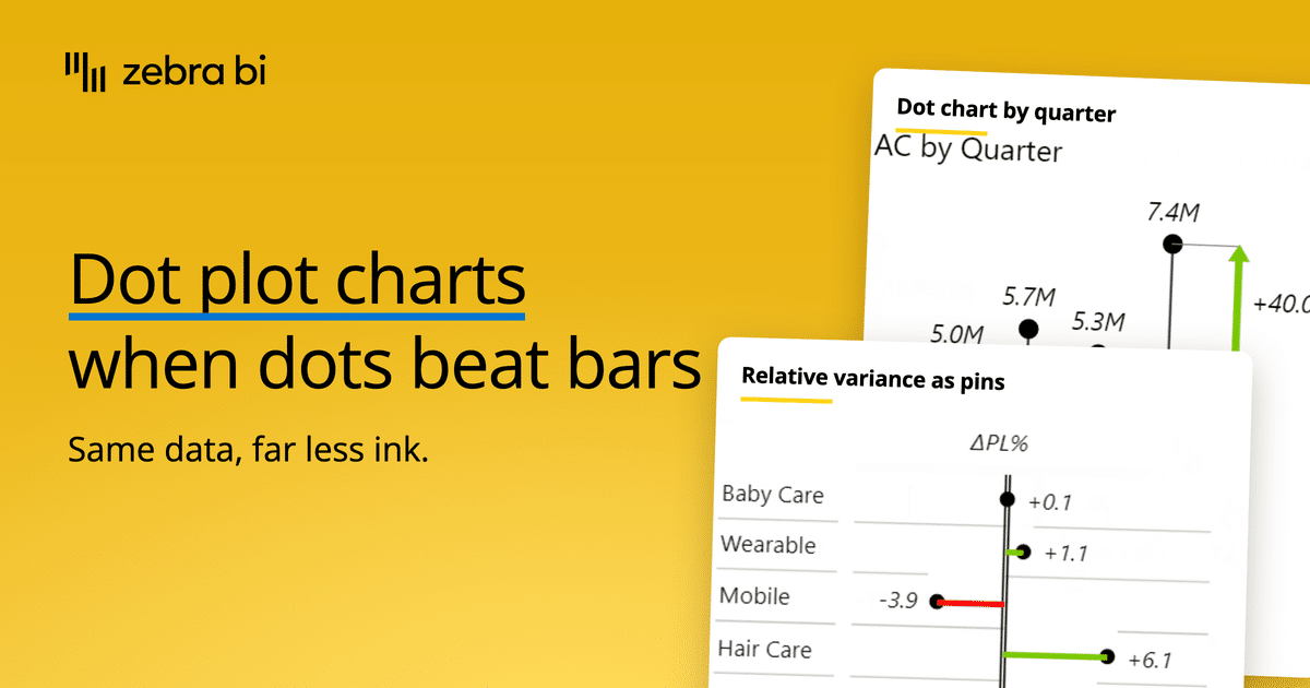
What Is a Dot Chart, When to Use It, and How to Build One
If your ranking has 30 categories and the bars are so thin that you barely see them, you should replace it with a different chart.
A dot chart is a visual that marks each category with a single dot on a value scale, so the dot's position represents the value. This makes the chart easy to read because you check the category and see where the dot is placed on the scale.
With dot charts, there's one catch, and that's the name. A dot chart, a dot plot, and a lollipop chart are all different names for the same chart.
In this guide, we'll share how a dot chart works, when to use one instead of a bar chart, the types of dot charts, and what to pay attention to when creating one.
What is a dot chart?
A dot chart is a visualization tool that plots one dot per category on a shared value scale, so the dot's position represents the value.
You read a dot plot by finding the category, then checking where the dot lands on the scale. Sort them by value, and the chart becomes a ranking you can scan in one pass.
Keep in mind that a dot chart doesn't need to start at zero. Position does the work instead of length, so you can start the scale at 4M and your chart still tells the truth, as long as you label it.

PRO Trial AVAILABLE FOR FREE!
Dots are a chart type in Zebra BI Charts, not a scatter chart with the categories numbered by hand. Pick Pin from the chart slider and every category comes back as a marker on a dropline.
Dot chart cheat sheet
The rows below settle the choice; the 3 cases beside them show it going right, going wrong, and being fixed.
Dot plot details
Doing its job
Time to switch
Broken most often
3 cases when you should use a dot chart
Dots beat the bar chart you already have when the list is long, when the values are tight, or when 2 units are sharing a plot.
1. Your category list runs past 12 rows
Every bar is a filled block that has to be tall enough to read as a bar. A dot only needs the height of a dot, so the same strip of screen holds a longer list.
2. The values sit close together
Draw 9 categories between 4.1M and 4.6M as bars and they all look identical, because every block is nearly full. Because position does the encoding rather than length, you can start the scale at 4M and the chart still tells the truth, as long as you label it. The UK Government Analysis Function puts it the other way round. When zero gets in the way of the story, reach for a Cleveland dot plot rather than break a bar chart's axis.
3. A percentage shares the chart with a currency
Put market share beside revenue and a label is the only thing keeping the 2 units apart. A different mark does that job.
"I would actually recommend using the pin chart for the market share. Why? Because, you know, the revenue you would typically show as columns or bars, right? So it's helpful for the end users that you use a completely different visualization for your market shares. Right? So market share is a percentage, that's completely different than, you know, millions or billions of US dollars."
Andrej Lapajne, Founder and Chairman, Zebra BI, in Make complete Product Portfolio and Brand Analysis in Power BI
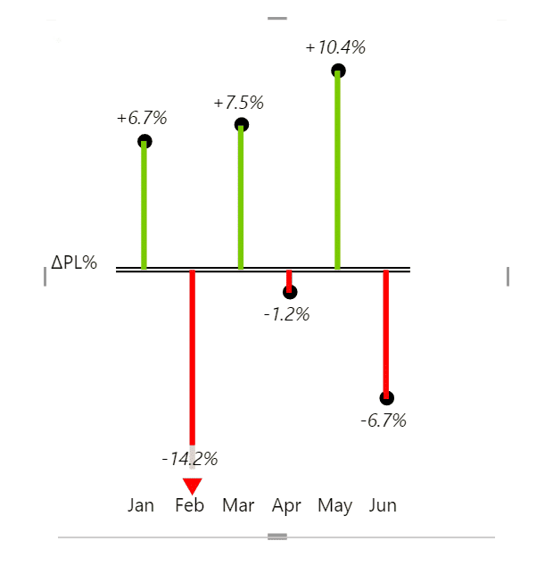
The same logic runs through the IBCS reporting standards, which draw a relative variance as a pin, the size of a very thin column, rather than as a full width bar.
3 cases when you shouldn't use a dot chart
There are 3 jobs a dot chart cannot do. Each one has an obvious replacement.
1. You need part to whole
A dot has no length and no area. Nothing about it adds up. If the reader has to see how the pieces make the total, use a stacked column.
2. The gap between 2 periods is the story
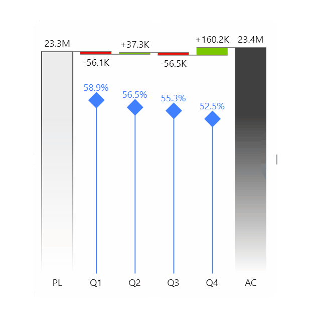
A dot chart gives you 2 end points and nothing in between. If the question is how the number got from plan to actual, use a waterfall chart, which draws every step.
3. Nobody in the audience has seen one before
A bar chart doesn't need explaining. Show a dot chart to somebody who has never seen one and they'll read the dot as a point in a scatter plot. If the report ships wide, you're safer with a sorted bar chart.
Dot chart vs bar chart
Dots and bars answer different questions.
| Criterion | Dot chart | Bar chart |
|---|---|---|
| What carries the value | Position of the dot | Length of the bar |
| Zero baseline | Optional | Required |
| Ink per category | A dot and a thin stem | A filled block |
| A long category list | Still readable | Runs off the page |
| Cropping the scale | Safe, once you label it | Misleading |
Pick bars when the reader has to feel that one value is twice another, because length carries the ratio, and pick dots when the ranking is the point. The same test runs through choosing the right chart for any other pair.
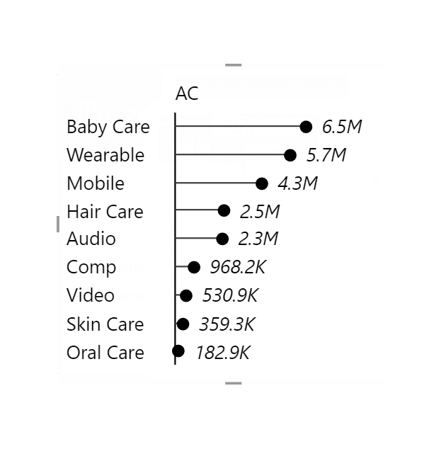
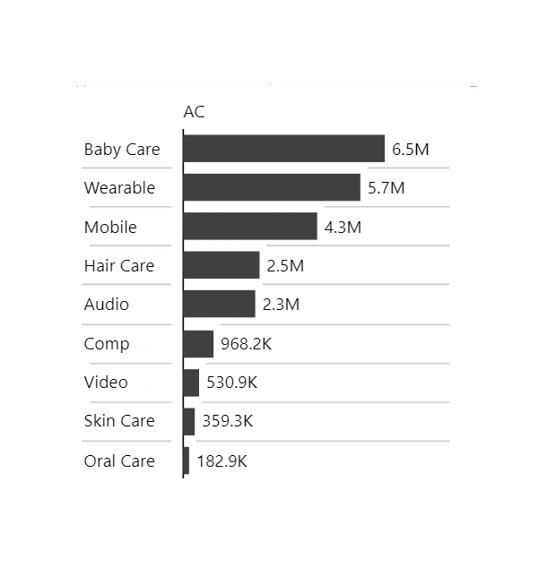
Dots or bars? Try the question on your own numbers. The Chart Selector is a Power BI Desktop file that walks you from the question you are answering to the chart that answers it, dots and bars side by side on real numbers. Download the Chart Selector
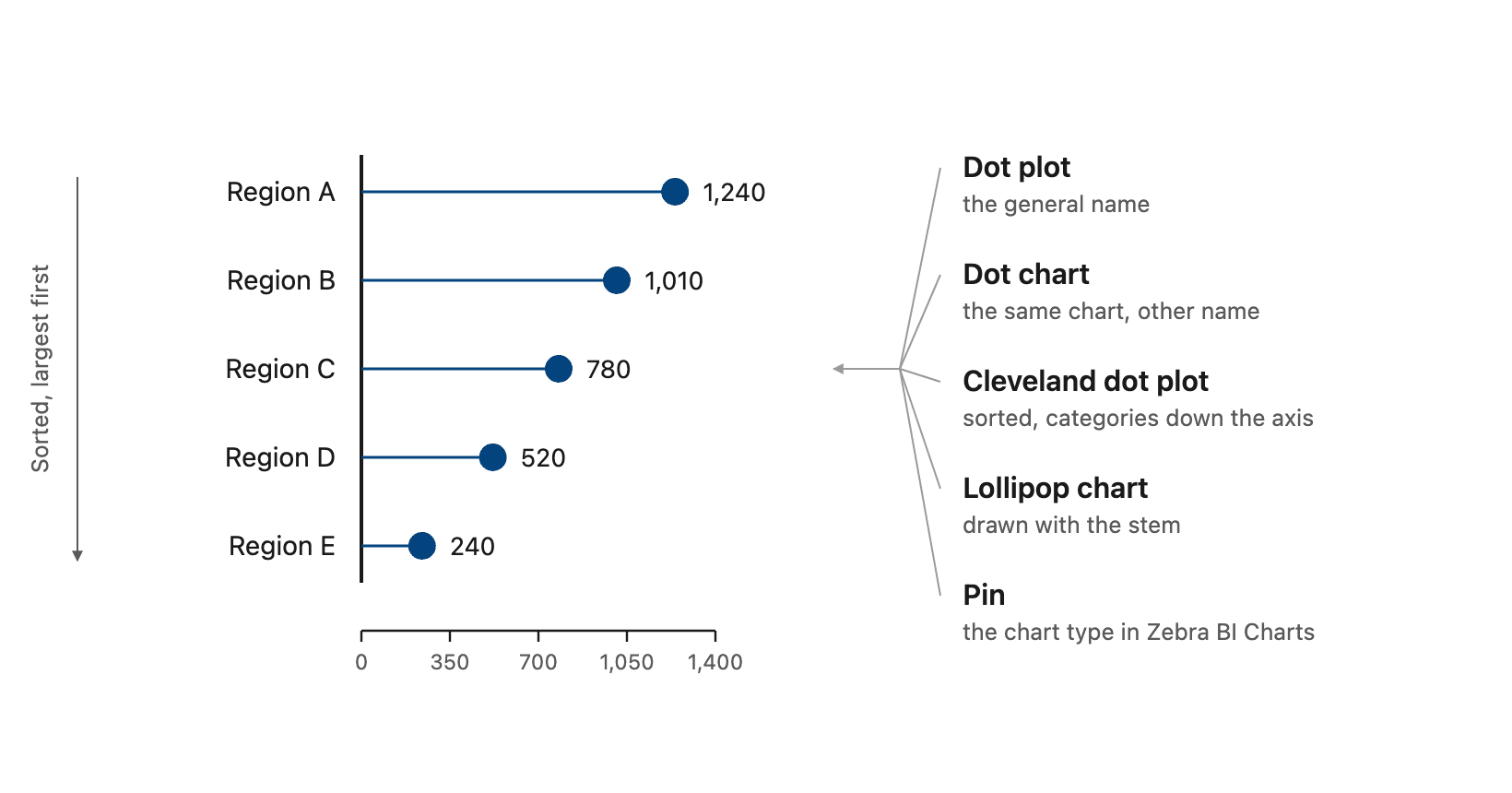
Dot chart, lollipop chart and Cleveland dot plot all mean the same thing
The first 5 rows are names for one picture. The last 2 are the variants people confuse it with.
| Name | What it means | Same chart? | Where you meet it |
|---|---|---|---|
| Dot plot | The general name for 1 dot per category | Yes | Everywhere, plus statistics |
| Dot chart | The same chart | Yes | The Dot chart color setting in Zebra BI Charts |
| Cleveland dot plot | Sorted, categories down a vertical axis | Yes | Named after William S. Cleveland, who introduced the dot chart in 1984 |
| Lollipop chart | The version with a stem | Yes | General use, and our Excel guide |
| Pin | A marker on a dropline | Yes | Chart type in Zebra BI Charts, and a chart type in IBCS |
| Plus minus dot chart | Dots either side of a zero rule | Variant | Relative chart in Zebra BI Tables |
| Sized dots chart | Diameter carries the magnitude | Variant | Relative chart in Zebra BI Tables |
Pin is the product's name for it. Dot plot is the standard label across charting libraries, and the IBCS standards use pin chart as a formal chart type of their own.
Types of dot chart
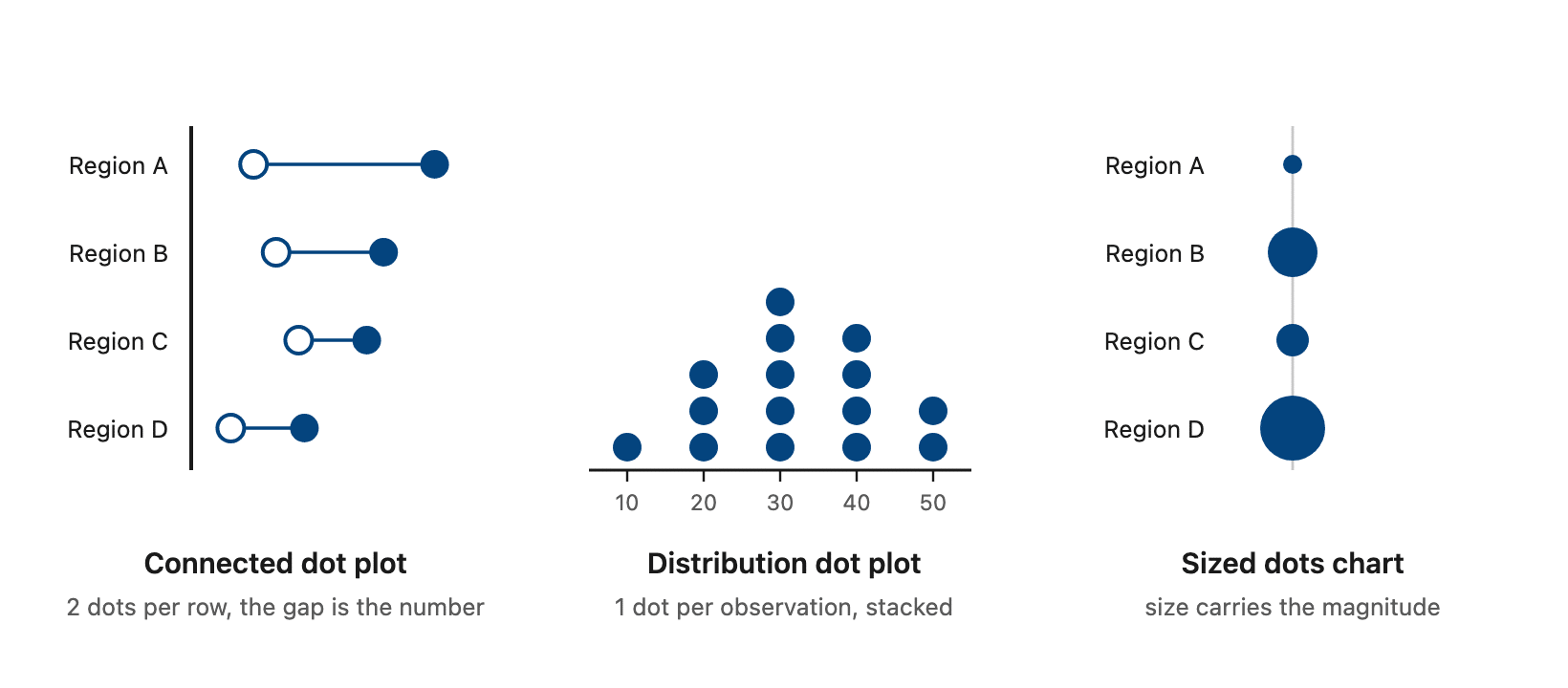
Almost every dot chart is 1 of 4 forms, plus 2 found only inside a table.
Cleveland dot plot
A Cleveland dot plot runs the categories down a vertical axis, sorted by value, 1 dot each. The name comes from William S. Cleveland. His graphical perception work with Robert McGill ranked position on a common scale as the most accurately read encoding, ahead of length, then angle, then area. Cleveland himself called it a dot chart; the eponym came later.
Connected dot plot and dumbbell chart
A connected dot plot puts 2 dots on each row joined by a line, this year against last or actual against plan. The line is the gap you are being asked about. Zebra BI Charts has no dumbbell type, but Show comparisons as, set to Markers, puts the comparison scenario on the chart as a marker beside the actual rather than as a second bar.
Lollipop chart
A lollipop chart is a dot chart with the stem drawn in. The stem is worth adding when the dots sit far from the axis and the eye needs help getting back to the category.
Distribution dot plot
A distribution dot plot is the statistics sense of the term: 1 dot per observation, stacked above a number line, so each stack's height is a frequency. Some versions bin the values into ranges first. Either way it ranks nothing, and no Zebra BI visual draws one.
Plus minus dots and sized dots inside a table
The relative variance column has 2 dot forms of its own. Plus minus dots sit either side of a zero rule, so distance off the rule is the signed percentage. Sized dots use the diameter instead, and you reach them from the dropdown in a relative variance column header. Both live on a relative variance column, which is a different picker from the one on a value column.

Dot chart layouts in Zebra BI


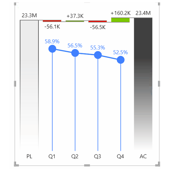


The 2 products handle dots differently.
In Zebra BI Charts, Pin is a chart type, and every category becomes a marker on a dropline. The marker and dropline properties sit in the format pane, under the group named Combo chart. There are 4 marker shapes. Marker density runs from every point down to none, or to just the first and last. Line style is solid, dotted or dashed. Droplines switch off when you take Drop line width to 0. Show vertical axis turns the whole thing on its side. The categories then run down the page and the pins run across it, which is the layout Cleveland described. When 1 chart has too many categories to read, the visual renders small multiples of any chart type, pin included. Each group keeps its own dots on a shared scale.
Zebra BI Tables is where most people look in the wrong place. Plus minus dots and sized dots belong to the relative variance column, so hunting for them on a value column gets you nowhere. A value column has a chart type picker of its own on the column header, and a dot chart is 1 of its 4 options there.
6 SCREENSHOTS, 2 VISUALS
Pick Pin. The grid above is 2 visuals and no workarounds.
Every screenshot in the grid above is real Zebra BI output, not a mockup. Put your own ranking through the same visual.
Dot plot in Power BI
Power BI can draw a dot plot, but not the ranked one this page is about.
Microsoft documents a dot plot as a mode of the scatter chart. Put a category on the horizontal axis instead of a number and, in Microsoft's own words, "Power BI creates a dot plot chart". What you get is a scatter, so there are no stems, no ranked category layout, and a 10,000 point ceiling. Lollipop charts are absent from the standard visuals altogether.
Zebra BI Charts is a licensed set of custom visuals for Power BI, and it adds the chart directly. The chart types overview lists it on the chart slider as "dot plot (lollipop)", beside column, line, area, hills and valleys and waterfall. The visual itself names the type Pin. Every category becomes a marker on a dropline, with shape, density and line style in the format pane. A 2nd measure laid over another chart comes back as a Pin dot series on the same plot, sharing the one axis. Max height percent, in the Combo chart settings, caps how much of the plot height that series takes. Nothing draws a second axis for it, so the dots carry their own data labels and you read the percentages off those. The limit is that same slider list: nothing outside those 6 types is on offer. Zebra BI Charts has the build detail.
Dot charts for Office
Zebra BI for Office is a separate product from the Power BI visuals, and it carries the same chart slider in Excel and in PowerPoint.
Dot chart in Excel
Excel has no dot plot and no lollipop chart in its gallery. Microsoft's list of Office chart types confirms it by omission. The standard workaround is an XY scatter with the categories numbered on 1 axis and custom error bars formatted into thin stems. Microsoft documents error bars for margins of error, never for this, so it is a technique rather than a supported route. Our lollipop charts in Excel guide walks the build. Sort the rows in the sheet first either way, because the chart takes the order the range hands it.
Zebra BI Charts for Office is a licensed Excel add-in. It puts the same chart slider inside the workbook, so a dot chart is 1 of the types you pick rather than a scatter you rebuild by hand. The Excel charts overview names the option "pin chart" and lists it beside column, line, area, hills and valleys and waterfall. The limit is that same list. A distribution dot plot or a dumbbell is still not on offer. One build note: the add-in reads the end of your actuals from where the Values measure stops, so leave those cells empty for later periods. Zebra BI for Office carries the full chart list.
Dot chart in PowerPoint
PowerPoint draws its charts from the same Office gallery, so it inherits the same gap, and that leaves 2 native routes. Build the chart in Excel and paste it in as a linked object, which Microsoft documents under inserting Excel data in PowerPoint. Or draw it with shapes and redraw it whenever a number moves. A linked object updates with the workbook and a hand drawn one does not. For a deck you rebuild every month, link it; shapes are only worth it for a slide that will never be updated.
Zebra BI Charts for Office is the same licensed add-in inside PowerPoint. The PowerPoint charts overview lists pin among the types on the chart slider, so the dot chart is a live mark on the slide rather than a pasted picture. One real limit comes with it, stated in the data linking article. Visuals only update when a slide is actively viewed, which the article calls a Microsoft API limitation. It does not apply to PowerPoint Online. Zebra BI for Office covers both surfaces.
Dot chart design best practices
5 rules. Sorting and stem weight are ours. The middle 3 follow the IBCS reporting standards, the open standard for how business reports present numbers.
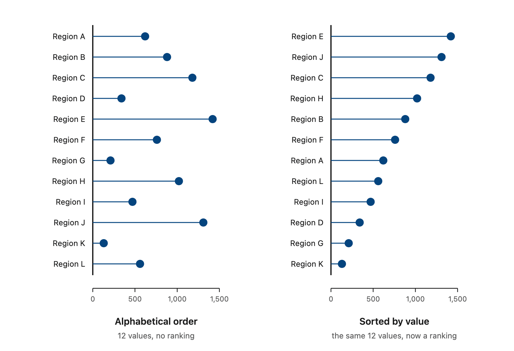
- Sort before you plot. Alphabetical order throws away the one thing this chart is best at.
- Draw relative variances as thin pins, not full width bars, so a percentage never reads as an amount. That is IBCS.
- Don't rescale the whole chart around one outlier nobody will act on, because a relative variance off a near zero base can be enormous and mean nothing. Mark it instead. That is IBCS too.
- Match the axis to the comparison: time along a horizontal category axis, structure down a vertical one. IBCS again, and it is the rule most often broken by accident.
- Keep the stem thin and let the dot be the heaviest thing in the row. If the stems read as bars you've built a bar chart with a decoration.

Join over 1.5 million Zebra BI users
A ranking of 30 categories should not need a scatter chart and a column of row numbers. In Zebra BI, dots are a chart type you pick from the slider, in Power BI, Excel and PowerPoint.

Dot plots might be the better choice
Dots aren't a replacement for bars. They're the better choice in three situations: a long category list, values that sit close together, and two units sharing one chart.
In Zebra BI Charts, Pin is a chart type you pick from the slider, so a ranking of 30 categories doesn't need a scatter chart and a column of row numbers. You can test Zebra BI's dot charts and the other chart types with a few clicks through the Zebra BI's 14-day free trial.
Frequently asked questions
How do you read a dot chart?
Find the category on 1 axis, then read the dot's position against the value scale on the other. Further along means a larger number, and sorting by value makes the chart a ranking.
Is a lollipop chart the same as a dot chart?
Close enough, yes. A dot chart marks each value with a dot on its own, and a lollipop chart draws a thin stem from the baseline out to that dot. Zebra BI Charts calls the type Pin, and its knowledge base calls it a dot plot or lollipop.
What is the difference between a dot chart and a scatter plot?
A dot chart plots 1 measure against a list of categories, so 1 axis is categorical and each category gets 1 dot. A scatter plot puts a measure on both axes and answers whether 2 numbers move together.
Does a dot plot have to start at zero?
No, and that's one of the reasons to pick it. Cutting the axis makes a bar's length lie about the ratio, while a dot's position survives the crop. Label the scale.
Can you make a dot plot in Power BI?
Yes, but not as a ranked chart type of its own. Natively it is a mode of the scatter chart, so you get points without stems and without a category ranking. Zebra BI Charts adds it as a real type, Pin, a marker per category on a dropline with 4 marker shapes and 3 line styles.
To see whether dots suit your category list, draw the measure both ways and compare. Pin sits in the chart type list in Zebra BI Charts.
Related links
- Lollipop charts in Excel
- Column chart
- Zebra BI Charts
- Zebra BI for Office
- Variance analysis
- Waterfall charts
- Choosing a chart
