Watch video recording & Get follow-along PBIX example
If you'd like to try all of this yourself, enter your data below to get immediate access to the PBIX example used in the this tutorial and the full 1-hour video recording of the webinar.
Are you wondering how to consolidate your KPIs? Then you are in the right place. Key performance indicators (KPIs) are crucial to quickly understand what is going on in your organization and also why.
Therefore, having an understandable and actionable dashboard is the first step in making the right decision. However, before discussing the visualization of your KPIs, your data needs to be prepared and consolidated properly. Let's see how.
This guide will help you to consolidate your KPIs in dashboards and the techniques you can use to do it. Either from Excel, using Power Query, or DAX and each approach has its benefits and drawbacks. The end result will be dashboards that perform better, are much easier to use, and are far more actionable than dashboards relying on static data.
Before we begin looking at the how-to's, let’s start by taking a quick look at how we came up with the idea. We published a nice-looking dashboard that immediately got a lot of feedback and questions about how we built it, which made us go back and look at the concepts behind it.
It’s actually a fairly simple dashboard with KPIs displayed as cards on the left.
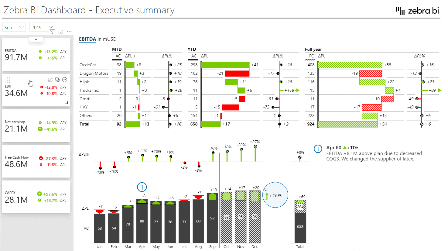
Users can click on individual KPIs to filter the information displayed on the right of the KPIs. A click on the EBITDA card, shows EBITFA details by business units or months, and so on. After you click on another card, the information is again filtered for that KPI.
This is a great example of a consolidated dashboard. It’s extremely user-friendly and information-dense, but sadly not something we typically see in Power BI dashboards or reports.
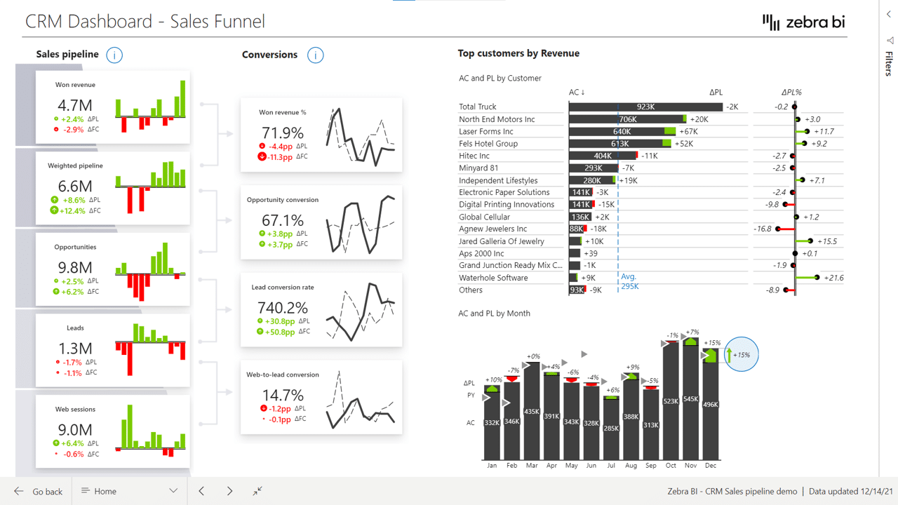
Another example is the CRM dashboard below. We’re working with a sales funnel that follows the same principle. This is one visual with several KPIs, such as won revenue, weighted pipeline, and other types of revenue. Each card is filtering all the other visuals on a page for easy and intuitive navigation through data. You can explore other Power BI dashboard examples and download our templates for free.
If you want to learn how to structure actionable dashboards, what to include on the landing page, where to put it, and what tools in Power BI should you use, check out our guide on KPI dashboards.
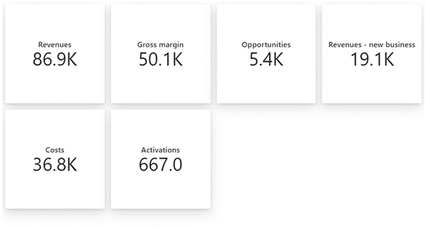
When you get started on a project in Power BI, you are working with a table with numerous measures. Some of them you might turn into cards and some might serve as the basis for charts when combined with date values. After some tedious clicking and copying and pasting, you end up with a simple dashboard showing your basic data.
The problem here is that these cards with KPIs are static, just plain numbers without visual elements that lack any interactivity. You cannot click on them to filter other elements on the page, such as other charts and tables.
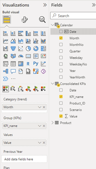
Now, let’s switch to the Zebra BI Cards visual. You can find the data in your Cards_DataSetup_1_Basic PBIX file. To create multi cards, simply add KPI and Value measures to the Zebra BI Cards visual.
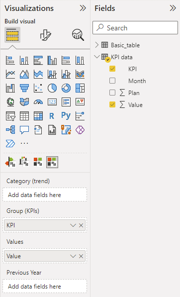
You now have all your KPIs in one visual, making it very easy to work with them. You can filter them or add other dimensions, such as time and plan in our case. You can still do the comparisons because the comparison is just a different business scenario, so you really have a lot of flexibility. Essentially, you need just two clicks to go from this …
… to this.
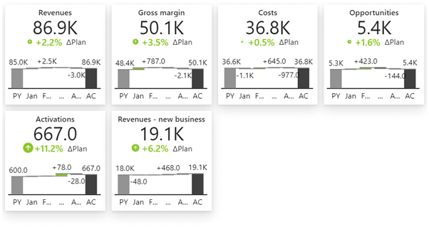
In order to do this, you need to transform your Power BI model in a way to collect all these measures into a KPI dimension. This will allow you to do things such as using scaled charts in the visual. This provides users with better insight into data and allows them to make visual comparisons without having to click through individual data points. The main benefit is that you can show multiple KPIs with a dedicated card for every KPI in a single visual.
The last benefit is behind the scenes. When you create a dashboard with many separate elements, it impacts its performance. When you’re dealing with multiple charts and cards and filters, a single refresh can balloon to tens of seconds, which is just unacceptable for the end users. When you are working with a consolidated KPIs data model, however, we are talking about milliseconds for a single refresh since everything is created within one visual.
Let’s look at the three ways to consolidate KPIs.
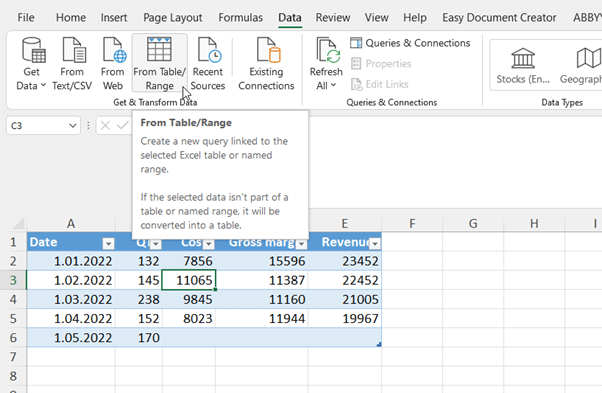
We’ll start with Excel. Open the file Data_inputs_basic.xlsx in your download package to load a simple table with four KPIs: quantity, costs, gross margin, revenues. Each is in its own column.
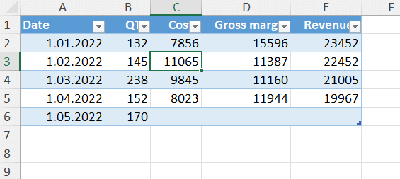
The basic operation that allows you to build this KPI dimension is called unpivoting. Start by clicking the Data tab on your Excel ribbon and then select the From Table/Range command. This will create a query that will actually turn those columns into one single column in the tool called Power Query.
This opens up a window with Power Query, where you can do many different transformations to your data. Start by selecting the columns you want to transform, right-clicking on the column heading, and selecting Unpivot columns.
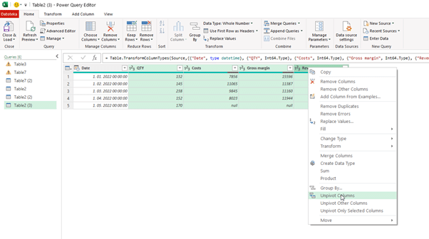
All of your columns will be consolidated in one column, so you’re left with just two columns - your KPIs and the value. Another way is to select the one column you are not unpivoting, right-clicking it and selecting the Unpivot other columns.
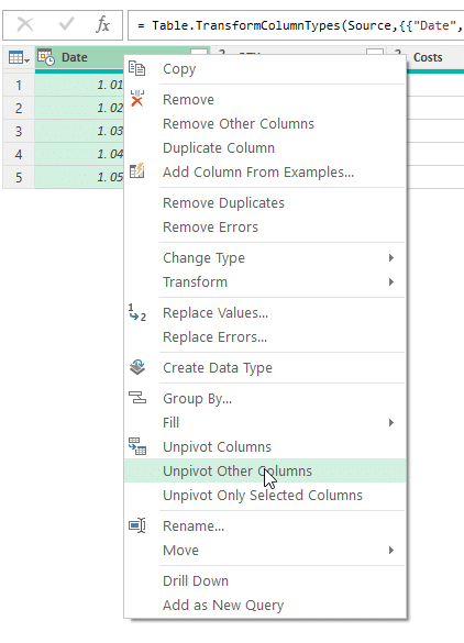
The result is exactly the same, but the approach is actually better. If you add another column with a KPI to your starting table here at a later date, this transformation will automatically apply for additional columns. You won’t have to change anything.
Click Close & Load and you get a new table in Excel with all KPIs in one data field, which is the basic prerequisite for what we are doing.
Power Query tool is actually the same in Power BI and in Excel. What we just did right now in Excel, you can do in Power BI. You can just connect to this Excel table to Power BI and then do the same thing with the Power Query in Power BI.
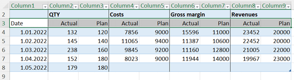
It’s slightly more complicated, though. This time, on top of our four KPIs - quantity, cost, gross margin, and revenues - we will also have a scenario. We will not work in Excel for this example. We will connect to this table from Power BI and do everything in Power BI.
This is a better approach because you don’t have to have your starting and transformed data duplicated in Excel and you don’t have to redo all steps.
NOTE: Whenever you are using Excel as a data source for Power BI, it is recommended that you click on the table and press CTRL+T. This creates an Excel table from the values in your spreadsheet.
This time, we’re working with a hierarchy on the columns. For each quantity, we have the actual and plan, creating two levels in the table.
This will make the unpivoting procedure more complex but worth it for the results.
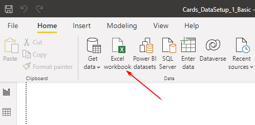
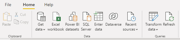
In Power BI, click the Excel workbook button to load the data.
Select the Excel file you worked on in the previous step and then select Table_webinar workbook from the Navigator. This will load the data into Power BI.
Now, select the Transform data button on your Home tab in Power BI and select the Table_webinar query from the right-hand pane.
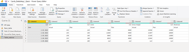
Because of the hierarchy, it looks sort of messy. To fix this, we’ll transpose the table first. On the Transform tab in the ribbon, select Transpose. This rotates the table by 90 degrees.
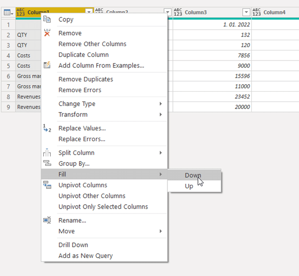
Now you have an issue with the empty (null) values. You can easily solve this by filling the content down. Right-click on the column header and select Fill > Down.
The next step is to use the first row as headers, which you do by selecting Home > Use First Row As Headers. This is starting to look like a regular table now. We also already have KPIs consolidated as a result of the transpose action.
However, we don't want to have separate dates as columns, so we need to unpivot the dates. Simply select the first two columns and use the Unpivot other columns command from the right-click menu.
You can now do some housekeeping by renaming individual columns and setting up formatting and then testing whether it works. You should see a Table_Webinar measure in your Fields selection pane. From here, you can add these values to the Power BI Cards visual.
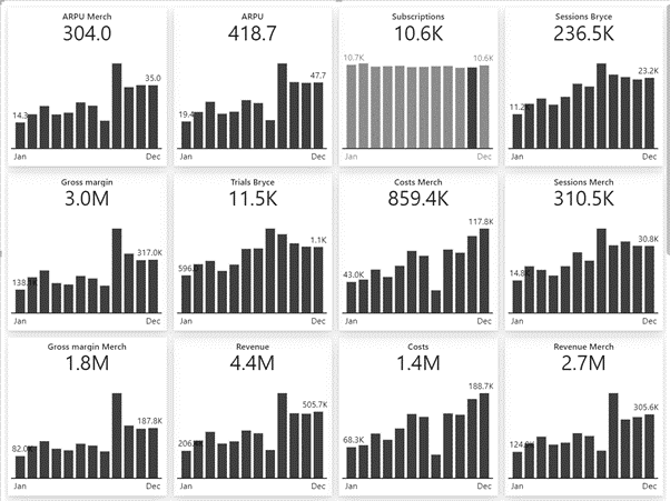
We now have a simple multi card visual.
However, in our data, we had two scenarios: actuals and planned values. We cannot just use the Value column, because everything is in this column and we need to filter it.
We need to add another measure by right-clicking on the Fields selection pane and selecting New measure. Calculate the actuals by inputting in the following formula:
AC = CALCULATE(SUM(Table_webinar[Value]), Table_webinar[Scenario]="Actual")
AC = CALCULATE(SUM(Table_webinar[Value]), Table_webinar[Scenario]="Actual")
Then add another measure for plan and input the following formula:
PL = CALCULATE(SUM(Table_webinar[Value]), Table_webinar[Scenario]="Plan")
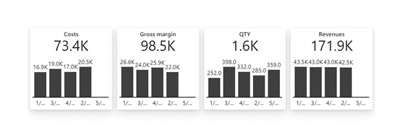
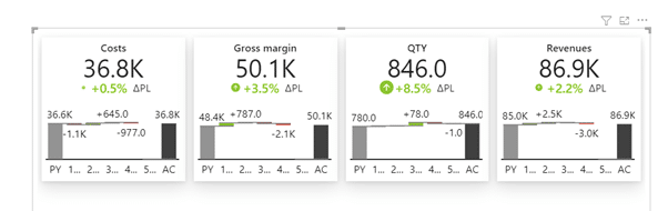
Essentially, this filters the values that belong to either of the scenarios. Once you add both measures to the visual in the Value and Plan placeholders, you get a more insightful visualization that conveys much more information.
This is now a flexible dashboard you can work with. You could enter new data in Excel and any changes will be reflected in the Power BI visual after you refresh it.
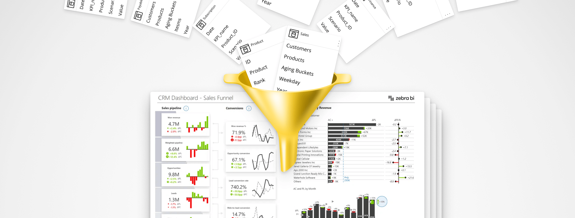
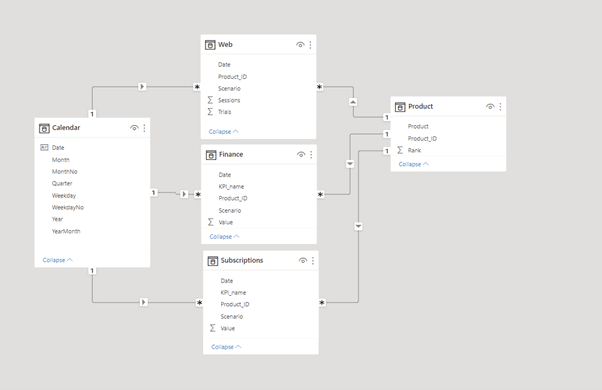
The next example involves multiple tables, because in real life your KPIs are coming from multiple locations - it could be finance, CRM systems, supply chain, manufacturing, etc. The bottom line is you are working with multiple tables, each of them has some KPIs you want to keep your eye on.
In our example, we’ll be working with web analytics, finance, and Subscription data.
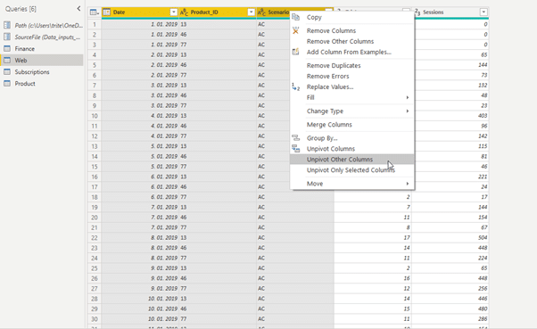
Open power Query and open the Finance table. It is already unpivoted and has KPI dimensions and scenarios prepared. Next open the Web query, where you need to unpivot Trials and Sessions data. Select the first three columns, right-click on the heading and select Unpivot other columns.
We should also rename the Attribute column to KPI_name. Since we are trying to append several tables, their structure needs to be exactly the same. Everything needs to be the same: number of columns, the names, everything.
The last query - Subscriptions - has already been prepared.
Open the Finance query and look for the Append Queries command.
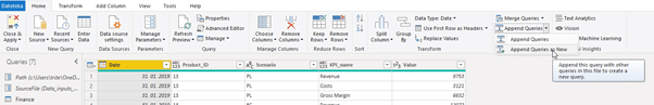
Select the Append queries as a new command, which will create another query with all the data. Select the Three or more tables radio button and then select all three queries you want to add.
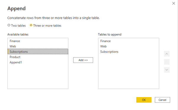
The result is a table with all the KPIs in it: cost, gross margin, sessions and trials, and any other KPIs that might be in these tables.
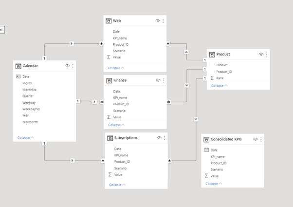
You have a new table in your model explorer and you essentially have duplicated data, since all data is in the Consolidated KPIs table as well as all others.
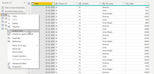
You should open Power Query again and disable the loading of data from all three tables making up the consolidated table. Right-click on the table name and deselect the Enable load option.
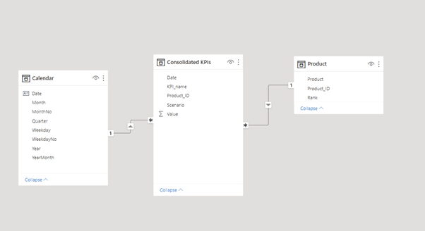
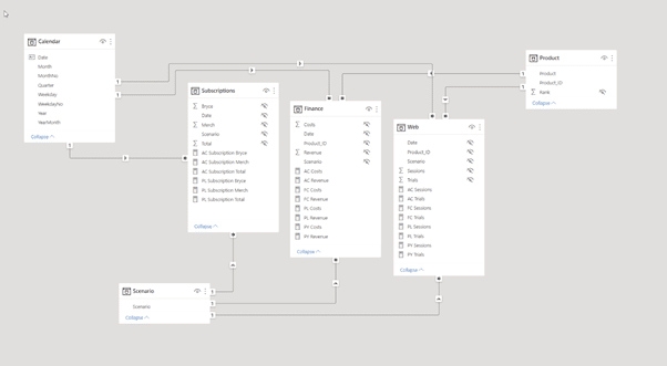
You are now left with just three tables. Create a relationship between Calendar and Consolidated KPIs table by dragging the Date value from one to the other. Also, create a relationship between the Product ID fields in Product and Consolidated KPIs tables.
Return to the Design window and set up the values to their respective placeholders.
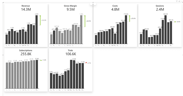
The final result shows your KPI values by month in a dynamic and flexible way.
Power Query is a powerful tool but it is not truly universal. You are much more likely to be in a situation where you simply cannot append all the tables together. You usually have very different types of tables and just want to collect certain KPIs from one table and then take another completely different table with three KPIs. In this case, you need to pick your data from multiple tables and merge it to consolidate KPIs.
Open the data model window in the example provided (Cards_DataSetup_3_DAX.pbix). Here you can see the three tables we’ll be working with.
Create a new table for consolidating your KPIs by clicking on the Enter data button on your Home tab.
This opens the Create Table window, where you can name the columns for your new table. It will contain two columns: one with KPI IDs and the second with actual KPI names. This will be a simple list of all of the KPIs that you want to consolidate in your model.
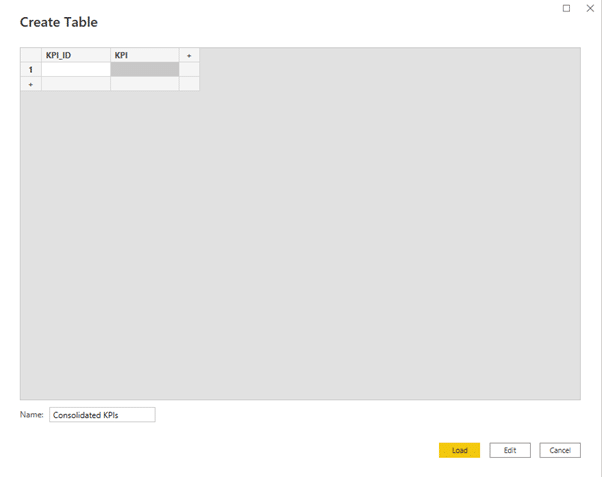
The important thing is that you list all of the KPIs here. I also recommend that you add the ID column so that you have a number that you can use for sorting and everything else.
After you add them, load the table into Power BI. After it loads, just leave this table as it is without relating it to any other tables. This is what is called a disconnected table in Power BI.
In the design view, we can start by creating a table showing all KPIs and their IDs. This is the starting point for getting the actual values for all KPIs. Since you have a lot of choices, you need to switch between all these options, and the DAX formula for that is called SWITCH.
Start by creating a new measure in the Consolidate KPIs table. Then add the following code:
AC = SWITCH(MIN('Consolidated KPIs'[KPI_ID]),
This formula evaluates the KPI ID. It looks at the KPI ID and then returns the correct result. For KPI number 1, the formula should return the revenue, which is located in the Finance table. The KPI name in there is AC revenue.
1, [AC Revenue],
Next up is the revenue from merchandise. This is not a separate KPI located in a specific table. It is instead a KPI we made up on the spot and we can create on the fly using DAX formulas. That is why this is a good approach because it allows you to calculate additional measures and add them.
Essentially, we'll take the revenue from the Finance table and filter it by product by only taking values where product equals merch. Here’s the formula:
2, CALCULATE([AC Revenue],'Product'[Product]="Merch"),
The next step is to do it for another product:
3, CALCULATE([AC Revenue],'Product'[Product]="Bryce"),
Afterward, you can keep going and collect data from different tables and filter them based on your chosen criteria. The full code for this example can be found in the download package accompanying the webinar.
After you have your formula, you can simply create a Zebra BI Cards visual and add your actuals and KPIs to get an instant overview of your core KPIs. Even better, you can add the month dimension to get a sense of how individual KPIs change over time.
What is even more powerful is that you can now create KPIs with cross calculations. Basically, you can take subscriptions that are in one table and your revenue and divide it by subscriptions to get the average revenue per subscriber.
The formula for calculating ARPU is the following:
16, Finance[AC Revenue] / Subscriptions[AC Subscription Total],
This takes the revenue from the Finance table and divides it by the AC Subscription total from the Subscriptions table.
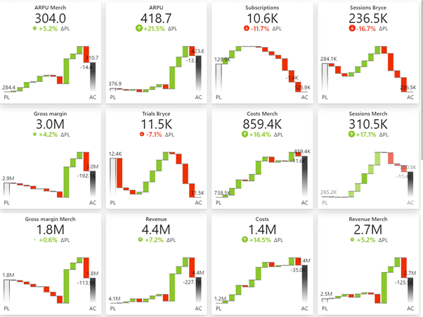
You could do the same for plan data, which involves copying the formula for actuals and replacing all occurrences of AC with PL. You can do this easily by selecting the first occurrence of AC in the existing formula and pressing CTRL + D multiple times to select all occurrences. Then simply type PL to replace them all at once.
Once you add plans to your visual, you get an even better overview of what is going on in your business.
We looked at the three options you have to consolidate KPIs in Power BI in order to collect all the KPIs in one place and display them in one visual. This gives you power not just in terms of performance but also in terms of making truly interactive dashboards.
Consolidation will allow users to click on a KPI card to filter all the information on a dashboard. This ensures true flexibility and greatly improves the user-friendliness of your dashboard. Most importantly, your dashboard will enable actionable insights for making better decisions faster.
To learn more about presenting your KPIs using Zebra BI Cards, visit our Knowledge Base.
Very good material, examples and explanations, as always!! Great job ZebraBI Team, thank you...
Esteban Fabiani
EMFConsulting Inc.
Thank you Esteban, always great to hear that. 🙂