 September 8th
 February 22nd
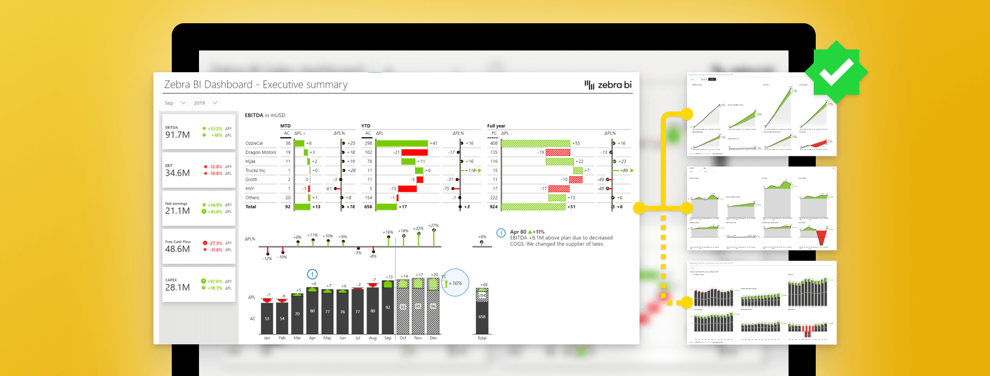
How to create a KPI dashboard in Power BI to make smarter decisions faster
PRO Trial
Imagine having a business meeting where you are given puzzles instead of information. To get to the KPI dashboard to round up your business performance, you need to piece the puzzle together. Sounds funny, right? Well, in reality, meetings or preparing a report often consist of pure efforts to obtain and interpret the right data.
In this tutorial, we will look at how to structure actionable dashboards and especially focus on the landing page. We will tell you what to put on the landing page, where to put it, and what tools in Power BI should you use to make those landing pages really actionable and understandable.
Furthermore, just having the data communicating nicely doesn’t necessarily prompt the change you need to improve your business. But what if the clear picture, that also inspires action, is right in front of you the whole time?
Actionable Reporting Put into Practice
The clear and inspiring picture mentioned earlier is what Actionable Reporting is about. It’s not just a fancy phrase, as it centers every decision on data. Moreover, it’s not just about translating data into information but turning data into insights that call for action.
Don’t allow your reports to just describe and summarize the metrics. What is going on, why is it happening, where you may encounter problems, and what are the next steps are the questions your actionable report should cover. The data then becomes a smarter decisions driver, rather than a static element.
Using Actionable Reporting, you won’t just improve the reporting process. Your goal is to ensure minimum action distance. Time spent between obtaining the right piece of information to actually making a decision should be as quick as possible.
Being able to understand and act upon reports rapidly, isn’t just a time and money saver, but an inspiring positive organizational change. For a fresh start, let’s see how to create an actionable KPI dashboard.
Why Dashboards Fail
One of the things we see most often when it comes to report pages is that people do not make them actionable. They tend to focus on key performance indicators, like total amounts, gross profit margins, cost of goods sold, quantities, and others.
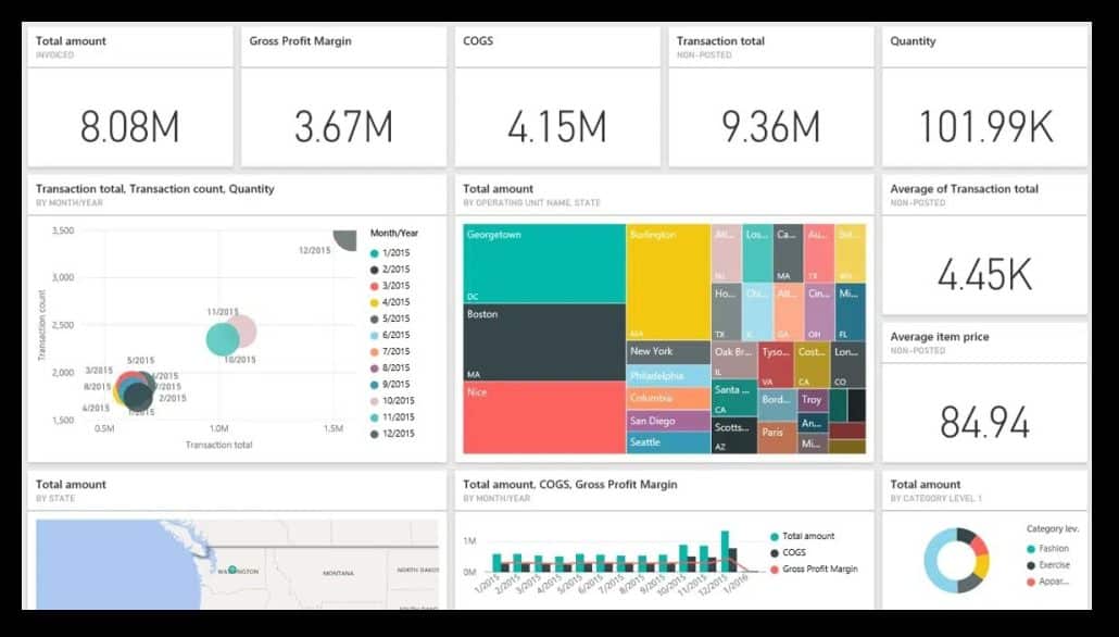
However, just having this information available does not make it actionable. Is the 8 million dollars in sales good or bad? How are you performing against the plan and your previous year? Where do you really need to focus your attention?
In short, this means that this dashboard is not actionable despite showing the most important information. Since there are no comparisons it is impossible to discern any trends or movements. The company with these numbers could be doing extremely well or be on the brink of becoming a failure. The numbers simply tell no story. Learn about the most common mistakes people make when creating dashboards.
Where Should You Direct You Attention?
Let’s take a look at something a little different.
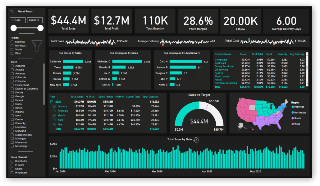
This dashboard is much more detailed. It has Big Annoying Numbers (trademark pending) at the top so we can see a pattern emerging. It has some interesting charts, like top states, top five employees, and other short charts displaying the top five elements. This is something we recommend you use.
On the right side of this dashboard, there are many filters, which means that I have to click each of them to see what’s going on. However, a dashboard should direct my attention to what matters before I click it.
Examples of "what matters" include:
- Real-time insights (because you need to be able to track performance instantly and make sure your metrics are up to date)
- Improving decision-making (both in terms of the times it takes to do it and the quality of the outcome)
- Better collaboration (because every team in your organization should be able to access the KPI dashboards and work on improving them, collaboratively)
- Increased efficiency (because your business needs to save time and eliminate errors as much as possible)
The Power BI KPI Dashboard Landing Page Checklist
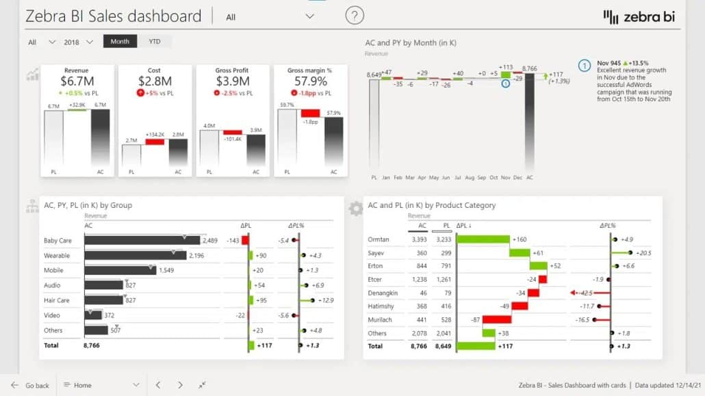
Let’s look at an example of a sales dashboard.
First of all, it has a KPI area that shows revenues, costs, gross profits, and margins. Instead of just Big Annoying Numbers, each KPI also shows performance versus the previous year and plan. You should put this area on the top left. Why? Because we normally read from left to right and from top down.
This is the KPI area close up:
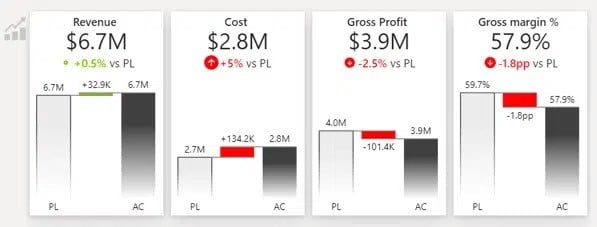
Now, when the sales manager looks at the KPI dashboard and sees that costs are 5% over budget, they want to see why. So you should set up filtering correctly so when they click on the number, the entire dashboard changes to show just the data for that KPI.
Power BI is great for filtering, you just need to set it up correctly. It allows the user to review information with a minimum number of clicks.
Page Tooltips in KPI Dashboards
You could also use page tooltips to provide more information without clicking. Regular tooltips just repeat the values, while page tooltips can display additional insights. What really works well is a vertical waterfall chart in a tooltip.
Drillthrough to Get to the Story Behind the Numbers
The next idea is to use the drillthrough option, which takes you through to a detailed report on the KPI you are analyzing.
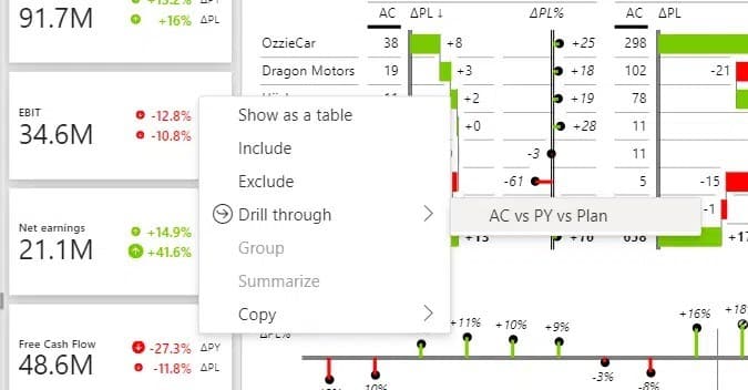
With drillthrough you can guide your user into increasingly more detail, so they can understand individual factors and trends that are shaping the KPI. However, make sure you always provide a way for them to get back to the landing page. This makes for a really user-friendly experience.
Dynamic Comments to Facilitate Understanding KPI Dashboards
Comments are chronically missing from typical dashboards. You could use dynamic comments that are linked to KPIs and specific time periods or business units. Short comments like that provide really useful information to the reader.
Use the Space around KPIs to Create Context
The charts located around the KPI area should provide context. In addition to revenue compared with the plan, you could also include the performance of individual product categories and product groups.
Make sure you keep it short. Just show those values that contribute significantly to the final result. You can use the Top N feature to just show the top 5 products, while the others are placed under the Other category.
Also, make sure you provide a help overlay to onboard your end-users. Let them know what your report is about and how they can read it.
7 Elements of a Great Landing Page in Power BI
To recap, here is the landing page checklist:
- Onboard your users with a help overlay that’s accessed with an icon.
- Use simple slicers for navigation. Don’t put all the filters on the landing page.
- Create a KPI area and put it in the top left of the page.
- Leverage breakdowns to provide context and use Top N + others to focus on key categories.
- Smart tooltips reduce the number of clicks by displaying a separate page in a tooltip.
- Provide drillthrough to allow users to explore data and plan their actions.
- Use dynamic comments to provide more context.
Here's an example of a good sales dashboard landing page in Power BI, done with Zebra BI:
Types of Power BI KPI Visuals
Before we dive into different use cases and specific ways to create KPI dashboards, you should know there are three main types of Power BI KPI visuals you can use (and which we will reference later on in this guide as well).
KPI Visual
A KPI (Key Performance Indicator) visual is used to display a single, critical metric at a glance. It highlights progress toward a specific goal, making it easy to track performance and identify trends quickly.
Gauge Visual
A gauge visual represents data in a speedometer-like format, highlighting how close a value is to a predefined target. This category of Power BI KPI dashboard visuals is ideal for showing progress, capacity, or performance within a given range.
Card Visual
A card visual is a simple way to display one key number or piece of information, such as revenue, total sales, or user count. This type of KPI visual in Power BI provides a clean, focused view of important metrics at a glance.
Some Inspo for Your KPI Power BI Dashboards
Let’s take a look at an executive KPI dashboard.
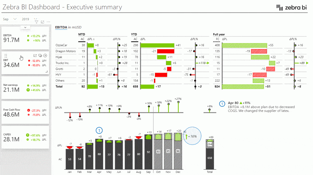
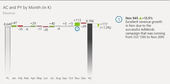
Financial executives typically want to see month to date and year to date performance and the full-year performance on the same page and on the same visual so they can compare it.
This is done with the Zebra BI Tables visual and you can always take a more data-focused approach. Our advice, however, is to try to at least visualize the absolute variances in a table, because this is what really guides the reader’s attention.
By the way, if you want to learn how to build effective Power BI financial dashboards, our guide on that might help too. Check it out!
A CRM dashboard
We wanted to be creative with this one.
The Power BI dashboard below shows the revenue, the weighted pipeline, opportunities, leads, and web sessions. We also included plans and comparisons even though it’s not a financial report. You can still set your strategic goals and benchmarks and include them in your visual.
We also included conversion rates and put them side by side with the pipeline.
Like the other charts we’ve covered, this one also allows you to filter by clicking on the content or drillthrough to more detailed reports.
Find out more about the best tips and methods for building your KPI dashboards.
Power BI KPI Dashboard Examples
Every KPI dashboard in every team and every organization is different--two businesses in the same industry may not have the same key performance indicators to track across Digital Marketing Teams, Sales, or Customer Service. And that's fine.
But if you want to narrow it all down to what each department's KPIs should definitely include, it would be this:
Marketing
Marketing dashboards help measure the effectiveness of campaigns, brand awareness, and customer engagement. Some of the must-have marketing key performance indicators to incorporate in your digital marketing team's KPI dashboard include:
- Website traffic
- Conversion rate
- Customer acquisition cost (CAC)
- Return on investment (ROI) for campaign performance
- Social media engagement
- Email marketing performance (open and click-through rates)
- Lead generation and qualification metrics
Customer Service
Customer Service KPIs focus on evaluating the quality of support and overall customer satisfaction. Here are some of the essential customer service-related target measures to consider for your key performance indicators dashboard:
- Customer satisfaction score (CSAT)
- Net promoter score (NPS)
- First response time
- Average resolution time
- Customer retention rate
- Ticket volume and backlog
- Escalation rate
Financial Health
Financial Health KPIs are essential for assessing the overall stability and profitability of a business. They provide valuable insights into financial performance and guide strategy for sustainable business growth. Key metrics to include in your financial dashboard and monitor include:
- Revenue growth rate
- Net profit margin
- Operating cash flow
- Gross margin
- Debt-to-equity ratio
- Current ratio
- Return on equity (ROE)
IT Performance
IT Performance KPIs are crucial for evaluating the efficiency, reliability, and innovation within an organization's technology infrastructure. These metrics ensure that IT systems align with business objectives and support overall operational success. Relevant metrics to track when you measure your IT performance include:
- System uptime and availability
- Incident response time
- Mean time to resolution (MTTR)
- IT service request resolution rate
- Network performance and latency
- Software deployment success rate
- Cybersecurity incident frequency
Sales
Sales performance is a critical driver of business growth and success. Tracking the right KPIs in Power BI allows organizations to measure the effectiveness of their sales strategies and identify areas for improvement. Essential KPIs for the sales performance dashboard include:
- Monthly sales growth
- Conversion rate
- Average deal size
- Customer acquisition cost (CAC)
- Sales cycle length
- Customer retention rate
- Lead-to-opportunity ratio
- Opportunity-to-win ratio
As mentioned before, every business and every department is different. But more often than not, measuring the aforementioned KPIs can help you draw valuable insights (and make informed decisions based on them).
If you are looking for advanced Power BI dashboard examples, check out our guide on this (and our list of top 12 most popular dashboards among our customers).
Best Practices for KPI Dashboards
Regardless of which type of Power BI KPI dashboards your organization needs, there are best practices you should keep in mind. Some of the essential ones include:
Identifying KPIs
It's very important to know how to identify the right. It's very important to know how to identify the right KPIs for each of your teams. Tracking the wrong ones could lead to confusion, focusing on the wrong actions, and wasting resources.
Here are some key points to consider when choosing KPIs:
- Relevance: The selected KPIs should align with your organization's goals and objectives.
- Measurability: Can the data for this KPI be easily measured and tracked?
- Actionability: Are the metrics actionable, meaning will they provide insights that can lead to meaningful changes in strategy or processes?
Types of KPIs
To know which key performance indicators you should focus on, it would help to know the main types of KPIs too (and how to work with them):
Quantitative
Quantitative KPIs are measurable and data-driven, such as revenue, number of customers, or conversion rates. Use these when you need clear, objective metrics to track performance over time.
Qualitative
Qualitative KPIs focus on subjective insights, such as customer satisfaction or employee feedback. These are ideal for understanding experiences and opinions when numbers alone can’t tell the whole story.
Lagging
Lagging KPIs measure past performance levels, like annual revenue or completed projects. Use these to evaluate results and determine if goals were met.
Leading
Leading KPIs predict future performance, such as website traffic or sales inquiries. Use these to identify trends early and make proactive, data-driven decisions.
Difference between KPIs and OKRs
Key Performance Indicators (KPIs) and Objectives and Key Results (OKRs) are tools for performance management, very similar in nature, but serving different purposes.
KPIs are specific metrics like customer retention or net profit, used to track ongoing activities and progress toward benchmarks.
OKRs, however, are goal-setting frameworks with qualitative objectives and measurable key results, designed to align efforts and drive ambitious, time-bound outcomes. While KPIs focus on maintaining and improving processes, OKRs encourage innovation and strategic growth. Together, they balance current performance with future goals.
Monitoring KPIs
Once KPIs are defined, regularly monitoring them is essential to track performance and make data-driven decisions. Use dashboards or tracking tools to visualize trends and patterns in real time. Establish a routine for reviewing KPIs, whether it's weekly or monthly, and adjust strategies as needed to stay on track.
Looking at actual performance against targets on a regular basis will help your strategic decision-making and help you better align your KPIs with business objectives. Plus, the more often you check for your metrics, the sooner you can identify problems across the board, like
- Project managers can identify resource allocation problems and how to optimize critical resources
- Sales teams can identify sales trends and how to optimize for conversions and revenue generation
- Marketing teams can identify monthly trends in MQL generation and campaign performance levels across the board
- Inventory and operations teams can identify if supply chain efficiency is at its maximum, or if there are any cost-saving opportunities
- Finance teams can identify issues in the financial performance of your business and gain deeper insight into financial planning optimization
Make sure every member of your company knows how to monitor their individual and team performance indicators in Power BI (our can come in handy here, as you don't need to be a Power BI expert to analyze the dashboards you create with Power BI and Zebra BI).
Use Advanced DAX
Advanced DAX (Data Analysis Expressions) allows you to unlock powerful insights from your data, especially in tools like Power BI. By using complex formulas and calculations, you can create dynamic measures, analyze trends, and perform detailed comparisons. Mastering DAX enables deeper, more actionable data analysis.
The good news is Zebra BI can handle a lot of the heavy lifting for you, so you don't have to waste time coding DAX from scratch. With Zebra BI, you can easily create advanced visual representations and calculations, even if you're not an expert in DAX. This allows you to focus on the analysis and actionable insights rather than spending time figuring out complex DAX functions.
Make Use of Power BI Templates
Power BI templates can save time and ensure consistency when working on reports or dashboards. Leverage pre-built dashboard templates for visualizations, presentations, and analysis frameworks to streamline your workflow. Customizing KPI templates to fit your specific needs can also improve efficiency and professionalism.
Have you checked our collection of Power BI templates, by the way?
Avoiding Common Mistakes
When implementing best practices, it's also important to learn from mistakes. Here are common pitfalls to avoid when using Power BI:
KPIs That Aren’t Key
Key Performance Indicators (KPIs) are meant to focus on what truly matters for your business or project. However, not all KPIs are created equal. Choosing the wrong KPIs — ones that don’t align with your strategic goals — can waste time and resources. When selecting KPIs, ensure they are tied directly to your organization's objectives and measurable outcomes. Focus on metrics that genuinely drive success rather than tracking data for the sake of it.
Vague KPIs
KPIs need to be clear and specific to be effective. Vague KPIs like "improve customer satisfaction" without defining how you’ll measure it can lead to confusion and lack of accountability. Instead, aim for measurable targets such as "increase customer satisfaction score by 10% within six months." This provides clarity and helps everyone understand what success looks like.
Unrealistic KPI Targets
Setting ambitious goals is important, but unrealistic KPI targets can demotivate your team and lead to burnout. It's crucial to set achievable, data-driven goals based on historical performance, market conditions, and available resources. Realistic targets inspire progress, while impossible ones can hinder morale and lead to frustration.
No Owners for the KPIs
KPIs are only effective if someone is responsible for tracking and achieving them. Without designated ownership, they can easily fall by the wayside. Assign clear accountability for each KPI to specific team members or departments. This ensures there’s someone actively driving progress and reporting on results.
Not Taking Action on KPIs
Tracking KPIs is only half the battle. If the insights gained aren’t used to drive decision-making and improvements, they lose their value. Regularly review your KPIs, identify trends, and take action where needed. Use the data to adjust strategies, allocate resources, or improve processes to ensure you’re making meaningful progress.
Making Visuals Too Complicated
Presenting KPI data in overly complex visuals can confuse stakeholders and obscure critical, otherwise actionable insights. Avoid cluttered graphs, excessive data points, or unclear labels. Instead, use simple and intuitive custom visuals that highlight key trends and results. The goal is to make it easy for your audience to understand performance at a glance.
How to Create KPI Visuals in Power BI (Step by Step)
Fortunately, Power BI provides powerful tools to create interactive and visually appealing KPI visuals, enabling you to quickly analyze data and make informed decisions.
Let's walk through the steps to create effective KPI visuals in Power BI:
Prepare Your Data
Organizing and cleaning your data is a critical step to ensure accuracy and reliability in your analysis (as well as gaining actionable insights from it, of course).
Here’s how you can do it effectively:
- Remove duplicates: Identify and eliminate duplicate entries to avoid skewing your results.
- Handle missing values: Address missing data by either filling it with appropriate values (mean, median, etc.) or removing incomplete rows, depending on the context.
- Standardize formats: Ensure consistency in formats, such as dates, numerical values, and text entries, for seamless analysis.
- Check for outliers: Identify and decide how to handle outliers that could impact the validity of your analysis.
- Validate data integrity: Look for errors or inconsistencies in the dataset and correct them to maintain quality.
- Document changes: Keep a record of any modifications made to the dataset for transparency and reproducibility.
- Prepare your data model
In one of our webinars, Tilen and Mark (Lead BI Specialists) went through how to create a star schema data model and how to use advanced visualizations to make the numbers make sense (and quickly, to everyone in the organization). Their demo is largely based on financial dashboards, but here it is, in case you want to learn more about creating actionable dashboards in Power BI.
Add Visuals
Choose charts, graphs, or table visualizations that best represent your data and help all stakeholders drive actionable insights. Ensure they are clear, concise, and easy to interpret. Here are some examples of Zebra BI visuals you can easily incorporate with your data model to relay your numbers in a clear, concise, and impactful manner:
- Waterfall charts, so you can see the overall trend and break it down into its components.
- Bar charts, which help you compare values across different subgroups of KPIs
- Small multiples, to compare trends or performance in a grid chart
- Dynamic cards with comments, tooltips, and drill-through features that enable you to show the full story and the "Why" behind the numbers
By the way, here's a quick guide on how to add definitions to your KPIs in Power BI with Zebra BI, so you can ensure that all stakeholders have a clear understanding of the data being presented.
How to design actionable KPI dashboards (Extra Tips)
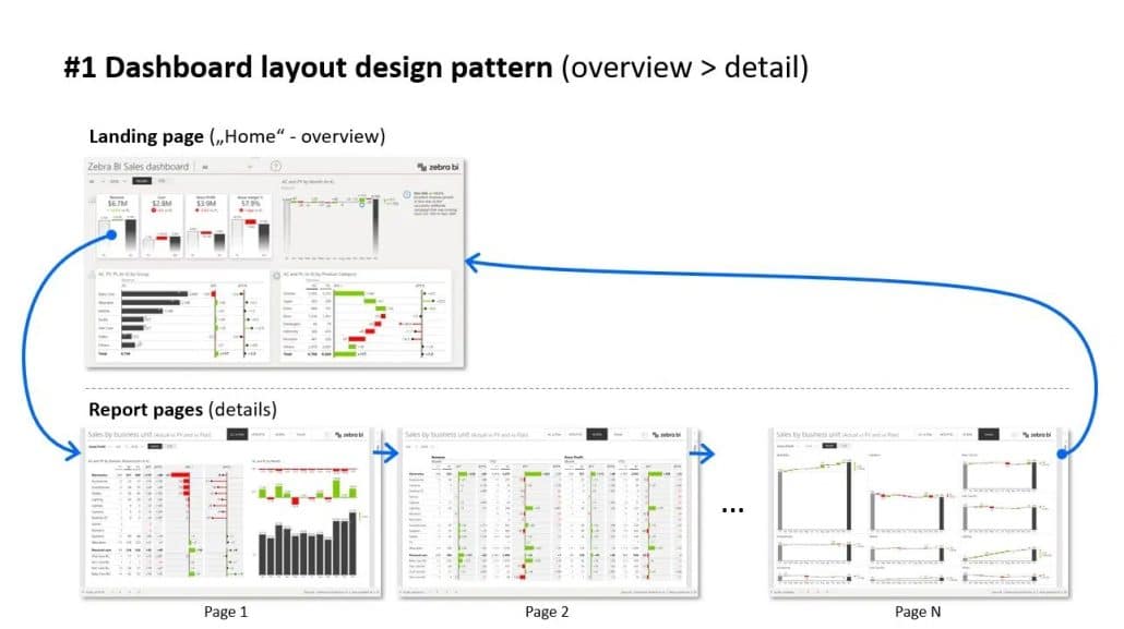
When designing a dashboard, start with a really good landing page. This is the first page your users will see, and it sets the "tone" for finding actionable insights.
When designing it, keep your audience in mind and personalize it for them. A sales manager (and their sales team) will need a sales KPI report with all the metrics they're responsible with. It could be about revenue targets, conversion rates, or other measurable goals agreed on.
Make the landing page your priority
How do you come up with the right KPIs? The best way is to talk to the users and then think about what contributes to these KPIs (and how they help with your business' strategic goals). Then you might focus on a breakdown by business units, by account managers or something else.
You really should make the landing page a priority. A good landing page drives adoption and user engagement. If you do a good job with the landing page, then people will keep coming back to their dashboards.
Detailed report ready just with a click
Once you have the landing page, you need to make sure that people will be able to navigate from the landing page to detailed reports. If possible, have it available just a click away. Do not make users click a series of filters or slicers on the landing page. That’s not what it’s there for. The landing page should provide key information and links to other reports.
Make navigation available through the content. When a user wants to investigate a certain data point, the most natural thing is to click on the element. This is where you should use the drillthrough option in Power BI.
With drillthrough you can easily move the user from the landing page to a report that is automatically filtered based on the choice the user just made. From there, they can navigate through multiple pages and then return back to the landing page.
Scaled Charts Help You Understand What Is Happening
Our next stop is a Power BI dashboard with the ever-popular speedometers.
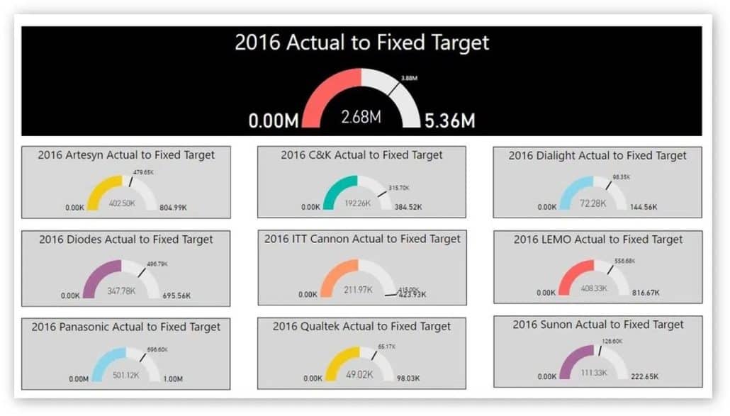
Individual charts are showing gaps but they’re not scaled. If you look at the two yellow charts, the one showing a larger gap is actually working with much lower totals, so it is probably less important than the other one.
Each chart is a different color and it’s impossible to see what individual colors mean if anything.
Proper KPI Dashboard Example
It is possible to do better. Here is a Power BI dashboard example for an actionable executive board.
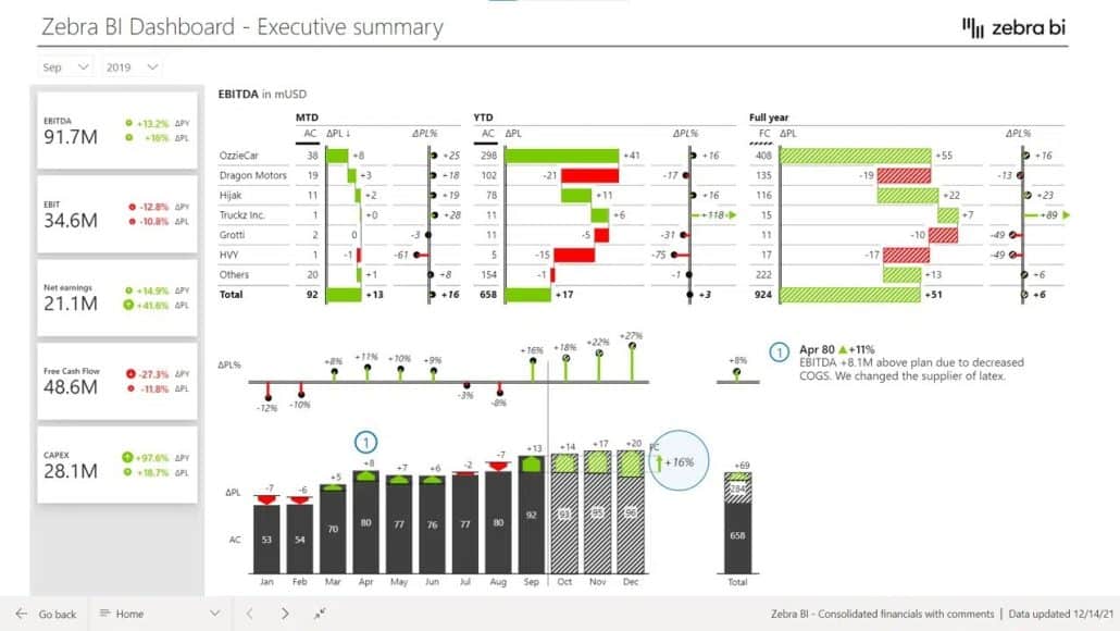
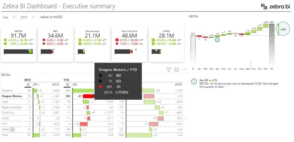
This dashboard has a KPI area showing key information about EBITDA in EBIT, net earnings, free cash flow, and CAPEX. You can click individual KPIs to filter the page and show information to date as well as forecasts and plans.
Or you could click on the free cash flow KPI that’s red and probably needs your attention. A click applies a new filter to show details about the problem area.

You can also drill through individual charts to locate the actual issue for poor results.
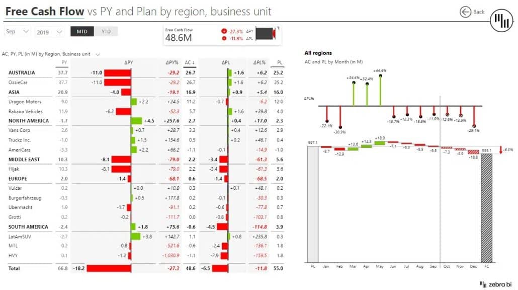
This makes it much easier to get the information you need to take action.
Before you can visualize your KPIs in one place, your KPIs should be consolidated. Learn how to consolidate your KPIs using 3 hyper-effective ways.
Ace Your KPI Dashboard with Zebra BI Cards
Visualizing KPIs in Power BI is quite a challenge. Natively, you don't have a lot of good options to visualize the performance of your KPIs cards in Power BI.
We came up with a solution for this, though.
The KPI area in this example was created using the Zebra BI Cards visuals, which helps bring your Power BI KPI cards to a whole new level. This interactive visual was created in response to our users’ requests.
Made you curious?
Try Zebra BI for Power BI, now.
Outstanding article. Most articles on the internet talk about things only at a concept level. This is something that can be used immediately. Too good. Keep up the good work.
Thank you Bhushan for your feedback. 🙂 If you are not already using our visuals you can try it out for 14 days for free or if you do, we would appreciate if you will give us your review on AppSource. Thank you. 🙂
Big Annoying Numbers (trademark pending)