Watch video tutorial
If you'd like immediate access to the full 1-hour video recording with Zebra BI's CEO and Founder Andrej Lapajne and the presentation from it, just fill out the form:
The end of the year is coming up, and this is when everyone produces tons of presentations to showcase their progress over the past twelve months. However, it can be difficult for anyone to grab all the data from different systems and tools, such as ERP, Word, or Excel, and deliver compelling, consistent, and meaningful presentations that keep people engaged. You don't want anyone yawning as you speak, don't you?
You want to capture their attention, tell a story, and lay the groundwork for meaningful and actionable decisions.
In short, we want to show you how to create perfect slide decks like today's top consultants.
We've all been there. An internal meeting, where the speaker is just moving from slide to slide, dropping financial numbers and tables on people like a downpour of figures. Then there are some pie charts from marketing and sales, followed by an elaborate financial analysis by the financial planning and analysis people. You can see some tables copied from Excel, screenshots from a BI tool, and - finally - more numbers.
Essentially, people use PowerPoint as a graveyard for everything, an empty bucket where they can copy and paste content. They expect that the audience looking at this will understand it and gain knowledge and insights from it.
That's practically impossible.
A listener must understand all these inconsistent shapes, colors, and data from different contexts. This is not how to achieve clarity and unlock insights. We have vast quantities of data available to us, and it is our responsibility to deliver insights based on our data in a meaningful and actionable way.
Let's look at how a better solution might look:
This presentation brings together data and insights from many different tools. Some of it is from Power BI, and some from Excel. Some of them are just ad hoc analyses and charts created in PowerPoint. However, the presentation is consistent. It has a consistent storyline and design, where a specific shape and color means the same regardless of the tool used to create it.
This blog post will examine the best practices for creating PowerPoint slide decks. We will go beyond design tips because we live in a different time now. Meetings occur online in collaborative spaces, so we need more than static charts and tables.
People working together on a project might want to drill down into data, filter it, get details, or make comments to provide more context or insight. We need to create visuals that allow them to do that, and we need tools that can do it very fast.
This blog post will show you how.
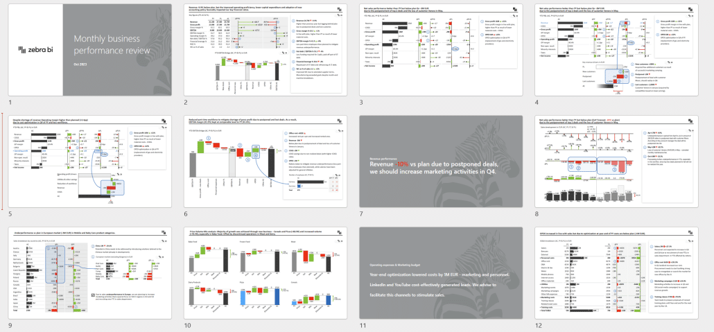
Now, let's look at a fictional slide deck created by a consultant. This is a monthly business performance review, and here is its opening slide.
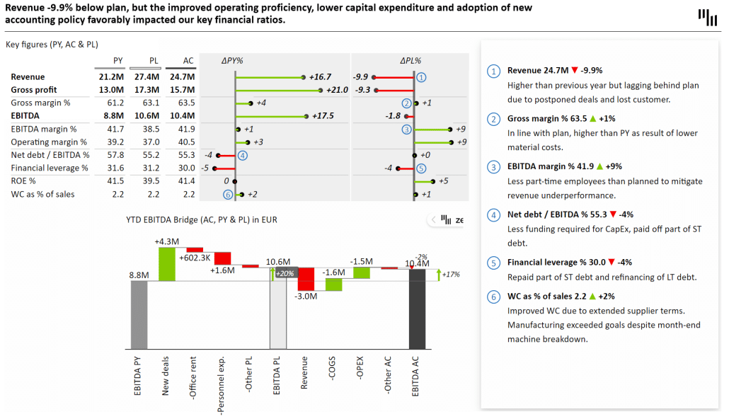
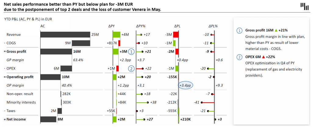
The situation is pretty straightforward. The slide starts with the most critical KPIs in the upper left corner. This means revenue, gross profit and margins, EBITDA, operating margins, etc. This is the first thing managers look at, and they can quickly assess the situation. In this case, revenue is growing but remains 10% below the plan. The EBITDA margin is already in the green, which is good.
This exciting situation could be challenging to understand just based on the numbers.
To solve this issue, you need to provide context for the numbers. As you can see, each line is commented on to give answers to individual data points. These are called linked comments and are an integral part of this chart.
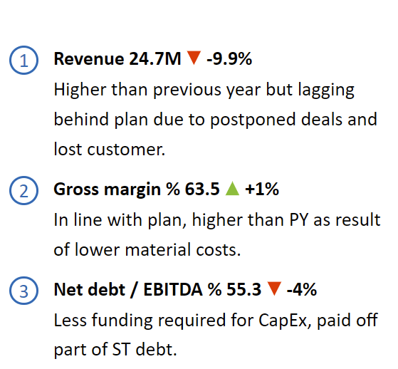
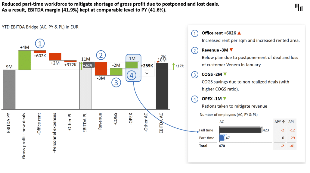
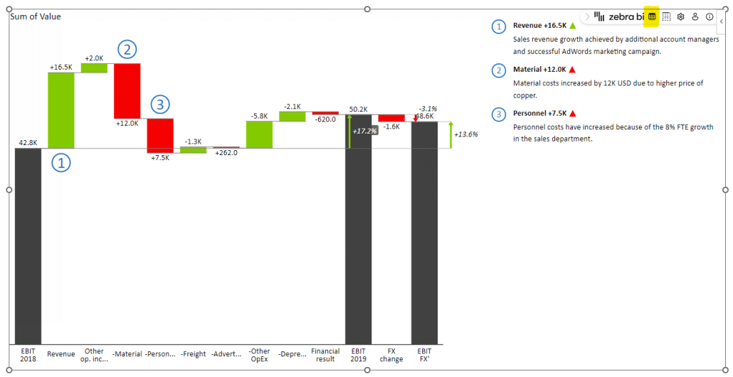
In the previous slide, we learned that revenue is 10% below the plan, and this is the information we are chasing now, trying to explain what happened. We want to show what contributed to this shortfall of 3 million. A great way of doing this is to "explode" a single variance into a separate chart to show what contributed to the value on the same slide:
How did we do this? It's a straightforward trick requiring adding another visual to the slide. This is easy to do if you're using Zebra BI for Office.
This additional visual provides a convincing explanation for what went wrong. It shows that the shortfall was caused by postponed deals, meaning the sales cycle has been prolonged.
Explanations like these expose the drivers behind your KPIs. Think about what is impacting your KPIs and then plot it. When choosing charts, we recommend vertical waterfall charts that show the contributions of those drivers to the final value. This type of analysis is also called a contribution analysis.
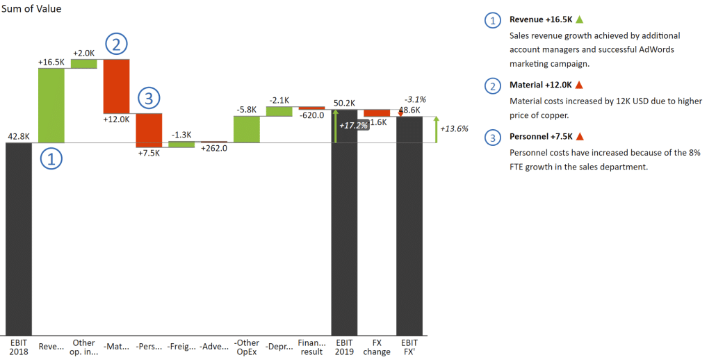
Here is another example of this highly recommended practice:
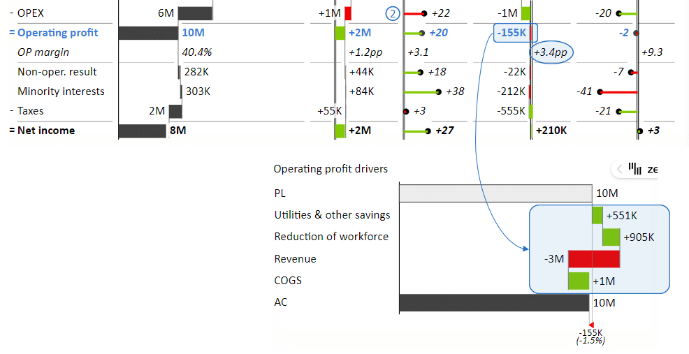
This chart shows the drivers behind the operating profit KPI. You can see that these explanations are straightforward to do. You need to add another visual and then use shapes to highlight and show the relationship between the two charts.
Creating a great slide is not hard when you have the right tools. This section will show you how to build a consultant-level slide using Zebra BI for Office. Let's start by looking at the result we're shooting for.
To start, you'll need the Zebra BI add-in that you can find in the Office Add-Ins marketplace.
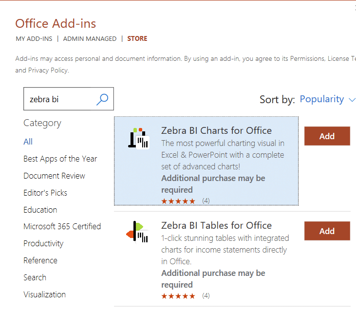
Both add-ins are free and have all the features unlocked, although they put a watermark on your visuals.
Create a blank slide and add a Zebra BI chart to it. On the left, select the Contribution chart type, and then select the Bridge chart on the right.
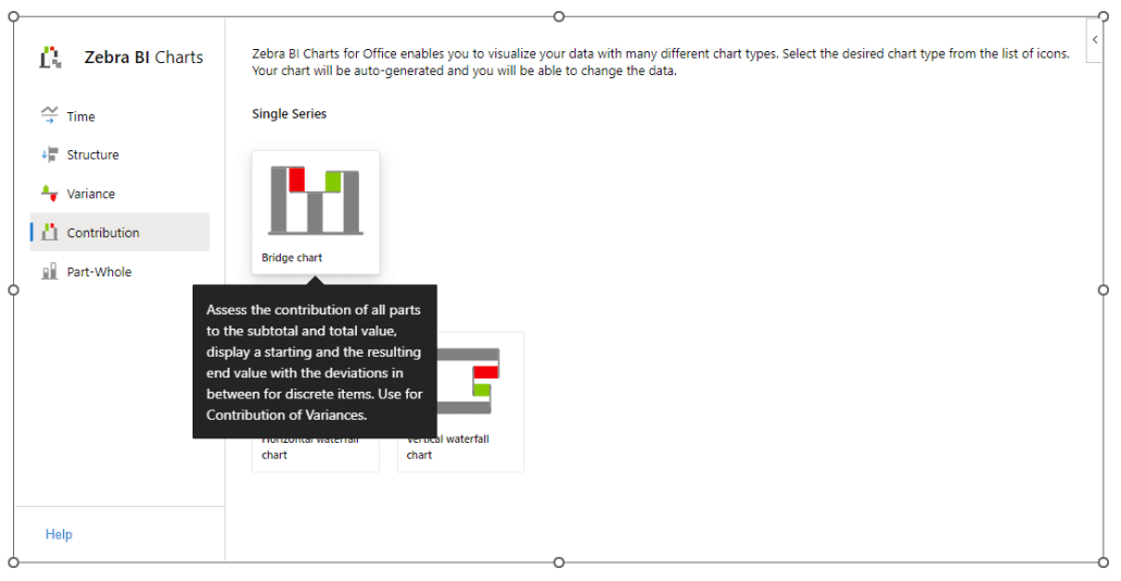
This adds a waterfall chart with sample data to your presentation.
You need to add your data by clicking the data editor button in the Zebra BI option slider in the upper right corner of the visual.
It looks like a little Excel table, and it's included out-of-the-box, so you can easily add data.
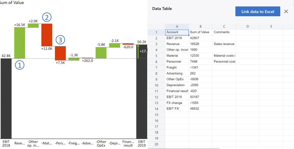
To make things easier, copy and paste data from the visual included in our sample PowerPoint presentation (you can download it from HERE).
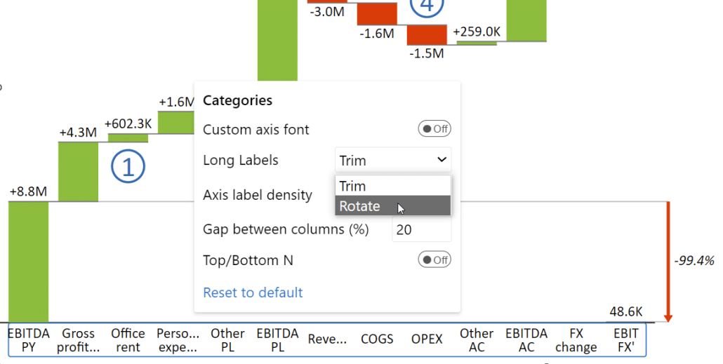
This chart needs some tweaks to ensure it communicates information well. Start by expanding the space available to labels. Click on the label area and select Rotate on the Axis label density drop-down menu.
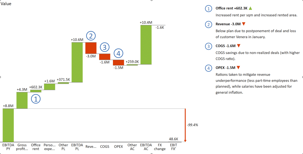
The next step is to set EBITDA PY, EBITDA PL, and EBITDA AC values as results instead of contributing drivers. Click on each column label and turn on the Result switch.
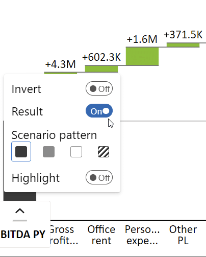
You also want to differentiate between different types of EBITDA. The actual value should be visually distinct from the plan and the previous year's values. The issue of this has been solved by IBCS specification. In this instance, we use light gray in the prior year's value, an outline for the plan, and solid gray for the actual results. As shown above, you can set the shading of columns by clicking on the label name and selecting it from the Scenario pattern selection row.
This is what we have done so far:
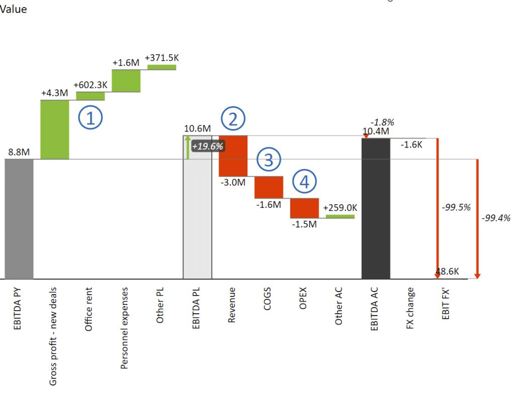
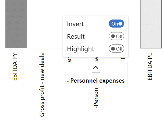
The next step to making the waterfall chart work is correctly invert individual values. For example, office rent and personnel expenses lower your EBITDA, so you need to invert them. The same holds for KPIs like the cost of goods sold and OPEX, where negative values contribute to your EBITDA, and you must also invert them.
Invert values by clicking on label names and turning on the Invert switch.
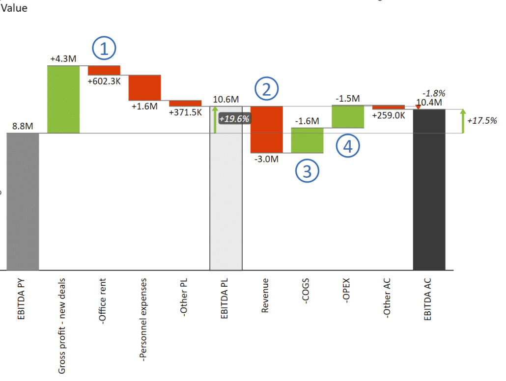
Here is the final result:
So far, we've been looking at how you can create visuals inside your PowerPoint slides. However, large companies, in particular, usually already have reports created in Power BI or other reporting tools. This option is desirable because all your data is constantly updated and available in the form you need.
The great thing about bringing Power BI into PowerPoint is that fully interactive visuals and dashboards are embedded in your slides. It offers all the advanced features of Power BI so you can explore data with others collaboratively.
Since both are Microsoft tools, the embedding process is straightforward. Select a report in the Power BI service to display on the canvas. Then, select Export and Embed live data in PowerPoint. You can either copy the link or select Open in PowerPoint. Power BI will now generate a slide with this report embedded. You can copy the slide into your deck, and you're done.
This is where the added value of an add-in like Zebra BI becomes apparent. Since it uses a consistent and unified visual language, it doesn't matter which visual tool was created. Green denotes positive variance, while red means negative variance. Forecasts are marked with a pattern, while actual values are in solid grey.
This approach allows you to mix and match your tools and reports and bring them together in PowerPoint.
When organizing your presentation, the best approach is to follow the principle of the information pyramid. With this approach, you start at the top with the key message that you then try to break down and explain at the lower levels so that people gain understanding. Ideally, you start with a single executive summary slide that displays key information.
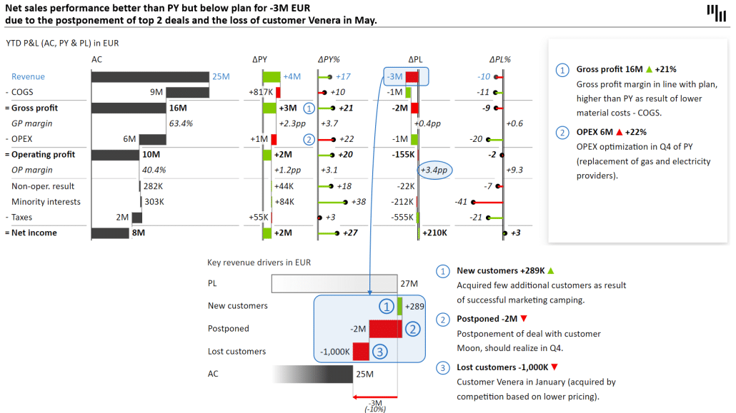
In our case, the part of the story we want to drill down into is the 10% revenue shortfall compared to the plan. This is the slide explaining it:
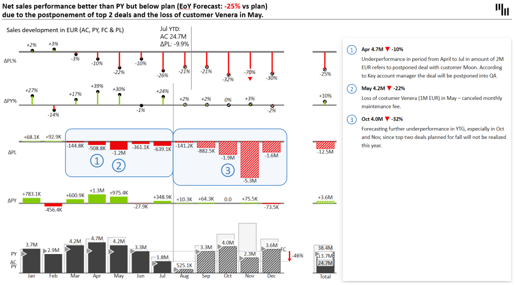
The chart clearly shows that events in April and May have resulted in a revenue shortfall, and the forecast indicates that the final results will be 25% below the plan.
This chart also shows why it's vital to include forecasts in your presentations. Looking at past data is like trying to drive by looking at the rear-view mirror. It would be best to look through your windshield into the future and look for action items to help you mitigate any issues you identified.
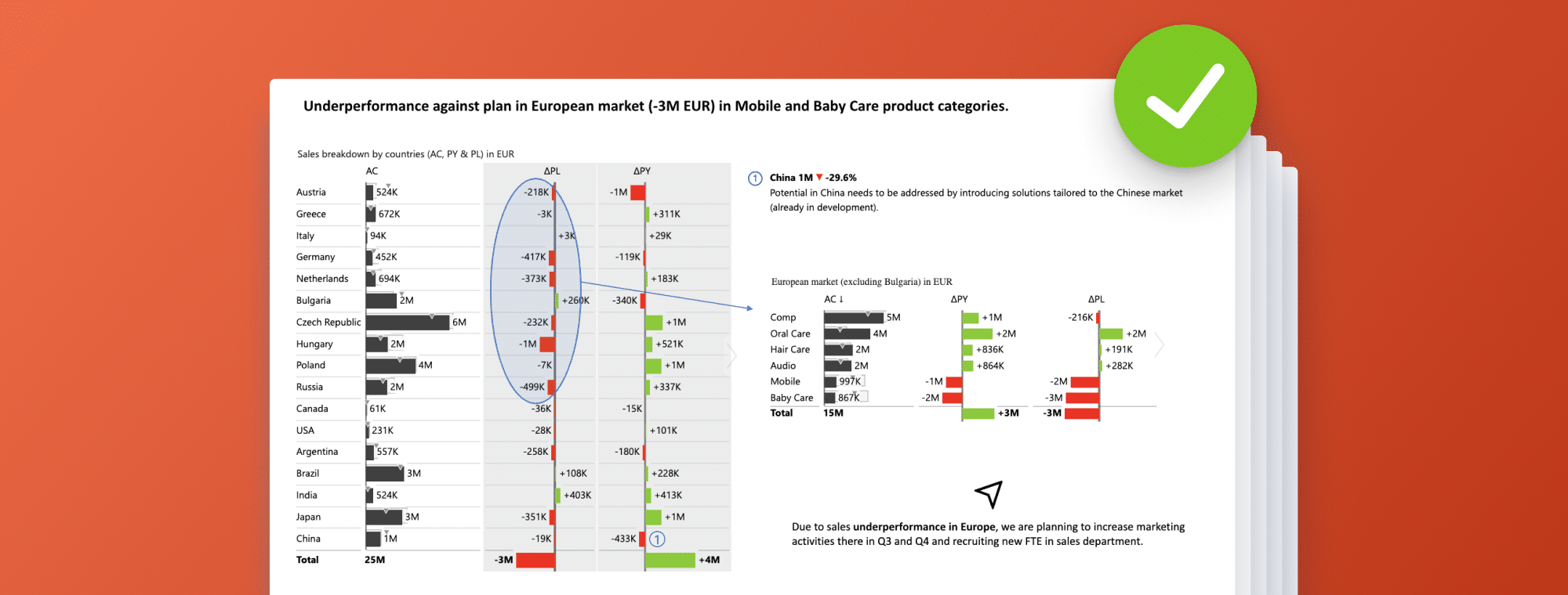
Let's create a country breakdown to understand further what is going on.
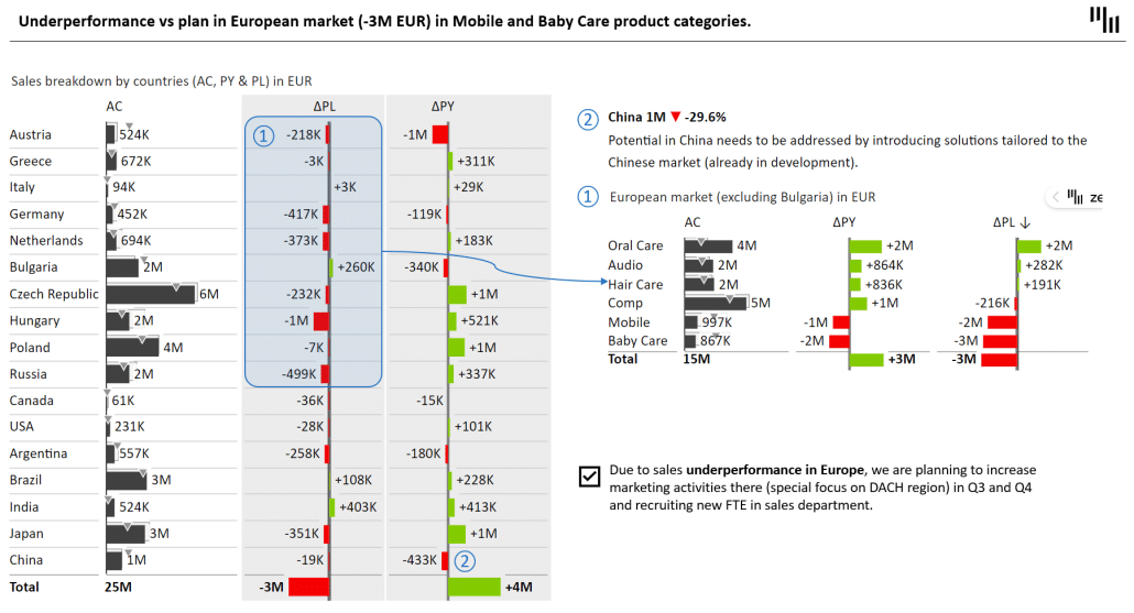
We see that all European countries except Bulgaria failed to reach the plan. To understand what is happening, another chart explains how different product lines are performing. An action item accompanies this to increase marketing activities in the region.
We could also use a price-volume-mix analysis to finetune our understanding of underlying issues further.
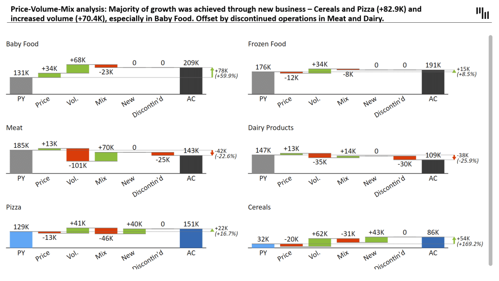
This analysis helps you determine where revenue is coming from and what is generating it. You can look at the causes of variance in revenue. Was it caused by volume or price change? Was the reason a new product or the discontinuation of an old one?
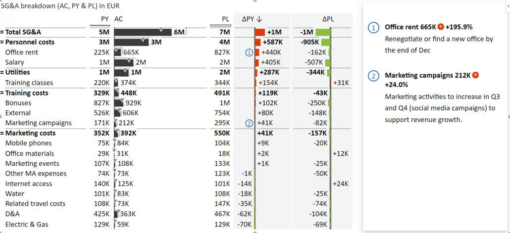
Managing costs is essential to running any business; well-designed presentations can help you do that more effectively. First, look at an operating expenses breakdown by different cost types.
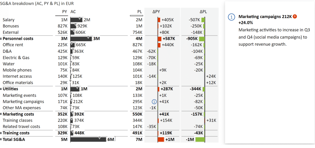
These charts are interactive so you can sort the data by individual columns. For example, you could sort items by the largest variance and see that Office rent has increased dramatically.

You can then discuss the issue with your colleagues and agree that the action item is to renegotiate or find a new office by the end of December.
You can enter a new comment on the fly to ensure everyone understands what is happening. You can open the Data editor and add the action item under comments, which will appear in the visual.

The chart updates instantly to look like this:
These Zebra BI for Office features work in presentation mode, allowing you to work collaboratively. With this approach, presentations are no longer read-only material for you to consume but an interactive canvas for planning actions, writing them down and tracking your decisions.
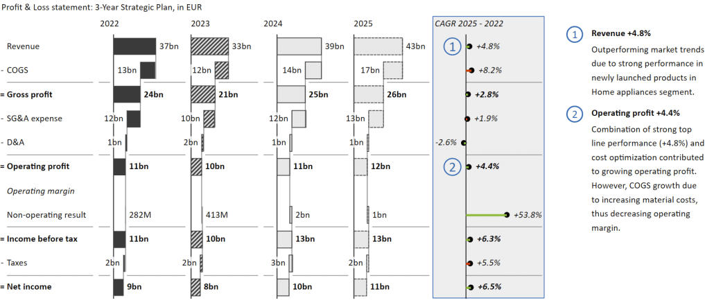
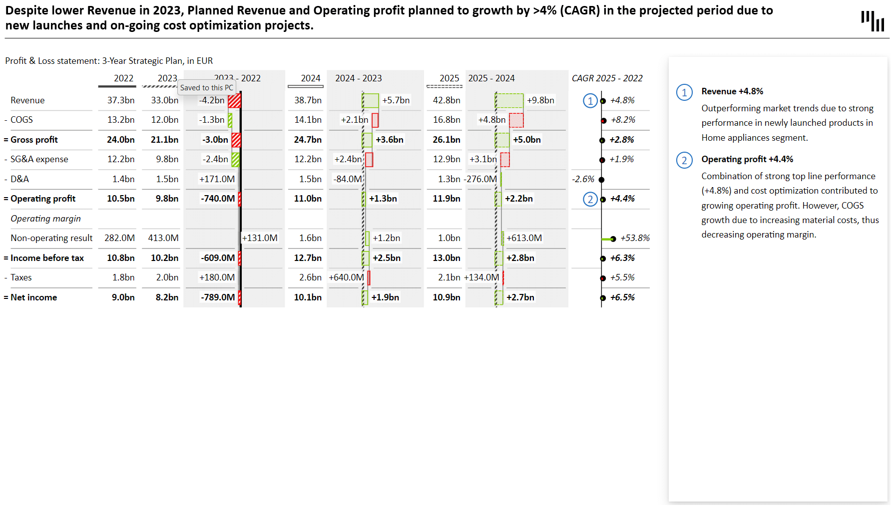
At the end of the year, most business users are working on business plans. First, here's a typical business plan with previous year data, forecasts for this year, and plans for the next two years, along with a compound annual growth rate.
One great thing about using the Zebra BI for Office add-in is the ability to switch between views on a single slide. Instead of having two slides, you can interactively switch between two views.
Instead of values, you can highlight variances using the same data. You need to click on a slider button.
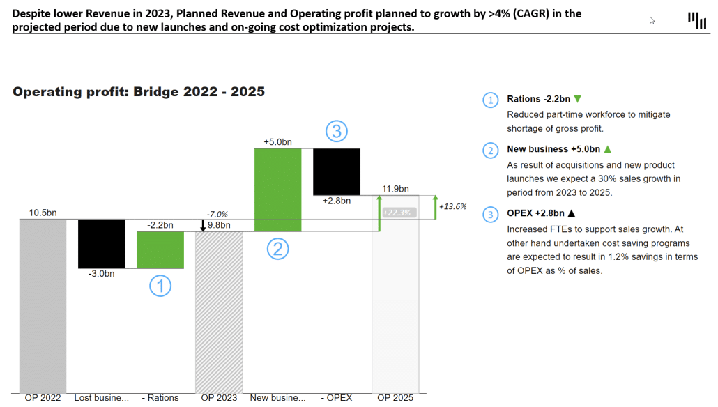
You can then work from this. Many consultants choose to focus on a single KPI based on this. In our case, we have an operating profit bridge, which looks like this:
However, this might not be the best option because the viewer might not remember what was on the previous slide. Here is an example of a possible solution.
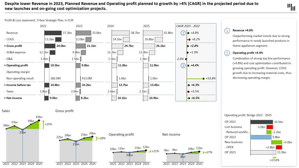
We've made the bridge chart explaining the operating profit much smaller, which leaves us enough space to show even more information in the form of visual trends of individual KPIs. The CAGR indicator is not good at explaining trends, and these small multiples do a much better job of it.
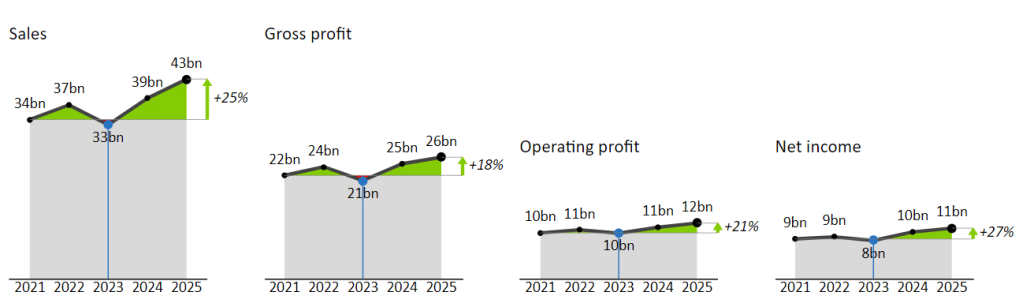
Since we're working with Zebra BI, these are not four charts. It is a single visual that you can then work with. You can switch between different chart types to emphasize additional information.
This approach leads to significantly better information density and lets you explain your points more clearly than switching back and forth between two slides.
We live in a new world that requires us to communicate effectively and interactively. This requires new tools and approaches. Instead of static PowerPoint slide decks comprising a jumble of different data and visualizations, we need interactive presentations to manipulate data and analyze what we see collaboratively.
Zebra BI for Office is an excellent solution for this. It allows you to work with the tool of your choice - Power BI, Excel, or PowerPoint - and create actionable and engaging presentations that hold your listeners' attention and drive collaboration and action.
Hi,
Thank you for providing this knowledge; this article was excellent, and the information regarding the fundamentals of building this spinning progress bar was quite beneficial to us. Thank you for sharing your wonderful work with us; we much appreciate it.