Data Storytelling with Power BI Comments: Shaping Insights and Decisions in 2024
PRO Trial
By definition, creating reports involves communicating data analysis insights and information to stakeholders in the most effective way possible. The heart of a powerful report lies in its simplicity; the clearer the narrative, the stronger its impact.
Commentary and data storytelling are integral to this process, serving as the bridge connecting analytics to insight presentations. Presenting your findings with reflective comments will help you transform raw data into compelling narratives, making insights accessible and engaging for all stakeholders.
What is data storytelling, and why are comments an essential part of it?
Data storytelling boosts information sharing and understanding within an organization. At its core, it leverages stories, one of the most powerful tools for communicating messages clearly and concisely—especially to executives and decision-makers. This approach transforms data perception from mere numbers into insights.
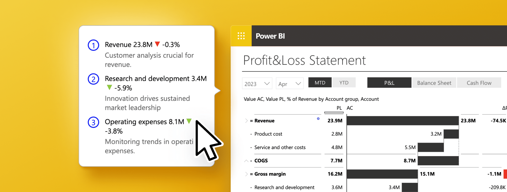
Most dashboards don't have comments or contextual explanations, which is a common problem. However, due to this, stakeholders cannot interpret raw data without additional insights. Such a gap can lead to misinterpretations, inefficient decision-making processes, and overlooked valuable insights.
Combining numbers with comments is the key to translating data into actionable insights. Illustrating what figures tell us and their role in the narrative breathes life into them (see what we did here?:). Dynamic comments improve reports by adding clarity, context, and insights directly within them. These insights lead from detailed analysis to strategic planning, driving informed actions.
Good, thorough analysis combined with storytelling leads to remarkable - and actionable - insights. Analytics experts may struggle to communicate their findings effectively; report readers may struggle to understand the key messages, not recognizing the total value of insights. Mastering data storytelling through comments in Power BI is more than a skill—it's an art that differentiates good analysts from those who can add value and drive actions through their insights.
Looking for a way to understand the broader picture of how turning raw data into stories works? Check out our Power BI data storytelling guide here.
Purpose of Power BI comments and how they fit into storytelling
As the cornerstone of data storytelling, comments transform data analytics into narratives that inform and inspire action. Analysts can shed light on underlying issues that data alone might not reveal by embedding comments. These annotations provide the necessary context, linking numbers to real-world events or strategic decisions, thus giving life to what might otherwise be perceived as mere statistics. In this way, significant data points are highlighted, safeguarding against oversight.
- Comments simplify complex information. The explanations and insights make the underlying data accessible to viewers regardless of their expertise. Having this clarity is essential in corporate environments where a diverse audience must understand data.
- Comments prompt action and encourage discussion among stakeholders.
- Comments support informed decision-making by providing a narrative highlighting key insights. As a result, stakeholders can delve deeper into the data.
The 'why' behind the data will question assumptions and, ultimately, make decisions backed by a thorough understanding of the insights presented. In the end, analyzing data is not just about observing trends but understanding their significance and using them to make strategic decisions.
Who Benefits from Comments in Data Storytelling?
Behind each data point is an expert tasked with analyzing, interpreting, and contextualizing the information. Decision-makers rely on these insights to understand the latest developments or the current state of the business. This understanding is crucial for making accurate and impactful decisions.
Storytelling might not seem like the best use of an analyst's time, to say it politely; in fact, it is quite the opposite. Crafting a narrative through comments saves time by minimizing back-and-forth communication to clarify the report. After all, analysis is not performed for the benefit of the analyst but for those who need to learn and act upon the insights provided.
Management vs. Operational Needs in Comments Context
Management and operational roles stand out because they address different organizational needs. Each requires a tailored approach to data interpretation and reporting.
Management Personas (C-Level, Director, Manager, Team Lead, etc.):
- Needs: Clarity and simplicity are crucial for management personas. They need straightforward reports alongside actionable insights and recommendations that come with context and interpretation of raw data.
- Focus: Their primary focus is strategic decision-making. This requires executive-level, simplified visualizations that distill complex information into actionable insights. They need insights directly relevant to strategic decisions, helping them identify opportunities, address challenges, and achieve business objectives.
- Role of Comments: Comments provide context and interpret raw data. They help translate complex data into clear, actionable insights, ensuring a thorough understanding of the data narrative that informs strategic decisions.
Operational Personas (Business Analyst, Data Analyst, Reporting Specialist, etc.):
- Needs: These roles demand extensive reports and detailed analyses that delve deep into the data.
- Focus: The focus here is on detailed data analysis and interpretation, requiring advanced and complex data visualizations that uncover the nuances within the data.
- Role of Comments: For operational personas, comments serve as a bridge between raw data and insights. They help clarify and contextualize the data, making it easier for these professionals to conduct a thorough analysis and draw conclusions.
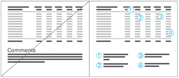
Comments must be seamlessly integrated right alongside your data, not tucked away in a separate file or email. This on-the-spot placement is crucial for both management and operational personas, streamlining processes and enhancing the understanding of the story or key message behind the numbers. This ensures that insights are immediately actionable and fully contextualized within the report's visual landscape, enabling a more effective and intuitive decision-making process.
To conclude, comments in data storytelling are needed across the spectrum, from management to operational roles. Each group benefits from comments differently, but the underlying value remains the same: comments turn data into a narrative that informs, clarifies, and drives action. Whether simplifying complex information for executive decision-making or providing depth and context for detailed analysis, comments are indispensable for making data accessible and actionable for all stakeholders.
How to Tell a Story with Data and Power BI Comments
Telling a story with data is about guiding your audience through a narrative that informs them and prompts them to act. To achieve this, consider what you want the audience to know and what you want them to do. Incorporating narrative elements through comments significantly boosts visual effectiveness, improving understanding and engagement.
Improving Visuals with Narrative Through Comments
1. Contextual Amplification
Comments should amplify the impact of visuals. When you integrate comments directly into charts or other visual elements, you enrich the audience's understanding. Comments that are seamlessly woven into the visual components they refer to ensure a higher level of comprehension. This integration is crucial, allowing comments to become part of the visual narrative and enhancing the overall message.
2. Clarity Over Redundancy
Avoid using terms that state the obvious or merely label what's already visible, such as "chart analysis," "development," or simply "comment." Terms like "table," "statistics," "report," "visualization," "structure," and "trend" add no value if they just reiterate what the audience can see. Instead, focus on minimal yet meaningful text that complements the visuals. Your comments should add value and propose actions or recommendations, gaining additional weight as visual data insights support them.
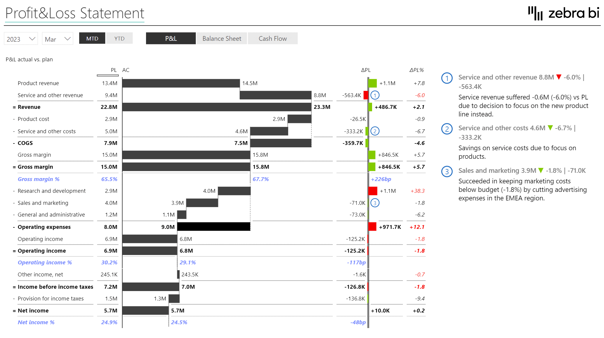
3. Precision in Commentary
Use comment markers thoughtfully, pairing them with specific values or positions within charts or tables. This approach ensures that your comments are directly linked to the relevant data points, enhancing the narrative's precision and impact.
4. Consistency and Standardization
A consistent comment design and standardized references significantly improve comprehension and speed. Uniformity in how comments are presented and referenced across your reports ensures smooth narrative flow and insights are quickly grasped.

By focusing on what the audience needs to know and guiding them toward what you want them to do, you transform data from mere information into a compelling story. You craft narratives that inform and inspire action by strategically using comments to provide context, clarify complexities, and link insights directly to actions. This approach to data storytelling guarantees that your reports extend beyond facts presentation, becoming powerful tools for decision-making and strategic planning.
Enriching Data Storytelling with Advanced Features
To maximize your data storytelling in Power BI, integrating comments with other dynamic features creates informative, interactive, and impactful narratives. Learn to master these features through the resources available at Zebra BI Academy, the Zebra BI Knowledge Base, and our extensive guides.
Highlighting: Use it to highlight key data points, enhancing their significance within the narrative.
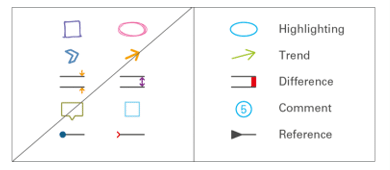
Drill-Through: A direct link to more detailed reports allows deeper analysis.
Bookmarks: Save and revisit specific views of your data effortlessly, preserving your insights context.
Tooltips: Provide additional dimensions and detailed insights not immediately visible in the primary visual.
Slicers & Filters: Dynamically refine the data displayed, enabling focus on specific information subsets.
Top N+ Others: Prioritize visibility of critical data elements, avoiding overwhelming your audience with excessive detail.
Quick Column Calculations: Rather than manually calculating additional measures, use custom calculations. These readily available custom calculations simplify the process of making Zebra BI Tables more understandable at first glance.
Formula Editor: Whenever you want to add another element to your table that is not in your data set, you can directly calculate it with a custom formula within a Zebra BI Tables visual.
For best practices in preparing visuals for storytelling, explore actionable reporting further and the International Business Communication Standards (IBCS).
Conclusion: Why do you need Power BI Comments?
With Power BI comments, data storytelling surpasses traditional reporting by presenting context, explanations, and actionable insights. This guide illustrates the pathway to transforming raw data into compelling narratives. It highlights the crucial role of comments in clarifying complex information and guiding strategic decision-making. For decision-makers to truly understand the "why" behind the data, it is essential to intertwine these elements within the fabric of data analytics.
As we've explored, comments are not just annotations; they are the bridge between data and decision, offering the context and insights needed for informed strategic actions. Whether through enriching visuals, integrating advanced Power BI features, or adopting best practices for data presentation, the goal remains the same: empower decision-makers with the knowledge to make confident and decisive decisions.
For those seeking to navigate the complexity of data-driven decision-making, welcoming the art and science of data storytelling through comments is not just an option; it's a necessity.