Designing Financial Statements for Non-Profits & Foundations - The Gates Foundation example
This time we'll take a deep dive into the 2014 annual report of Bill & Melinda Gates Foundation to find out if data visualization can help explain their consolidated financial statements. As Stephanie Evergreen pointed out in her intriguing article, there's a lot of room for improvement in annual reports of non-profits and foundations (to put it mildly). Data visualization in annual reports is far from being efficient and clear. Many times it's just non-existent.
Stephanie's got an excellent point. However, when observing her proposed visuals and especially when faced with the extreme ranges of values in the financial statement of Bill & Melinda Gates Foundation, I thought it's time to add some more 'meat' to this topic.
Original Report
Here's the original report by KPMG:
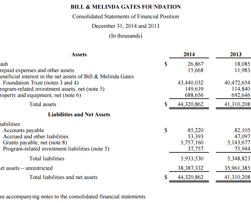
A plain table. It's obvious that the sole goal here was to hand over exact numbers. No effort whatsoever was put into communicating these numbers to the readers. The thing looks like it's been typed on one of those old typewriters my father used to operate on in the '60s.
It is perfectly legit to use tables in reporting, but even tables can benefit from a few design rules. For example, the least you can do is to align the text in columns correctly. But how about doing the readers a favour and present the changes between 2013 and 2014? How about helping them understand what caused those changes?
Enough said, let's move to the important question: can data visualisation help present such financial statements in a better way? Would charts help? Which charts and in what arrangement?
OK, first a couple of observations about this dataset. It's particularly challenging for several reasons, the main ones being:
- Outliers. One of the figures (Beneficial interest in net assets of the Bill & Melinda Gates Foundation Trust) represents 98% (!) of all the assets, making other assets practically irrelevant for the analysis of this financial statement.
- Structure of data categories. The dataset is a calculation, not just a simple comparison of data elements. On top of particular types of assets and liabilities, we also have Total Assets and Total Liabilities as well as the resulting Net assets, plus an additional sum of Liabilities + Net assets.
- Semantics. Elements within the dataset have opposite meanings: positive (assets and net assets) or negative (liabilities).
There are many possibilities for how to design consolidated financial statements. Read on to discover 3 redesigns that hopefully get the message across.
Redesign #1: Visualize and explain the changes
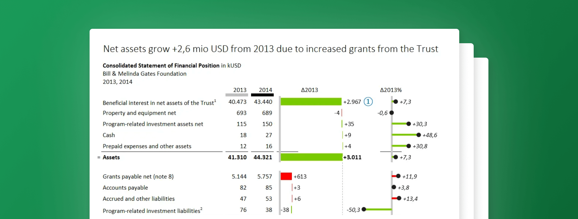
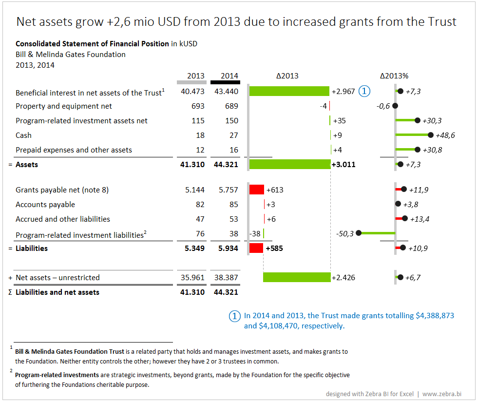
Since financial statements are predominantly read by financial professionals, shareholders and other professional readers, my guess is that could appreciate something like this:
Does it make sense to you?
Since the base values (particular assets and liabilities in USD for 2013 and 2014) differ almost for an order of magnitude (from $43 Mio down to $16.000), it makes little sense to try to compare them directly in charts. So I decided to leave them in a table and visualize the variances instead.
After all, the most important thing here is the change from the previous year and the explanation of what caused this change.
So Δ2013 in the above report represents the absolute change from 2013, while Δ2013% represents the relative change from the previous year (growth in %). Positive changes are green, negative changes are red.
Now for the tricky parts:
- The structure of changes in assets: to explain how changes in certain assets affected the total growth of assets, we used the waterfall chart. This way is becomes pretty obvious that the growth in the "Beneficial interest in net assets of the Trust" is the single most responsible data category that affected the total growth of assets.
- The structure of changes in liabilities: similar to assets, we visualized the changes in liabilities with another waterfall chart. We can see that "Grants payable net" were most responsible for the growth of liabilities. However, this time the increase in liabilities has a negative meaning, that's why the red/green colors are inverted.
- The relation between assets and liabilities: to properly understand the relation between assets and liabilities, both waterfall charts are scaled (rendered on the same Y-axis scale). Now it's easy to see that the assets grew much more than liabilities.
- Net result - the Net assets: the result of the calculation (Assets - Liabilities) is preseted as a floating bar, exactly in the position between the total assets and total liabilities. We call this a subcalculation. Two assisting vertical lines (dotted) further indicate this calculation. Because a growth in net assets is a positive thing, it's colored green.
- Relative growth in %: for practical reasons I also visualized the relative growth in %. But a percentage is a totally different unit then thousands of dollars, that's the reason why the rightmost charts also look differently. These charts are called 'pin' charts, however, I like to call them lollipops. Again the color of the red/green line representing the variance is inverted for the liabilities. (BTW: relative changes are only meaningful when the base values are equally big. Othwerwise - like in our example - they become very volatile. In this case you can just skip the visualization and put them as numbers in a table column instead.)
A few more subtle details in the design (hopefully) further enhance the understanding:
- A light gray marker under the column header for 2013 is repeated in all chart's axes. The axis is not just a plain line, but rather a semantic axis, indicating the base scenario (grey = previous year).
- In all the charts, number labels contain either a + (plus) or a - (minus) sign in front of the number. This helps the reader understand that those are the differences (changes from previos year), not the absolute values.
- Labels for negative variances are always displayed on the left side, while positive labels are on the right. So even if the variance is extremely small, the position of the label will indicate its nature
- The % sign in the rightmost charts (relative variance) is deliberately omitted from the number format for better legibility. However, the chart title (Δ2013%) contains the sign so that we know what we're looking at.
A big headline at the top introduces the reader to the story, while (finally) a blue comment is added directly to the visualization so that the storytelling is complete (in KPMG's original report, the comments are placed separately somewhere at the back of the 16 pages long report).
Disclaimer: I invented the headline for educational purposes only, I'm certainly not an auditor. Also, if my maths is correct, the KPMG's comment only explains $0,28 mio change, not the $2,9 mio? (@KPMG: help!)
Alright, that was just a warm-up 😉 Read on to discover a few more possibilities of designing consolidated financial statements.
Redesign #2: Waterfall charts
Here's another approach, this time more visual. The table is gone, all values are displayed in waterfall charts:
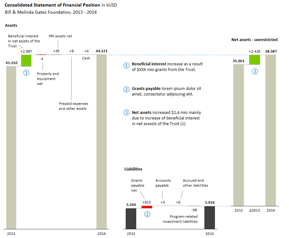
Each waterfall chart explains how the changes between 2013 and 2014 in particular categories contributed to the total growth. E.g. Assets grew from $41.3 mio in 2013 to $44.3 mio in 2014 and practically all this growth is because of +$2.9 mio change in 'Beneficial interest in net assets of the Trust'.
Since all charts are scaled, we clearly see that liabilities are much smaller than the assets, resulting in fairly large net assets. The Net Assets chart is positioned slightly higher - a little trick that helps understand that net assets are a difference between the assets and liabilities.
A simplified version of this approach would be to display the net assets only and focus on how the changes contributed to the final result: the growth of net assets:
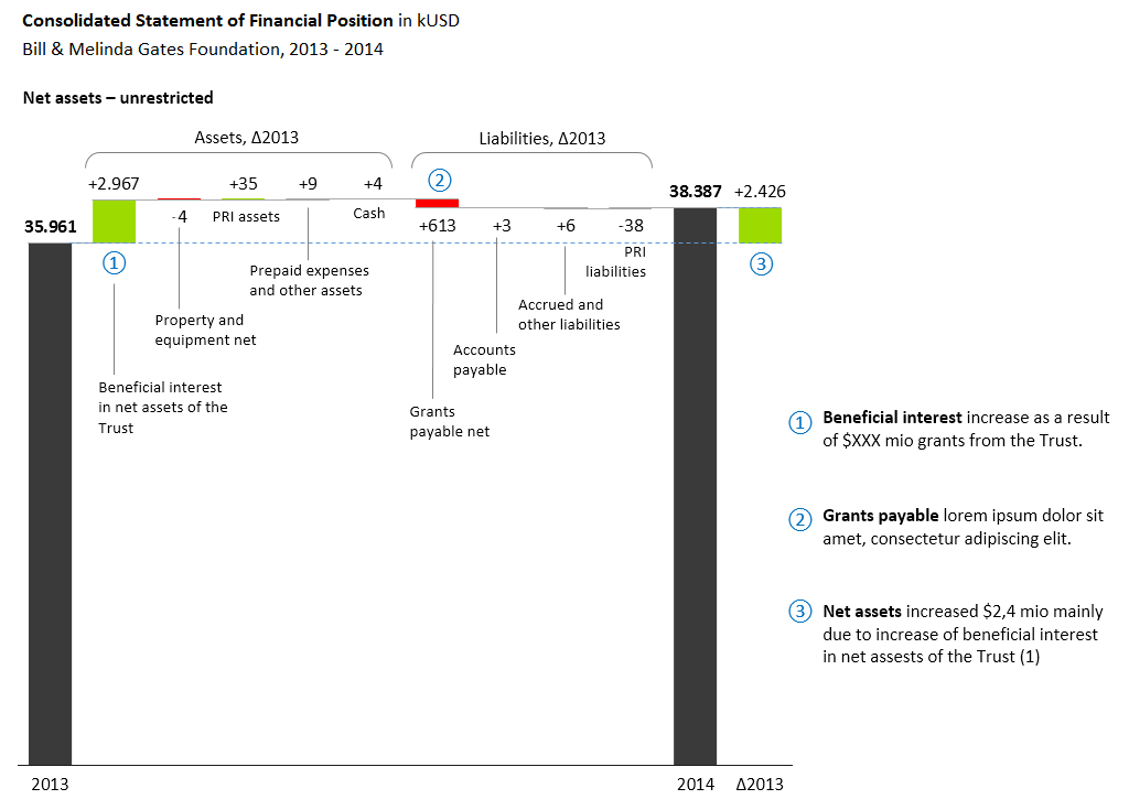
Btw, I've created all my examples, including all the waterfall charts in MS Excel with Zebra BI Add-in.
Redesign #3: Comparing figures in all data categories (Small multiples)
Finally, here is Stephanie's redesign, that actually triggered this whole writing:
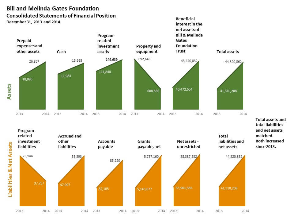
As she proclaimed in her original post, I'm sure this visualization 'is going to grab a lot more eyeballs'.
All figures in the charts, that's great. Arranged in small multiples, that's even more exciting. I'm a HUGE fan of small multiples, as you can learn from my previous articles, for example How to visualize trends for multiple markets, products, etc., Making small multiples in Excel or Small Multiples – 16 are better than one.
But wait a minute, what does the above visualization actually tell us?
That all categories are very similar in size??? The first 3 assets are practically the same and so are all the liabilities (except from the first one)?
And why are Net assets orange and appear within liabilities? According to this visualization's logic, they should be green and placed separately.
The problem with the above solution is that small multiples are not scaled. But they should be. Every chart above has its own Y-axis scale, that's why they all look similar. But as we've already learned, the differences between categories are in fact huge.
So just for a quick exercise, let's try to fix the scaling and see what we get:
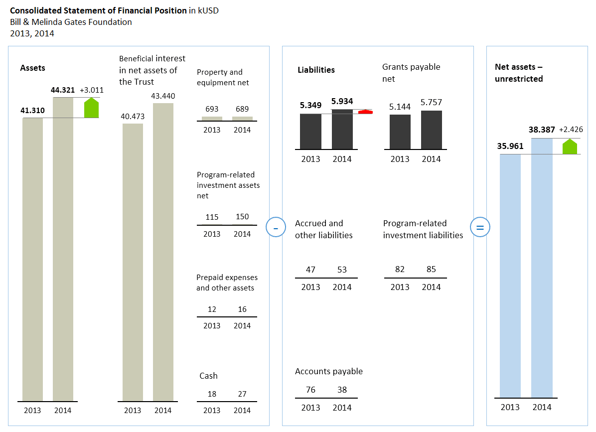
This is a true picture. Everything is scaled so we can compare all the categories. I also added a few red and green highlights to emphasize the key message.
Some categories like Cash or Accounts payable are almost non-existent, but that's exactly the situation in Bill & Melinda Gates Foundation's financials.
BTW, if you really want to break the scale, do it only once and make sure that you visually indicate it:
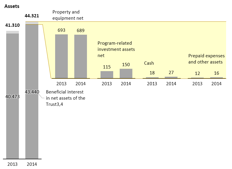
I've used the 'lens' method to indicate that all small charts belong to the tiny, practically irrelevant portion of the assets. The 'Beneficial interest in net assets of the Trust' takes up almost all the assets. Now the chances that the reader will understand the true nature of assets are much higher.
To conclude, I would say that redesign #3 with small multiples is really taking us nowhere, so I would stick with either redesign #1 or redesign #2. Do you agree?
Don't forget your target audience!
Before I rest my case, I need to make another important point; the choice of data visualization depends on many factors. One of them is the target audience.
Who's reading these reports? Is it the general public, the shareholders or somebody else? Are they financially savy or not?
Only when we're familiar with the readers and their goals, can we decide upon the design. Especially on its complexity.
OK, I rest my case. 😉

 September 8th
 February 22nd