 September 8th
 February 22nd
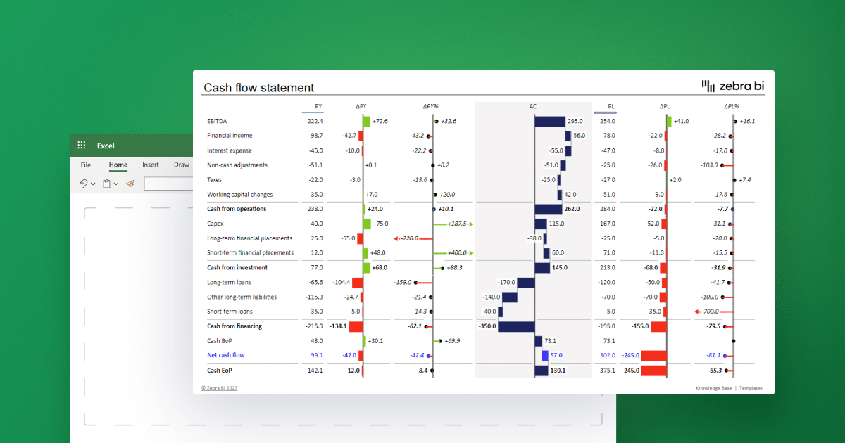
Cash Flow Statement in Excel: How To Create A Good One In 2024
Managing cash flow is crucial for businesses of all sizes. Understanding your company's cash inflows and outflows can help you make informed decisions, optimize operations, and improve financial performance. One of the most effective ways to gain visibility into your cash flow is by creating a cash flow statement in Excel.
Excel is a powerful tool that allows you to organize, analyze, and present financial data clearly and concisely. A cash flow statement in Excel will help you easily track your cash flow and identify trends, risks, and opportunities. Moreover, Excel provides flexibility and control over your data, enabling you to make changes quickly.
In this guide, we will show you how to create a cash flow statement in Excel that does not suck. We will provide step-by-step instructions on building your cash flow statement from scratch and best practices for accuracy and error-proofing. We will also introduce you to Zebra BI for Office, a powerful add-in for Excel that can help you take your cash flow statement to the next level with actionable charts and next-level tables.
Whether a small business owner or a controller, this guide will provide the tools and knowledge you need to create a top-notch cash flow statement in Excel. So let's get started!
The fastest way to create a cash flow statement in Excel
Get the feature-rich statement of cash flow template that shows how different factors affect your cash flow and presents your numbers in context.
Zebra BI was made for:
- BI specialists
- FP&A specialists
- Consultants
- Digital transformation officers
- C-level and managers
Understanding the Cash Flow Statement
Before we dive into the nitty-gritty of creating a cash flow statement in Excel, it's essential to understand what this type of statement is and why it matters.
A cash flow statement is a financial statement that shows how cash is coming in and going out of a company during a specific period.
It provides an overview of a company's cash position by breaking down cash inflows and cash outflows into tIt provides an overview of a company's cash position by breaking down cash inflows and cash outflows into three categories: operating activities, investing activities, and financing activities.
- Operating activities refer to cash inflows and outflows that result from a company's primary business operations, such as revenue from sales, payments to suppliers, and salaries to employees.
- Investing activities refer to cash inflows and outflows that result from buying and selling long-term assets, such as equipment, property, or stocks.
- Financing activities refer to cash inflows and outflows that result from raising and repaying debt, issuing and buying back stock, or paying dividends.
By tracking these three categories, a cash flow statement provides a comprehensive picture of a company's cash position, helping financial management teams, investors and managers understand how well the company manages its finances, how to improve cash management and preempt cash flow issues, as well as how to create an accurate cash flow forecast.
Cash Flow Statement vs Income Statement vs Balance Sheet
A cash flow statement tracks actual cash movements in and out of the business over a period. A balance sheet shows what the company owns, owes, and equity at a specific point in time. An income statement reports revenues, expenses, and profit over a period, but uses accrual accounting (not actual cash). In short: the income statement shows profitability, the cash flow statement shows liquidity, and the balance sheet shows financial position.
The next section will discuss how to prepare to create your cash flow statement in Excel, including determining data sources and organizing your data.
Cash Flow Statement Essentials
Before we move on to how to create a cash flow in Excel, let's take a closer look at the most important elements of this type of financial statement:
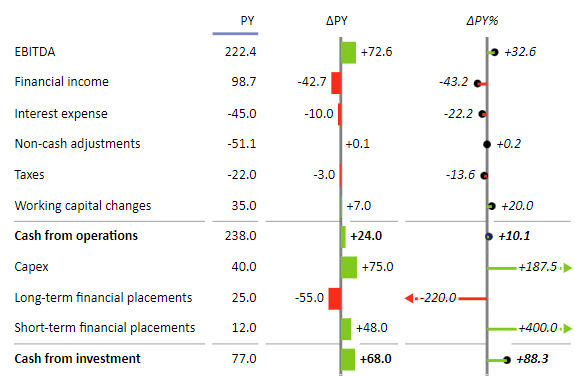
Operating Activities
Operating activities represent the cash generated or used from a company’s core business operations. This includes cash received from customers, payments to suppliers and employees, interest payments, and taxes. It’s the most important section as it shows whether the business can generate enough cash to maintain and grow operations.
A positive cash flow from operations indicates a healthy, sustainable business model. Companies can calculate this using either the direct method (showing actual cash receipts and payments) or the indirect method (starting with net income and adjusting for non-cash items). Most businesses use the indirect method as it’s simpler and reconciles directly with the income statement.
Investing Activities
Investing activities track cash used for investments in long-term assets and securities. This includes purchasing or selling property, equipment, buildings, and investments in other companies. These activities typically show negative cash flow as companies invest in growth.
Large negative cash flows in this section aren’t necessarily bad—they often indicate a company is expanding and investing in its future. Conversely, consistent positive cash flow from investing activities might mean the company is selling off assets, which could signal financial distress. The key is understanding whether investments align with the company’s strategic goals.
Financing Activities
Financing activities show how a company raises capital and returns money to investors. This includes issuing or repurchasing stock, borrowing or repaying loans, and paying dividends to shareholders. These cash flows reveal how the company funds its operations and growth.
Positive cash flow from financing indicates the company is raising capital through debt or equity, while negative cash flow shows it’s paying down debt or returning cash to shareholders. A healthy balance depends on the company’s life stage—startups typically show positive financing cash flow as they raise capital, while mature companies often show negative flows as they pay dividends and buy back shares.
Preparing to Create Your Cash Flow Statement in Excel
Outlining your cash flow statement, determining your data sources, and organizing your data are crucial steps before you start building the cash flow statement in Excel. A step-by-step procedure would look like this:
- Outline your cash flow statement: To create a cash flow statement that meets your needs, start by outlining the sections you want to include. For example, you can add operating, investing, and financing sections.
- Determine your data sources: Once you have outlined your cash flow statement, determine the data sources you need to use. This may include your financial and bank statements and other financial records.
- Organize your data: To make creating your cash flow statement in Excel easier, organize your data clearly and consistently. This may involve formatting your data, removing duplicates, and sorting your data by date or category.
- Consider using Zebra BI: If you're struggling to visualize your data or want to streamline the process, consider using Zebra BI for Office. This powerful add-in for Excel can help you organize your data and create clear & understandable charts and tables.
By taking these steps to prepare your cash flow statement in Excel, you will be able to create a statement that is accurate, comprehensive, and easy to read. The next section will discuss building your cash flow statement in Excel, including creating a layout and inputting data.
Building Your Cash Flow Statement in Excel
Now that you have prepared to create your statement of cash flows in Excel, it's time to start building it. Here's what you need to do:
- Create a layout: Create a layout for your cash flow statement. This should include the sections you outlined in the preparation phase and rows and columns for inputting your data.
- Build the operating activities section: Start with the operating activities section, typically the largest section of a cash flow statement. Input your data for cash inflows and outflows related to your primary business operations, such as revenue, cost of goods sold, and salaries.
- Create the investing and financing activities sections: Once you have inputted your data for the operating activities section, move on to the investing and financing activities sections. Input your data for cash inflows and outflows related to long-term assets, debt, equity, and dividends.
- Error-proof your cash flow statement: Finally, make sure to error-proof your cash flow statement by checking your data for accuracy and consistency. You will probably want to double-check formulas and functions in Excel to ensure that your calculations are correct. The Zebra BI add-in can automatically calculate variances for you.
By following these steps, you can create a cash flow statement in Excel that is accurate, comprehensive, and easy to read.
For a more advanced statement of cash flows, consider Zebra BI for Office. As we move forward, we will explore how Zebra BI can make your cash flow statement more powerful
Enhancing Your Cash Flow Statement in Excel with Zebra BI
As we've learned, the cash flow statement is a financial statement that shows how a company's net cash flow and cash equivalents have changed over a specific period. It provides invaluable insight into a company's liquidity and ability to generate net cash flow.
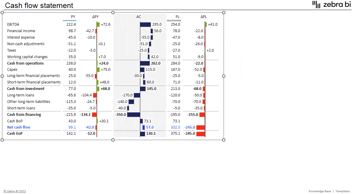
Let's have a look at how this works in the example below.
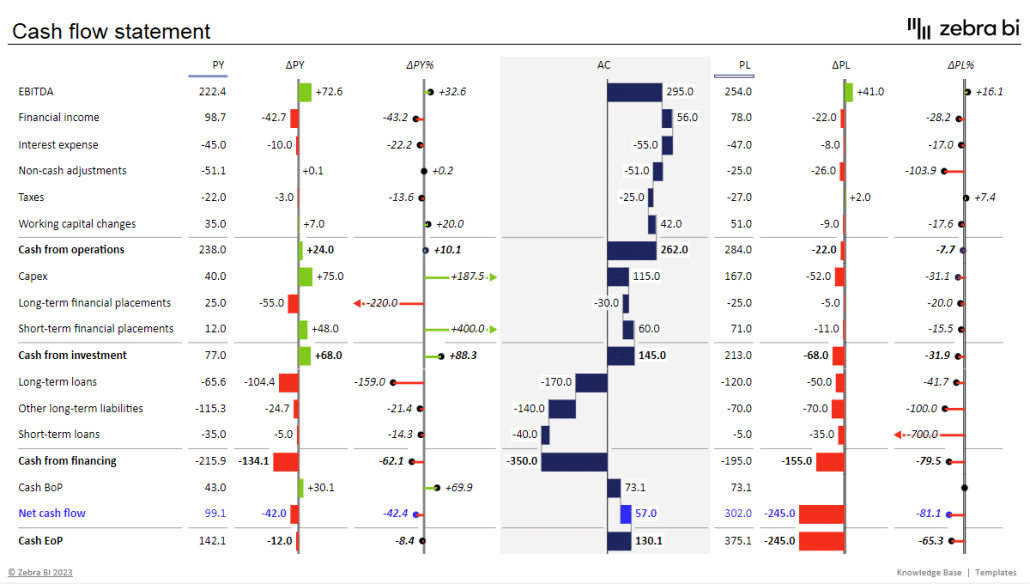
We can see that a cash flow statement displays cash inflows and cash outflows from operations, investments, and financing activities. The final items clearly show the amount of cash and cash equivalents that a company had at the beginning of the period and the end of it.
However, the report in the image above is not your regular cash flow statement. Most cash flow statements have nothing but plain numbers on a chart, which makes them extremely difficult to read. The one created with Zebra BI for Office includes powerful elements that make it easily understandable with just one glance. Let's have a look at what some of them are.
Key elements of an actionable cash flow statement
The above statement is a feature-rich report that uses a waterfall chart on the actual value to illustrate how various categories affect cash flow (including cash and cash equivalents). Additionally, it displays absolute variances, which show how actual results deviate from the plan and the previous year's numbers.

Once again, the report is structured to clearly show how individual elements combine into larger groups, using subtotals and calculations.
When you understand your cash flow, you can make more informed decisions about hiring, equipment purchases, expansion, and salary increases.
Creating a cash flow statement
Now, let's create a simple cash flow statement. Open the Excel spreadsheet with your data and insert a Zebra BI Tables visual. To do that, click Insert on your tool ribbon, then click the My Add-ins button. Select Zebra BI Tables for Office. You will see a table with an overlay, where you should click Continue with a free license.
To change the Zebra BI Tables visual into a cash flow waterfall chart, expand it and click on the AC column.
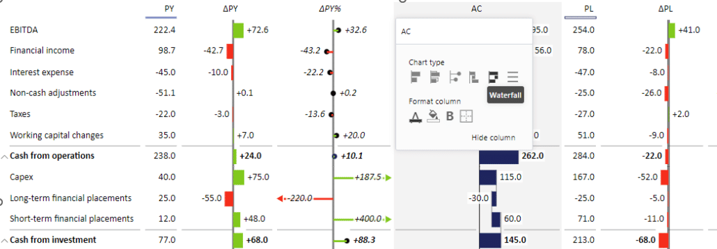
The next step is to change the selected values to Results.
What's super neat is that these visuals are interactive: enlarging the chart will automatically add more information. For example, it also adds relative and absolute variances for a more complete overview.
See exactly how this works in the gif below:
So cool, right? For even faster results, you can also grab a cash flow statement template & start there.
What's important to note is that Zebra BI Charts and Tables for Office are IBCS-certified, which ensures consistent reporting out of the box.
Creating a cash flow statement in Excel doesn't have to be difficult. Following the steps outlined in this guide, you can create an accurate and effective cash flow statement that provides valuable insights into your company's financial performance. With Zebra BI for Office, you can take your cash flow statement to the next level with stunning data visualizations that make it easy to understand and communicate your financial data.
Check this short video to see how easy it is to create a cash flow statement in Excel with Zebra BI for Office:
Now that you know just how easy it can be to build such an actionable cash flow statement in Excel, why not give it a go with your data?
Create advanced cash flow statement in Excel fast
Ready to test-drive all the great features we've showcased above? Grab the free Excel template now!