Why is having standards important? What are the basics of IBCS (International Business Communication Standards)? In this article, we'll make a case for the importance of having standards in our lives, explain the basics of IBCS, show common mistakes and highlight the best dashboard design practices. We'll also carry out a full top to bottom redesign of a poorly designed dashboard. Read on to learn about IBCS and its application in practice.
Why are standards practical?
Standardization is the process of developing and implementing technical standards. It can help to maximize compatibility, interoperability, safety, repeatability, or quality. (source)
Having standards in our daily life is beneficial for many reasons. They simplify our decisions, enable us to work more efficiently, often even make our lives better - just to name a few.
We have standards in the tools we use, the processes we follow, the way we give and receive information, etc.
Wherever you're from, you know what to do when you see this
Here are four well-known examples of standardization:
Writing. The majority of the world uses the Latin alphabet to write text. There are also other "standards", like the Cyrillic, Arabic, and Chinese alphabets.
Electricity. Mains electricity is standardized worldwide in the form of alternating current (as opposed to direct current). However, different voltages and frequencies of electric power supply exist, which prompts the use of different (standardized) plugs and sockets to provide protection from accidental use of appliances with incompatible voltage and frequency requirements.
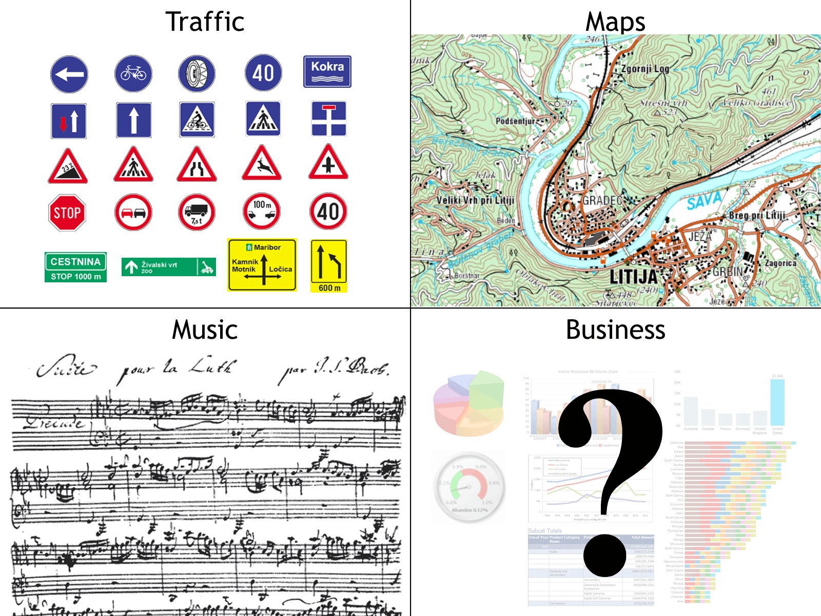
Traffic. The traffic signs are standard worldwide. With billions of vehicles on the road every day, having standards is essential to keep them moving as smoothly as possible.
Music. Musical notation has been standardized for more than a thousand years, allowing musicians from all over the world to play music from the same sheets - even if they are centuries old.
Traffic signs, maps and music sheets are standardized. What about business communication?
There hadn't been any initiative to standardize the presentation of financial and business data. Until recently.
Standardization of business communication
Business communication is the materialization (e.g. creation of printed reports, digital presentations, ...) of quantitative information for analytical and reporting objectives. (source)
In 2004 Dr. Rolf Hichert took on a challenge to standardize the way analysts and controllers present data in their reports, dashboards and presentations.
Without standards in place, the CEO might get blue line charts for sales from one financial analyst, and a red pie chart from another or someone else might decide that columns or bars are a better fit for data.
In this case, each author individual decides on the design of the reports and, even worse, the design of the individual objects (charts and tables). This leads to confusion for the management team that receives these reports, poor decision-making and often even complete disregard for the reports they were given.
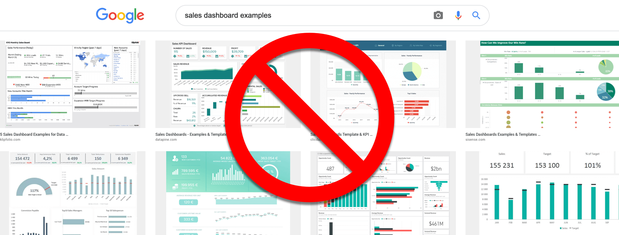
For example, you can see there are no similarities and patterns to recognize between the sales dashboards below, even though they serve the same purpose.
The three pillars of IBCS standard
The suggestion of the IBCS association is to use the same expressions and the same visualizations for the same content. If the content is not the same, it should not look the same.
Conceptual rules - how to organize your content so that it gets your message across.
Perceptual rules - which visualizations to use in any given case.
Semantic rules - introduce the IBCS notation. This is the actual standardization of business communication. It covers the unification of all important and frequently used aspects of business communication: terminology, descriptions, dimensions, analyses, and indicators.
They are the result of intensive work by Hichert and the IBCS association, with large portions of it based on works of several authorities in the visualization field: William Playfair, Willard Cope Brinton, Gene Zelazny, Edward Tufte, Stephen Few, and Barbara Minto.
Thus, the standards are built on top of a scientific, experimental, and practical experience foundation.
Top 5 IBCS Recommendations
Before we even get into the recommendation, there is one simple but very central tenet to IBCS. "Things that mean the same thing have to look the same." The opposite also applies: "If things do not mean the same thing, they should not look the same."
With this in mind, let's look at the top 5 recommendations of IBCS.
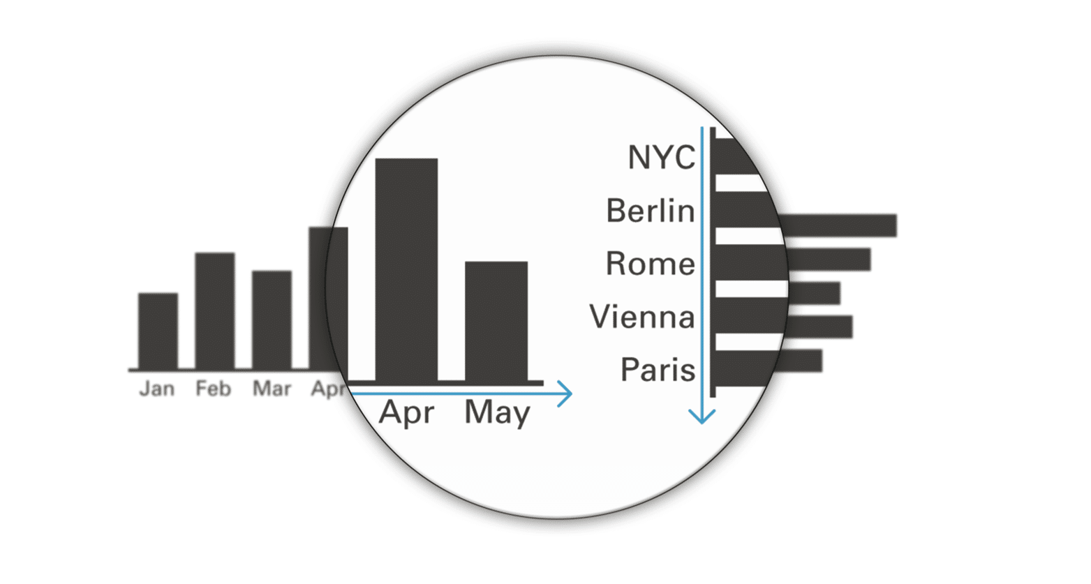
1. Present time series with horizontal axes
This recommendation applies to 95% of all charts. We distinguish between two different types of series: time and structure. Time series means months, years, quarters, days and other time data. You should always put time series on the horizontal axis. On the other hand, put structural comparison, like cities or locations, countries, projects or types of revenue on the vertical axis.
An easy way to remember which type of data should be displayed on vertical or horizontal axis
2. Unify the titles of pages, charts, and tables
Every journalist will tell you that when you try to capture attention, it's all about the title. You need to be clear about what you are trying to communicate with your chart.
Here is the recommended approach:
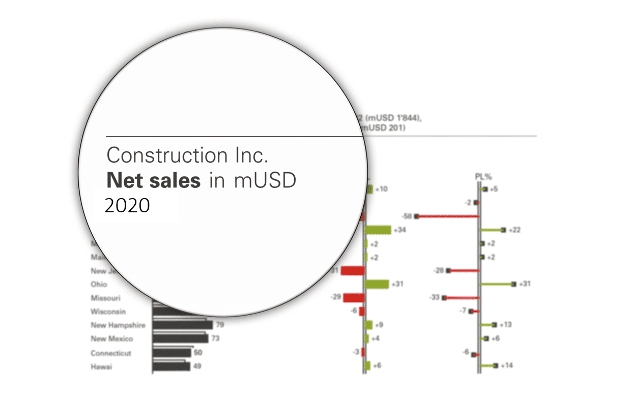
Subject. This could be your company, a division, country, or store name.
Measure with units. The measure is the quantity you are showing - your profit, loss statement, net sales, etc. so it could be dollars of revenue or something else.
Time period. End the title with the period for which you are showing data - January, 2021, etc.
An example of an IBCS-compliant chart title
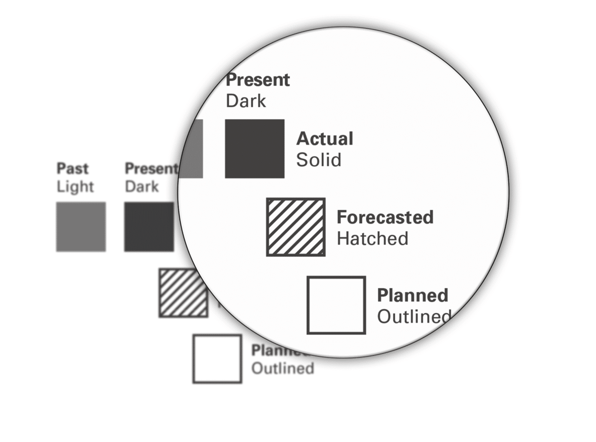
3. Identify scenarios by fill patterns
Dashboarding is all about comparisons. Let's say we are working with a comparison of plan versus actuals with a forecast included. In this case, we use a solid fill with actual values, an outline with the plan and a hatched pattern for the forecast.
Showing different scenarios by using different fill patterns
4. Highlight variances with green and red
As you see, IBCS recommendations call for simple charts in black white. This is because the IBCS philosophy is that colors should be reserved for more important things. Variances, for example.
The approach here is as straightforward as possible. While the color red denotes negative variances, green denotes positive variances. Also, keep in mind that a negative variance is not necessarily a negative number. For example, an increase in costs is a positive value that is negative variance.
Positive and negative variances are shown in green and red
Why a consistent visual language is needed - a case study
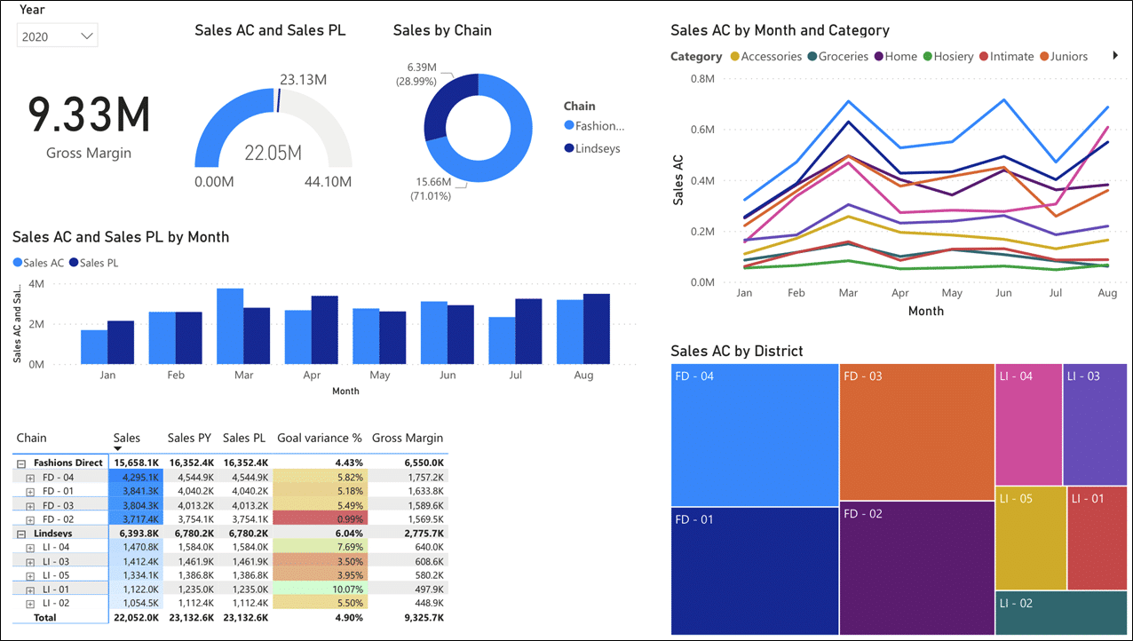
Let's use an example to show you just how bad a typical sales dashboard or a similar corporate report is at communicating. Look at a chart that is all too common.
A typical sales dashboard
We will break down the mistakes that plague this approach to dashboarding. Obviously, there are several issues right off the bat:
Uninformative title and a mixture of inappropriate chart types
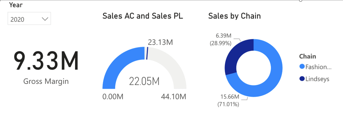
First, the title just shows the year and nothing else. Consequently, you don't know what company this is, what measures are shown and what units.
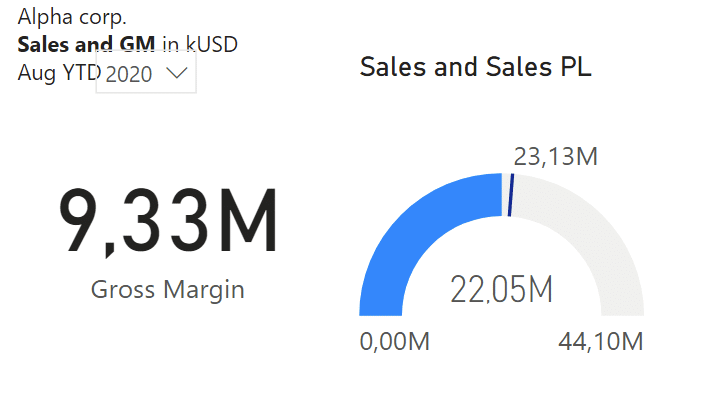
Next up is the speedometer chart that is a poor choice. It should highlight the variance and not the actual values. Also, the letter M should be in the title.
The doughnut chart is also a poor choice because of its low information density. It also uses external legends, which you should not use and always display within the chart.
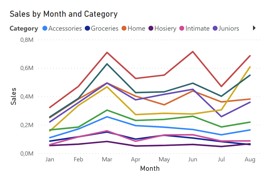
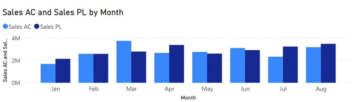
This line chart has several issues, including labelling
Obviously, this chart type is not ideal for showing this type of information. Again, the legend is external and you should label values within the chart. There should also be tick marks on the time axis which again bears the redundant 'Month' label. That is something you can easily eliminate to reduce the clutter.
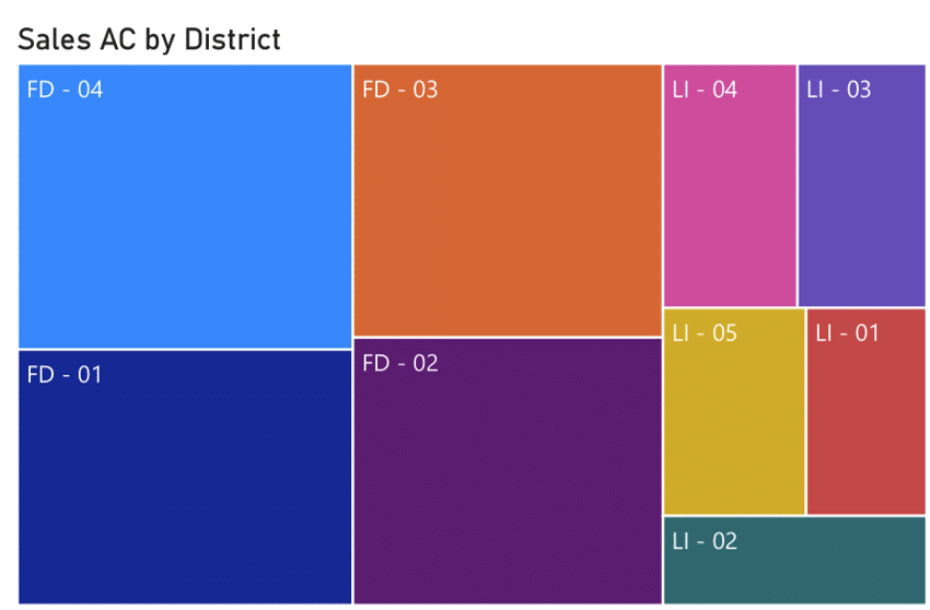
This treemap uses up a lot of space for little insight
The next element is the treemap also called the Marimekko chart. It uses up a lot of space for very little insight. The labels for the values are missing and only different product areas are labelled. Obviously, the colors are selected without any meaning.
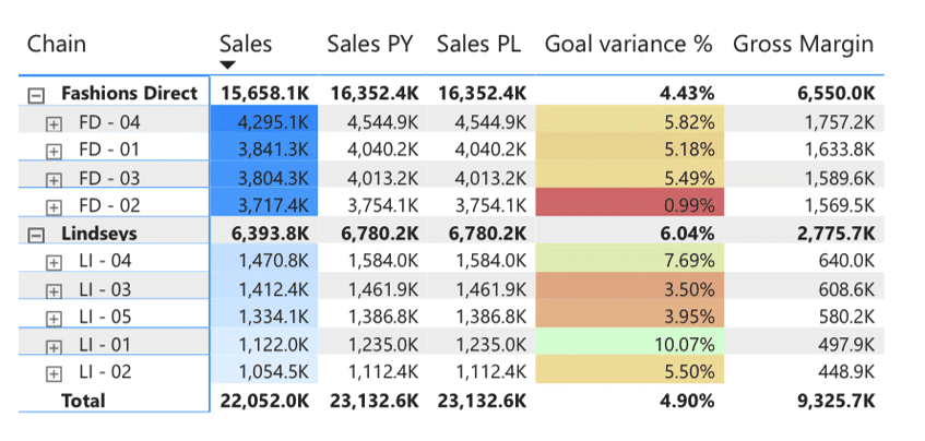
The column width should not be defined by the label length and goal variance column is simply too wide for its content. Cell backgrounds should not be colored and a fast and firm rule is to always put black text on white background. In column headings, the term "Sales" is repeated three times, which is redundant. Also, labels should be right-aligned while letters K and M denoting thousands and millions should be in the chart title or subtitle.
Lastly, let's look at this column chart. External legends should be avoided, especially because the information is already provided in the tile. The X axis bears the month label, which is obvious.
We also want to avoid the vertical axis. Instead, individual columns should be labeled with values. This makes it much easier to understand the values.
To redesign this dashboard, we'll use the Zebra BI visuals for Power BI that are IBCS certified to make sure IBCS rules will be applied completely automatically.
We'll start by redesigning these two charts:
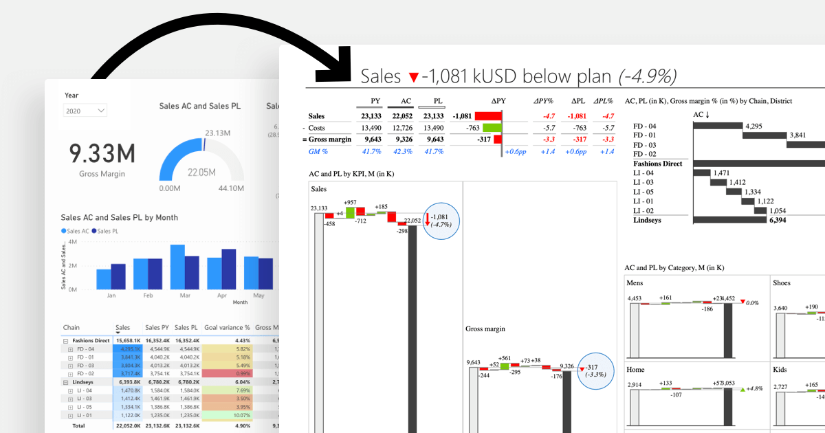
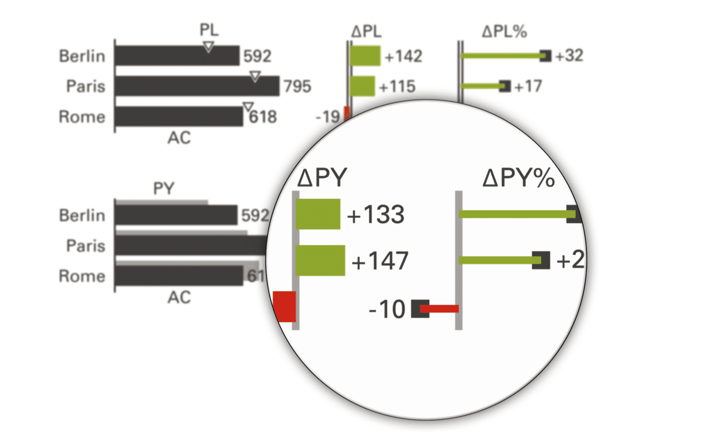
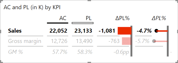
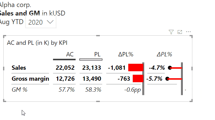
The first thing is to replace them with a table showing gross margin and sales KPIs where actual values are compared to planned values. The comparison is actually key here. We also want to show both the absolute variance as well as relative variance.
Improved table showing additional information
We were even left with enough space to add the gross margin expressed in percent. That's something that's really easy to do in Zebra BI. You simply right click on the table to select Add formulaentry from the dropdown menu.
Adding formula to the table
To get the Gross Margin in percent, you simply divide the gross margin by sales.
The formula for gross margin in percent
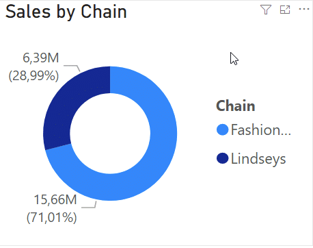
Dealing with the doughnut chart
Next up is the doughnut chart. Actually, this little chart is the first step down a path that will tackle several elements of this dashboard at once. First, let's look at what we are working with.
The Sales by Chain doughnut chart
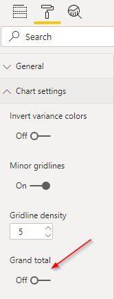
The first step is to turn the chart into a Zebra BI table and then add the grand total. You do this by turning on the Grand total setting under Chart settings in the Format tab on the Visualizations pane.
Turning on the grand total setting
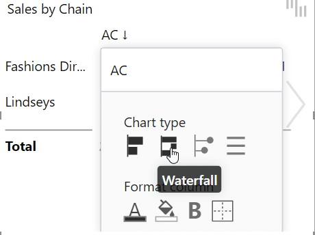
Afterwards, we turn it into a waterfall chart to show clearly how each chain contributes to the total. Click on the column heading and select Waterfall from the Chart type.
Turn a regular bar chart into a waterfall chart
However, seeing contributions to the total is not all that useful. We need to see how this compares to plan, so we simply add the plan field (PL under Sales group) to the Plan placeholder.
Turn on the comparison to the plan
Here is the result.
Now, let's move on to the cool part of this redesign. We'll take the District measure and drop it in the Category placeholder. After that, we add the gross margin in percent (GM%) to the Values placeholder.
As you can see, this table now includes all the information from the doughnut chart as well as the Marimekko chart and the original table. This is a very successful redesign. Instead of changing just one chart, we just merged three different visuals into a single table that tells the entire story in a much better way.
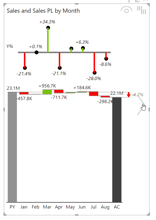
Monthly chart redesign
The monthly chart is too stretched out and too narrow. IBCS recommendations give us several options but the best approach is probably a waterfall chart that quickly shows variances and contributions to the overall result.
Switching between different charts
Untangling the spaghetti chart
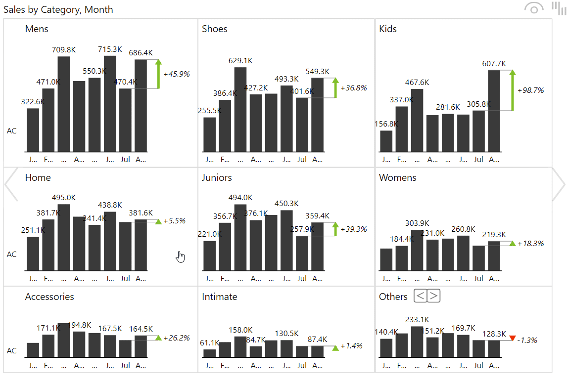
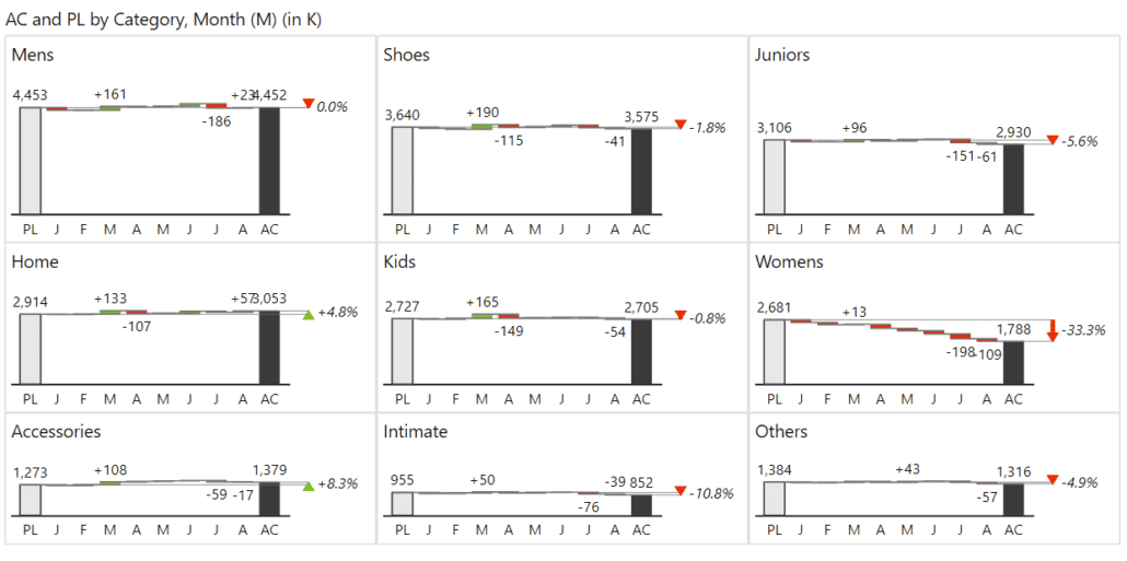
Now is the time to conclude the redesign with the spaghetti chart. While colorful, it doesn't really tell us all that much. IBCS recommends that we break it all down into separate charts. This is something that is called small multiples. Essentially, you put all your charts displaying different categories on a single page while also scaling them (synchronize the Y-axis).
Instead of having a single line chart with lines that are crossing each other making things unreadable, we will switch it to the Zebra BI chart. This will give us nine different charts, each showing individual values.
Small multiples for individual values.
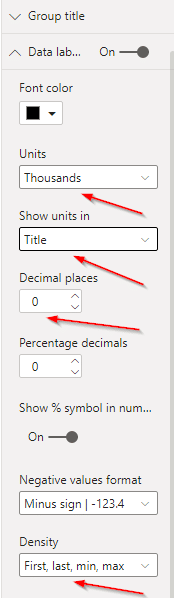
While this is better that what we had, we still need to clean it up a bit. There is the K label for every unit, which is something we can easily put in the title. We can also get rid of the decimal place and reduce the label density somewhat by just displaying the most important labels - the first and last and the minimum and maximum values.
You can do all this by under Data labels in the Format tab in the Visualizations pane.
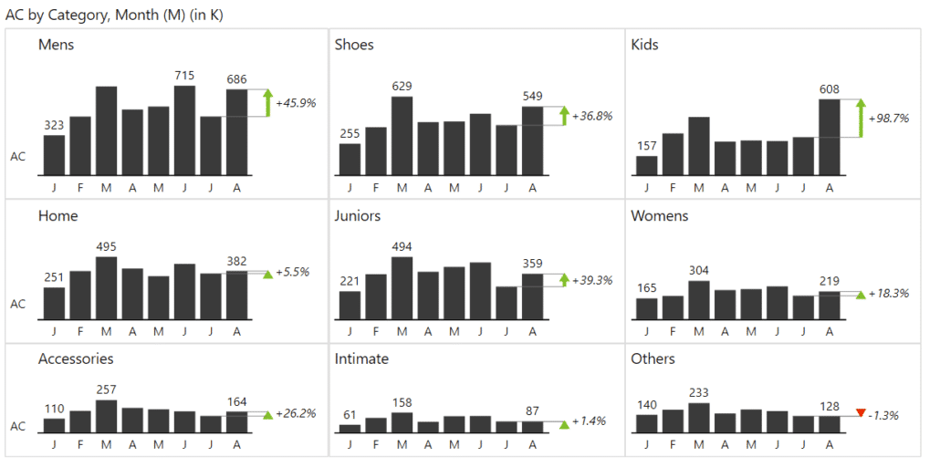
This gets us a much simpler and readable chart. Note that we also changed month name labels into single letters so we can condense the entire chart even more.
Cleaned up small multiples
However, to make this visual truly useful, we need something more. Comparisons, of course. By adding the Plan value to the Plan placeholder, we can see that the women's clothing is an issue for us. Before we added that, everything seemed OK, but now, the issues are more visible.
Adding the plan for comparison makes everything clearer
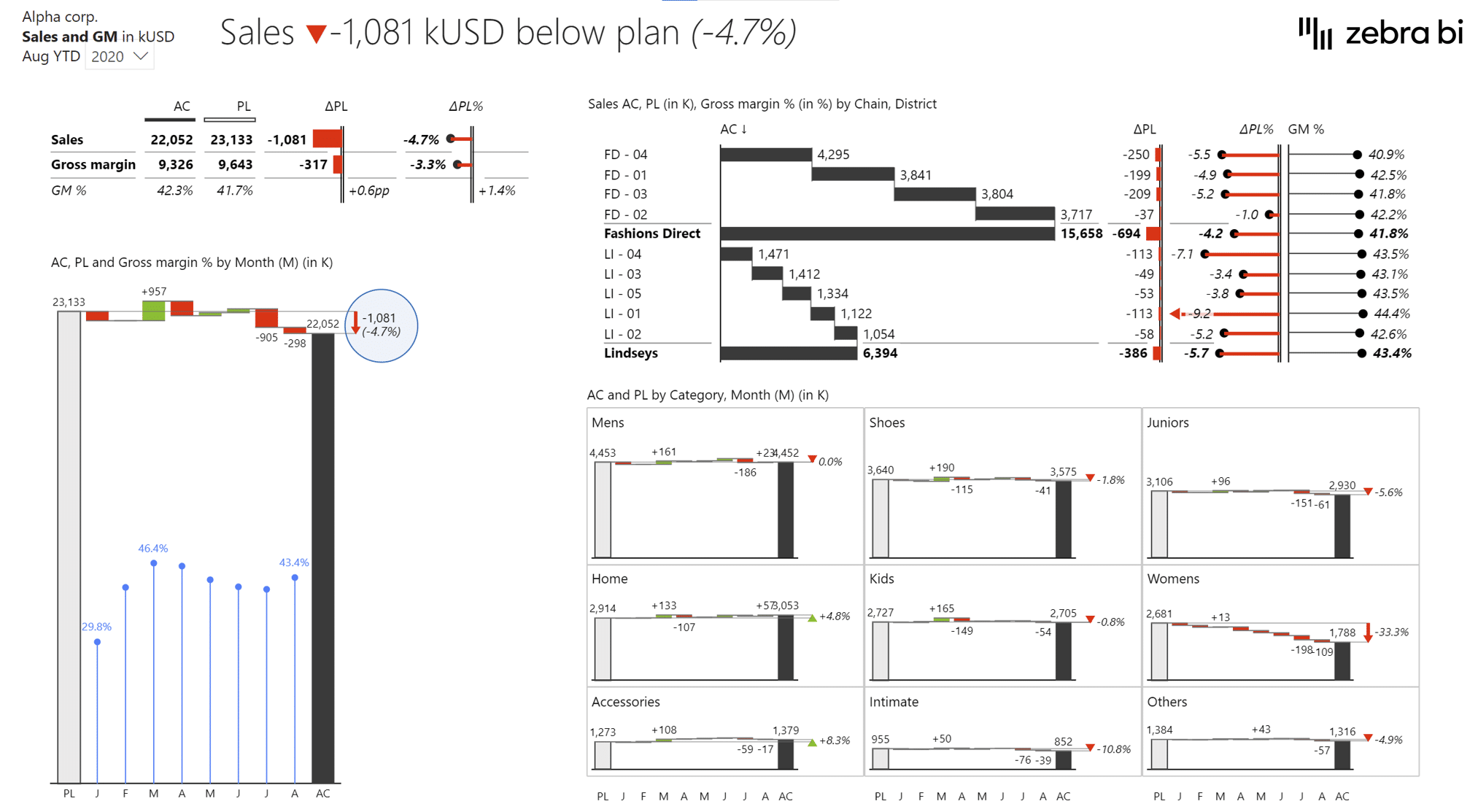
The final result of the redesign
In the end, we need to consider the placement of objects on the dashboard page. It is necessary to consider the type of arrangement that works best. As a rule, we always start reading from left to right and top to bottom. Therefore, we need to put the most important information like key KPIs top left and follow it up by explanations.
Our dashboard redesigned with IBCS recommendations
Key takeaways from IBCS
To conclude the design section, let's look at some simple general tips that will help you design actionable and effective reports and dashboards.
Avoid any kind of clutter
Design is not about filling all available space, it's also about negative space. After all, when you go to see a movie, you don't want to see logos and frames or anything. You just want to see the movie. Keeping things simple will direct attention in keep focus on the important information.
Don't put things around information you want people to see
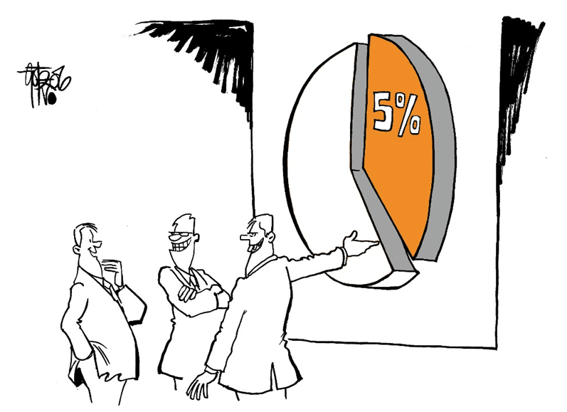
Minimize colors to direct focus
If you want to draw focus, do not color the entire dashboard just use the colors where you need your reader's attention. Take this traffic light, for example. Coloring the entire picture would obscure its importance. See the result, when you use less color:
Use color just for those things you want to highlight
Scale properly
You want to be honest and don't want to mislead in your reports, so do not truncate axes and compare with the same measures on the same page.
Not scaling properly can be hugely misleading
Use the appropriate fill pattern
Instead of colors, use fill patterns. These are the patterns recommended by IBCS:
Solid black for actuals
Outline for the plan
Hatched pattern for forecasts
Previous year or month values are gray
The right fill pattern can tell the whole story
IBCS implementation in your company
You can fix all business communication problems. If the following 3 preconditions are satisfied, success is guaranteed.
Concept. You have to have a clear concept with a set of rules on how you plan to make the internal business communication more effective, understandable and standardized. The IBCS Standards offer a straightforward way of doing this.
Software. Without software, you cannot fix any business communication problems. This was rather difficult 5 years ago. There was Excel, but no other tool existed. Today, the situation is very different. See below to read about the role of software in the implementation of IBCS.
The right management. The management must be on board with the change. However, this point is proving to be the toughest of the three. People are obviously reluctant to change their concepts. They're proud of what they've done and don't want to suddenly start following some external rules. however, the top management (CEO, CFO) can pass these concepts on to the lower levels. There are certain organizations that have rolled out these concepts on a global scale. But it's not a weekend job, it took them 3-4 years to do it.
The role of software in the implementation of IBCS
Software plays a crucial role in fixing business communication problems.
You cannot write a booklet, send it to all of the people in your organization and say: "Follow these rules". Of course, people don't want to learn every IBCS concept by heart.
However, with new software tools available on the market (like Zebra BI), they don't have to. Now everyone can create best practice reports in just a few clicks.
The users don't have to care about the IBCS rules. They just need to prepare the data (for different business scenarios: previous year, actual, budget, forecast) and the software makes sure the charts created from the data are IBCS compliant.
The software knows what is the previous year, sales, or headcount. The software includes a meta layer with definitions of certain rules that incorporate IBCS into the software.
Furthermore, for a software tool to be officially accepted as being able to create IBCS compliant reports, the IBCS Association offers a certification process. However, the software must pass strict testing procedures to ensure the charts created and reports produced are in line with the IBCS specifications.
On June 8th 2015, Zebra BI passed the IBCS certification process, becoming the first "IBCS certified charts + tables" software.
Standardization of business communication leads to improved decision-making which ultimately leads to better financial results for your company. When will YOU start?
Watch video recording & Get follow-along PBIX example
If you'd like to try all of this yourself, enter your data below to get immediate access to all PBIX examples used in the this tutorial and the full 1-hour video recording of the webinar on IBCS Standardswith Zebra BI's CEO & Founder Andrej Lapajne and the guest of honor, Dr. Rolf Hichert.
I slept through the original presentation (2am here ...) so I'd like to view the replay.
I've submitted 2 online requests for the PIBX and access to the video over the last couple of hours. No response.
Yes, I checked my spam folder
I used to work in a shop with strict code programming standards.
When I moved on to another shop and suggested using coding standards what i heard were gasps of horror ... 'but that would stifle creativity' ... The only reply to that whine is there should not be creativity in how the program code is structured. Save the "creativity" for the logic you design.
.
Same idea with charts. Save your creativity for the "nuts & bolts" you use in the background, stick with standards for the visuals the users see.
Hi Ron! The recording was sent to you on 16 April, the day after the webinar. In any case, I'll resend it in a couple of minutes! - Urška
Thanks, got it now.
I got an email (lost track of it in SPAM folder for a while).
Glad to hear this! Enjoy!