Leila Gharani x Zebra BI: How To Design A Perfect Excel Dashboard From Scratch
Do you want to build an Excel dashboard that will show insights, look professional, and not waste too much of your time? Well, you came to the right place because Leila Gharani matched with Zebra BI to show you exactly how to do it in no time.
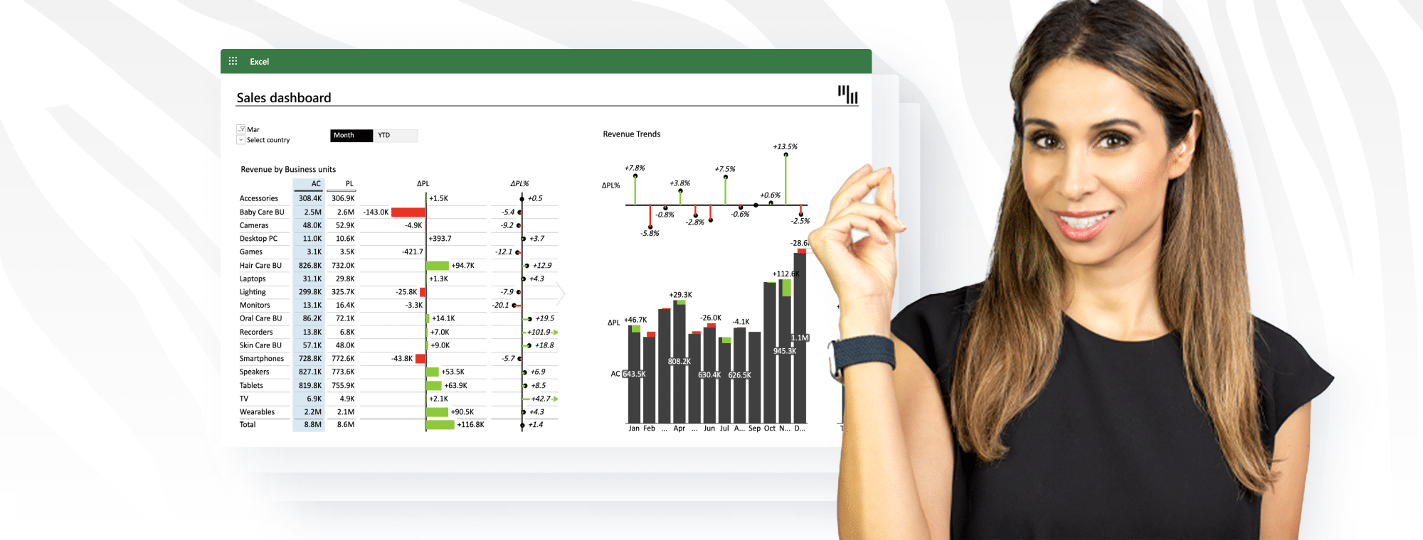
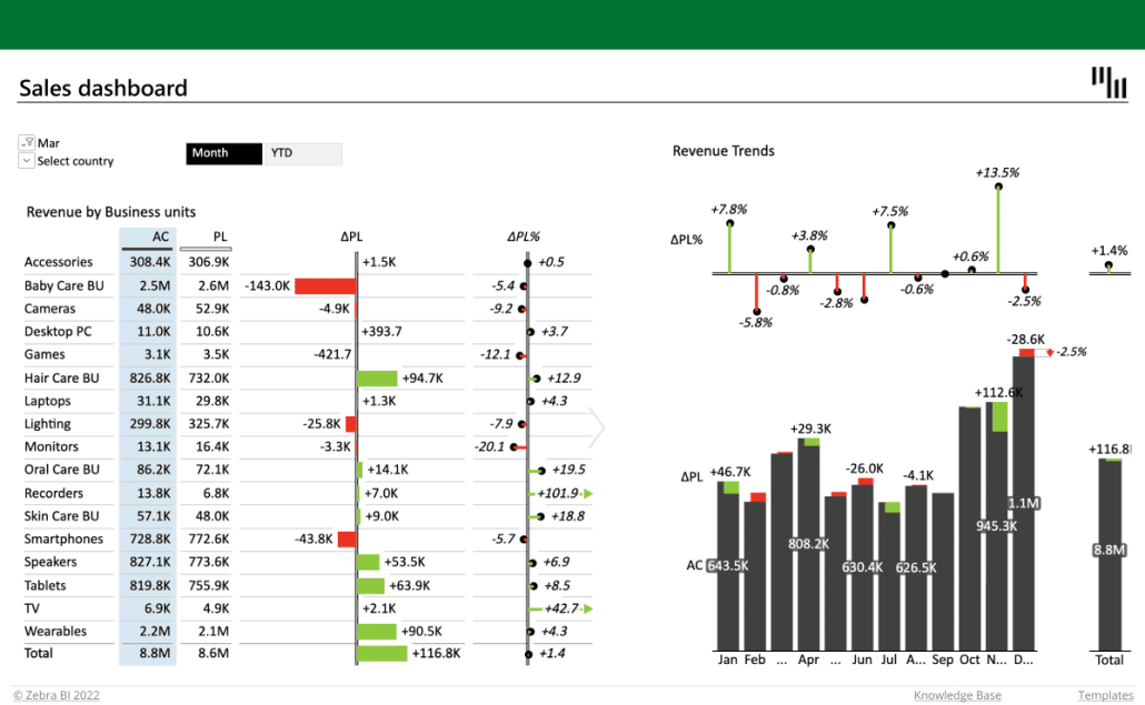
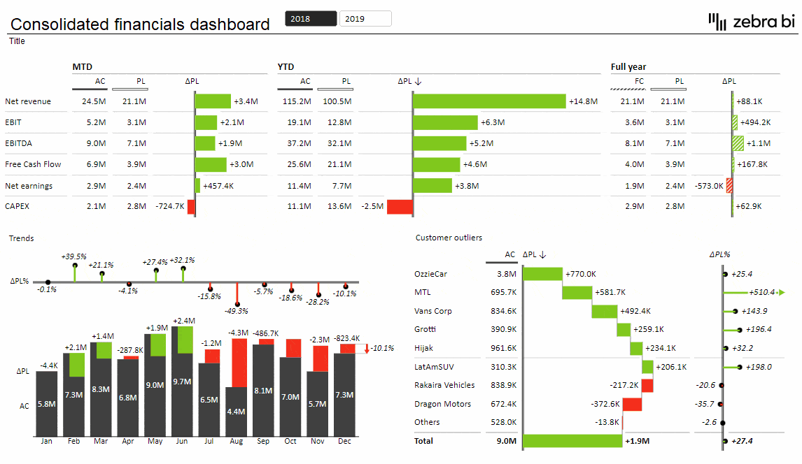
In today's data-driven world, effectively analyzing and presenting information is invaluable. Excel dashboards are the key to displaying critical business metrics and trends dynamically. Recognizing the significance, Zebra BI has partnered with Leila Gharani, a renowned Excel expert, to bring you an insightful tutorial. In her latest video, Leila will guide you through creating an interactive Excel dashboard to compare actuals, budgets, and year-on-year performance.
This article aims to complement Leila's detailed video. While the video serves as a practical, step-by-step guide, our focus here is to shed light on the broader importance and application of Excel dashboards in business analytics. Whether you're a seasoned professional or just starting, this read, and Leila's video will be a gateway to elevating your data presentation skills using Excel and Zebra BI's tools.
Let's explore the world of Excel dashboards and learn how to harness their potential impact fully.
The True Value of Excel Dashboards
Excel dashboards have become vital for business professionals in today's data-centric era. Beyond charts and graphs, these dashboards offer a thorough view of a company's performance, turning large volumes of data into easily digestible visual formats.
As a result, decision-makers can understand complex information and make informed choices quickly.
Excel dashboards excel (pun intended:) in comparing various data sets, like actual performance against budgeted targets and year-on-year analysis. Such comparisons are crucial for businesses to track progress, spot trends, and adapt to market changes.
These dashboards also democratize data, making it user-friendly and accessible to everyone in an organization, not just data analysts. This inclusivity encourages a culture where all team members engage in data-driven discussions and decisions. However, this broad access can sometimes lead to publishing reports that don't meet the highest data reporting standards.
We collaborate with Leila Gharani with one goal in mind: to bridge the knowledge gap and empower all team members to create a perfect Excel dashboard easily.
Key Components of an Effective Dashboard
Creating an effective Excel dashboard is an art that balances aesthetics with functionality. At the core of every impactful dashboard are several key components that ensure its effectiveness and usability.
Clarity and Simplicity
The best dashboards communicate the most important information at a glance. They avoid clutter, focusing on clear, concise data presentation. In short, choose the right charts and graphs and arrange them in an easily navigable layout.
Relevance of Data
An effective dashboard contains only relevant data. It's crucial to select metrics that directly align with the business's goals and objectives. Irrelevant data can distract from key insights and lead to misinformed decisions.
Interactivity
Modern dashboards offer interactive elements, like filters and drill-down capabilities, allowing users to explore the data in depth. This interactivity enhances user engagement and provides a tailored data view based on specific queries or interests.
Real-Time Data Integration
A dashboard should reflect the most current data available. Real-time integration ensures decision-makers can access the latest information, vital in rapidly changing business environments.
Zebra BI add-ins allow seamless data linking: you can link your Excel dashboard with the Power BI data set, ensuring that the information shown on the dashboard is always up-to-date.
Consistency in Design
Consistent use of colors, fonts, and design elements makes a dashboard more intuitive and easier to read. This consistency aids in quicker comprehension and long-term user adoption. Zebra BI stays faithful to IBCS standards, meaning our Office add-ins follow the latest best reporting practices.
By focusing on these components, businesses can create Excel dashboards that are visually appealing and powerful tools for data-driven decision-making. These principles guide our approach at Zebra BI, ensuring that every dashboard we help create meets the highest standards of effectiveness and efficiency.
Read more: Best practices for using Excel for data visualization
Learn From Leila Gharani's Tutorial
Leila Gharani's Excel dashboard tutorial is a valuable opportunity to improve your data presentation skills. Her expertise simplifies complex processes into manageable steps and offers practical tips and insights you can implement immediately.
Whether a beginner or an expert, Leila's guidance is valuable in mastering the art of Excel dashboard creation.
Implementing Your Learning with Zebra BI
After learning from Leila Gharani's tutorial, you will improve your Excel dashboard skills with Zebra BI's tools. Our Tables and Charts add-ins seamlessly integrate with Excel, enhancing its functionality and enabling you to create more sophisticated, dynamic dashboards. With Zebra BI, visualizing complex data becomes more intuitive, allowing you to produce professional-grade reports quickly.
Zebra BI is not just about advanced tools; we also offer comprehensive support and resources. Our platform includes detailed tutorials, user guides, and a supportive community forum where you can share insights and seek advice. We provide webinars and personalized training sessions for those looking to refine their dashboard skills further. Whether you're starting your journey in data visualization or looking to polish your expertise, Zebra BI is committed to supporting your growth and helping you unlock the full potential of your Excel dashboards.
Conclusion
We highly encourage you to watch Leila Gharani's video to understand how to craft effective Excel dashboards thoroughly. By combining advanced tools from Zebra BI with her lecturing skills and techniques, she can help you effortlessly improve your dashboard creation process.
Improve your data visualization skills and transform Excel dashboards into powerful business tools for intelligent decision-making.
Now, it's your turn: build an advanced Excel dashboard easily!
Using Zebra BI for Office, you can design and build a professional-looking, advanced dashboard in Excel with just a few clicks.