Get follow-along PBIX example
If you'd like to try any of these features yourself, enter your data below to get immediate access to the full 1-hour video recording of the webinar and all PBIX examples used in the this tutorial.
 September 8th
 February 22nd
Welcome to the Tableau vs Power BI: The Superstore Challenge!
There are two heavyweights in the data visualization space right now - Tableau and Power BI. We think the best way to tackle the Tableau vs Power BI comparison is to take a single case and work with both tools to see what they offer and compare the features.
We will look at features such as geography, tooltips, small multiples, multiple measures, data modelling, ...
To conclude, we will take a look at the extensions and custom visuals that both tools support.
At every comparison, we'll look at the strengths and weaknesses of both tools.
Note: This Tableau vs Power BI comparison analysis is based on our 1-hour webinar on the same topic. If you prefer to watch the video, scroll to the bottom of this tutorial, enter your details and we'll send you the webinar recording and all PBIX examples to go along with it.
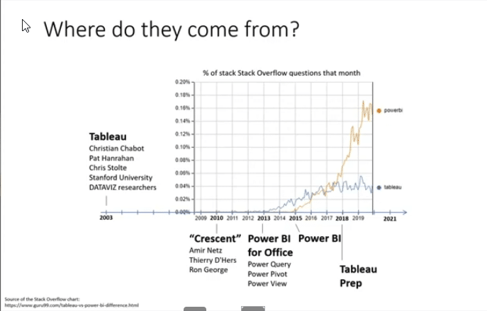
Before we get to the nitty-gritty of features and head to head comparisons, let's take a step back and look at the market. In the most recent (February 2021) Magic Quadrant for Analytics and Business Intelligence by Gartner, Power BI extended its lead over competitors. Power BI and Tableau have both been leaders for quite some time. However, Microsoft has been consistently improving its completeness of vision and the ability to execute.
Tableau started in 2003. It was founded by three guys from the Stanford University who were really interested in data visualization. This was what informed their design thinking - a tool for data exploration, visual exploration and visual analysis. A tool designed by data geeks for data geeks.
It's no wonder Gartner sees Tableau's user experience as its main advantage and the tool has several features that are just amazing. It has rightfully garnered large numbers of enthusiastic users that will always recommend it. Tableau's downside is that it's not a cloud-native tool and is simply more expensive than Power BI. Price is absolutely one of the main drivers of Power BI's success.
On the other hand we have Microsoft Power BI whose ability to execute has improved mainly because of its steps towards AI and tighter integration with Office and Teams. Microsoft has really doubled down on integration to make sure Power BI works seamlessly with its productivity and collaboration products. AI is also poised to deliver great value with features, such as smart narratives, the key influences visual and the outlier detection.
And then there's the affordable price ...
What about Power BI's drawbacks? There's Microsoft focus on the cloud which means that the on-premise version is always behind with some functional gaps. There are also some concerns about governance in really large environments. With thousands and thousands of users and workspaces, it could become difficult to keep the explosion of reports and dashboards under control.
There's no denying it. Since its launch in 2015, Power BI has been ascendant. While Tableau has almost a decade of advantage, Microsoft has taken an almost start-up approach. It has explosive growth and very fast development cycles. After its initial focus on data preparation, Power BI has grown into the role of a data visualization tool. On the other hand, Tableau responded with Tableau Prep to boost its data preparation features.
There is an informal but very effective way to look at how popular a tool is. It's Stack Overflow. Let's just look at the percentage of questions on Stack Overflow over the years, and you can see how Power BI's adoption rocketed.
The first task in our Tableau vs Power BI superstore challenge is... Geography!
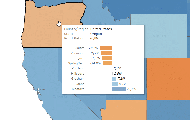
Let's start the comparison in Tableau. The demo included with the tool is the Superstore demo. It's a typical sales dashboard featuring sales across different geographies, different types of products and different segments. Let's look at the first page:
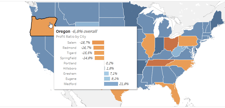
This map gives us a profit ratio overview by geographies. We can see in the tooltip that Oregon has some negative profitability and we can review each state individually.
Where do you start to create something like this? Basically, you always start working in a Tableau sheet, which contains one type of visualization. You start with that, and then you can expand on that with its myriad of options.
As you create a new Worksheet, you simply double-click the State measure and Tableau knows we want to work with geography. It's also easy to drop in the Sales measure and create a simple analysis with a couple of clicks.
This visualization is showing sales in individual states. The tooltip is displaying the name of the Country, State and sales revenue.
It's just as easy to add Profit Ratio, which is included under calculation measures.
This will deliver the colorful chart seen at the start of this chapter.
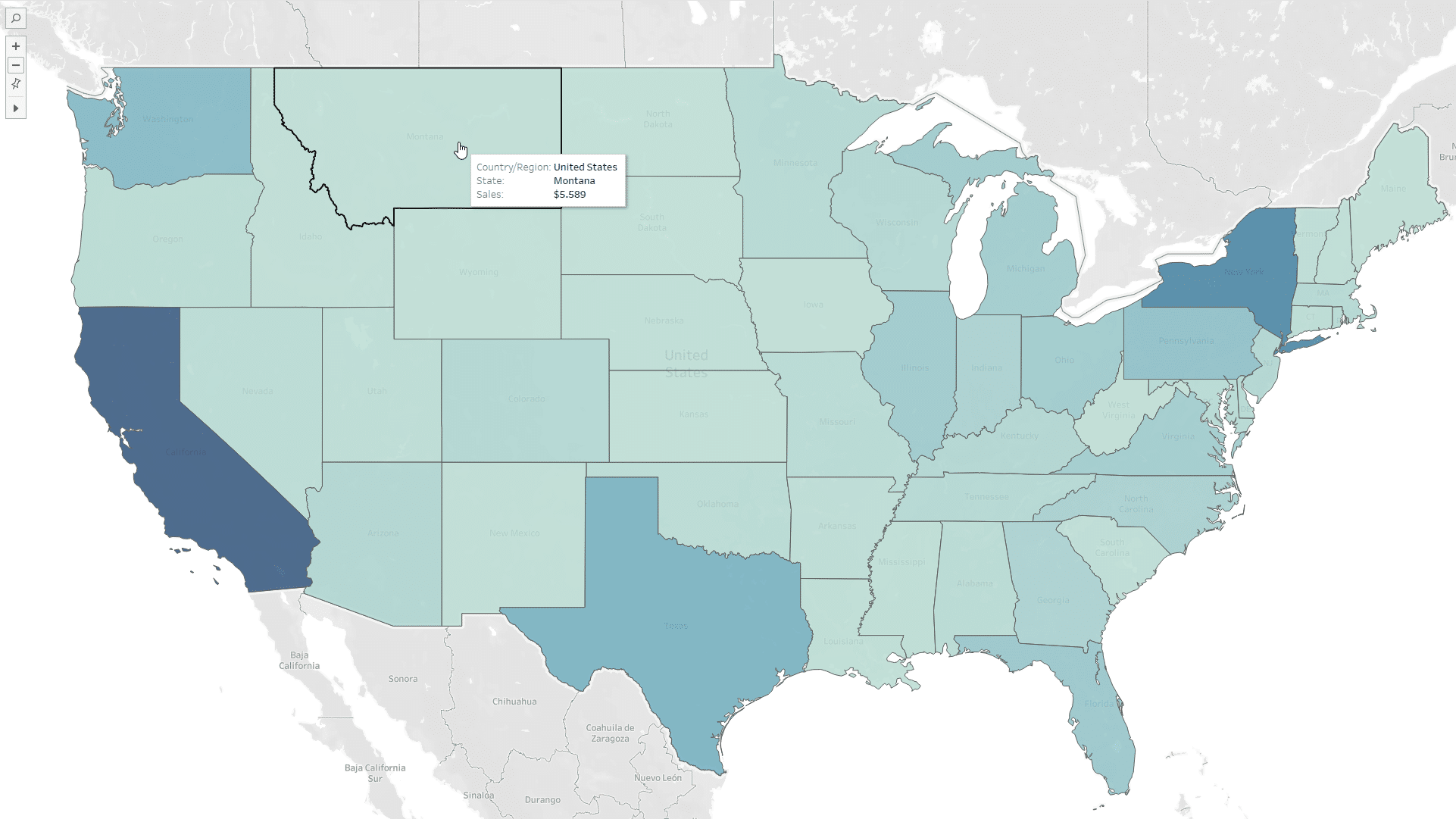
So, what about Power BI? We load up our data and click on the State measure.
Just like Tableau, Power BI knows it would be a good idea to show a map. Similar to Tableau, you can switch between a regular map with values shown as circles and Filled Map, which colors individual areas.
To get the same effect in Power BI, we also need to set up Data colors. You find these in the Visualizations pane in the Format tab. Open the Data color section.
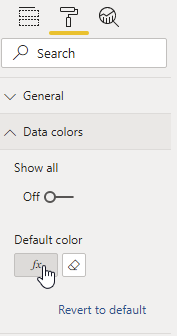
After you click on the formula button, a new window pops up, where you set up the colors for each individual measure. Now, select the Profit ratio measure and set it up to move from orange to blue.
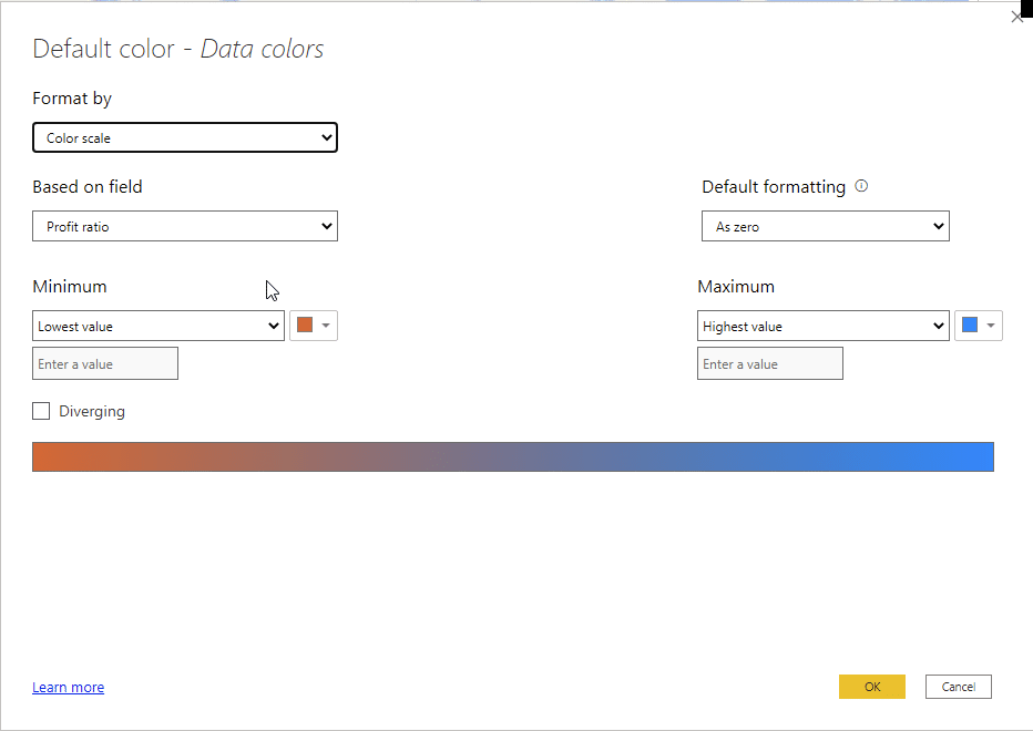
Tableau has very flexible tooltips. In the Marks section, you can click on the Tooltip button to edit how your tooltips look and feel.

What you get is an edit box where you can type in whatever you want and change parts of the text. If you need, you can change the font type and sizes and so on, so you can emphasize something or not.
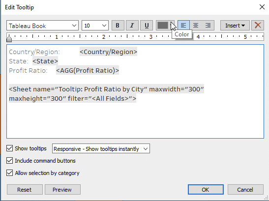
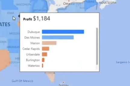
In this case, we even inserted a whole additional chart into the tooltip by clicking the Insert button and adding the Tooltip: Profit Ratio by City sheet into the tooltip. This gives you a way to review the performance of individual cities as you review individual states. Here's how it looks in action:
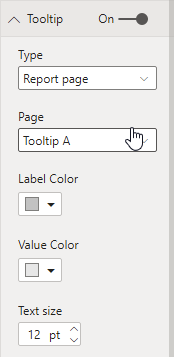
Now, let's look at Power BI. It has a similar concept called Report page tooltip. For this to work, you must create another page, which will then be displayed in the tooltip of another visual. In our sample file, we've created a new page called Tooltip A.
Set up the tooltips in Power BI. You find these in the Visualizations pane in the Format tab. Open the Tooltip section and set the Type field to Report page and then select the Tooltip A value under the Page value.
The final result is very similar. While it's not completely the same because the charts now behave slightly differently, it is a very similar principle.
However, at this point, the decade head start of Tableau kicks in. It pulls ahead with much more complete options for geographical visualization, including layers, rich label options and many others. Some of these options are not at all available in Power BI, which is very likely the reason that some advanced users do not want to switch to Power BI.
Let's continue our Tableau vs Power BI challenge with one of our favorites: small multiples!
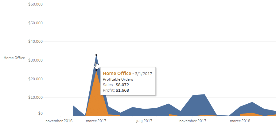
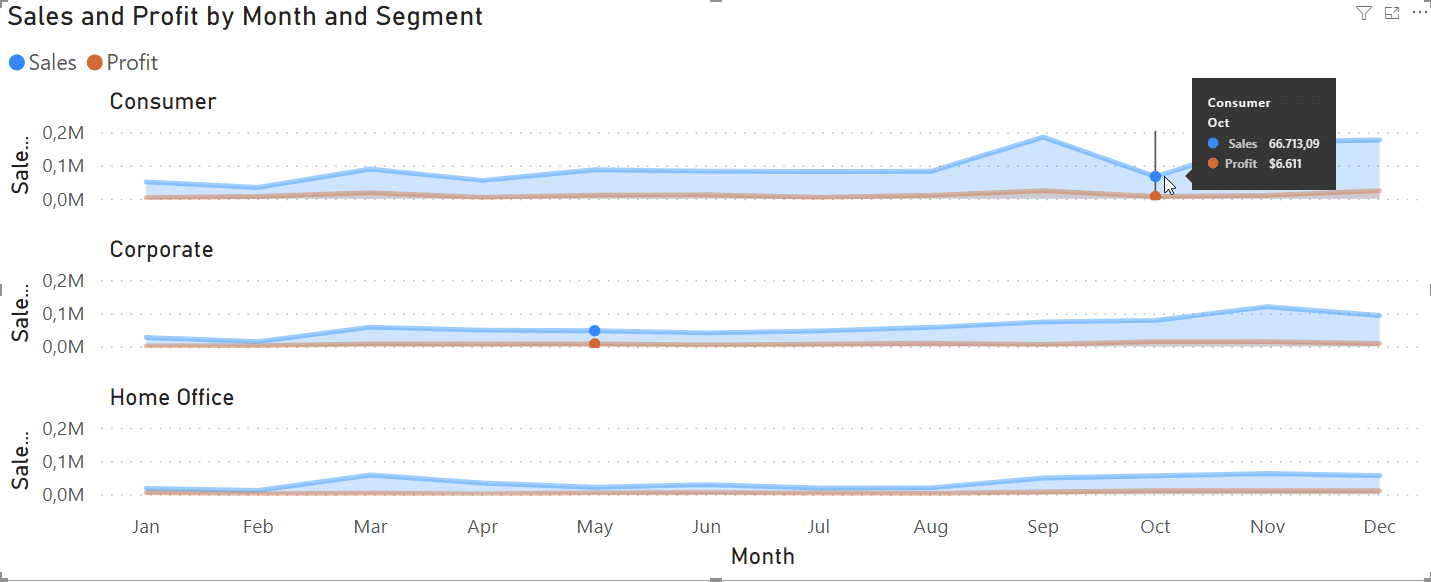
First, let's look at the Sales by Segment chart shown on the Overview dashboard in Tableau. This is an area chart analyzing sales and profits over time across three segments. It's actually a bit difficult to understand at a glance and you have to hover over the chart to see what the data actually says. In this case, the orange area shows the portion of the orders that were unprofitable.
This chart is repeated across three panes for each segment individually. Tableau works with rows and columns, so you can plug in additional dimensions to create small multiples.

Once you have this, you can just as easily drop the Product category dimension into the Columns placeholder to add more charts. Like this:
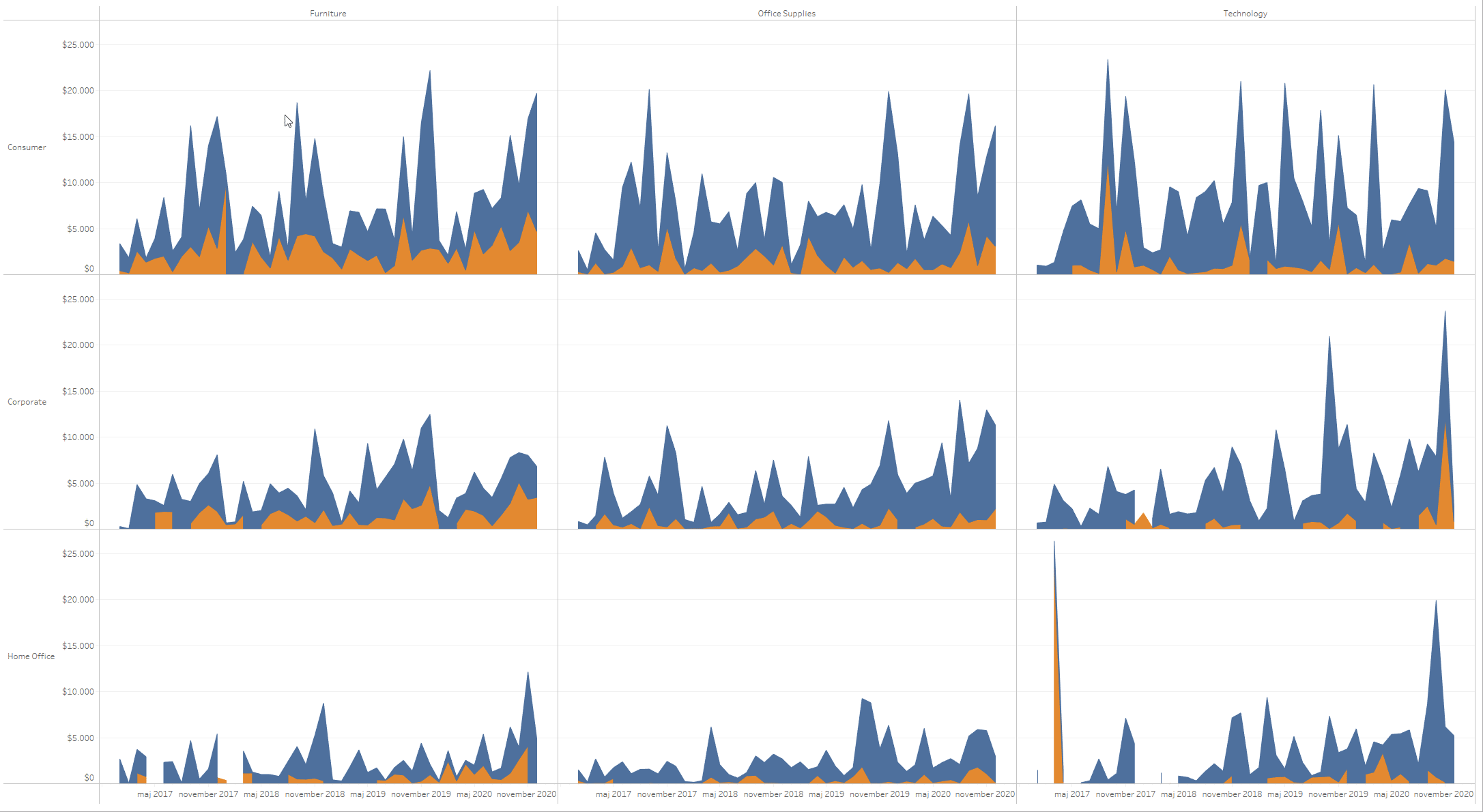
Tableau was probably one of the first tools to do this well and it's really easy to make. These charts are scaled and they work well but there are some issues. Small multiples here are always equidistant so all charts are the same size regardless of whether they actually need all that space. You will start to see this as a limitation once you move to the intermediate or advanced level.
If you're interested in learning more about small multiples in Power BI, here's a full 1-hour webinar on the topic: Supercharge Your Power BI Dashboards with Small Multiples.
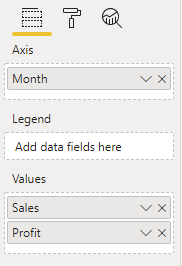
In Power BI, you can easily replicate the same thing. Start by enabling small multiples in the Options and settings menu. Enable the “small multiples” feature on the Preview features page. Then add an Area chart to your report and add Month, Sales and Profit dimensions.
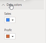
Replicate the look by going to the Format tab in the Visualizations pane. Here, you can set up the data colors to match the overall design.
All you need to do now is to just drop the Segment dimension into the Small multiples placeholder and you have your small multiples.
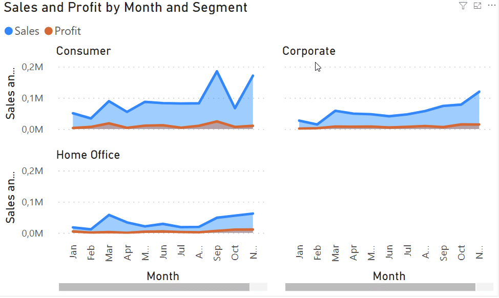
Compared to Tableau, which always operates on a two-dimensional matrix, so when you have three charts, you will either have all three in a single row or all three in a single column. On the other hand, Power BI has more flexibility, giving you more options to customize your layout. For example, you can switch from the above layout with 2 rows and 2 columns to a single column view. This is particularly useful when you have a larger data set that you need to display.
Change the look by going to the Format tab in the Visualizations pane. Here, you can set up the number of rows and columns in the Grid Layout menu.
Let's look at how we can further work on this data in Tableau. I want to look at sales and profit by quarter and categories, so I will add these measures to my worksheet.

You can make the visual more intuitive by adjusting the color of profits. which you can do by editing the SUM(Profit) Mark colors. You can make it stepped instead of a gradient, so it emphasizes important data more.

Now right-click on Profit and select Dual axis, which actually just takes the profit and overlays it over sales. You can also click on the Size button under Marks and make the profit bar slightly thinner to get a better overview of what is going on.
Obviously, you can quickly see that something's wrong here. Profit cannot be larger than the sales. The issue is that both bars are on different axes, so you need to synchronize them by right-clicking on it and setting it.
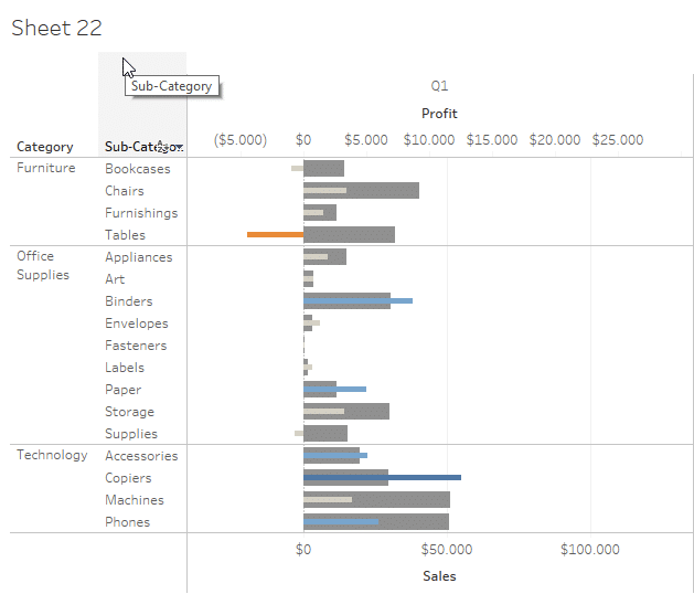
Now let's look at another visual and the dirty tricks we had to do to get it. Let's say we want to look at sales versus target because the database also includes plan data. Let's look at Tableau's default behavior. Essentially, when you add a new measure, Tableau always takes up full available space. This means that when we added the sales vs. target measure, everything is way off.
The axes between the two visuals are not synchronized and we cannot just right click and turn on that option here. What people in Tableau do is they take the sales measure and put it once again here to add another chart.
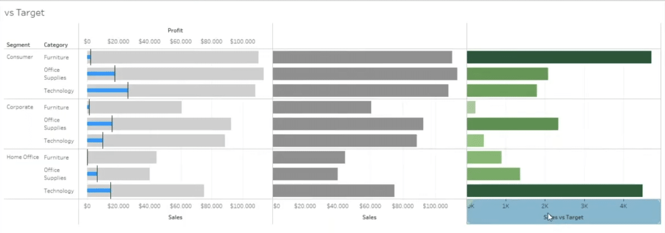
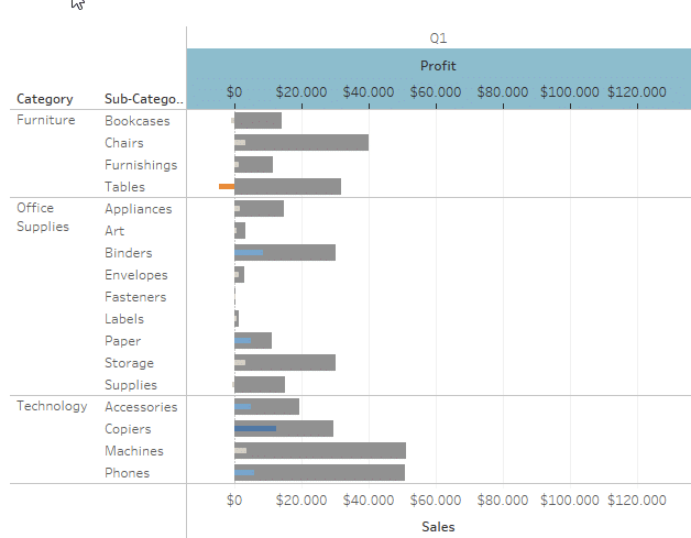
Only then can you make a dual-axis to join two charts.
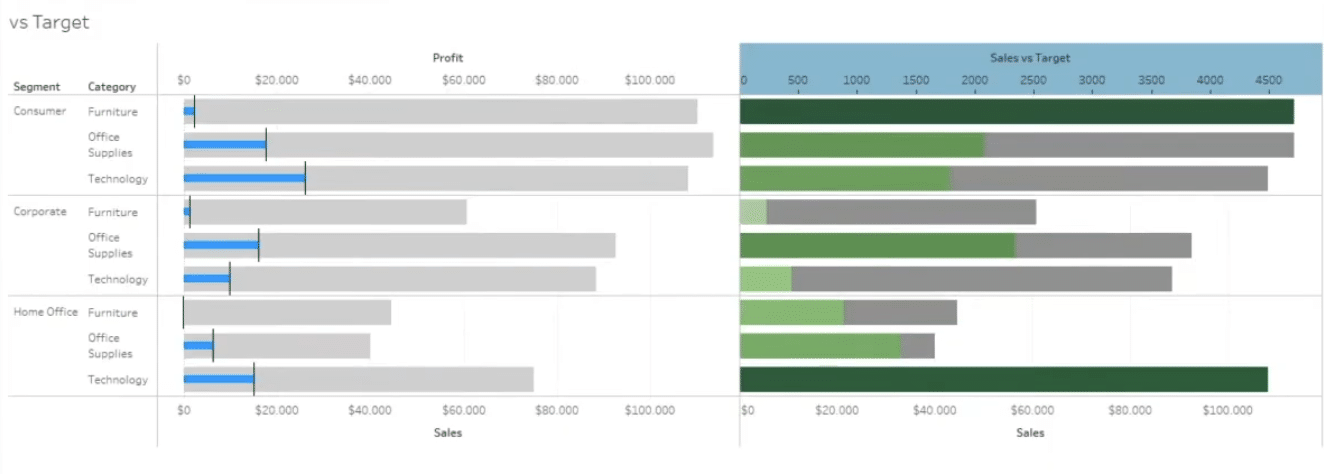
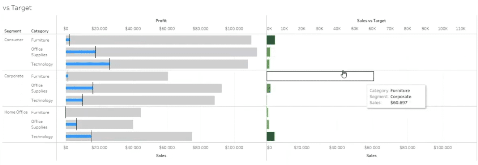
To fix the scaling issue, you need to synchronize the axes once again and then hide the bars representing sales to emphasize the variance. This trick only works if you don't have any negative values and you're also left with a lot of white space that can cause trouble once you try to create a good-looking dashboard.
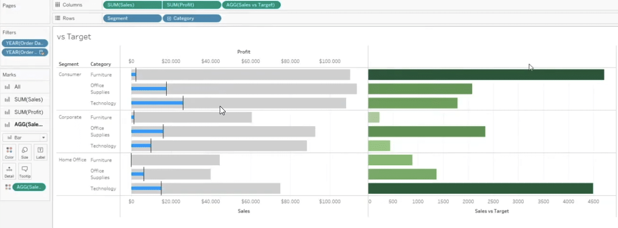
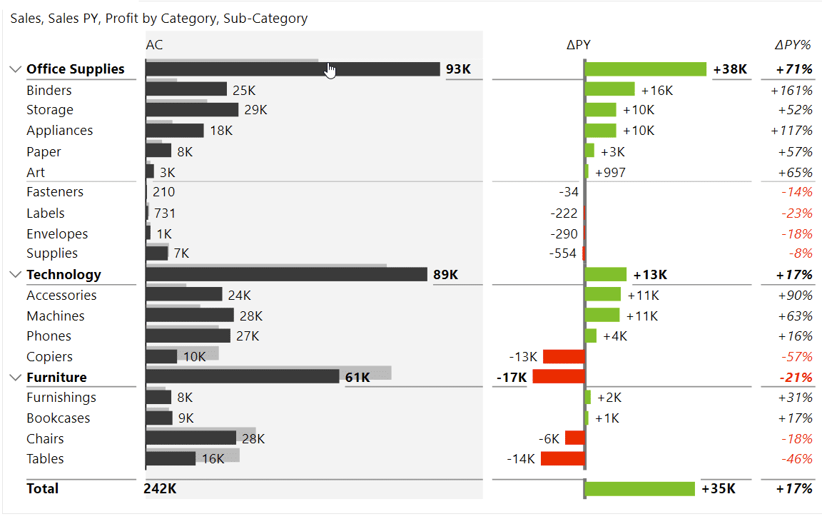
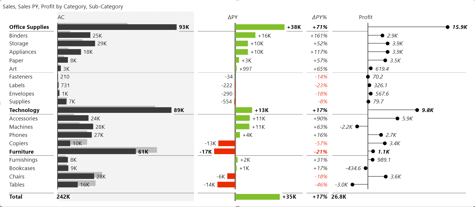
When you work with data like this, the recommended strategy is to use the Matrix visual.
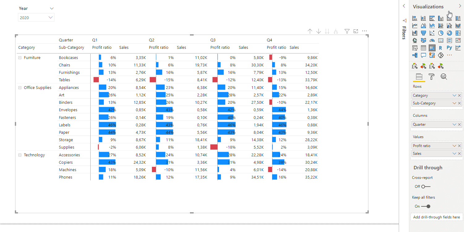
You start by setting up the matrix with Category and Sub-Category measures in Rows and Quarter measure in the Column placeholder. The values shown are Profit ratio and Sales.
You can design this matrix by setting up conditional formatting to show data bars for the Profit ratio measure. You can also set up colors for positive and negative values to make this go from a boring table to a more attractive combination of visualization and data.
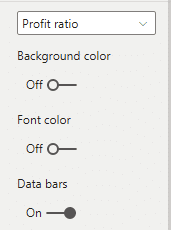
So while this is not a proper separate chart, it's conditional formatting in a matrix that's not a bad alternative to what we did in Tableau.
This is an area, where Power BI is much stronger. While Tableau has improved over the last year with Tableau Prep, Power BI is still far ahead. While you can connect to many data sources with both tools, Power BI boasts two tools with two languages - M for Power Query and DAX for data modeling and calculations. This allows you to do anything with any kind of data source.
Power BI also brings the power of transformations to the table. If you look closely here you can even include machine learning algorithms through your clustering and other options as you load your data into your analysis.
In Power BI, you can use live connections or loaded data and even a composite model that mixes the two. When needed, you can use relationships to make your data model even more powerful.
If you'd like to learn more about data modeling in Power BI, here's our tutorial: Top 5 Power BI DAX tricks for super effective Power BI dashboards.
Both tools offer a way to extend their functionalities. Tableau calls them extensions and Power BI calls them custom visuals. The difference in adoption is huge right now. While Tableau has 52 extensions available, Power BI has 381.
We are talking about two completely different worlds. In Tableau, extensions are very limited and only work in dashboards and not in core Tableau. On the other hand, Microsoft is much more open and partner oriented. It has open infrastructure and APIs and marketing channels for partners. This is what drives the difference.
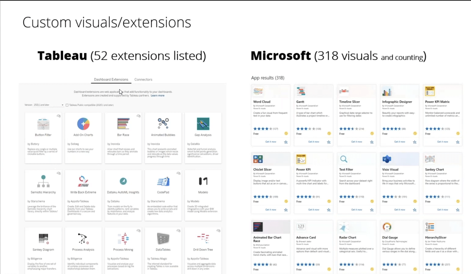
In Power BI, custom visuals are completely integrated into the tool. Sometimes, you can't even tell the difference. Custom visuals can access the same data and the workflow is the same. Microsoft even certifies the best visuals out there, to make sure they meet security standards.
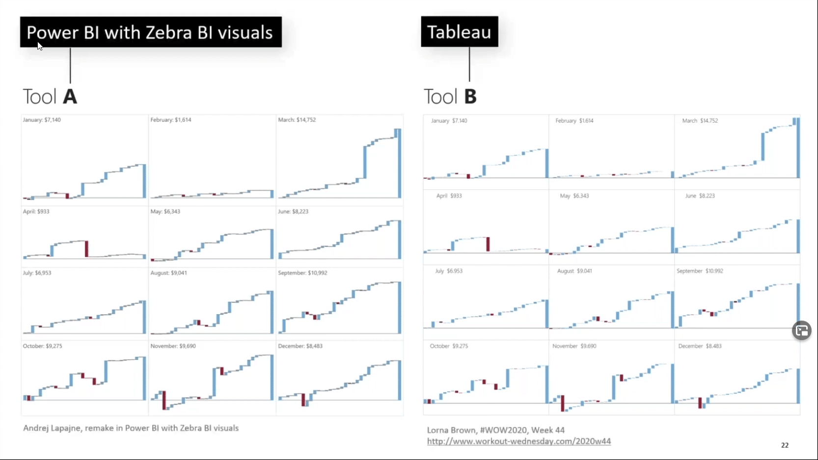
This gives Power BI an enormous advantage over the competition. It allows it to close the gap in certain visualizations. For example, Tableau does not offer waterfall charts by default. However, you can tweak them and create small multiples with waterfall charts. On the other hand, Power BI does support waterfall charts but you cannot use them in small multiples. However, you can use a custom visual to do it. So let's look at the end result in both tools:
This extensibility means that you can do things in Power BI that you can do in Tableau but you can do so much more. You can use specialized custom visuals that do things even Tableau can't.
For example, here is a visual where some values are much larger than other values. United States is so much larger than other countries but the distribution of these charts is not equidistant. Other countries are split in a dynamic and highly automated small multiple while still staying scaled. This is something that Tableau can't do, even with the best tricks out there.

Or take financial statements where you need to present changes. And once you have those changes, they need to be aligned and scaled with the base values. Something like this:
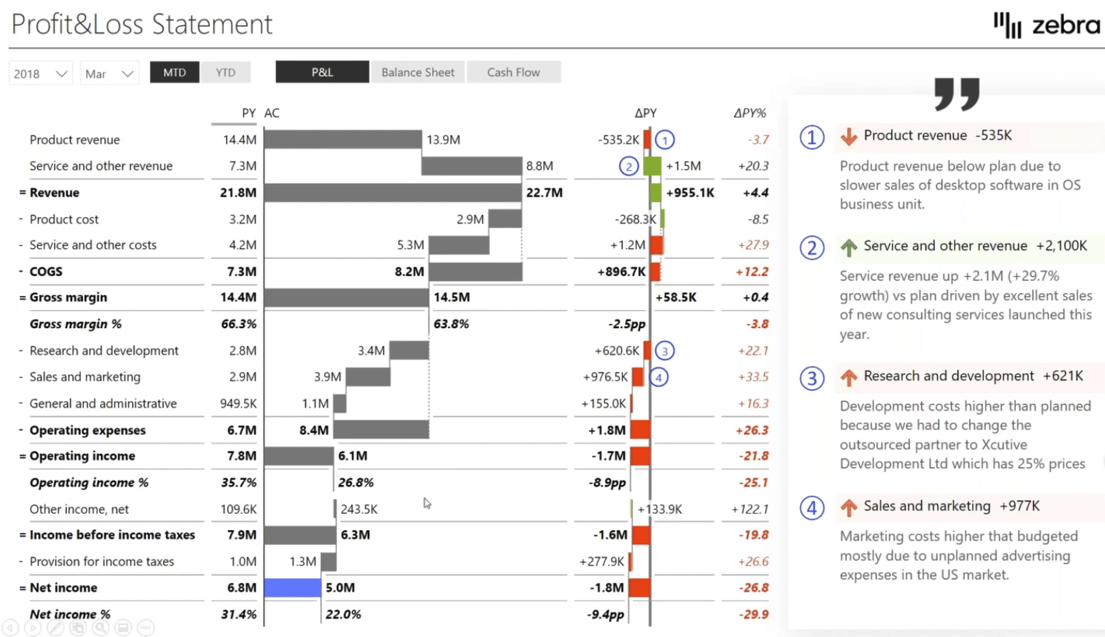
This is something Tableau cannot do and Power BI can do to an extent. However, custom visuals really save the day here.
The above two visuals were created in Zebra BI and it's super easy to add to Power BI. Simply click "Get more visuals" and select what you need from all those 318 visuals. Simply search for them in the marketplace. Zebra BI tables and charts are here along with many, many others that will help you with composition trees and many other types of visualizations, infographics and so on.

Custom visuals give you a lot of flexibility. For example, you can take a chart comparing sales to the plan and add profit as another value to turn a simple chart like this ...
into a more meaningful chart like this:
Let's look at an even more extreme example - sales by state. This is a great test of the functionality of the small multiple, because it creates dozens of charts.
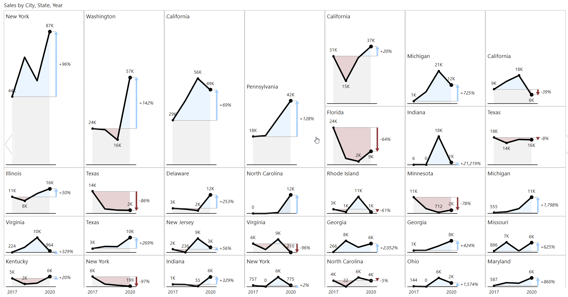
Something like this would not even be possible in Tableau. You would just see either one row or one column and the height would be the same for all of them. Here you have maybe 20 or more charts on one page. Even when you go down, as the values get smaller, the amount of space they take up is smaller.
The point here is that custom visuals add this additional power even in the spaces where maybe Tableau had years of advantage.
So who wins our Tableau vs Power BI Superstore challenge? Well, it depends... 🙂
While Tableau is still a force to be reckoned with in the data visualization space, Power BI is deservedly making inroads.
Try Power BI out with some custom visuals like Zebra BI and you'll see you can really create visual stories that are meaningful, impactful and actionable.
Especially if you're a beginner, Power BI is the more suitable choice. You will be able to start working and creating faster and with fewer difficulties.
Could You please add a Print/PDF Button.
Thanks,
gab
Gab, thanks for your message! We're planning to do it sometime in the future for articles like this one, stay tuned! 🙂
Thanks for sharing this informative article, after reading this, I found that When you create a business plan and goals earlier in the year, then there is a very low-risk rate in business developing and it will go smoothly.