September 8th
 February 22nd

How to Build Your First Power BI Report in 4 Steps
You have Power BI installed. You have data somewhere in an ERP, a data warehouse, or a folder of Excel files. And you have a boss, or a boss's boss, who still runs the monthly review from a spreadsheet because "that's the number we trust."
This is the most common place new Power BI users get stuck. Not on installation, not on licensing, but on the gap between opening a blank workspace and producing a Power BI report that leadership actually uses. In our conversations with finance teams, this stall shows up constantly: the tool is live, a few visuals exist, and yet every management reporting decision still routes through Excel.
Here's the good news: your first Power BI report doesn't need to be a masterpiece. It needs to be trusted. And trust is something you can build deliberately by taking 4 specific steps.
This article gives you the step-by-step process. No prerequisites beyond Power BI Desktop and access to your data. You can complete the whole thing with what you already have; in steps 3 and 4, we'll point out where a purpose-built tool speeds things up, and where it doesn't matter.
What a "trusted" Power BI report means
Before we start, let's define the finish line. A report in Power BI is trusted when it clears 4 bars:
- The numbers match the source. Anyone can check the report total against the ERP or the ledger and get the same answer, to the cent.
- Variance against plan is visible. Not just actuals. The report shows how performance compares to budget or forecast, because that comparison, the variance analysis , is the question every review meeting is really asking.
- One page answers one question. No scrolling through 12 tabs. A reader gets the answer in seconds, then the supporting detail.
- A named owner refreshes it. Someone is accountable for the data being current. A stale report is worse than no report, because it teaches people to double-check everything.
That's it. Notice what's not on the list: advanced DAX (Power BI's formula language), a certified data model, or a design award. Those come later.
Not sure how many of these four your current reports already clear? Take the 8-question maturity check - two minutes, no email.
Tyler Snyder, Senior Financial Data Analyst at AbbVie, put it plainly:
Trust and credibility have to be the baseline if reports are going to be adopted.
Now that we know what a report should look like, here's how you can build it:
Step 1: Get one number right
Goal: one question, one data source, numbers that make sense.
The single biggest mistake new builders make is starting broad. They load 6 tables, sketch a landing page with 10 KPIs, and spend the next month debugging relationships. The best move is to skip all of that and pick a number so small it feels like you're not even designing a Power BI dashboard yet.
Pick the question
Choose one question a decision-maker actually asks every month. Here are a few that usually work:
- How is revenue tracking against plan, by region or product line?
- Where are operating expenses over budget?
- How did gross margin move versus last month?
Pick the one your CFO or team lead asks most often, so you're not building a report and hoping someone needs it.
Connect one source
Resist the urge to model everything. Connect to the one table or export what answers your question: the trial balance extract, the revenue ledger, or the same file your team already trusts.
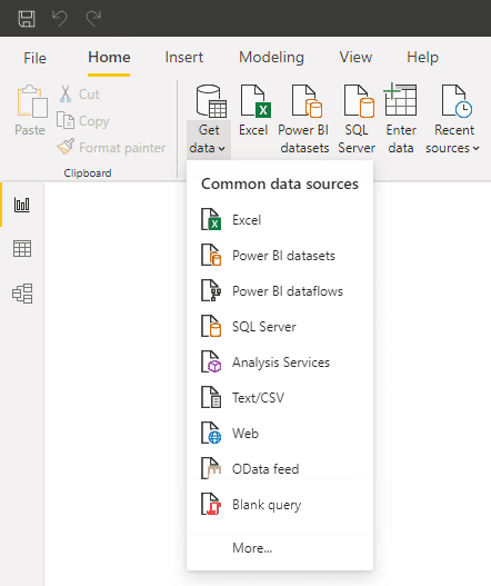
Use Power Query to load it, apply the minimum transformations (fix data types, remove blank rows, name your columns clearly), and stop there.
Match the number before you visualize
This is the habit that pays off for years: before you build a single chart, put your total in a table visual and compare it against the source system. Revenue year-to-date in Power BI must equal revenue year-to-date in the ERP. If it doesn't, find out why now, in a two-column table, not later in a board meeting.
Most of the time, it's duplicated rows from a bad join, filters applied during load, currency or date cut-off mismatches. Every one of these is easier to fix when your model has one table.
Step 1 checkpoint: You can open your file, show one total, and make sure it matches the source. Then, write down how you validated it.
That note becomes your answer when someone asks, "where does this number come from?"
Step 2: Build one page that answers one question
Goal: a single report page that a reader understands in 30 seconds.
When building the report, keep the focus narrow: one page, one question, with the answer at the top.
Add the minimum model
You'll need 3 things beyond your data table:
- A date table. Even a simple one. It makes month-over-month and year-to-date calculations behave predictably.
- A plan or budget table, if your question involves one (and it should; see step 3). Load it the same careful way you loaded actuals.
- Three measures: Actuals, Plan, and Variance (Actuals minus Plan). Writing these as explicit measures rather than dragging raw columns into visuals is the one modeling habit worth adopting right away.
Lay out the page like a news story
Put the answer first. The top of the page should carry the headline number and its variance against plan. Below that, the breakdown that explains it: by month, by region, by cost category. Place detail tables at the bottom of the page, or on a hidden drill-through page if the reader needs more information.
Here's how to test what you've built so far: ask a colleague who hasn't seen the report to answer the main question within 30 seconds of looking at the page. If they hesitate, cut something. As one of our Bayer users likes to say, it's the quality of the content, not the quantity.
Stick to one page
Every idea that doesn't serve the core question goes on a backlog list, not on the canvas. A focused page that answers one question is better than a sprawling dashboard that almost answers 5 questions.
Step 2 checkpoint: Only one page. A colleague can easily read it and find the answer to your chosen question. The numbers on your Power BI reports still trace back to the source.
Step 3: Make variance impossible to miss
Goal: plan vs. actuals, visualized the way finance reads it.
Here's where most first reports quietly fail. They show actuals beautifully while hiding the comparison, which is the entire point. "Revenue was 4.2M" means nothing in a review meeting.
What they want to know is that "revenue was 4.2M, 6% under plan, driven by 3 regions."
The native way
You can add variance to the page using built-in Power BI features. It's still worth building it by hand once, so you understand what's going on:
- Write variance and variance-percent measures, then display them in a matrix next to actuals and plan.
- Use conditional formatting to color negative variances so the eye lands on problems first.
- Build a waterfall chart to show how you got from plan to actual, category by category.
Expect a bit of friction here, but don't worry, that's normal, not a sign you're doing something wrong.
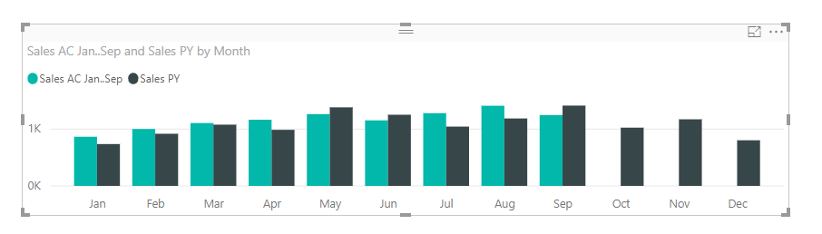
Calculating variances over a plan scenario, getting subtotals to behave in a matrix, and building a waterfall that handles invert logic and subtotals, all of that usually means custom DAX and a lot of formatting passes. Finance teams tell us this is exactly where the "quick Power BI report" turns into a 2-week project.
The faster way
Can you skip all the DAX? Yes, that's the whole premise of Zebra BI: a set of visuals that plugs into Power BI and handles variance and waterfall calculations for you.
It's a paid product with its own license and sign-in, so budget for that conversation with whoever approves tools.
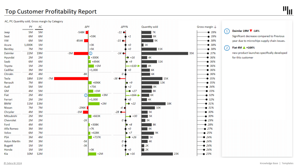
In exchange, you get: variance calculations, plan-vs-actual charts, waterfalls, and small multiples (the same chart repeated across categories for side-by-side comparison) that work out of the box, following IBCS standards (International Business Communication Standards, the reporting notation used by companies like Bayer and AbbVie).
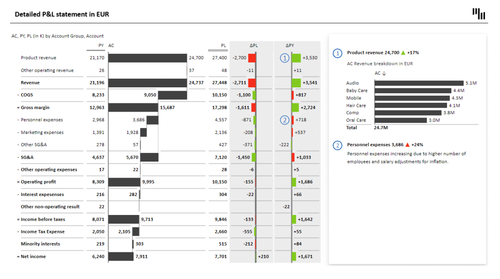
Your data never leaves Power BI; the visuals render right where your model already lives. The variance and waterfall work you'd build by hand becomes an afternoon of dragging fields.
Shane Brinkmann, a business analyst at Gore Medical, started exactly where you are now:
I had no Power BI knowledge prior to taking the role. I found Zebra BI early on, and once I used the trial, I built a report in half a day, and it was infinitely better than what I had done with base Power BI.
That report became the template for his team. By consolidating and automating reporting from that starting point, Gore Medical estimates it saved one to two analysts' worth of time per year. Instead of every analyst starting from scratch, the team now has a single standard for everyone to build from.
Your variance page, without the DAX
Variance, waterfalls and small multiples work out of the box, following IBCS. Your data never leaves Power BI.Start your free trialNo spam. No credit card. Full version. Great tutorials included.
To be clear: you can finish this plan entirely on native visuals. It costs more hours and more DAX, and the output takes more polishing to look finance-grade, but the milestones don't change.
Step 3 checkpoint: Your page shows actuals, plan, and variance together. Negative variances are visually obvious and someone scanning the page can name the biggest problem area without asking you.
Step 4: Ship it, refresh it, own it
Goal: the report lives in the Power BI Service, updates on schedule, and gets presented.
Right now, your Power BI report is still just a file on your laptop. Now, you publish it, put it on a refresh schedule, and get it in front of the people who are supposed to use it.
Publish and schedule
Publish the report to a Power BI workspace and set up scheduled refresh against your source.
Test the refresh, then test it again after the next data load. Then do the part everyone skips: write down, on the report page itself or in its description, who owns this report and when it refreshes. That one line ("Refreshes daily at 7:00, owned by [name]") builds more trust across your team than any visual choice you'll make.
Present it, don't email it
Don't send a link cold. Book 15 minutes with the person whose question this report answers and walk them through it live. Show the answer first, then how to read the page, then where the numbers come from (your step 1 validation note earns its keep here).
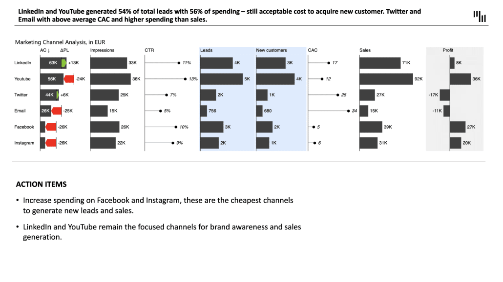
There's a structure you should follow, one that Almir Mulahasanovic, Head of Business Intelligence at Raiffeisen Bank, formalized:
We follow the 3-30-300 principle. In 3 seconds you see the status, in 30 you understand the cause, and in 300 you're ready to act.
If your page delivers those 3 layers (status, cause, action) at those 3 speeds, you've built something better than most reports in most companies.
Watch for the unlock moment
You'll know the report is trusted when something specific happens: someone who didn't ask for it wants it. A neighboring team lead sees it in a meeting and asks, "Can we get this for our numbers too?" Your CFO opens it before the review instead of asking for the Excel version.
That unsolicited pull is the signal that you've moved from "person experimenting with Power BI" to the "person who builds reports people use."
Step 4 checkpoint: The report is live, refreshes on schedule, names its owner, and has been presented live to its primary audience. All 4 trust criteria from the top of this guide now hold.
What happens after your first Power BI report
One trusted report changes your position more than it changes your workload. You now have a proof point, a repeatable checklist, and an audience. The typical next steps, roughly in order:
Clone the pattern. Your second report reuses the date table, the measure structure, and the layout logic. Expect it to take a fraction of the time.
Add depth, one element at a time. Ivana Meier, a senior financial analyst at Abbott, described her rollout approach this way:
I didn't want to scare them off. I just kept adding one new element at a time until we got where we wanted to be.
Drill-throughs, commentary, and small multiples earn their place gradually.
Turn the report into a standard. When 2 or 3 reports share the same visual language, you can start the conversation with your finance lead about making it the department's way of reporting, not just yours. That's the move from a functional report to an aligned reporting practice, and it's a topic for another article.
Where to go from here
If you want to see the full path from a blank page to a boardroom-ready report demonstrated live, watch one of our webinar recordings on financial reporting in Power BI. They're free and show the actual clicks, not slides.
If you already have reports and you're not sure where you stand, take the reporting self-assessment. It maps your current setup against the reporting maturity model and tells you which of the 4 trust criteria you're missing.
The Last Mile Maturity Check
8 questions. Check every box that describes your organisation right now.
How many of these sound familiar?
And if step 3 is when you want the shortcut, Zebra BI's free 14-day trial offers the full feature set. Start it on step 1, rebuild your variance page with it, and run the 30-second test on both versions.
Your CFO doesn't need a prettier dashboard. They need one number they don't have to double-check. Go build it.