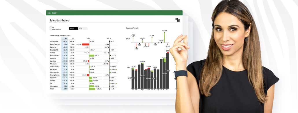
Discover key tips for Excel dashboard creation with Leila Gharani's tutorial and enhance your skills using Zebra BI's advanced tools for optimal analysis.
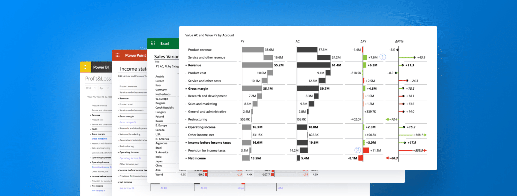
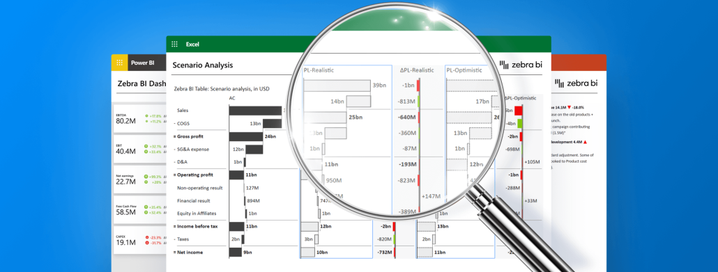
Explore Zebra BI Tables for efficient report space, clear visuals, and easy use. Ideal for modern business challenges with advanced visuals and IBCS compliance.
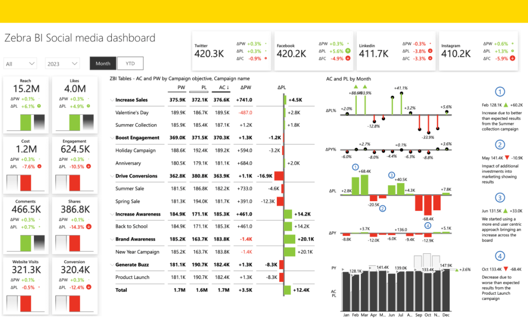
Zebra BI's Social Media Power BI Template provides a clear view of your online activity. Easily navigate key metrics and boost your social media impact.
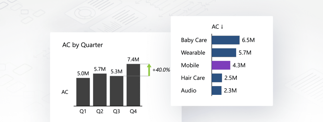
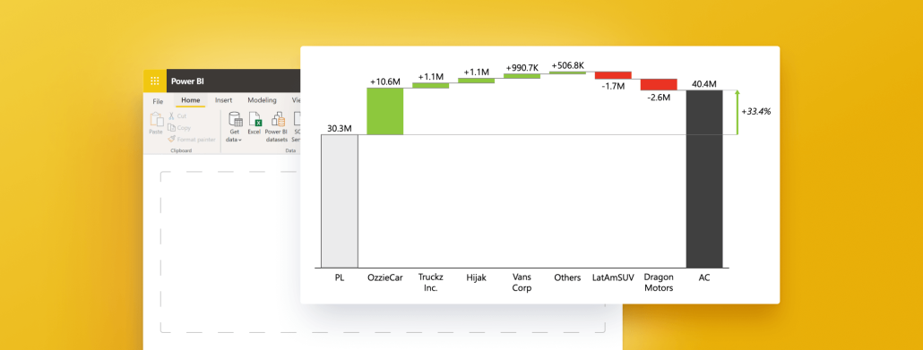
Need to understand waterfall charts (and quickly)? This guide explains everything you need to know about Power BI waterfall charts and their main use cases.
Unveil the future of business intelligence as we delve into data visualization using AI, revealing game-changing tools and a glimpse at what's to come.
 September 8th
 February 22nd