P&L in Power BI: How to Create a Profit and Loss Dashboard (Free Template)
Share this
Building a profit and loss statement in Power BI sounds simple until you need to do it for your next meeting.
Revenue and costs don't sort themselves into the right order, subtotals like gross profit don't exist anywhere in your raw data, and one wrong sign convention can make your whole report look profitable when it isn't.
A profit and loss (P&L) statement, also called an income statement, shows how a business turns revenue into profit over a given period. It's one of the most important Power BI financial statements a company relies on, and one of the most requested reports in FP&A and management meetings.
But there's a gap between having a P&L and having one you can actually work with, drill into, compare period over period, and trust it the moment new data lands.
This guide walks through how to build a P&L in Power BI step by step, first using native visuals and DAX, then with a faster, no-DAX approach using Zebra BI.
You'll also find real P&L dashboard examples and a free template if you'd rather skip the setup entirely.
What Is a Profit and Loss Statement in Power BI?
A P&L in Power BI is an income statement that shows how much money a business made, spent, and kept over a specific period of time.
Usually, financial teams build it as a live, interactive dashboard that updates automatically as new data comes in and lets you take a closer look at the numbers.
For P&Ls, it's worth clearing up something: P&L, income statement, and estado de resultados (its common name in Spanish) are all the same document. Different teams and different regions use different names, but the report and the logic behind it don't change.
It's also worth remembering that the P&L doesn't stand alone. Power BI financial statements typically cover 3reports together: the income statement, balance sheet, and cash flow statement, and the P&L is usually the one teams build first.
A typical profit and loss statement includes:
Revenue: The money earned from sales or services.
Cost of Goods Sold (COGS): The direct costs associated with generating revenue.
Gross profit: Revenue minus COGS.
Operating expenses: Indirect and overhead costs.
EBITDA: Earnings before interest, taxes, depreciation, and amortization, a common profitability benchmark between gross profit and net income.
Net profit (or loss): The final financial result.
What’s important to understand is that a profit and loss statement is not just a list of numbers. It’s a structured financial statement with a specific order, clearly defined subtotals, and accounting logic behind every line. It can vary by business, which makes it difficult to create accurate, digestible visuals, especially in Power BI.
This is why building a profit and loss statement in Power BI causes so many issues.
Sound familiar? Skip the manual setup entirely.
The ready-made Income Statement template already includes row order, subtotals, sign logic, and variance calculations - no DAX required.
At first glance, creating a P&L in Power BI sounds simple: you have transactions, you sum them up, and you show the results. In practice, that approach breaks down very quickly.
The reason is that a profit and loss statement is not a flat report. It’s a structured financial statement with rules that don’t naturally exist in raw data. Native Power BI doesn’t handle those rules automatically, which is where the challenges arise.
Here are the most common difficulties finance teams run into.
1. Custom Row Order
P&L statements follow a strict financial layout: revenue first, then costs, then calculated profit lines. This order has nothing to do with account numbers or alphabetical sorting.
In native Power BI, visuals are designed to sort data dynamically, not to respect a fixed financial statement structure. As a result, teams must manually control row order, usually through additional tables or custom logic.
2. Subtotals don’t come from raw data
Key P&L lines, such as gross profit or net profit, are not stored in the source data. They are calculated results that sit between other rows.
Power BI doesn’t inherently understand these relationships. Subtotals have to be explicitly defined using measures, which increases model complexity and requires careful design to avoid errors. Gross and net profit are the heartbeat data of any business, so it pays to get it right.
3. Accounting signs (+/–)
Native Power BI visuals don’t apply accounting sign logic automatically. Finance teams must handle this manually through measures, sign flags, or structure tables to ensure the P&L reads correctly. Once again, this is a key risk area for errors or oversight.
4. Ragged hierarchies (headers vs detail rows)
A P&L statement mixes different types of rows:
Section headers (like Operating Expenses).
Detailed account lines.
Calculated subtotal rows.
These don’t form a clean hierarchy. Some rows have children, others don’t. This “ragged” structure is difficult to represent cleanly using standard Power BI hierarchies and visuals without additional modelling effort.
5. Maintenance complexity when the structure changes
P&L structures are not static. Accounts get added, categories change, and reporting requirements evolve.
In a native Power BI P&L, even small structural changes can require updates to:
Mapping logic
Measures
Row order definitions
Over time, this often leads to increased time spent on maintenance and increases the risk of mistakes across reports.
All of these challenges are normal, and they don’t mean Power BI is the wrong tool. However, they do show why building a P&L statement requires a deliberate, structured approach, rather than a simple table or chart.
Using a Profit and Loss Statement in Power BI means creating a dynamic statement that can change even on a daily basis. It pays to create clear, digestible data that can be updated quickly and easily.
Native Power BI doesn’t handle those rules automatically, which is where the challenges arise.
Note: If you want to avoid manually handling these structural rules, the ready-made Income Statement template below already includes them.
Don't build these rules from scratch
The Income Statement template handles row order, subtotals, sign logic, and variance calculations automatically.
How to create a P&L in Power BI step by step (native visuals)
The key to a reliable P&L statement in Power BI is getting the structure right before you touch a single visual.
Here's how you can do it:
Step 1: Set up your data model
Before you build anything, your data model needs 3 core tables:
GL (General Ledger) table The GL table includes all of your relevant data, such as transaction amounts, account numbers, and dates.
Calendar table A date table is non-negotiable for financial reporting. It's what makes monthly and quarterly views, and year-to-date totals comparisons possible.
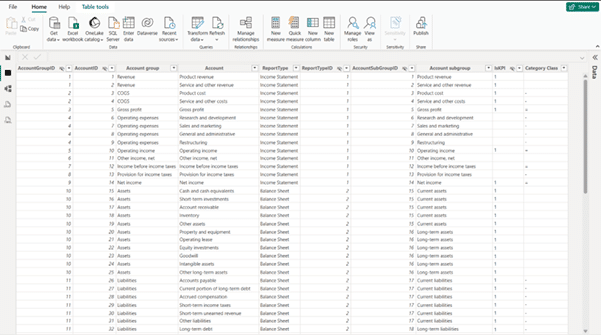
Chart of Accounts table This table defines your P&L's structure independently of the transaction data: line names like Revenue and Operating Expenses, the order they appear in, which rows are subtotals, and how signs should be handled.
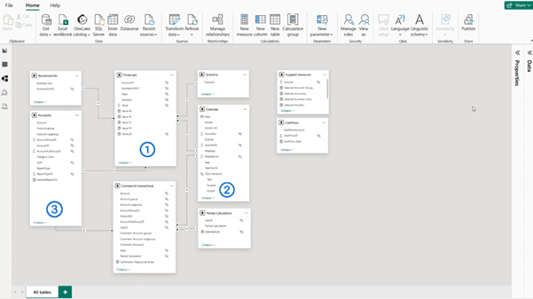
These 3 tables form a simple star schema, with the GL table at the center and the Calendar and Chart of Accounts tables connected to it.
Most finance teams pull GL data directly from their accounting or ERP system rather than building it manually. Power BI connects natively to the most common sources, including:
SAP
Microsoft Dynamics 365
QuickBooks
Xero
Oracle
In practice, most models grow beyond these 3 tables, business units, scenarios, cash flow, and comments are common additions. Here's what that looks like in Power BI:
Step 2: Create a P&L Structure Table
In this step, you’re telling Power BI how you want your P&L statement to look like.
First, you have to map account codes to P&L line items.
Your GL table has dozens, maybe hundreds, of account codes that mean nothing to Power BI on their own.
Mapping each one to a P&L line shifts your logic from "sum by account number" to "sum by financial meaning," for example:
Accounts 4000–4099 → Revenue
Accounts 5000–5099 → Cost of Goods Sold
Accounts 6000–6199 → Operating Expenses
Then, set the display order.
A P&L doesn't sort alphabetically or by account number: Revenue comes first, then COGS, then Gross Profit as a subtotal, and so on down to Net Profit. A sort-order column on your structure table lets you enforce that layout no matter how the accounts are numbered.
Lastly, build the table.
When it comes to building a table within the P&L statement, there are 2 options:
Enter Data manually. This is the best option if your P&L structure is stable enough. Power BI's built-in "Enter Data" feature lets you type the mapping directly, no separate file needed.
Import from your GL or ERP system. This method works well if your chart of accounts is large or changes often. Maintain the mapping in a spreadsheet or your accounting system, then import and refresh it like any other table.
At this moment, your table doesn’t store any dollar amount. It only stores the logic that turns your transactions into a financial statement.
Step 3: Write the DAX measures
With your structure table in place, DAX is what actually calculates the numbers behind each P&L line.
1. Revenue and COGS measures
Start with a basic measure for each side of the P&L, filtered by the account mapping from Step 2:
Revenue =
CALCULATE(
SUM(GL[Amount]),
ChartOfAccounts[PL_Line] = "Revenue"
)
COGS =
CALCULATE(
SUM(GL[Amount]),
ChartOfAccounts[PL_Line] = "COGS"
)
2. Sign logic
Costs are usually stored as positive numbers in the GL, but a P&L must subtract them from revenue. Rather than editing your source data, handle the sign in DAX:
COGS (Signed) = [COGS] * -1
Applying the sign in a measure, not in the data, keeps your raw GL untouched and makes the logic easy to audit later.
3. SWITCH measure for P&L rows
Instead of writing a separate measure for every single line in the Matrix visual, a SWITCH measure reads the current row from your structure table and routes it to the right calculation:
P&L Value =
SWITCH(
SELECTEDVALUE(ChartOfAccounts[PL_Line]),
"Revenue", [Revenue],
"COGS", [COGS (Signed)],
"Gross Profit", [Revenue] + [COGS (Signed)],
BLANK()
)
Step 4: Build the Matrix Visual
Add a Matrix visual and configure it like this:
Rows: your P&L structure table, sorted by display order
Columns: your Calendar table's month or period field
Values: the SWITCH measure from Step 3
Because the structure table controls row order and sign logic, the Matrix will render Revenue, COGS, Gross Profit, and so on in the right order automatically, no manual sorting needed.
If it looks too complicated, here’s how you can make it easier to read:
Turn off automatic subtotals for detail rows. Your subtotals are already calculated in the SWITCH measure, so default subtotals would just duplicate them.
Format values as currency with consistent decimals.
Suppress zeroes so unused accounts don't clutter the report.
At this point, you have a working P&L. The last step is turning it into something people can actually analyze.
Step 5: Add variance analysis and interactivity
Make your P&L statement actionable by adding comparisons and interactivity.
1. Actual vs. Plan vs. Prior Year
Add extra measures for your budget or forecast data and for the same period last year, then place them as additional columns next to your actuals:
Variance vs Plan = [P&L Value] - [Plan Value]
Variance vs Plan % = DIVIDE([Variance vs Plan], [Plan Value])
Do the same for the prior year. These variance columns are usually what finance teams and management actually look at first, since they show where performance is ahead or behind, not just what the raw numbers are.
2. Date slicer
Add a slicer using your Calendar table so users can toggle between MTD, QTD, and YTD views without needing separate reports for each.
3. Drill-down
Enable drill-down on your revenue and cost lines so users can click into a P&L line and see the individual accounts or transactions behind it, rather than taking the total on faith.
DAX Formulas for Your Power BI P&L
Turn your raw data into a working profit and loss statement with a handful of DAX formulas. Here’s the core set, ready to copy to your statement:
1. The Revenue Measure
Every P&L starts with a measure that sums transactions tagged as revenue in your Chart of Accounts:
Revenue =
CALCULATE(
SUM(GL[Amount]),
ChartOfAccounts[Type] = "Revenue"
)
This pulls all transactions mapped to a revenue account and returns a single total, filtered by the active period or slicer on the report.
2. Sign Logic for Costs
In most GL systems, costs are stored as positive numbers. A P&L needs to subtract them from revenue, so the sign has to be flipped somewhere, and that somewhere should be DAX, not your source data.
The simplest approach multiplies the total by -1 directly in the measure:
A more scalable version stores the sign as a column on your Chart of Accounts table instead of hardcoding it into every cost measure.
Add a PLSign column (1 for revenue, -1 for costs) to your structure table, then reference it directly:
Amount (Signed) =
SUMX(
GL,
GL[Amount] * RELATED(ChartOfAccounts[PLSign])
)
This way, if a new cost category gets added later, you only update the sign in one place, your structure table, instead of hunting through every measure that touches costs.
3. The SWITCH Measure for P&L Row Mapping
Rather than building a separate visual or measure for every line, a single SWITCH measure reads the current row from your structure table and returns the right value:
P&L Value =
SWITCH(
SELECTEDVALUE(ChartOfAccounts[PL_Line]),
"Revenue", [Revenue],
"COGS", [COGS],
"Operating Expenses", [Operating Expenses],
BLANK()
)
This is the measure that goes directly into your Matrix visual's Values field. Add a new line to the SWITCH statement any time you add a new row to your P&L structure table, no new visual required.
4. Gross Profit and Net Income Calculations
Subtotals like Gross Profit and Net Income should never be stored as raw data.
They're calculated results, derived from the measures above:
Gross Profit = [Revenue] + [COGS]
Net Income = [Gross Profit] + [Operating Expenses]
Because COGS and Operating Expenses are already sign-adjusted, these subtotals are simple additions, no extra inversion needed.
Once these are in place, profitability as a percentage is one more step:
How to build a P&L dashboard in Power BI with Zebra BI (3 steps, no DAX)
Basically, we cut the hard work you had to do on your data model and made it a one-click process. Once your data model is ready, you can have your P&L done in less than 30 seconds.
Here's what the new, updated process for creating Profit and Loss statements in Power BI could look like if you used Zebra BI:
Step 1: Data modeling
The first step remains unchanged and is critical for building a strong foundation for your reports. Begin by constructing your General Ledger and account hierarchy as you normally would, ensuring it aligns with your organizational needs.
Next, create the necessary relationships between your fact tables and dimensions to enable seamless data analysis. This phase is essential because Zebra BI operates on top of a robust data model, ensuring accuracy and consistency throughout your reporting process.
Do make sure you add a separate column in your data model and assign the right symbol for the calculation (to make sure your tables and reports will calculate everything correctly). Here's a more detailed guide on how to do this.
Step 2: Drag and Drop
With your data model ready, it's time to leverage the intuitive drag-and-drop functionality of Zebra BI. Start by adding the Zebra BI Tables visual to your report page. Then, incorporate your account hierarchy and basic DAX measures like Actual, Budget, and PY into the visual.
Once you apply custom sorting in your Zebra BI table and sort by column (by Account ID), Zebra BI will instantly bring your data to life, rendering rows in the correct order without the need for manual sorting.
Zebra BI also calculates subtotals and totals based on your data model, adds automatic variance columns (both absolute and percentage), and ensures the correct signs for income and expenses, automatically. This saves you a lot of time (as until not very long ago, you had to manually set your invert/ skip/ results for each item).
Additionally, the Zebra BI visual comes with IBCS-compliant elements like bar charts, small multiples, and variance highlights for enhanced visual clarity. For example, here are some specific use cases where IBCS visuals will prove very useful in painting the right picture in your P&L statements:
Increasing information density through the use of small components, maximizing use of space, adding data, elements & objects (by embedding chart elements in tables)
Ensuring visual integrity: avoiding manipulated axes & visualization elements, using the same scales
Choosing proper visualizations, like the use of appropriate table types, adding comparisons (adding variance and scenarios), or explaining the causes behind a specific change
Avoiding the clutter created by unnecessary components and decorative styles (colors, fonts, backgrounds, avoid vertical lines) by right-aligning data
Organizing the content by build hierarchical structures or visualizing structures in tables
Step 3: Done
Zebra BI eliminates the need for manual subtotal logic, extensive DAX formulas, placeholder rows, or complicated SVG bar/arrow tricks. You won’t have to create custom sorting measures or wrestle with formatting gymnastics. Instead, you’ll achieve a clean, polished report that's ready to share.
You can see how it works in this interactive example:
Just turn on the preview features in the visual settings and enjoy a coffee while the calculations take care of themselves--and not just for Profit and Loss statements, but anywhere you need to calculate and summarize data effectively, like:
SaaS Power BI dashboards with ARR, MRR, Churn calculations
Marketing & Sales dashboards with CAC, LTV, and ROI metrics
Inventory and supply chain optimization models
Extensive income statements
Financial planning and budgeting scenarios
Or basically anything related to presenting financial performance in an interactive, professional, and clean way
All in minutes, rather than hours, excluding the data modeling, and with far less Power BI and DAX skillset required. And all, even if you are new to Zebra BI.
Seen enough? Build your first P&L statement in 30 seconds.
Start your free trial and get the Income Statement template - just connect your data and you're done.
Power BI P&L Dashboard Examples (Income Statement Templates)
Your data can power very different P&L dashboards, depending on the question you’re trying to answer.
Here are the 3 most common examples finance teams build in Power BI:
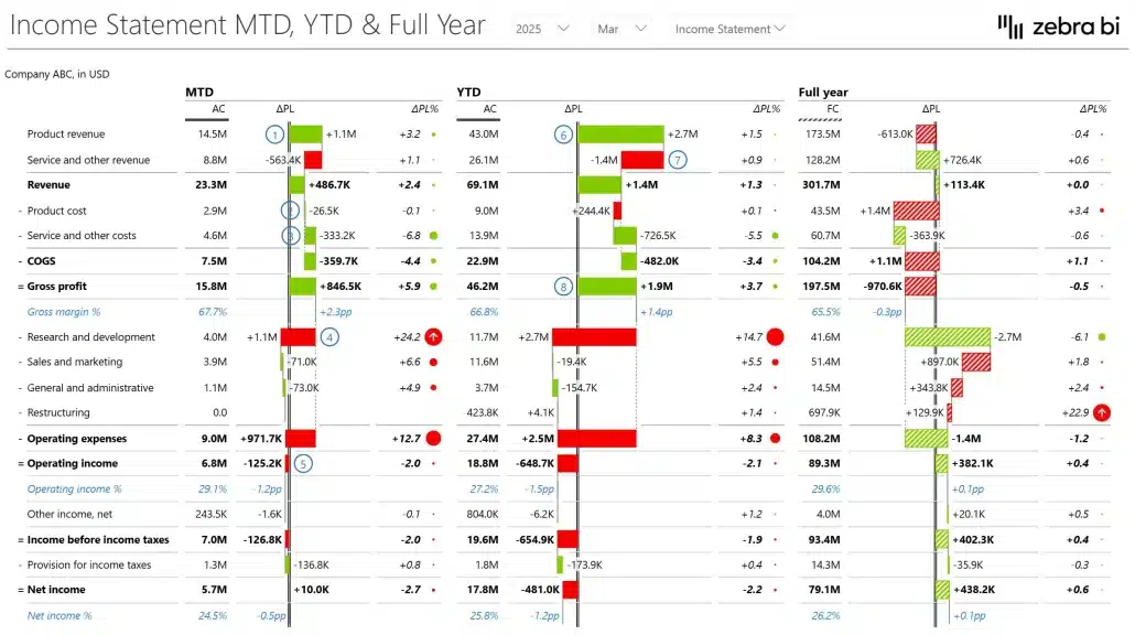
1. Monthly P&L with YTD Comparison
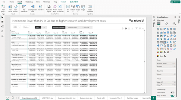
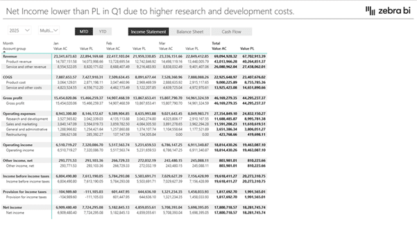
The monthly P&L with YTD comparison template gives finance teams a fast read on performance without touching a single formula. Actuals sit side by side with prior year and plan for every month, plus a running year-to-date total.
Variance highlights flag which months are ahead or behind automatically, so the story is immediately visible instead of being buried in a table of raw numbers.
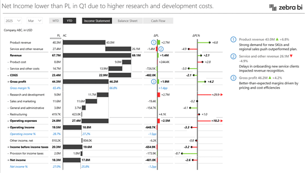
2. P&L by Business Unit or Product Line
The P&L by business unit template shows exactly which parts of the business are driving results, and which aren't.
Instead of one flat statement for the whole company, results break down by division or product line, with details for each. It's built for teams that need more than a company-wide number, they need to know where performance is coming from.
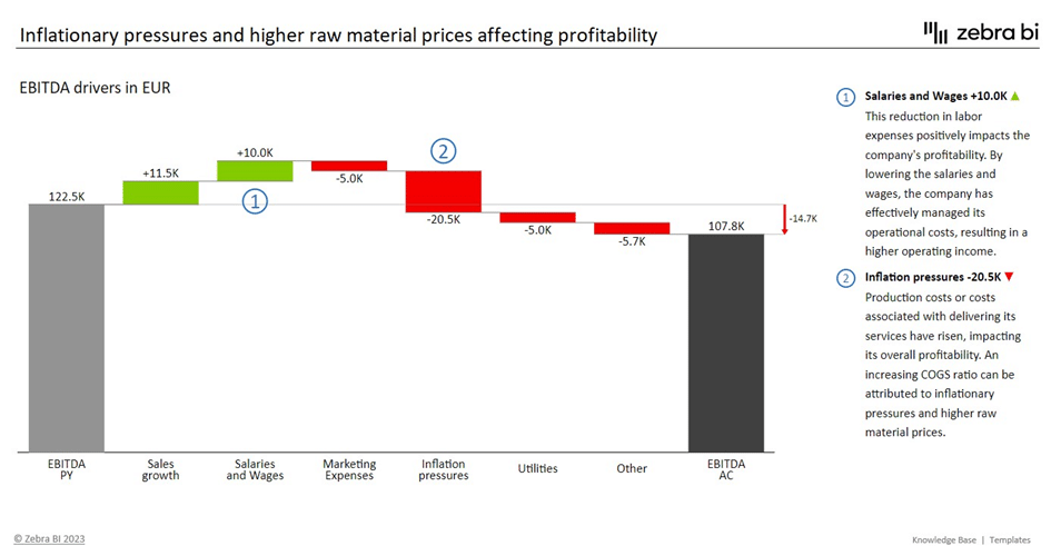
3. EBITDA Bridge / Waterfall Chart
The EBITDA bridge template shows exactly why profitability moved, not just that it did.
The waterfall chart shows exactly how revenue turns into EBITDA, step by step through COGS, operating expenses, and other adjustments.
Want reports like these without building from scratch?
The Income Statement template includes all 3 dashboard layouts: monthly P&L, business unit breakdown, and EBITDA bridge.
Do you want to skip the headache of creating a P&L statement from scratch?
You can use Zebra BI's free template that's already built, tested, and used by 20,000+ finance teams.
This P&L dashboard template includes:
A pre-built P&L layout with the correct row order and structure ready to go
Automatic variances across actuals, prior year, and plan
Waterfall charts for EBITDA bridges and other profitability breakdowns
Dynamic comments so you can annotate specific numbers directly on the report
IBCS-compliant formatting out of the box
You can connect it to any data source, including SAP, Dynamics 365, QuickBooks, Xero, and Oracle, so you can plug in your own data and have a working P&L in minutes, not hours.
You’ve seen how complex native P&L modelling can become. Now try a structured approach instead.
🎯 Build a structured Income Statement in Power BI - without manual setup
Join 10,000+ finance professionals who standardize P&L reporting in Power BI with Zebra BI.
Your access includes:
✓ Pre-built Income Statement template
✓ Automatic subtotals and sign logic
✓ Variance calculations without manual DAX
✓ Guided onboarding
✓ Video tutorials, guides, and implementation support
No credit card required · Full access · Works inside Power BI
Frequently Asked Questions
What is the difference between a P&L and an income statement in Power BI?
There isn't one. A P&L and an income statement, and an estado de resultados are all the same document. Different teams and regions use different names, but the report and the logic behind it don't change.
What is the difference between P&L and financial statements in Power BI? ?
The P&L is one of 3 core Power BI financial statements, alongside the balance sheet and cash flow statement. Together, they give a complete picture of financial status, and Power BI is commonly used to report all three side by side.
What Power BI visual is best for a profit and loss statement?
For native builds, the Matrix visual is the standard choice, since it supports hierarchical rows, custom sorting, and subtotals.
Do I need DAX to create a P&L in Power BI?
Only if you're building it with native visuals. A native P&L relies on DAX for sign logic, subtotals, and row mapping. Tools like Zebra BI apply that logic automatically, so you can build a P&L dashboard without writing any DAX at all.
Is there a free P&L template for Power BI?
Yes. Zebra BI’s free P&L dashboard template includes a pre-built layout, automatic variances, waterfall charts, and IBCS-compliant formatting.
This is the definitive guide to income statements in Power BI. It includes tips and tricks and a couple of new features in Zebra BI visuals. I have been able to construct full financial statements that conform to predefined layouts.
Hi Asif, only the result is bolded by default, all the other things you need to bold manually. Right-click on the Row >> Format >> B. Hope this helps. 🙂 If you need more details check out this article.
 September 8th
 February 22nd
Excelentes gráficos
|Thats amaying what you do
This is the definitive guide to income statements in Power BI. It includes tips and tricks and a couple of new features in Zebra BI visuals. I have been able to construct full financial statements that conform to predefined layouts.
Thanks, Dan!
I tried keeping layout same with bold font, +-= signs but unable to do it myself. Is it the feature of paid version?
Hi Asif, only the result is bolded by default, all the other things you need to bold manually. Right-click on the Row >> Format >> B. Hope this helps. 🙂 If you need more details check out this article.
Excellent!
Superb!
Amazing!
Hi Gabriel. Thanks a lot for your feedback. We appreciate it. 🙂 Can we kindly ask you to give us your feedback here.