September 8th
 February 22nd

CFO Dashboard: What Belongs on It (and What Doesn't)
Here's a quick check for financial reporting teams: when did the CFO last open the dashboard they asked for?
Chances are it was right before the last meeting, when they took a quick look and asked for an Excel version anyway.
If this has happened to you, you’re not alone.
When we talk to finance teams, the same pattern comes up again and again: dashboards exist, data is live, yet the month-end scramble continues. On top of this, the manual rework continues, and executives stop opening the dashboards.
This happens because of an inefficient design, not because of bad data. Most CFO dashboards are built to display everything, leading to pages that show a lot but decide nothing.
A well-designed CFO dashboard should drive decisions, not decorate presentations. Everything on it should either answer the CFO’s questions or get cut.
In this guide, we’ll cover the 5 KIPs that should be on every dashboard, the anti-patterns that kill adoptions, a one-page structure that works, and how to build it in Power BI.
What a CFO dashboard needs to answer
A CFO dashboard is a single, live view of financial performance that answers 4 questions as soon as you open it:
- How is performance? (vs. plan, vs. last year, vs. forecast)
- What does it mean? (which variances matter, which are noise)
- Why? (the drivers behind the numbers)
- What's next? (where attention and action should go)
That’s it. No need to include every number your company tracks. A CFO already has a general ledger, an ERP, and a team of analysts for depth.
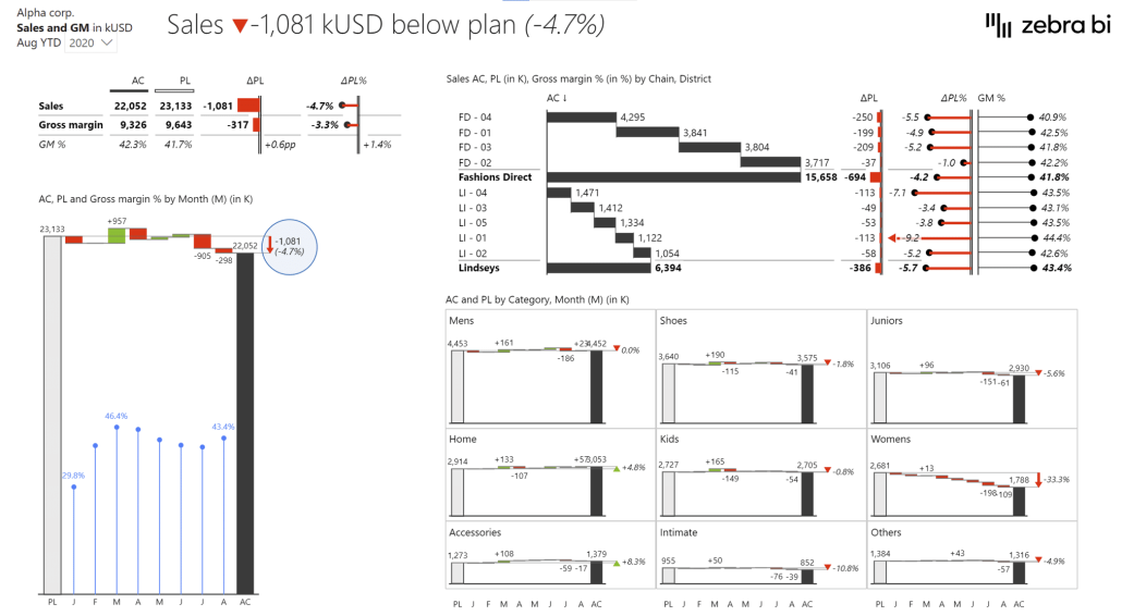
The dashboard should highlight what matters. It should tell CFOs where to look and what to ask in the 5 minutes before a meeting starts, not after 30 minutes of clicking through tabs.
You can test your dashboard using the 3-30-300 principle, borrowed from Raiffeisen Bank's reporting team.
- In 3 seconds, you should see the status.
- In 30 seconds, you should understand the cause.
- In 300 seconds, you should be ready to act.
Thomas Andersen, CFO at Tellu, puts it plainly:
It's not supposed to be a firework show. It's about making the key insights stand out.
Now, let's look at the KPIs that matter most and should be included in every CFO dashboard.
The 5 must-have KPIs for a CFO dashboard
Depending on your business, you’ll have to tune the details, but these 5 views cover what every CFO needs to see weekly or monthly:
1. Revenue vs plan
This is the most important view on the page: actuals against budget and prior year, absolute and relative variance, by month, with a year-to-date view.
It's the first thing a CFO checks and the first thing the board asks about, so it goes top left, where the eye naturally lands.
When working on a CFO dashboard, keep in mind to show the variance, not just the 2 lines. "Revenue was $4.2M" is some random trivia. "Revenue was $310K below plan, driven by 2 regions" is the start of a conversation.
2. Margin bridge
Revenue can hit plan exactly while margin quietly bleeds out underneath it, which is easy to miss on a revenue chart alone.
A margin bridge, a waterfall chart from budgeted to actual margin, shows exactly which effects moved gross or operating margin: price, volume, mix, input costs, and FX. It answers the "why" question in a single chart instead of 3 appendix slides.
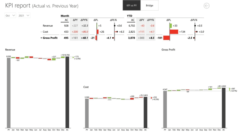
This is the chart that most finance teams skip because it’s difficult to build with native tools. However, it’s also the one executive reference most often used once they have it, because it turns "margin is down 1.2 points" into "margin is down 1.2 points and here are the 3 drivers."
3. Cash runway and liquidity
Revenue and margin can look fine on paper while cash quietly runs out. This is why your dashboard needs a forward-looking cash view: current position, projected runway, and trend against the forecast.
Depending on the business, that might mean runway in months for a scale-up, or net working capital and free cash flow against plan for an established company.
This helps you decide on timing: when to draw on a facility, when to tighten collections, when a hiring plan needs a second look.
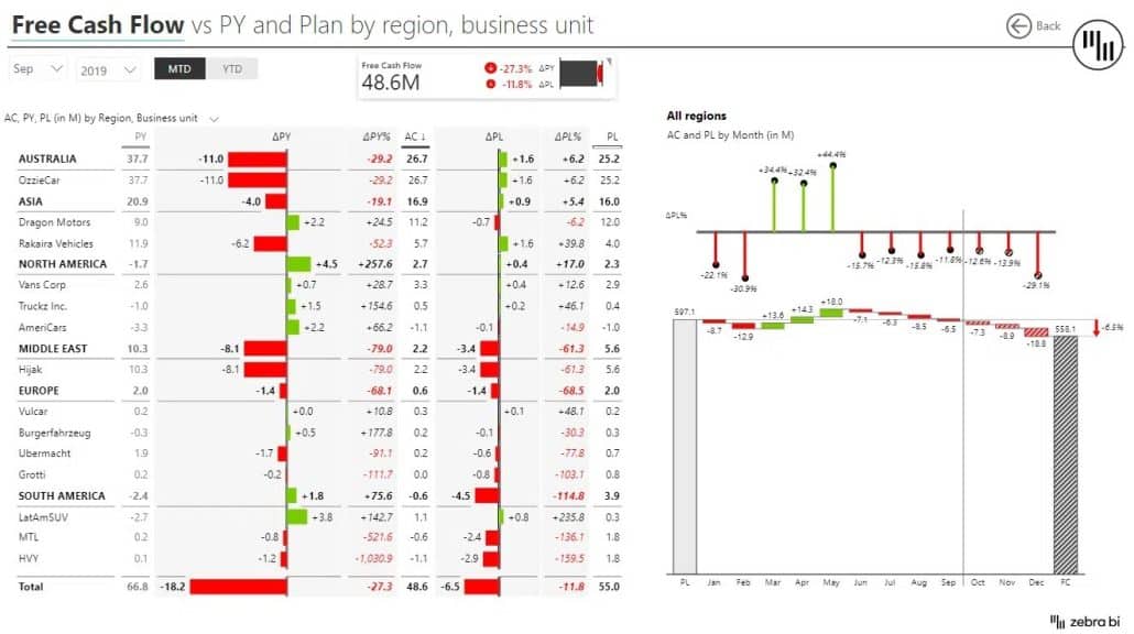
Usually, the timing is off when cash is only reviewed once a quarter in a separate dashboard.
4. OPEX variance
This view breaks down operating expenses by cost category or cost center, actual vs. budget, sorted by variance size. Your company CFO doesn’t need to see 60 cost centers performing on plan. They need to find the 5 that are off track, flagged automatically with the overspend already quantified.
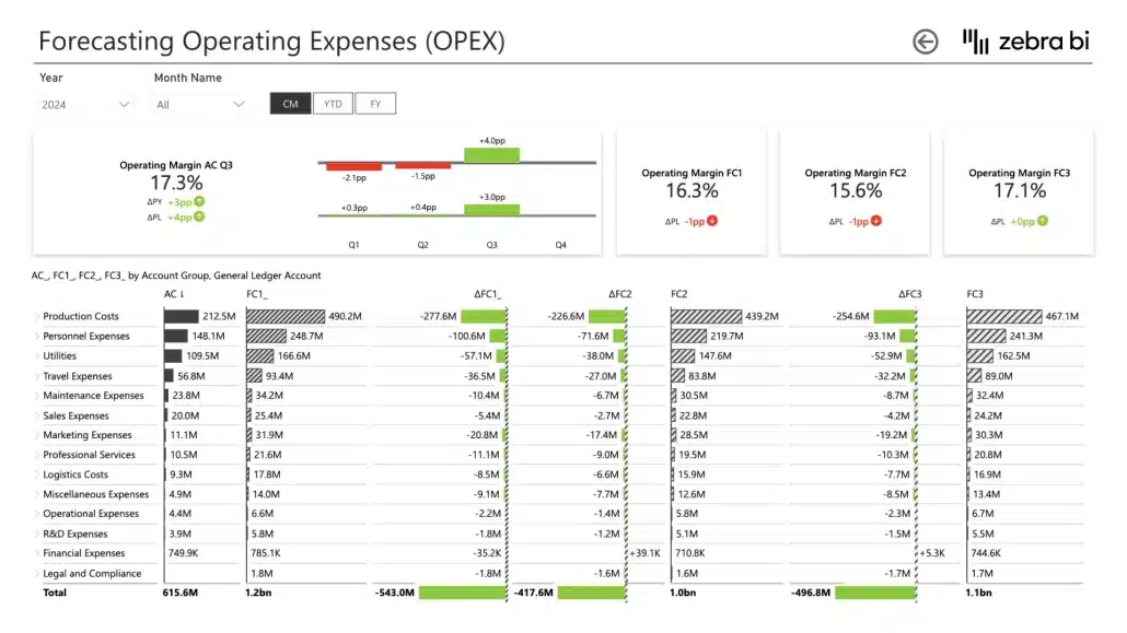
This is why you should add a variance-first layout to the CFO dashboard. Sort it by impact, highlight what’s over budget, and you can answer the “where’s the leak?” question in 30 seconds instead of calling a meeting with the entire financial team.
5. Headcount and people cost
For most companies, people are 50 to 70 percent of the cost base, so headcount deserves its own view. On a CFO dashboard, this view includes actual FTEs vs. planned, people's cost vs. budget, and open positions in the pipeline.
That's because hiring ahead of plan is one of the most common ways a well-modeled year drifts off course, and it usually shows up here months before it reaches the P&L narrative.

These 5 views give a CFO dashboard everything it needs to answer the 4 questions that matter:
- What happened? (revenue vs. plan)
- How much it matters (variances)
- Why it happened? (margin bridge, OPEX detail, headcount)
- What comes next? (cash and the ranked exceptions).
The 3 patterns that kill CFO dashboard adoption
These 5 views will help you build an efficient CFO dashboard. While you might be tempted to add more information to make it even more useful, here are 3 patterns that you should avoid:
1. Vanity metrics and trivia
Every abandoned dashboard has the following visuals: total historical revenue, website sessions, and a gauge showing “87% data quality.” These are numbers that only go up, or that nobody would act on if they were to change.
Every vanity metric on the page adds unnecessary noise and makes the CFO stop paying attention.
Here's how to decide whether to keep a certain tile: if this number moved by 10 percent, would anyone do anything? If the answer is no, you can remove it from the dashboard.
2. The 40-visual sprawl
Even if there’s a good intention behind it, this is one of the most common mistakes when designing a CFO dashboard.
Every stakeholder asks for "just one more view," nobody wants to say no, and 18 months later, the CFO dashboard has 6 tabs, 45 visuals, and a record-breaking bounce rate.
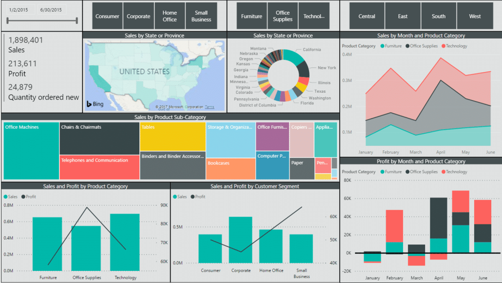
Sprawl sabotages your dashboard by shifting the work of prioritization from the report to the reader. A CFO scanning 40 visuals is doing the analyst's job for them.
As one champion at Bayer's corporate controlling team put it, it's about quality of content, not quantity.
If you feel you need a bigger screen when looking at a dashboard, you have to cut some of the visuals.
3. Numbers without comparisons
The CFO dashboard is meaningless if it shows a revenue figure with no plan next to it, a cost chart without the prior year, or a KPI card that says “$1.5M”. A number without a comparison is not information, because it can't be judged. Good or bad? Better or worse? Expected or surprising? The reader can't know.
Every number on a CFO dashboard should include context: Every measure on a CFO dashboard should carry its context: vs. plan, vs. prior year, or vs. forecast, ideally with the variance computed and color-coded consistently.
When the dashboard’s content is right, the structure makes it usable.
How to structure a CFO dashboard
When designing a CFO dashboard, stick to the following structure:
- One page
- Variances first
- Consistent notation
Here's why each one matters:
1. One page
One page. Not one page per topic. One page.
Once the key story spans tabs, you've reintroduced the searching problem the dashboard was meant to solve. Details can live in drill-downs and linked report pages; the decision view stays on one screen.
Here’s a layout that helps users find answers fast:
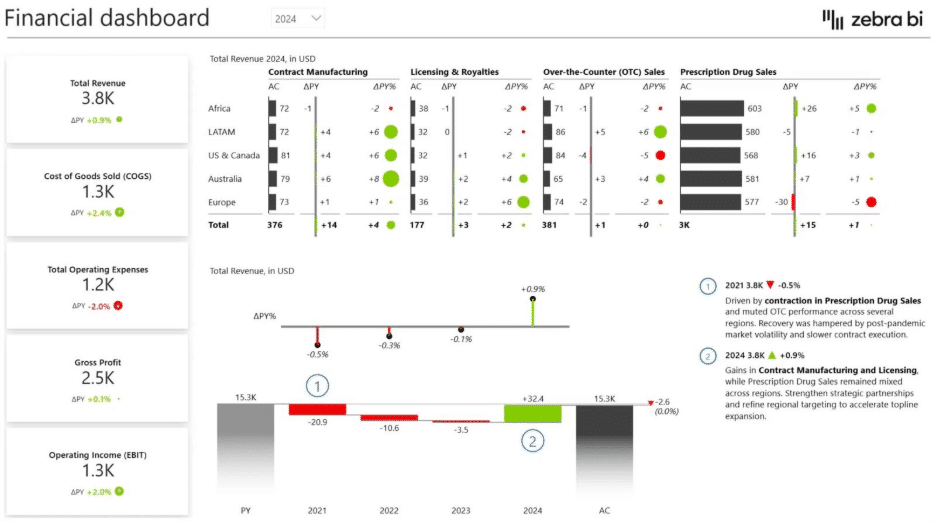
- Top row: the headline KPIs with variances (revenue, margin, cash, OPEX, headcount)
- Middle: the margin bridge and the revenue trend vs. plan
- Bottom: the ranked exception lists (top over-budget cost centers, top under-performing units).
2. Variance-first
Design every element around the difference from expectation, not the absolute value. Absolute values describe the business, while variances direct attention.
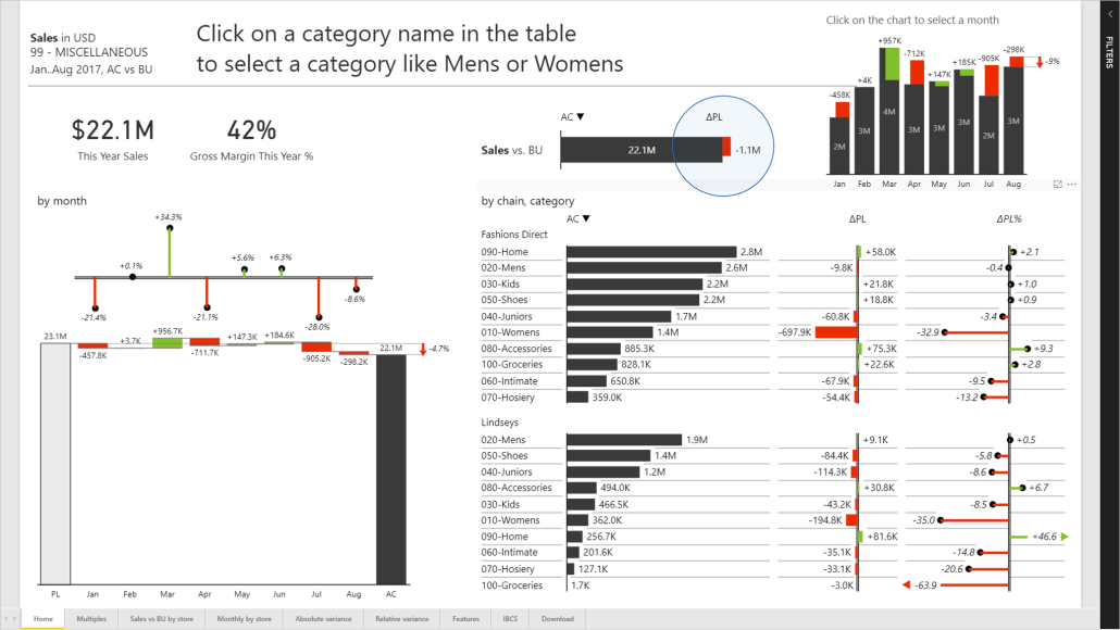
This is also what makes a CFO dashboard pass the 3-second test: a wall of green with two red bars tells its story instantly.
3. IBCS-aligned
IBCS standards (International Business Communication Standards) are the reporting rules used by companies like Bayer and Heijmans to make their reports readable across the entire organization.
Actuals are solid, plan is outlined, forecast is hatched, negative variances are red, positive are green, everywhere, always. Every report reads the same way, so nobody spends the first 10 minutes of a meeting decoding the chart.
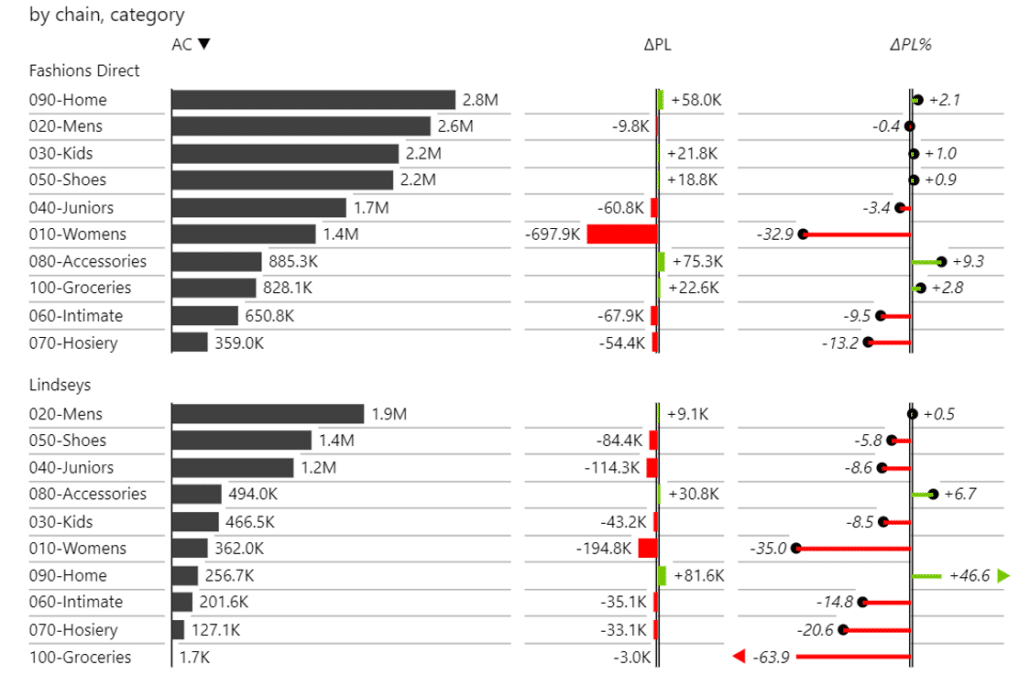
There’s one more thing that separates dashboards executives use from dashboards they ignore: commentary.
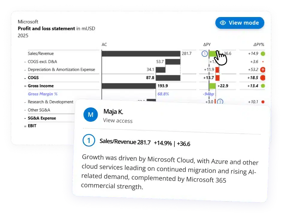
The numbers say margin dropped; a one-line annotation says why ("raw material surcharge in EMEA, recovery priced in from Q3"). When the explanation lives in the report instead of a follow-up email, meeting time goes toward deciding, not explaining.
How to build it in Power BI (and where Zebra BI comes in)
If your company runs on the Microsoft stack, Power BI is the natural home for this dashboard: your data is already modeled there, refresh is automated, and access is governed by IT. No exports, no emailed spreadsheets, and the numbers stay inside your Power BI environment.
The catch is that the layout described above is exactly what native Power BI makes hard.
Out of the box, there are no automatic variance calculations (your team writes DAX, Power BI's formula language, for every act-vs-plan delta), no P&L-style tables with subtotals and invert logic, no proper margin bridge with subtotal support, and no built-in IBCS notation. That's even more intimidating when you're working on your first Power BI report.
So teams either spend weeks of analyst time on workarounds or quietly go back to Excel.
This is the gap Zebra BI's visuals for Power BI close. They're finance-specific building blocks that drop into your existing reports:
- Zebra BI Tables for the revenue-vs-plan and OPEX variance views: plan, actuals, forecast, and both absolute and relative variances calculated automatically, with P&L logic like subtotals and inverted cost accounts built in
- Zebra BI Charts for the margin bridge and trend views: waterfall charts with proper subtotals, small multiples for by-region or by-unit comparisons
- Zebra BI Cards for the headline KPI row, each card carrying its comparison and variance by default
- Comments and annotations directly on the visuals, so the "why" travels with the numbers
- IBCS notation out of the box, so consistency is the default rather than a style guide nobody follows under deadline pressure.
Zebra BI is a licensed product that works inside Power BI, so your data model, security, and refresh pipeline stay exactly where they are. What changes is the output: the one-page, variance-first layout above becomes a build-in-hours job instead of a custom development project.
Here's a quick look at how these visuals work in a real Power BI report:
The results show up in whether executives actually use the thing. Shane Brinkmann, business analyst at Gore Medical, describes what happened after his team rebuilt their finance reporting this way:
Our CFO stopped using other tools and now lives in the Zebra BI dashboard for meetings. It's easy to use, and the value was immediately clear.
That's the adoption bar to aim for: not "the CFO received the link" but "the CFO lives in it."
Gore's team also consolidated and automated enough reporting to save roughly one to two analysts' worth of time per year, which is the other half of the payoff. A dashboard the CFO trusts is also a dashboard your analysts stop manually rebuilding every close.
Start with the template, not the blank page
You don't need to design this from scratch. The fastest way to test the one-page, variance-first approach against your own numbers:
Download a ready-made Power BI dashboard template from Zebra BI's template library, connect your data, and put a working CFO view in front of your leadership this week.
Or book a demo, and we'll walk you through how finance teams structure their executive reporting in Zebra BI, using your use case rather than a generic one.
Because in the end, a CFO dashboard with 5 views on one page will always beat one with 40 spread across tabs.