Product: Excel

April 5, 2016
How to Create Efficient Variance Reports
Learn how to design efficient variance reports to track the actual performance against your company goals with the help of Zebra BI.
March 24, 2016
Top 3 Ways to Report your Variance Analysis in Excel
There are a couple of different ways to perform variance analysis. Learn how to easily do it in Excel in 3 ways and improve your reporting.
March 23, 2016
8 Steps to Creating an Efficient Variance Report
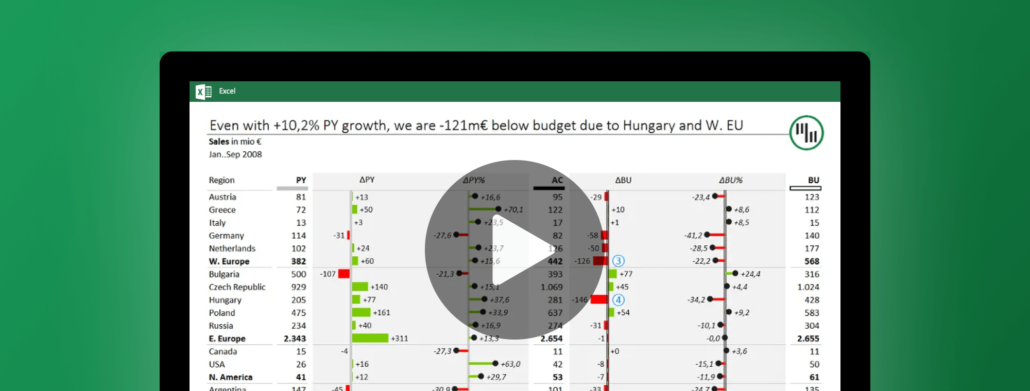
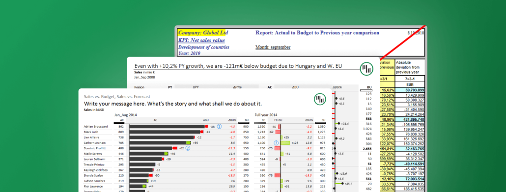
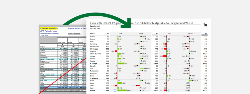
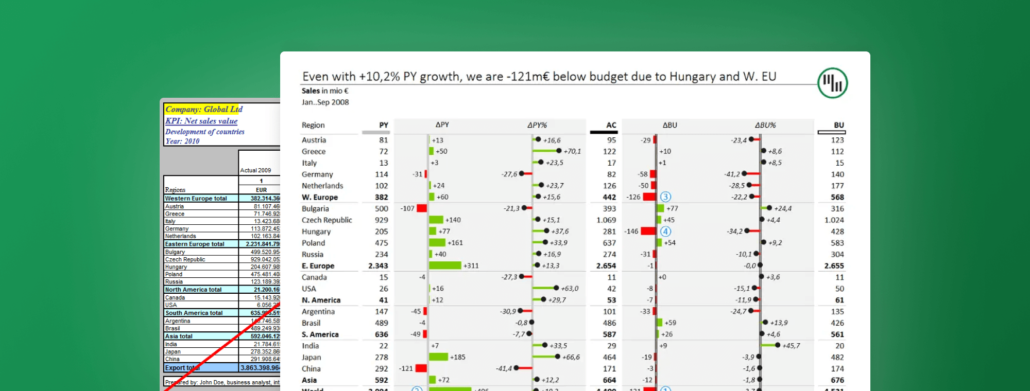
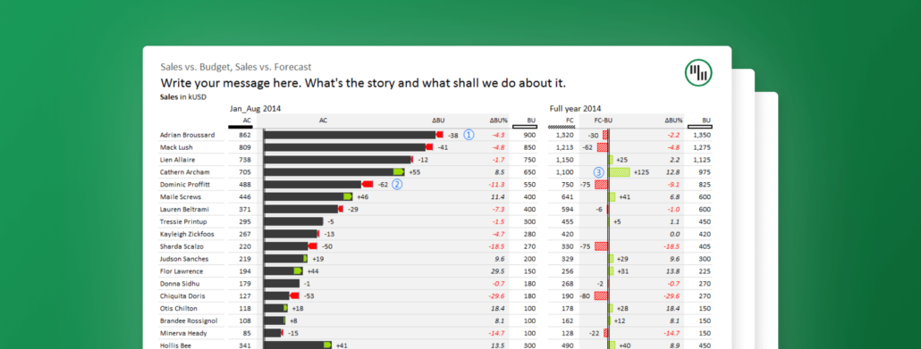
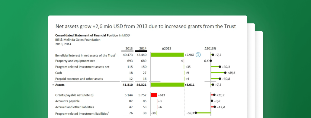
The internet is full of bad examples of variance reports. Follow this guide to see how we turn one such example into a great and efficient variance report.
March 22, 2016
Getting Started with Zebra BI for Excel
Zebra BI is the perfect Excel add-in to help you effectively visualize and standardize your data. Take your chart types to the next level!
March 3, 2016
Struggling to visualize your data? Zebra BI's got you covered!
Whether it’s waterfall charts, variance charts, or lollipop charts, Zebra BI has everything you need to visualize your data for all to understand.
February 5, 2016
The fastest way to insert lollipop charts in Excel
Lollipop charts can be used in similar situations as bar charts and column charts, but they have the advantage of producing a cleaner-looking picture.
January 19, 2016
Designing Financial Statements for Non-Profits & Foundations - The Gates Foundation example
This time we'll take a deep dive into the 2014 annual report of Bill & Melinda Gates Foundation. Check how we redesigned their financial statement.
January 12, 2016
How to visualize trends for multiple markets, products, etc.
Recently, my attention was drawn to an interesting analysis of The Hottest Startup Sectors In 2016. See how we analyzed and redesigned the data.
January 7, 2016
Why are some charts difficult to understand?
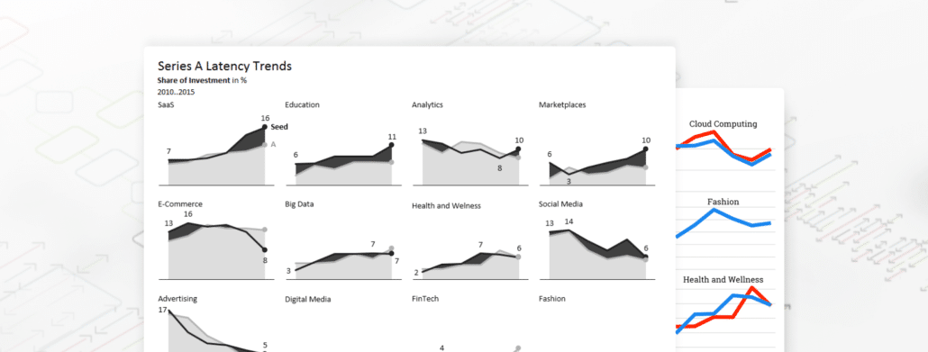
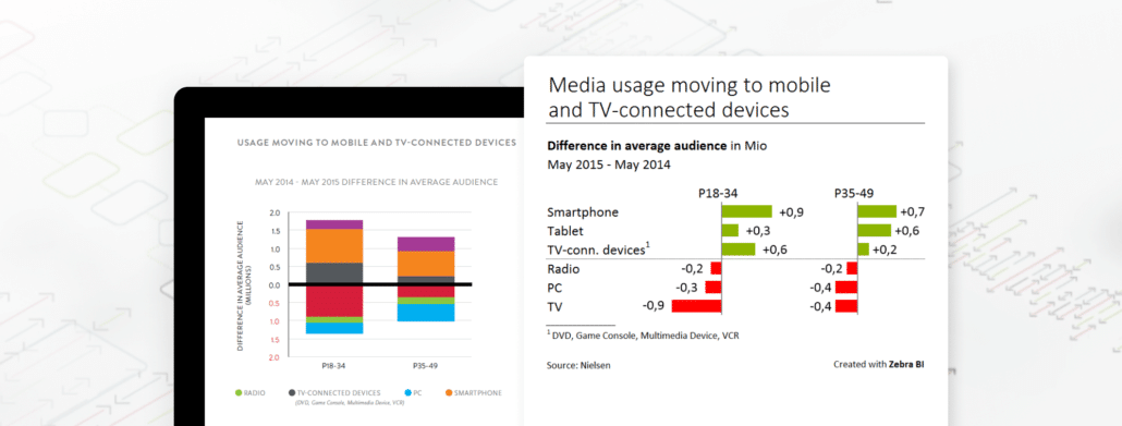
Charts should provide a clear and practically immediate insight into the underlying dataset. Learn how you can take control of the complexity of big data.