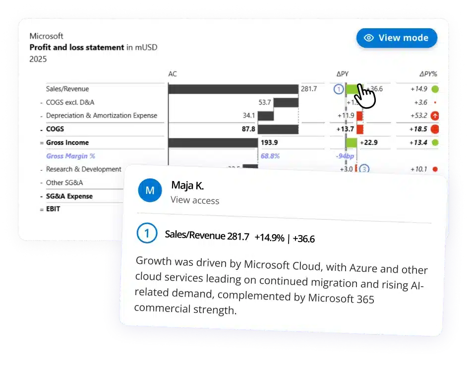
Put best practices into practice
Start your free Zebra BI trial and get the dashboard template - pre-built with the right chart types, automatic variance analysis, and IBCS color standards already applied.
 September 8th
 February 22nd
 27 Oct 2026
Poor data visualization leads to bad business decisions.
Most dashboards and reports fail because they prioritize aesthetics over clarity. While they look impressive during board meetings, they don’t answer any relevant questions.
The idea is simple: effective dashboards must be understandable and actionable.
If your audience can't understand your data within seconds or doesn't know what to do with the information, your report is useless, no matter how beautiful it looks.
In this guide, we’ll share what an efficient Power BI dashboard looks like, how to create one, the most common mistakes, and where you can get ready-to-go dashboards that follow best practices out of the box.
Note: This Power BI dashboard design tutorial is based on our 1-hour webinar on the same topic. If you prefer to watch the video, scroll to the bottom of this tutorial, enter your details and we'll send you the webinar recording and all PBIX examples to go along with it.
See what a best-practice dashboard looks like
Get the Zebra BI trial and a dashboard template built to IBCS standards - the right chart types, variance analysis, and layout already applied.
Misleading visualizations lead to wrong decisions that cost time and money. Confusing dashboards mean stakeholders stop using them altogether, wasting months of data collection and analysis effort. Poor design erodes credibility.
Once your audience catches a misleading chart or confusing layout, they'll question everything you present.
The most common outcome? Dashboards that look beautiful but provide no actionable insights. Common signs of poor data visualization include:
First, what’s the difference between a Power BI dashboard and a report? Before getting into the details, let’s make sure we got the terms right.
A Power BI report is a multi-page, interactive document where users explore data in depth. A dashboard is a single screen showing your most important metrics, designed for monitoring rather than exploration.
While they may look different, both follow the same rule: if a user can’t understand what they’re looking at and know what to do next, the design has failed.
Here’s a simple test for every Power BI dashboard or report you build: can a user identify the main insight within 5 seconds of opening it?
If they're scanning, squinting, or hovering over tooltips to figure out what's going on, your Power BI dashboard or report needs improvement.
Every dashboard should help you and your financial team make a single decision.
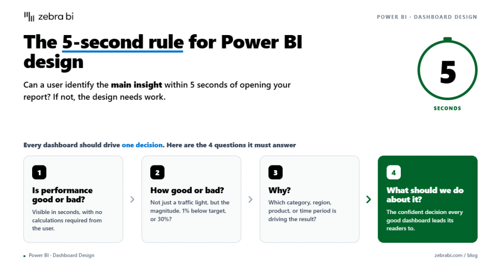
Here are the 4 questions Zebra BI’s dashboards answer to lead to a confident decision:
Your Power BI dashboard design is the difference between data that drives decisions and data that gets ignored. You can have accurate data, the right chart types, and the IBCS color schemes, but if the layout is messy, users won’t know where to look, and they’ll search for another source of truth.
To create a design that makes the meeting run smoothly, focus on 3 things: a clear hierarchy, how people read your dashboard, and appropriate spacing.
Now, let’s take a look at each of these.
This Power BI dashboard framework is based on the way users check information: summary first, context second, detail third.
Here’s how you should structure your dashboard:
Most of the time, users will scan your Power BI dashboard instead of reading it.
And they will scan it in a Z-pattern: top-left to top-right, then diagonally down to the bottom-left, then across to the bottom-right.
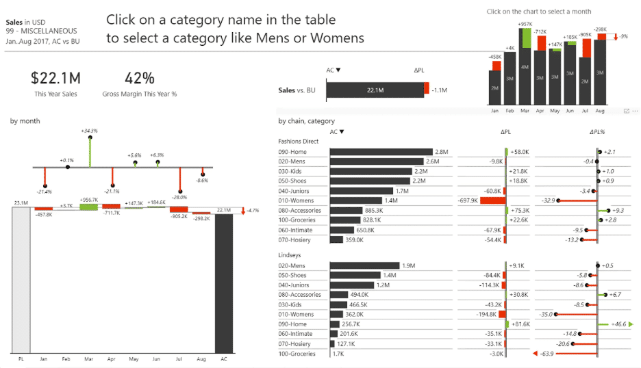
When the filter pane, logo, or decorative chart is taking up space across this route, users can’t find what they’re looking for and lose trust in the dashboard.
Keep visuals spaced to avoid overwhelming dashboard users.
Take advantage of whitespace, avoid cramming charts, and keep your dashboard easy to scan.
Here are a few rules that keep your dashboard clean and easy to scan:
Here are 7 best practices to help you build dashboards your team uses whenever a decision needs to be made. If you're starting from a blank canvas, build your first trusted report before working through the list below
The chart type determines how fast users understand the data. Even if your information is up to date, the wrong chart type can make it confusing even for experienced Power BI users.
Here’s a simple guide on how to choose the right chart type:
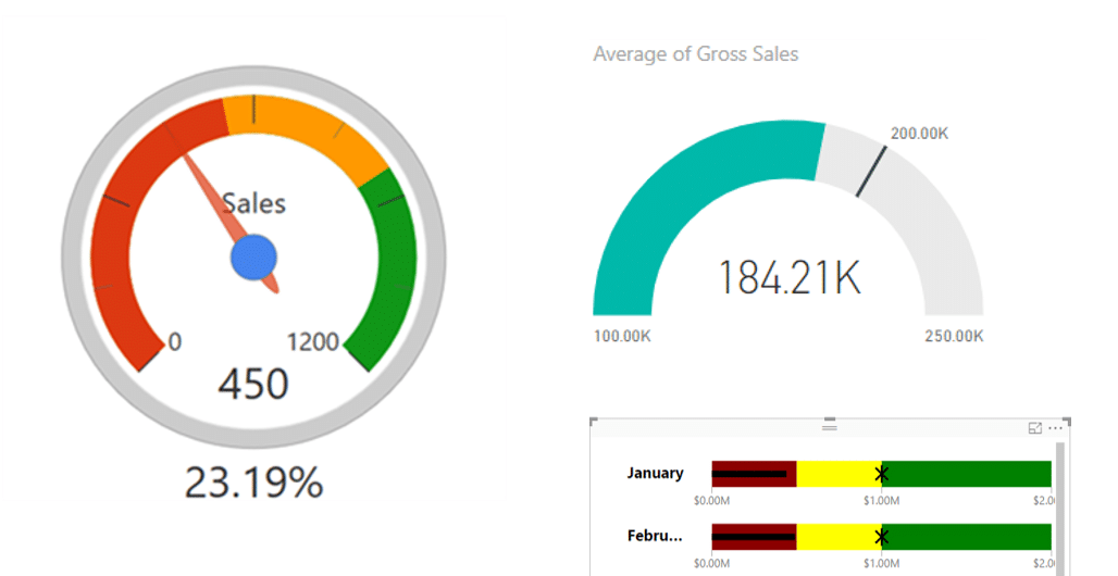
Pie, donut, and gauge charts make it hard for users to quickly and accurately compare values.
Usually, these charts force users to do the mental work that the charts should be doing for them.
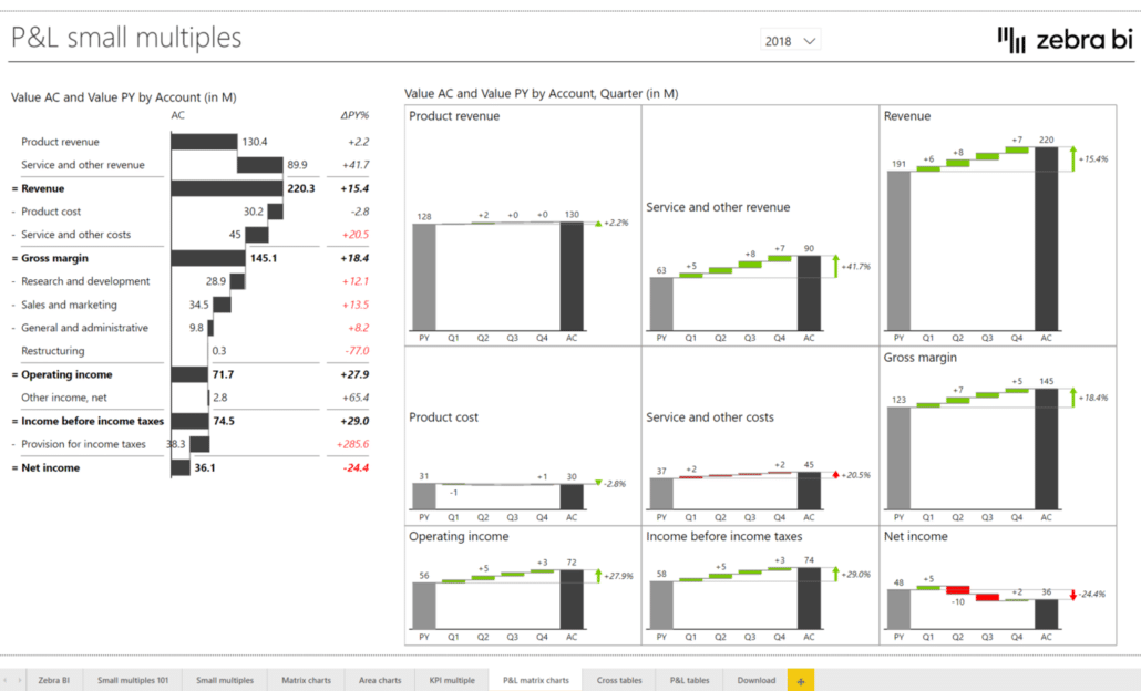
Small multiples show the same chart repeated across categories, all on the same scale, so users can compare both trend and magnitude immediately. A category generating 10M and one generating 500K should not look the same size on a dashboard.
Once you have the right chart type, there's one rule you should never break: start your bar chart axes at zero. Shortening the axis makes small differences look far more dramatic than they are, distorting the story your data is actually telling.
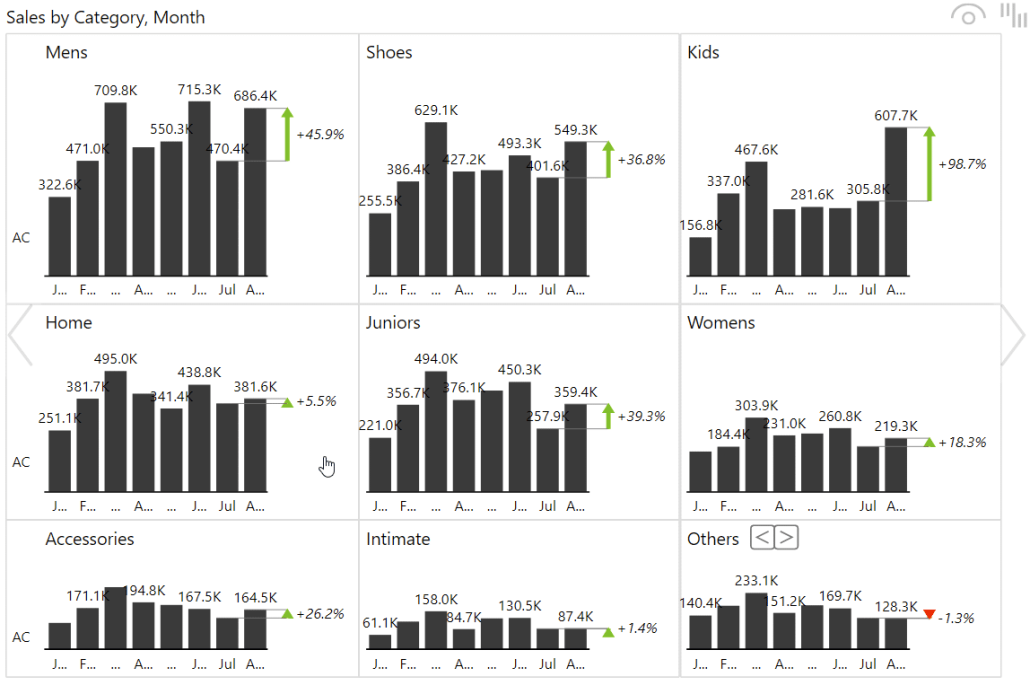
Zebra BI automatically synchronizes axes across small multiples so every category is shown at its true scale, with no manual adjustments needed.
The right financial chart type, every time
Waterfall, variance, and small multiples - the chart types finance teams actually need are built into Zebra BI. No custom DAX, no manual workarounds.
When creating a Power BI dashboard, use color to guide attention to what matters. If you’re mixing colors to style your report, chances are you’ll confuse everyone in that meeting.
To keep your dashboard readable with one look, use colors intentionally. Every color on your dashboard should have a clear meaning. Use 3-5 colors to prevent users from losing track of what each color represents.
Additionally, use semantic color conventions. Red for negative variance, green for positive, and gray for anything that doesn’t need attention.
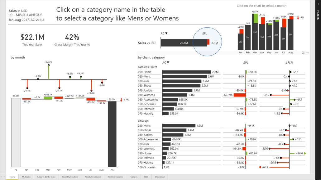
When working on your dashboard design, keep your color coding consistent. If blue means revenue on one page, it should mean revenue everywhere. Reassigning colors per chart forces users to relearn your dashboard every time they switch pages.
The easiest way to keep your dashboards consistent?
Use a Power BI tool like Zebra BI that has IBCS-compliant color conventions built in so everyone reads your dashboard the same way, regardless of job title, team, or location.
To take it a step further and make sure everyone understands your reports, don’t rely on color alone. Pair it with labels, icons, or shapes so the message still lands.
Here are a few tips to make your reports easier to read and faster to act on.
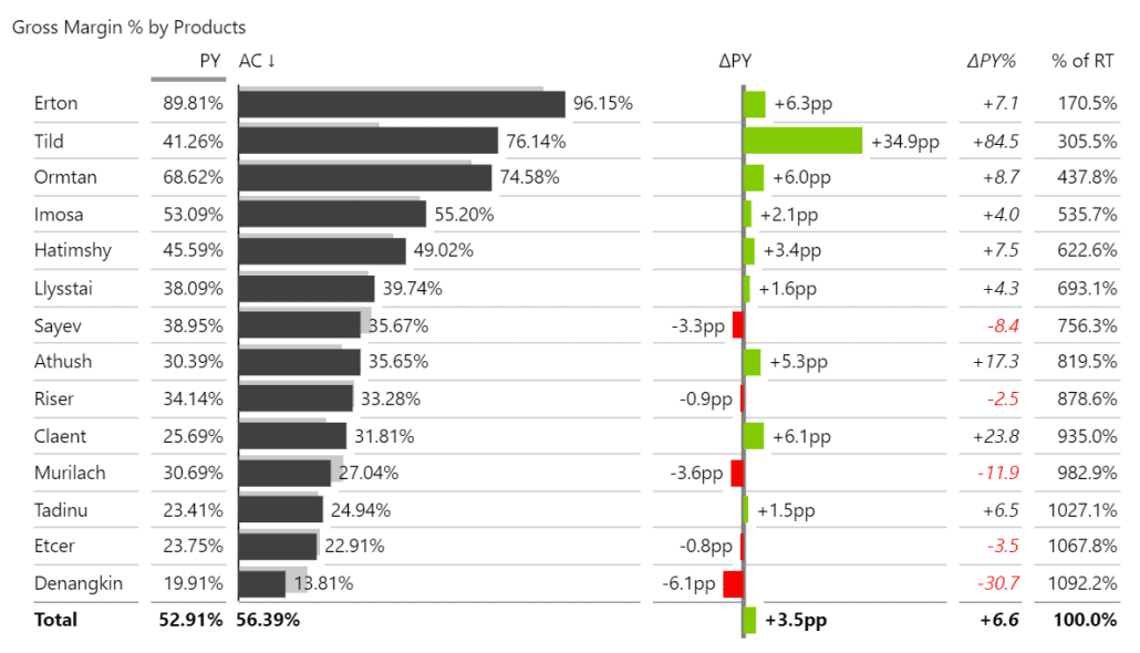
Describe the insight using titles. “Revenue chart” doesn’t share a lot of information. “Revenue 12% below target” tells users exactly what they’re looking for. When writing labels, think of them as a summary for someone who only has 5 seconds to analyze the page.
Key figures should be bold and large enough so they’re the first thing you see when opening the dashboard. Additional details, such as secondary metrics or axis labels, should use a smaller, standard font.
If everything looks the same, nothing stands out, and users will have to read every number before knowing where to focus.
Additionally, keep labels clean by minimizing decimal points and scaling large numbers instead of showing every digit.
However, make sure to include currency symbols or units, so your numbers always have context.
The more intuitive your dashboard is to navigate, the more users will use it for data-driven decisions.
To avoid overwhelming users, limit slicers to a maximum of 5. If you need more slicers, switch to a drop-down menu placed at the top of the page to keep navigation smooth.
Also, know when to use drill-through and drill-down. Drill-down keeps users on the same visual, moving from year to quarter to month. Drill-through takes them to a dedicated page with more context, better suited when the next level of detail needs its own layout.
Use page tooltips instead of cluttered detail pages. A tooltip page surfaces secondary details on hover, so you don't need a full page for information that users check occasionally.
Additionally, make multi-page reports feel intentional by guiding users with bookmarks and buttons. Bookmarks let you build different views of the same data, like a "by region" view versus a "by product" view, each of them accessible with a single click.
Stop fixing these problems manually in every report
Zebra BI applies consistent layout, colors, and formatting automatically - so your team spends time on analysis, not formatting.
If your dashboard users check performance from their phones between meetings or in the field, build a dedicated mobile layout. To get the best results, use Power BI’s mobile view editor instead of hoping for the desktop version to scale down well.
To keep your mobile dashboards useful, limit each screen to 3 to 5 KPIs, and stack visuals vertically instead of side by side. Also, make sure every touch element is at least 44px so users can easily find the right visuals.
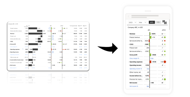
Once you optimize it for mobile, test it on a real device, not a browser simulation. A layout that looks fine in a resized browser window can still feel cramped or unresponsive on a phone screen, and that's the only place your users will see it.
A revenue figure of 4.2M means nothing on its own. Without a comparison, users can't tell if performance is good or bad, and that's the whole point of a dashboard.
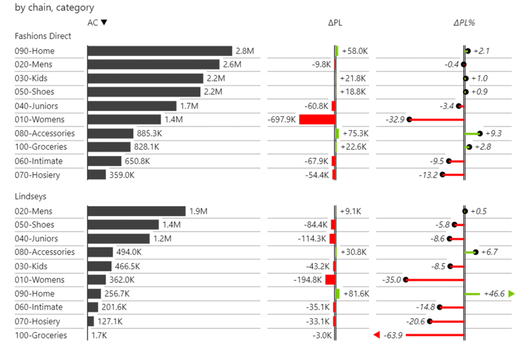
Always pair actuals with a target, a budget, or the previous year. If you're using side-by-side bars to compare, go one step further and show the gap directly. A waterfall chart or a variance bar makes the difference visible at a glance, so users don't have to calculate it themselves.
Actual vs. budget. YoY. Plan vs. forecast. In one click.
Zebra BI adds automatic variance analysis to any report - IBCS-compliant, visually structured, and ready for the boardroom without custom calculations.
Slow dashboards get abandoned, no matter how clean their layout is.
Keep in mind that every visual on the page fires a query, so the more visuals you add, the longer it takes to load and the worse the experience gets.
To find out where your dashboard is slowing down, use Power BI’s Performance Analyzer. It breaks down the load time visual by visual, so you know exactly where to focus to improve your Power BI dashboard performance.
Sometimes, the easiest way to improve a dashboard is to stick to the same pattern.
Here are 3 dashboard design ideas that will make your next report easier to build and faster to understand.
If you want more ideas to optimize your Power BI dashboards or, even better, skip the blank dashboard entirely, you can download Zebra BI's dashboard templates.
Every template is built to IBCS standards, so dashboards are clear, consistent, and ready to present.
If you want to see these principles in action on real data, watch our webinar where we walk through the most common Power BI dashboard mistakes and show you exactly how to fix them.
Here's a quick checklist of how things go wrong when they're ignored, and how to get back on track.
Avoid pie charts for 6 categories, gauges for simple comparisons, and line charts for non-time data.
Match the chart to the question instead: bar for comparison, line for trend, waterfall for variance.
Cramming 15 charts onto one page creates visual overload and slows the dashboard down. Stick to one decision per page and cut anything that doesn't support it.
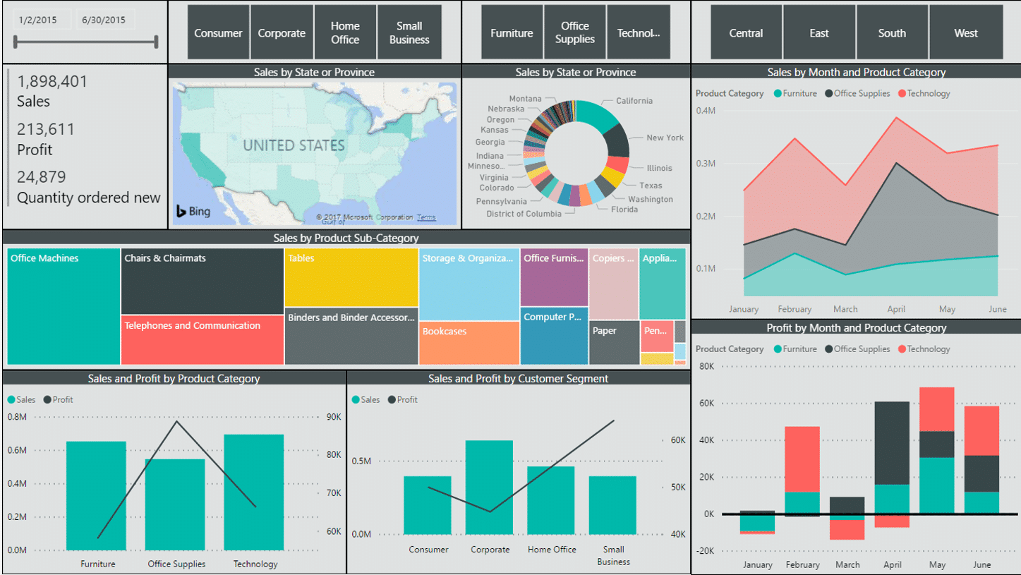
Raw data without context tells users nothing about whether performance is good or bad. Always match actuals with a target, a budget, or the previous period.
The same color meaning different things on different charts forces users to relearn the dashboard every time they switch pages. Assign each metric one color and keep it consistent everywhere.
Or stick with IBCS rules so everyone uses the same standard across different dashboards
A dashboard with 10 slicers asks users to do work before they see a single number. Limit slicers at 5, use dropdowns beyond that, or turn the data into a clickable chart instead.
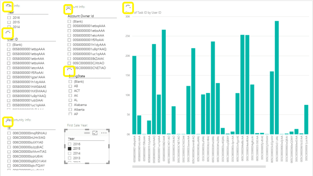
A chart with no explanation forces users to guess why a number changed. Use titles that state the insight, and add annotations where the data alone won't tell the full story.
Charts showing very different values at the same visual size make a 50K category look as important as a 5M one. Use small multiples with synchronized axes, so size reflects scale.
Good Power BI dashboard design comes down to a few principles applied consistently: one decision per page, the right chart for the right question, color that guides rather than decorates, and a layout that respects how people actually read.
Focus on the one-page, one-question framework. Show comparisons instead of raw numbers, follow the 3-tier layout, and keep colors to a maximum of 5.
As few as it takes to answer the page's central question. In practice, that usually means 6 to 8 visuals per page.
Place your most important KPI in the top-left corner and align everything to a consistent grid with enough spacing between visuals.
Use Power BI's mobile view editor to build a dedicated mobile layout rather than relying on the desktop version to scale down. Always test on a real device, not a resized browser window.
Use neutral grays for baseline data, green for positive variance, and red for negative variance. If you want to include your brand colors, make sure they fit the dashboard color scheme and don’t make it confusing
New: Zebra BI Tables+ and Charts+