 September 8th
 February 22nd
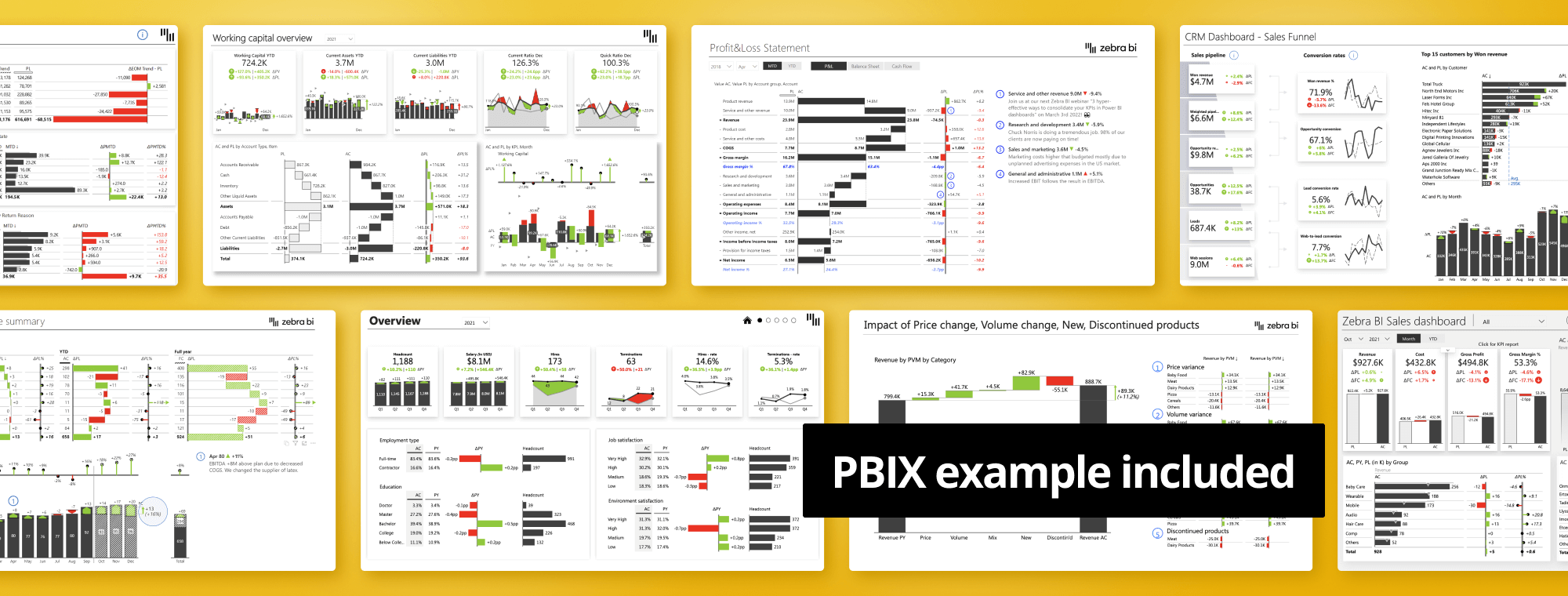
Top 8 Management Reports in Power BI in 2024
PRO Trial
Management reports are the cornerstone of any successful business. Their job is to provide crucial information, analysis, and insights that bolster decision-making and management activities. These reports zoom in on key performance indicators (KPIs), alongside other relevant data related to an organization's operations. Management reports provide a comprehensive overview of a company's finances, sales, marketing, or overall performance.
But their impact doesn't end at providing insights. These reports fuel informed decisions and strategies, helping managers and executives identify opportunities and roadblocks in real time. Management reports are not merely data collection tools—they are guiding lights in business complexity.
Advantages of Power BI for Preparing Reports
With an understanding of management reports' significance, the question becomes: how can we prepare them efficiently and accurately? Enter Microsoft Power BI. Power BI is not just a business analytics tool—it's your ally in transforming raw data into meaningful insights.
One of Power BI's most compelling benefits is its ability to analyze data from diverse sources. It seamlessly brings together disparate data, turning it into a cohesive, comprehensive whole. In other words, you can gather and analyze data from spreadsheets, on-site databases, cloud services, and more, all in one place.
Power BI doesn't just make data understandable—it makes it interactive. With its user-friendly and interactive interface, you can explore data intuitively, uncovering hidden insights with a simple click.
And let's not forget Power BI's data modeling capabilities. It offers robust features that allow you to transform and shape your data to fit your analysis needs. But Power BI isn't just about numbers—it's about telling stories. Its wide array of visualizations, including charts, graphs, maps, and tables, bring your data to life and make complex insights understandable.
Collaboration is easy with Power BI. Its features allow you to share reports and dashboards with others, enabling collaborative decision-making within your organization. Plus, its mobile accessibility means you can access Power BI management reports anywhere, anytime.
In essence, Power BI serves as a comprehensive platform to prepare management reports, making the process efficient, interactive, and insightful. Stay tuned as we dive into the top 8 management reports in Power BI to further elevate your business analytics.
Top 8 Management Reports in Power BI
Now that we've laid the groundwork for the importance of management reports and Power BI capabilities, let's dive into the top 8 management reports in Power BI that can transform your business analytics. These reports cover a wide range of business operations, providing actionable insights and strategic direction for decision-makers.
Daily Sales Report
A daily sales report is your go-to source for understanding your sales performance on a granular level. It provides a daily snapshot of sales transactions, enabling you to identify sales trends, monitor sales strategies, and forecast future sales. The Daily Sales Flash in Power BI by Zebra BI presents this data in an interactive and engaging format, making it easy to digest and respond to these crucial insights.
Zebra BI advantage: This Power BI Dashboard example features all three Zebra BI visuals for Power BI: Zebra BI Cards, Zebra BI Tables, and Zebra BI Charts.
Zebra BI visuals include many advanced features: small multiples, the Top N feature, hiding the columns that are not needed, scenario patterns, difference highlights, absolute variance charts, and so on.
Financial Statement Analysis Report
The Financial Statement Analysis report provides an in-depth analysis of your organization's financial health. It includes a detailed examination of income statements, balance sheets, and cash flow statements. The Income Statement in Power BI Template by Zebra BI effectively visualizes these financial data, allowing you to quickly spot financial trends and assess your organization's financial performance.
Zebra BI advantage: The Zebra BI Tables visual is the perfect tool for this task and it offers a load of features, such as completely responsive design, integrated variances, and hierarchies.
Calculations are among our most proud achievements. Whenever you want to add another element to your table but it's not in your data set, you can calculate it using a formula within a visual, without having to edit your data.
Related resources:
- Written guide: The Definitive Guide to Income Statements in Power BI
- Webinar: The Definitive Guide to Income Statements in Power BI
- Webinar: Create user-friendly income statements in Power BI
Month-end Reporting
Month-end reports are vital for understanding your business's financial situation and performance over a given month. These reports consolidate financial data to provide a comprehensive overview of your financial position at the end of the month. Zebra BI's Consolidated Financials in Power BI simplifies this process by offering an easy-to-understand, interactive format that clarifies complex financial data.
Zebra BI advantage: The waterfall charts (vertical and horizontal) are the show stoppers, but filtering is the real jewel. By clicking on individual KPI cards on the left, you can filter the entire dashboard and review contributing factors.
Related resources:
- Written guide: Consolidating KPIs in Power BI
- Webinar: 3 hyper-effective ways to consolidate your KPIs in Power BI dashboards
Human Resource Analysis Report
Human Resource Analysis reports provide insights into your workforce's performance and needs. These reports can track various metrics such as employee turnover, engagement, productivity, and more. HR Analytics in Power BI by Zebra BI presents this data in a clear, concise manner, enabling you to make informed decisions about your workforce strategy.
Zebra BI advantage: All subsequent pages of this Power BI dashboard are linked from the first page. The dashboard also features "Report Tutorials", which opens 3 dynamic tutorials with text and GIF animations to help less experienced users navigate it.
Working Capital Analysis Report
The Working Capital Analysis report helps you understand your organization's efficiency and short-term financial health. It highlights your current assets and liabilities, helping you optimize your operations and liquidity. Zebra BI's Working Capital in Power BI report presents crucial financial information in an engaging, interactive format.
Zebra BI advantage: The first page of this template shows a great use of all three Zebra BI visuals for Power BI:
- Cards are used at the top to provide an overview of the critical KPIs. They also act as a filter for the trend chart on the bottom right.
- The Tables visual is used on the bottom left to visualize the balance sheet with vertical waterfall charts
- The Charts visual is used on the bottom right to visualize trends in the chosen KPI
Related resources:
- Whitepaper (PDF): Working Capital Management in Times of COVID-19 Crisis
Sales, COGS, and Gross Profit Analysis Report
The Sales, COGS (Cost of Goods Sold), and Gross Profit Analysis report provides insights into your organization's sales performance, costs associated with producing goods, and overall gross profit. The Sales Dashboard in Power BI Template by Zebra BI delivers these insights in an accessible, visual way. This helps you understand your profit margins and cost efficiencies.
Zebra BI advantage: This Power BI dashboard example includes all the essential elements such as buttons, report page tooltips, drill-through buttons, drill-downs, and advanced small multiples. It relies on advanced DAX code and other Power BI techniques.
One of our favorite features is the Top N feature, which shows just the top product categories or groups and summarizes the others. This keeps the dashboard manageable so you can focus on just the elements that contribute most to the bottom line.
Related resources:
- Written guide: Power BI Dashboard Design
- Webinar: 7 Worst Power BI Dashboard Mistakes & How to Avoid Them
Sales Pipeline Analysis Report
The Sales Pipeline Analysis report offers insights into your sales process, helping you understand how deals move through the sales funnel. It's a valuable tool for forecasting sales and identifying potential bottlenecks in your sales process. The Sales Funnel Dashboard Template for Power BI by Zebra BI visualizes this process effectively, allowing you to optimize your sales strategies.
Zebra BI advantage: This is one of our most actionable Power BI dashboard examples. It uses the updated Zebra BI Cards visual with conversion rates where the second column of cards displays conversions, such as opportunity conversion, lead conversion rate, and web-to-lead conversions. This is an excellent visual indication of how individual KPIs come together.
Related resources:
- Written guide: How to create a KPI dashboard in Power BI to make smarter decisions faster
- Webinar: Supercharge your Power BI dashboards to drive action
Price-Volume-Mix Analysis Report
The Price-Volume-Mix Analysis report helps you understand how price, volume, and product mix changes affect your revenue. Zebra BI's Price-Volume-Mix Variance Analysis in Power BI Templates presents this information in a clear, interactive way, making it easier to strategize your pricing and product mix decisions.
Zebra BI advantage: For a more detailed analysis of your Price-Volume-Mix Variance, switch to a view with small multiples. The goal is to enable easy comparison between multiple charts (rendered to the same scale) in one dashboard. It is one of the best ways to compare data and something we worked hard on making intuitive and easy to use.
Related resources:
- Written guide: Price Volume Mix Analysis in Excel and Power BI
- Webinar: Price-Volume-Mix Variance Analysis in Power BI and Excel
Power BI management reports listed here give you comprehensive, actionable insights into your business operations. However, you can further enhance your Power BI experience with Zebra BI, which we'll explore in the next section.
Enhance Your Power BI Experience with Zebra BI
While Power BI offers impressive capabilities for creating and analyzing management reports, you can take your data analytics game a notch higher with Zebra BI. Zebra BI custom visuals for Power BI have been Microsoft-certified and are trusted by businesses worldwide to present data in a more effective and comprehensible manner.
Why choose Zebra BI over native Power BI visuals? Let's explore some of the key advantages.
- IBCS Compliance: Zebra BI visuals comply with International Business Communication Standards (IBCS), ensuring clarity, comprehensibility, and consistency.
- Advanced Reports in a Single Visual: Zebra BI lets you create complex reports combining multiple dimensions and measures in a single visual, which saves valuable dashboard space and makes your reports easier to read and understand.
- Comparisons Out-of-the-box: Zebra BI visuals offer automatic variance comparisons, enabling you to identify differences and trends across periods, scenarios, or categories.
- Fully Responsive Visualizations: With Zebra BI, your reports will adjust and look great on screens of any size, making them appropriate for presentations or mobile viewing.
- Advanced Visualization: Zebra BI offers visuals beyond traditional charts and graphs. You can create waterfall charts, variance charts, and other advanced visuals that bring your data to life.
- Dynamic Comments: Zebra BI allows dynamic comments on reports. These comments can be linked to your data, ensuring your report narratives are always up-to-date.
- Formula Editor: Zebra BI's formula editor gives you the flexibility to define your own custom calculations directly in the visual. This means you can create reports that fit your specific business needs without adjusting your data model.
And let's not forget, Zebra BI includes all native Power BI functionalities. With Zebra BI's tools, creating comprehensive, comprehensible, and actionable management reports in Power BI becomes a walk in the park. Let Zebra BI be your companion on your journey to better business analytics.
Get all templates
If you'd like to explore all our Power BI dashboard examples and templates, click on the button below and enjoy! Remember, all templates are downloadable!